Mar 25, 2025·8 min
How to Create a Website for a Vertical SaaS Educational Hub
A practical guide to plan, design, and launch a vertical SaaS educational hub website: structure, content types, tech stack, SEO, analytics, and upkeep.
A practical guide to plan, design, and launch a vertical SaaS educational hub website: structure, content types, tech stack, SEO, analytics, and upkeep.
Before you sketch pages or pick a CMS, define what “educational hub” means for your product and vertical. For some vertical SaaS companies it’s primarily a knowledge base and product docs; for others it’s an academy with courses, certifications, templates, office-hours webinars, and implementation playbooks. Your scope should reflect how customers actually learn your product—not what competitors publish.
Write a one-sentence mission statement, then list the content types you’ll support in version 1.
Example: “Help clinic admins get from signup to first successful appointment booking in under 30 minutes.” That mission naturally points to quick-start guides, short videos, and role-specific checklists—rather than long theory articles.
Also define what the hub won’t do at launch (e.g., “no community forum yet,” “no certification v1,” “no partner portal”). This prevents scope creep.
Vertical SaaS almost always has multiple user roles with different goals and permissions. Map your primary roles (e.g., admins, managers, frontline staff, end clients/students, and partners/resellers) and decide who the hub is for first.
To keep scope controlled, prioritize 1–2 roles for launch, then add the rest once you have data on what reduces friction.
Choose metrics that reflect customer outcomes, not just content production. Common educational-hub metrics for vertical SaaS include:
Be explicit about team size, budget, and timeline. Also list compliance and legal needs tied to your vertical (privacy rules, record retention, accessibility requirements, partner branding rules). These constraints will shape content formats, moderation, and whether you can host community discussion.
Split content into:
This decision affects navigation, search, and authentication—and helps you avoid rebuilding later when you add gated onboarding or partner training.
An educational hub works when it mirrors how real customers learn your product—not how your org chart is structured. Start by defining who you’re teaching, what they’re trying to accomplish, and what usually gets in the way.
In vertical SaaS, the same feature can mean different things to different people. Break your audience down by role (and seniority) and list the top jobs each role needs help with:
This role-based lens helps you avoid generic content and instead create guidance that matches how customers actually work.
Don’t guess what people struggle with—harvest it. Pull verbatim questions from support tickets, sales calls, customer success notes, and onboarding sessions. Look for repeated phrases, confusion around the same screen, and “almost works” scenarios.
Translate those questions into page titles and search-friendly headings. If customers ask, “How do I export weekly compliance reports?” that’s likely your best headline.
Most hubs need at least three learning tiers:
Make the progression explicit with “Start here” paths and clear prerequisites so people don’t feel lost.
Vertical SaaS brings unique friction: industry terminology, regulations, and integrations with legacy tools. Call these out early with plain-language explanations and concrete, domain-specific examples.
Write like a helpful teammate: short sentences, clear definitions, and examples that match your customers’ day-to-day reality. Avoid internal jargon—even if it’s normal inside your company.
A vertical SaaS educational hub succeeds or fails on how quickly people can find the right answer—and how confidently they can continue learning afterward. Before you write more content, decide how the hub is organized and how users move through it.
Most teams do well with a small set of predictable destinations:
Keep top navigation stable. New content should usually fit inside these hubs rather than adding more top-level tabs.
Some visitors arrive ready to explore; others are in a hurry and will search immediately. Support both:
Define categories that reflect real usage:
Document these rules so writers tag content consistently.
Every article should answer: What should the reader do next? Add:
This reduces support tickets caused by missing context.
Choose a predictable structure that can grow for years, for example:
/getting-started/…/how-to/…/troubleshooting/…/academy/…/release-notes/…Avoid embedding dates or internal team names in URLs. Stable patterns make maintenance, SEO, and cross-linking much easier later.
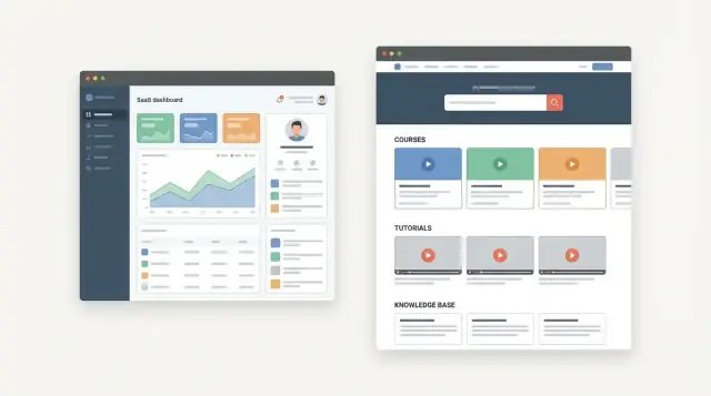
A vertical SaaS educational hub works best when content feels consistent—so users can scan, trust, and act fast. Start by documenting a small set of must-have formats, then standardize how each one is produced.
Most teams need a mix of quick help and deeper customer education:
Don’t launch every format at once. Choose 2–3 that you can keep current.
Create one template per format. For written guides, a simple structure keeps quality high:
Set rules for screenshot style (cropping, blur sensitive data, highlight clicks) and an expected length range.
Agree on reading level, inclusive language, and accessibility basics (descriptive headings, alt text guidelines for key images, clear link text). Standards keep the hub coherent as more authors contribute.
List the top 10–20 user jobs (e.g., “import data,” “invite teammates,” “run reports”) and create content briefs for each. This keeps your educational hub focused on what customers actually do.
Define who writes, who approves, and how often content is checked (monthly for fast-changing features, quarterly for stable areas). Shared ownership across product, support, and marketing prevents stale documentation and keeps customer education credible.
A great educational hub serves two very different user moods: “I need an answer in 30 seconds” and “I want to learn this properly.” Your UX should support both without forcing people into the wrong flow.
Treat the homepage as a dispatcher, not a marketing page. Put a prominent search bar at the top, followed by clearly labeled top tasks (e.g., “Invite a teammate,” “Connect billing,” “Fix a sync issue”). If your product serves multiple roles, add role-based paths so users can self-identify quickly (e.g., Admin, Instructor, Director).
Create a short “Start here” page per persona (for example, clinic admin vs. practitioner; teacher vs. school director). Each page should answer:
Keep these pages brief, with a guided path into deeper modules.
For series content (courses, onboarding tracks, certification), use a clear module layout with:
If your users work in the field, on shared devices, or in low-bandwidth environments, prioritize fast-loading pages, readable typography, and tap-friendly controls. Avoid heavy embeds when a lightweight alternative works.
Include author (or team), “last updated” date, and version notes where relevant. This builds confidence and helps users decide whether the guidance matches what they see in the product.
Your educational hub will only stay fresh if the people who maintain it can publish quickly and safely. Start by matching the CMS to how your team already works—then choose the smallest tech stack that still meets your needs.
If subject-matter experts (support, CS, trainers) will publish often, a WYSIWYG editor reduces friction. If your team already writes docs in Markdown, keep that workflow—especially for technical setup guides and changelogs.
Define requirements upfront:
An all-in-one docs/academy platform can get you to launch faster with built-in search, navigation, and templates. A headless CMS plus a custom frontend is better when you need tighter brand control, custom learning paths, or deep integration with your product site.
A simple decision rule: if your team can’t (or doesn’t want to) maintain a frontend, prefer an all-in-one platform.
If you do want a custom experience but don’t want a long build cycle, a vibe-coding platform like Koder.ai can be a practical middle path: you can prototype (and then ship) a React-based hub front end, connect it to a Go + PostgreSQL backend, and iterate through chat-driven “planning mode” rather than starting from scratch. It’s also useful for building internal admin tools for content ops (imports, tagging, review queues), with source-code export and rollback when you need safer changes.
If you plan to offer customer-only courses, certification content, or premium implementation guides, design for authentication early. Consider SSO (SAML/OIDC) so users can move between your app and the hub without extra logins.
If you’ll support multiple languages, pick tools that handle structured content, locale-specific URLs, and a clear translation process (human, machine, or hybrid). Retrofitting localization later is expensive.
Whether managed or custom, ensure you have strong speed, uptime, backups, and a staging environment for testing changes before they go live.
Your educational hub shouldn’t feel like a separate “content island.” When it’s tightly connected to your marketing site and your in-app onboarding, it reduces confusion, shortens time-to-value, and gives users the next best step—without forcing them to hunt.
Start by defining the core questions visitors bring from your product site. Many will be evaluating or troubleshooting, so make sure the hub clearly covers:
This clarity helps your marketing pages link to the right learning content—and helps your learning content link back to the right decision pages.
Each major hub page should offer one or two relevant calls-to-action. Keep them specific and situational:
Place CTAs where they make sense (end of article, sidebar, or after a key section). Avoid sprinkling CTAs after every paragraph.
Link learning content to product pages and vice versa, based on user intent:
The goal is guidance, not SEO spam: only link when it genuinely helps the reader complete a task or make a decision.
After a user signs up, route them into the right learning path based on role, industry segment, or use case. For example:
On high-traffic articles and onboarding steps, include a simple “Was this helpful?” prompt. Pair it with an optional comment field so you can capture missing steps, confusing terms, or broken assumptions—and improve the hub continuously.
Self-serve only works when people can find the right answer in seconds—and when they can confidently move to the next step if they can’t.
Most users don’t browse categories; they type what they’re seeing on screen. Prioritize an on-site search bar in the header and within the support area, and make results useful:
For vertical SaaS, that synonym list is a superpower: map “CPT,” “procedure code,” and “service code” (or your industry equivalents) to the same results so customers don’t have to guess your preferred term.
Create repeatable “symptom → cause → fix” pages for common problems. Write symptoms in the user’s language (“Invoice won’t send,” “Sync stuck at 0%”) and structure fixes as short, testable steps.
When text alone causes mistakes, add annotated screenshots or 10–20 second clips that show exactly where to click and what success looks like.
Self-serve should end with a clean handoff when needed:
Done well, search and support pathways reduce tickets while making customers feel taken care of.
SEO for a vertical SaaS educational hub works best when it mirrors how customers think about their job—not how your product menu is organized. Start by mapping search demand to real workflows, then turn that map into a clear set of pages that are genuinely helpful.
Create keyword clusters that reflect end-to-end tasks in your niche (e.g., “close month-end,” “run compliance audits,” “schedule field teams”), then support each cluster with a few tightly connected pages:
This approach catches both broad and specific intent without forcing every page to compete for the same keywords.
For each page, pick one primary query and match its intent in the first few lines:
Keep titles specific (“How to Reconcile X in Y: Step-by-Step”) instead of vague (“Reconciliation Guide”).
If your CMS supports structured data, add schema that matches the page:
Only add schema when the page truly contains that structure.
If two pages overlap heavily, combine them into one stronger resource. Add pitfalls, “what good looks like,” and concrete examples so the content feels complete.
Define simple rules editors can follow:
This helps search engines understand topic relationships and helps readers keep moving forward.
An educational hub only works if customers can actually use it—regardless of device, ability, or environment—and if they can trust it with their data. Treat accessibility, privacy, and security as requirements, not polish.
Start with the basics that improve the experience for all readers:
If you publish video lessons, include captions and provide a transcript. Transcripts also help search and make content easy to scan when someone just needs the answer.
Decide what data you collect (analytics, cookie preferences, feedback forms, chat transcripts) and document it in plain language. Include links from the hub footer to /privacy and /cookies (or your equivalents), and keep consent options consistent across the main site and the hub.
For feedback forms, collect only what you need. If an email is optional, say so.
Educational hubs often include embeds, forms, and third-party scripts. Use secure defaults:
Finally, add content disclaimers where your vertical requires them (for example, “Not legal advice” or “Not medical advice”), especially on templates, calculators, and policy guidance.
Analytics turns your educational hub from a “content library” into a system that gets better every week. The goal isn’t to collect every metric—it’s to answer a few recurring questions: Are people finding what they need? Does the hub reduce support load? Does it move users toward activation and paid conversion?
Set up two primary paths to measure:
This view helps you find “assist” content—pages that don’t directly convert, but reliably support key actions.
Beyond pageviews, prioritize signals that reveal confusion:
Pair these with support insights: track top deflected topics (articles that precede “no ticket created”) and the areas where customers repeatedly get confused despite reading.
Create one dashboard the whole team trusts: top entry pages, top searches, zero-results, hub → demo assists, and deflection indicators. Then run a 30-minute weekly review with a short agenda:
Add lightweight feedback on key pages (“Was this helpful?” + optional comment) and a way to report outdated steps. Use the input to prioritize edits over new pages when it’s faster—often the biggest gains come from rewriting titles, improving the first 10 lines, adding a missing prerequisite, or updating screenshots.
A strong launch is less about “publishing pages” and more about ensuring people can reliably find the right answer on day one—and that the hub stays accurate after every product change.
Run a final pass with both marketing and support in the room. Focus on the unglamorous items that prevent confusion:
Assign clear ownership: one person accountable for the hub’s structure, and subject owners for major areas (onboarding, billing, integrations). Define approvals (who can publish), and set update triggers tied to releases—new features, renamed UI labels, or changed permissions should automatically create content tasks.
For key guides (setup, critical workflows, compliance), keep a lightweight change log: what changed, when, and why. It reduces support tickets and helps customers re-train teams without guessing.
Schedule audits to catch:
Publish a simple “what’s next” page so customers and internal teams know what to expect: next roles to support, next workflows, and next integrations. This turns maintenance into a visible, planned program instead of last-minute fixes.
Start with a one-sentence mission that ties directly to customer outcomes (e.g., “get admins to first successful workflow in 30 minutes”). Then limit v1 to 1–2 primary roles and 2–3 content formats you can realistically keep updated. Use your support tickets and onboarding notes to pick the first 10–20 “jobs” to cover.
Separate metrics into learning activity and product outcomes:
Avoid relying on pageviews alone; they don’t tell you whether users succeeded.
Vertical SaaS users have different permissions and goals. Create role-based “Start here” paths (e.g., Admin, Manager, Frontline) and tailor each path to:
Launch with the top 1–2 roles to prevent scope creep.
Use a small set of predictable top-level sections and keep them stable:
Then apply consistent tags (role, feature, workflow, integration, industry terms) so search and “recommended next” links work across the whole hub.
Make it obvious, early—because it affects navigation, search, and authentication.
If you expect gated onboarding or partner training later, plan for it now to avoid rebuilding IA and URLs.
Start with formats that match real workflows and are easy to maintain:
Pick 2–3 formats for launch; consistency beats variety.
Standardize each format so multiple authors can produce consistent help. For written guides, a repeatable structure is:
Also set screenshot rules (cropping, blur sensitive data) and a review cadence (monthly/quarterly by volatility).
Choose based on who will publish most and how much frontend work you can maintain:
Also require: roles/permissions, draft→review workflow, versioning/rollback, and a staging environment.
Treat search as the primary navigation for urgent users:
Pair search with clear escalation (“Still stuck?” linking to /contact) and pre-filled context where possible.
Bake them into your baseline requirements:
If your vertical requires it, add clear disclaimers (e.g., “Not legal advice”).