Jan 24, 2026·5 min
Customer portal vs full app: how to make the right call
Customer portal vs full app: learn how login frequency, repeat tasks, mobile use, and training needs can point you to the better fit.
Start with the real user problem
Before you compare a customer portal vs full app, stop and define the job the user needs to do. Not what your team wants to launch, and not what looks good in a demo. The right product shape usually becomes obvious once the main task is clear.
That task should fit in one plain sentence. "Customers need to view orders and download invoices" is clear. "Customers need a modern digital experience" is not. If the goal is vague, the build will be vague too.
It also helps to name the user and the situation. A portal for existing customers who want to check status, upload a document, or pay a bill solves a very different problem from an app people open every day to manage work, track activity, or respond to alerts.
Before deciding anything, write down four basics:
- the main task users need to complete
- who is doing it
- how often they come back
- what must work on day one
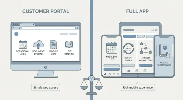
Login frequency matters more than most founders expect. If people sign in once a month to complete one simple task, a customer portal may be enough. If they come back several times a week, they start to expect speed, familiar navigation, and often a better mobile experience.
This is where teams often drift into feature talk too early. Someone suggests notifications, another wants dashboards, then reports, settings, chat, and approvals get added. The list grows fast, but that does not mean the product needs to be a full app.
Split ideas into must-haves and nice-to-haves. Must-haves are the features people need to finish the core task. Nice-to-haves can wait. That one step prevents a lot of overbuilding.
When a customer portal is enough
A customer portal works well when people do not need to log in every day. They come in, complete a short task, check something important, and leave. If that is the normal pattern, building a full app usually adds more cost than value.
Portals are a strong fit for simple, contained actions such as viewing invoices, uploading a document, approving a quote, checking order status, or updating account details. These tasks have a clear start and finish. They do not require long sessions or repeated decision-making.
A useful test is this: can a new user sign in and understand what to do without a walkthrough? If yes, a portal may be all you need. People should not need training just to find the next step.
A portal is often the right choice when:
- users log in occasionally, not daily
- most tasks take a few minutes
- the main actions are checking, sending, paying, or approving information
- mobile access is helpful, but not central
Picture a small service business that wants customers to download reports, pay bills, and approve project updates. A portal handles that comfortably. The goal is clear, the steps are short, and the learning curve stays low.
That simplicity has real advantages. Portals are easier to explain, faster to launch, and less likely to generate support requests. For many businesses, that makes them the smarter first version, not a lesser one.
When a full app makes more sense
A full app is the better choice when the experience itself is part of the value. Users are not just checking something once in a while. They come back often, repeat the same flow, and expect the product to feel fast every time.
Daily or near-daily use changes what matters. People start building habits. They remember where buttons should be. They notice extra taps, slow screens, and awkward navigation. A portal can feel fine for occasional account tasks, but clumsy for repeated work.
This becomes even clearer when tasks happen in sequence. Think of a team that reviews a request, updates details, uploads a photo, gets approval, and closes the task. When that workflow repeats all week, a full app can guide users through it with less friction.
Mobile use is another major signal. If people are working on the move, between appointments, or on-site, they need a product designed for that context. A portal that technically opens on a phone is not the same as a client mobile app built for quick taps, clear status updates, and fast actions.
Training matters too. If users need help to avoid mistakes, a full app can reduce that burden with clearer flows, better prompts, and stronger onboarding.
An app usually makes more sense when:
- people return many times each week
- the same task flow repeats often
- most use happens on mobile
- users need more guidance through the process
A home repair business is a good example. Technicians in the field may need job details, checklists, photos, updates, and status changes in one smooth flow. That repeated, mobile-first work is where the extra effort of a full app starts to pay off.
Four questions that make the decision easier
If you are stuck on the portal or app decision, ignore feature lists for a moment and look at behavior. These four questions usually tell you what kind of product you actually need.
How often will people log in?
If most users sign in once a month to check an invoice, download a file, or approve something, a portal is often enough. If they open it every day, a full app becomes more likely.
What do they repeat each week?
Repeated actions are where design quality matters most. If users keep updating records, sending requests, booking jobs, or tracking work, a smoother app experience can save real time.
Do they need it on the go?
If people use the product while traveling, visiting clients, or working in the field, mobile needs carry more weight. That is especially true when they rely on phone features such as a camera, fast updates, or notifications.
How much training will they need?
If someone needs a long walkthrough before they can do the basics, that is a warning sign. Occasional users usually do better with a simple portal. Frequent users may accept a more involved product, but only if it becomes part of their regular work.
A simple pattern helps: low login frequency plus simple tasks usually points to a customer portal. High login frequency plus repeated work usually points to a full app.
If you are still unsure, sketch both flows before building too much. Tools like Koder.ai can help founders turn a simple chat brief into an early portal or app concept, which makes it easier to compare real usage instead of guessing.
Common mistakes that lead to the wrong choice
Build a simple portal
Create a customer portal for invoices, approvals, uploads, and status checks from one prompt.
Bad product decisions usually start with the wrong question. Instead of asking what users need to do again and again, teams ask what sounds bigger, newer, or more impressive. That is how a simple need turns into an expensive product people barely use.
One common mistake in the customer portal vs full app decision is choosing an app for status. A full app can sound more premium in a pitch or planning meeting. But if customers only log in from time to time to check invoices, upload a file, or review updates, a clean portal is usually the better fit.
Another mistake is forcing mobile into the plan when desktop already works well. If most users complete tasks at a desk during work hours, mobile-first design may add cost without solving a real problem.
Scope is another trap. Teams pile on messaging, reports, admin tools, settings, and approval flows before they know what people will actually use. More features do not make a product feel complete. They often make it slower to launch and harder to understand.
Watch for these warning signs:
- you want an app because it feels more advanced, not because users need it often
- you are planning mobile features without proof that people need them away from a desk
- version one is trying to solve too many jobs at once
- you are underestimating the cost of onboarding and support
Training is the hidden budget many founders miss. If users need demos, help docs, support calls, and reminders just to finish basic tasks, the product may be too heavy for the problem.
A realistic example
Start with one real job
Turn your core user task into a clear portal or app brief in Koder.ai.
Imagine a coworking business with two very different user patterns.
The first user is an office manager. She logs in once a month to download invoices, usage reports, and billing details. She does not need alerts, fast mobile actions, or a polished daily workflow. She just wants a clear place to sign in, find documents, and leave.
For her, a customer portal is the better fit. It keeps the job simple and avoids extra complexity.
Now look at a second user: a freelancer who uses the space almost every day. He checks room schedules on his phone each morning, books desks at short notice, and wants reminders before meetings. He is usually not sitting at a laptop when these needs come up.
For him, a full app makes more sense. Daily use raises the bar. The product needs to be quick, mobile-friendly, and built around repeat actions.
That is the heart of the software choice for founders. The same business can need different tools for different users. One group may only need a practical portal for reports and account details. Another may get more value from a full app because they rely on it throughout the day.
A low-risk way to choose
When the answer is still not fully clear, build the smallest version that solves one real job for one real group of users. That keeps cost down and gives you better evidence than a long planning phase.
Start narrow. Pick the task people need most, such as downloading invoices, approving requests, booking appointments, or checking order status. Then watch what happens.
The first release should answer a few practical questions:
- do people log in without reminders?
- can they finish the main task quickly?
- what support questions keep coming up?
- are they trying to do this on mobile more than expected?
These signals matter more than opinions. If users log in often, repeat the same actions, and keep reaching for their phones, you may be seeing app-like behavior. If usage stays occasional and focused on a few basic actions, a portal may be enough for much longer than you think.
Keep version one easy to change. Do not load it with edge cases, extra roles, and advanced settings on day one. A smaller product is easier to test, easier to explain, and easier to improve.
It is also smart to plan for growth without building everything now. You might start with a browser-based portal for account access and simple requests. Later, if users begin logging in weekly and asking for faster mobile flows, you can expand into a fuller app without throwing away the original work.
Track a few simple numbers in the first month: login rate, task completion rate, time to finish the main action, and the number of support requests. Those numbers will tell you whether the product feels natural or still needs too much hand-holding.
If you want to test both directions quickly, Koder.ai is one way to create an early portal or app from chat and see real screens before committing to a bigger build. That can help you make the customer portal vs full app decision based on user behavior, not assumptions.
The best choice is usually the simpler one that still fits the real work. If a portal solves the problem cleanly, start there. If the job is frequent, mobile, and repeat-heavy, build the app users actually need.