May 05, 2025·8 min
Datadog and the Platform Shift: Telemetry, Integrations, Workflows
See how Datadog becomes a platform when telemetry, integrations, and workflows become the product—and practical ideas you can apply to your stack.
See how Datadog becomes a platform when telemetry, integrations, and workflows become the product—and practical ideas you can apply to your stack.
An observability tool helps you answer specific questions about a system—typically by showing charts, logs, or a query result. It’s something you “use” when there’s a problem.
An observability platform is broader: it standardizes how telemetry is collected, how teams explore it, and how incidents are handled end-to-end. It becomes something your organization “runs” every day, across many services and teams.
Most teams start with dashboards: CPU charts, error-rate graphs, maybe a few log searches. That’s useful, but the real goal isn’t prettier charts—it’s faster detection and faster resolution.
A platform shift happens when you stop asking, “Can we graph this?” and start asking:
Those are outcome-focused questions, and they require more than visualization. They require shared data standards, consistent integrations, and workflows that connect telemetry to action.
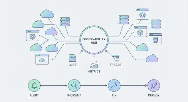
As platforms like the Datadog observability platform evolve, the “product surface” isn’t only dashboards. It’s three interlocking pillars:
A single dashboard can help a single team. A platform gets stronger with each service onboarded, each integration added, and each workflow standardized. Over time, this compounds into fewer blind spots, less duplicated tooling, and shorter incidents—because every improvement becomes reusable, not one-off.
When observability shifts from “a tool we query” to “a platform we build on,” telemetry stops being raw exhaust and starts acting like the product surface. What you choose to emit—and how consistently you emit it—determines what your teams can see, automate, and trust.
Most teams standardize around a small set of signals:
Individually, each signal is useful. Together, they become a single interface to your systems—what you see in dashboards, alerts, incident timelines, and postmortems.
A common failure mode is collecting “everything” but naming it inconsistently. If one service uses userId, another uses uid, and a third logs nothing at all, you can’t reliably slice data, join signals, or build reusable monitors.
Teams get more value by agreeing on a few conventions—service names, environment tags, request IDs, and a standard set of attributes—than by doubling ingestion volume.
High-cardinality fields are attributes with many possible values (like user_id, order_id, or session_id). They’re powerful for debugging “only happens to one customer” issues, but they can also increase cost and make queries slower if used everywhere.
The platform approach is intentional: keep high-cardinality where it provides clear investigative value, and avoid it in places meant for global aggregates.
The payoff is speed. When metrics, logs, traces, events, and profiles share the same context (service, version, region, request ID), engineers spend less time stitching evidence together and more time fixing the actual problem. Instead of jumping between tools and guessing, you follow one thread from symptom to root cause.
Most teams start observability by “getting data in.” That’s necessary, but it’s not a strategy. A telemetry strategy is what keeps onboarding fast and makes your data consistent enough to power shared dashboards, reliable alerts, and meaningful SLOs.
Datadog typically gets telemetry through a few practical routes:
Early on, speed wins: teams install an agent, turn on a few integrations, and immediately see value. The risk is that every team invents its own tags, service names, and log formats—making cross-service views messy and alerts hard to trust.
A simple rule: allow “quick start” onboarding, but require “standardize within 30 days.” That gives teams momentum without locking in chaos.
You don’t need a huge taxonomy. Start with a small set that every signal (logs, metrics, traces) must carry:
service: short, stable, lowercase (e.g., checkout-api)env: prod, staging, devteam: owning team identifier (e.g., payments)version: deploy version or git SHAIf you want one more that pays off quickly, add tier (frontend, backend, data) to simplify filtering.
Cost issues usually come from defaults that are too generous:
The goal isn’t to collect less—it’s to collect the right data consistently, so you can scale usage without surprises.
Most people think of observability tools as “something you install.” In practice, they spread through an organization the way good connectors spread: one integration at a time.
An integration isn’t just a data pipe. It usually has three parts:
That last part is what turns integrations into distribution. If the tool only reads, it’s a dashboarding destination. If it also writes, it becomes part of daily work.
Good integrations reduce setup time because they ship with sensible defaults: prebuilt dashboards, recommended monitors, parsing rules, and common tags. Instead of every team inventing its own “CPU dashboard” or “Postgres alerts,” you get a standard starting point that matches best practices.
Teams still customize—but they customize from a shared baseline. This standardization matters when you’re consolidating tools: integrations create repeatable patterns that new services can copy, which keeps growth manageable.
When evaluating options, ask: can it ingest signals and take action? Examples include opening incidents in your ticketing system, updating incident channels, or attaching a trace link back into a PR or deploy view. Bidirectional setups are where workflows start to feel “native.”
Start small and predictable:
If you want a rule of thumb: prioritize integrations that immediately improve incident response, not the ones that merely add more charts.
Standard views are where an observability platform becomes usable day to day. When teams share the same mental model—what a “service” is, what “healthy” looks like, and where to click first—debugging gets faster and handoffs get cleaner.
Pick a small set of “golden signals” and map each one to a concrete, reusable dashboard. For most services, that’s:
The key is consistency: one dashboard layout that works across services beats ten clever bespoke dashboards.
A service catalog (even a lightweight one) turns “someone should look at this” into “this team owns it.” When services are tagged with owners, environments, and dependencies, the platform can answer basic questions instantly: Which monitors apply to this service? What dashboards should I open? Who gets paged?
That clarity reduces Slack ping-pong during incidents and helps new engineers self-serve.
Treat these as standard artifacts, not optional extras:
Vanity dashboards (pretty charts with no decisions behind them), one-off alerts (created in a hurry, never tuned), and undocumented queries (only one person understands the magic filter) all create platform noise. If a query matters, save it, name it, and attach it to a service view others can find.
Observability only becomes “real” for the business when it shortens the time between a problem and a confident fix. That happens through workflows—repeatable paths that take you from signal to action, and from action to learning.
A scalable workflow is more than paging someone.
An alert should open a focused triage loop: confirm impact, identify the affected service, and pull the most relevant context (recent deploys, dependency health, error spikes, saturation signals). From there, communication turns a technical event into a coordinated response—who’s owning the incident, what users are seeing, and when the next update is due.
Mitigation is where you want “safe moves” at your fingertips: feature flags, traffic shifting, rollback, rate limits, or a known workaround. Finally, learning closes the loop with a lightweight review that captures what changed, what worked, and what should be automated next.
Platforms like the Datadog observability platform add value when they support shared work: incident channels, status updates, handoffs, and consistent timelines. ChatOps integrations can turn alerts into structured conversations—creating an incident, assigning roles, and posting key graphs and queries directly in the thread so everyone sees the same evidence.
A useful runbook is short, opinionated, and safe. It should include: the goal (restore service), clear owners/on-call rotations, step-by-step checks, links to the right dashboards/monitors, and “safe actions” that reduce risk (with rollback steps). If it’s not safe to run at 3 a.m., it’s not done.
Root cause is faster when incidents are automatically correlated with deploys, config changes, and feature flag flips. Make “what changed?” a first-class view so triage starts with evidence, not guesswork.
An SLO (Service Level Objective) is a simple promise about user experience over a time window—like “99.9% of requests succeed over 30 days” or “p95 page loads are under 2 seconds.”
That beats a “green dashboard” because dashboards often show system health (CPU, memory, queue depth) rather than customer impact. A service can look green and still be failing users (for example, a dependency is timing out, or errors are concentrated in one region). SLOs force the team to measure what users actually feel.
An error budget is the allowed amount of unreliability implied by your SLO. If you promise 99.9% success over 30 days, you’re “allowed” about 43 minutes of errors in that window.
This creates a practical operating system for decisions:
Instead of debating opinions in a release meeting, you’re debating a number everyone can see.
SLO alerting works best when you alert on burn rate (how quickly you’re consuming the error budget), not on raw error counts. That reduces noise:
Many teams use two windows: a fast burn (page quickly) and a slow burn (ticket/notify).
Start small—two to four SLOs you’ll actually use:
Once these are stable, you can expand—otherwise you’ll just build another dashboard wall. For more, see /blog/slo-monitoring-basics.
Alerting is where many observability programs stall: the data is there, the dashboards look great, but the on-call experience becomes noisy and untrusted. If people learn to ignore alerts, your platform loses its ability to protect the business.
The most common causes are surprisingly consistent:
In Datadog terms, duplicated signals often appear when monitors are created from different “surfaces” (metrics, logs, traces) without deciding which one is the canonical page.
Scaling alerting starts with routing rules that make sense to humans:
A useful default is: alert on symptoms, not every metric change. Page on things users feel (error rate, failed checkouts, sustained latency, SLO burn), not on “inputs” (CPU, pod count) unless they reliably predict impact.
Make alert hygiene part of operations: monthly monitor pruning and tuning. Remove monitors that never fire, adjust thresholds that fire too often, and merge duplicates so each incident has one primary page plus supporting context.
Done well, alerting becomes a workflow people trust—not a background noise generator.
Calling observability a “platform” isn’t just about having logs, metrics, traces, and a lot of integrations in one place. It also implies governance: the consistency and guardrails that keep the system usable when the number of teams, services, dashboards, and alerts multiplies.
Without governance, Datadog (or any observability platform) can drift into a noisy scrapbook—hundreds of slightly different dashboards, inconsistent tags, unclear ownership, and alerts nobody trusts.
Good governance clarifies who decides what, and who is accountable when the platform gets messy:
A few lightweight controls go further than long policy docs:
service, env, team, tier) plus clear rules for optional tags. Enforce in CI where possible.The fastest way to scale quality is to share what works:
If you want this to stick, make the governed path the easy path—fewer clicks, faster setup, and clearer ownership.
Once observability behaves like a platform, it starts to follow platform economics: the more teams that adopt it, the more telemetry gets produced, and the more useful it becomes.
That creates a flywheel:
The catch is that the same loop also increases cost. More hosts, containers, logs, traces, synthetics, and custom metrics can grow faster than your budget if you don’t manage it deliberately.
You don’t have to “turn it all off.” Start by shaping data:
Track a small set of measures that show whether the platform is paying back:
Make it a product review, not an audit. Bring platform owners, a few service teams, and finance. Review:
The goal is shared ownership: cost becomes an input to better instrumentation decisions, not a reason to stop observing.
If observability is turning into a platform, your “tool stack” stops being a collection of point solutions and starts acting like shared infrastructure. That shift makes tool sprawl more than an annoyance: it creates duplicated instrumentation, inconsistent definitions (what counts as an error?), and higher on-call load because signals don’t line up across logs, metrics, traces, and incidents.
Consolidation doesn’t mean “one vendor for everything” by default. It means fewer systems of record for telemetry and response, clearer ownership, and a smaller set of places people have to look during an outage.
Tool sprawl typically hides costs in three places: time spent hopping between UIs, brittle integrations you have to maintain, and fragmented governance (naming, tags, retention, access).
A more consolidated platform approach can reduce context switching, standardize service views, and make incident workflows repeatable.
When evaluating your stack (including Datadog or alternatives), pressure-test these:
Pick one or two services with real traffic. Define a single success metric like “time to identify root cause drops from 30 minutes to 10” or “reduce noisy alerts by 40%.” Instrument only what you need, and review results after two weeks.
Keep internal docs centralized so learning compounds—link the pilot runbook, tagging rules, and dashboards from one place (for example, /blog/observability-basics as an internal starting point).
You don’t “roll out Datadog” once. You start small, set standards early, then scale what works.
Days 0–30: Onboard (prove value fast)
Pick 1–2 critical services and one customer-facing journey. Instrument logs, metrics, and traces consistently, and connect the integrations you already rely on (cloud, Kubernetes, CI/CD, on-call).
Days 31–60: Standardize (make it repeatable)
Turn what you learned into defaults: service naming, tagging, dashboard templates, monitor naming, and ownership. Create “golden signals” views (latency, traffic, errors, saturation) and a minimal SLO set for the most important endpoints.
Days 61–90: Scale (expand without chaos)
Onboard additional teams using the same templates. Introduce governance (tag rules, required metadata, review process for new monitors) and start tracking cost vs. usage so the platform stays healthy.
Once you treat observability as a platform, you’ll usually end up wanting small “glue” apps around it: a service catalog UI, a runbook hub, an incident timeline page, or an internal portal that links owners → dashboards → SLOs → playbooks.
This is the kind of lightweight internal tooling you can build quickly on Koder.ai—a vibe-coding platform that lets you generate web apps via chat (commonly React on the frontend, Go + PostgreSQL on the backend), with source code export and deployment/hosting support. In practice, teams use it to prototype and ship the operational surfaces that make governance and workflows easier without pulling a full product team off roadmap.
Run two 45-minute sessions: (1) “How we query here” with shared query patterns (by service, env, region, version), and (2) “Troubleshooting playbook” with a simple flow: confirm impact → check deploy markers → narrow to service → inspect traces → confirm dependency health → decide rollback/mitigation.
An observability tool is something you consult during a problem (dashboards, log search, a query). An observability platform is something you run continuously: it standardizes telemetry, integrations, access, ownership, alerting, and incident workflows across teams so outcomes improve (faster detection and resolution).
Because the biggest wins come from outcomes, not visuals:
Charts help, but you need shared standards and workflows to consistently reduce MTTD/MTTR.
Start with a required baseline that every signal carries:
serviceenv (prod, staging, )High-cardinality fields (like user_id, order_id, session_id) are great for “only one customer is broken” debugging, but they can raise cost and slow queries if used everywhere.
Use them intentionally:
Most teams standardize on:
A practical default is:
Pick the path that matches your control needs, then enforce the same naming/tagging rules across all of them.
Do both:
This prevents “every team invents its own schema” while keeping adoption momentum.
Because integrations are more than data pipes—they include:
Prioritize bidirectional integrations that both ingest signals and trigger/record actions, so observability becomes part of daily work—not just a destination UI.
Anchor on consistency and reuse:
Avoid vanity dashboards and one-off alerts. If a query matters, save it, name it, and attach it to a service view others can find.
Alert on burn rate (how fast you’re consuming the error budget), not every transient spike. A common pattern:
Keep the starter set small (2–4 SLOs per service) and expand only after teams actually use them. For basics, see /blog/slo-monitoring-basics.
devteamversion (deploy version or git SHA)Add tier (frontend, backend, data) if you want a simple extra filter that pays off quickly.
The key is making these share the same context (service/env/version/request ID) so correlation is fast.