Jul 11, 2025·8 min
DIY Branding: Build a Logo, Colors, and a Matching Website
Learn a practical DIY branding workflow to design a simple logo, choose a color palette and fonts, and build a website that looks consistent everywhere.
Learn a practical DIY branding workflow to design a simple logo, choose a color palette and fonts, and build a website that looks consistent everywhere.
“Matching branding” doesn’t mean everything looks identical. It means everything follows the same set of visual rules—so your logo, colors, fonts, and website layout feel like they belong to one brand.
When those rules are consistent, people recognize you faster, trust you sooner, and move through your site with less friction. When they’re not, your business can feel scattered—even if each individual piece looks “nice.”
At a practical level, matching branding is consistency across a few core elements:
If you can take a screenshot of your homepage, an email, and an Instagram post—and they clearly look like the same company—you’re doing it.
DIY branding works best when you aim for clarity over complexity. Your goal isn’t to build an endless “creative” system—it’s to build something you can repeat without guessing.
A good DIY target is:
Think of your brand as a kit you’ll reuse everywhere. By the end, you should have:
Before designing, list where people will encounter you. Most small businesses need consistency across:
The point: matching branding reduces decision fatigue. Once your rules are set, you can create new pages and posts faster—and everything still looks like you.
Before you open a logo tool or browse color palettes, decide what your brand is trying to signal. If you skip this step, you end up designing by personal taste—and later wondering why the website, logo, and socials feel like they belong to different businesses.
Keep it plain and specific enough that a customer would nod and say, “Yes, that’s what you do.”
Example formula:
“We help [audience] get [result] by [how], without [common frustration].”
This sentence becomes your filter: if a design choice doesn’t support that promise, it’s decoration.
Choose words that describe the feeling you want people to have after seeing your brand.
Try a mix like:
If your adjectives fight each other (e.g., “luxury” + “cheap”), your visuals will struggle too.
Don’t stop at demographics. Write down what matters in the moment they’re choosing you:
This will influence everything later: typography (formal vs. casual), spacing (calm vs. punchy), and even button labels.
Grab screenshots of homepages, logos, packaging, and social posts. Screenshots are stable, easy to compare, and force you to notice patterns.
For each example, note why it works for you:
You’ve now created a clear direction—so your logo, colors, and website can match on purpose.
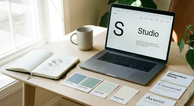
A DIY logo doesn’t need to be complicated to look professional. What matters is that it’s clear, repeatable, and works in the places you’ll actually use it—your website header, social profile, invoices, and a tiny favicon.
Start by choosing one of these common logo types:
If you’re unsure, a wordmark is usually the safest and easiest DIY option.
A simple logo system starts with one primary version you use most of the time—typically a horizontal logo in one color.
Decide now what your default is, such as:
The goal: you shouldn’t be redesigning your logo for every new use.
Shrink your logo down to about 16–32 px (favicon size). If it turns into a blur, simplify.
Common fixes:
A logo that survives the favicon test will usually work everywhere else.
DIY logos often go wrong by adding too much:
Instead, aim for clean shapes and strong contrast. A logo should still look good in a single color on a plain background.
You’ll need a few predictable variations for different spaces. Keep it limited and intentional:
Also decide acceptable color versions:
When these variations are defined upfront, your website, social profiles, and documents will automatically feel more consistent—even if you’re building everything yourself.
You don’t need to be “artistic” to make a usable logo—you need a repeatable process that gets you to a clean, consistent mark. The goal here isn’t to create a masterpiece. It’s to build a logo you can place on a website header, social profile, invoice, and packaging without it falling apart.
Set a timer for 10 minutes and sketch 20 tiny ideas. Keep them thumbnail-sized (small boxes on paper).
Quantity matters more than quality because it stops you from obsessing over the first decent idea. Most of these sketches will be bad—and that’s the point.
Pick a few sketches and deliberately test different “types” of logo directions:
Keep each direction consistent for a few variations so you can compare them fairly.
Before adding details, make the logo work as a bold silhouette. Ask:
Use basic geometry—circles, squares, straight lines—to clean up shapes. This is where DIY logos often improve fast: less detail, cleaner edges, better balance.
Once you have a direction you like, do a fast search to avoid near-copies:
You’re not doing legal clearance here—just avoiding something obviously too close.
Now switch from “idea mode” to “polish mode.” Pick one main option (and one backup) and refine:
Export a simple set of files you’ll actually use: a full logo (symbol + name), an icon version, and a one-color version for flexibility later.
Color is where “matching branding” either clicks instantly—or quietly falls apart. On screens, your palette needs to do two jobs at once: feel like you and stay readable across phones, laptops, and different lighting conditions.
Keep it tight. A small set of well-defined colors is easier to apply consistently across your logo, website, social posts, and documents.
If you’re unsure which color should be “primary,” pick the one you want people to associate with you after a quick glance—then commit to using it in the same places every time.
A beautiful palette isn’t useful if your text and buttons are hard to read. Before you fall in love with a shade, test it in real UI situations:
A practical rule: if you have to squint, it’s not your final color. When in doubt, make text darker, backgrounds lighter, and reserve bright/saturated colors for accents.
Instead of thinking “blue, green, gray,” think in jobs your colors do:
This is how you avoid the common DIY problem where every page uses the same colors—but in totally different ways.
Most small business sites work best with a light default (white/near-white background, dark text) because it reads cleanly and feels familiar.
If your brand naturally leans dark (premium, nightlife, tech), design one strong dark version intentionally—don’t just invert colors. You don’t need both light and dark modes unless your product is software-heavy or your audience expects it.
Don’t leave color choices trapped in your design tool. Store your palette in your mini style guide with:
Example format:
Once these are set, your logo, website buttons, and marketing materials stop feeling like separate projects—and start looking like one brand.
Typography is one of the fastest ways to make your brand feel intentional. When your headings, body text, and buttons follow a clear pattern, your logo and colors automatically look more polished—especially on a website.
Start with one primary typeface for headings and a secondary typeface for body text. Keep it simple: two fonts max, or choose one font family with multiple weights (Regular, Medium, Bold) and use it everywhere.
A practical pairing rule: pick a heading font with personality (slightly distinctive), and a body font optimized for reading (clean, neutral). If you’re unsure, use a well-designed workhorse family for both and rely on weight/size to create contrast.
You don’t need a huge system—just a consistent one. Define:
Write these sizes down in your mini style guide so your homepage, product pages, and blog don’t drift.
Good spacing makes even basic fonts look premium. As a starting point:
If your text feels hard to read, it’s often spacing—not the font.
Before you commit, check that your fonts include the characters you’ll actually use: currency symbols, punctuation, accents/diacritics, and any special characters for names or locations. This avoids ugly substitutions later.
Lock these choices into your /brand-guidelines so every new page stays visually consistent.
A mini style guide is a one-page rulebook you can follow every time you touch your website, social posts, or printed materials. The goal isn’t to document every possibility—it’s to prevent accidental inconsistency.
Pick a default corner radius for your UI and keep it consistent.
Write it down as a rule, for example: “All cards, inputs, and buttons use 8px rounded corners.” If your logo is very geometric and sharp, matching sharp corners often looks more intentional.
Buttons are where brands get messy fast. Decide these three styles and reuse them everywhere:
Add one line for each: background color, text color, border (if any), and hover behavior (slightly darker fill, underline, etc.).
Choose outline or filled icons—don’t mix. If you use outline icons, set a consistent stroke width (e.g., 2px) and corner style (rounded vs square). This tiny decision makes your pages feel designed, even with simple layouts.
Use a simple spacing scale so margins and padding look intentional. A common choice is an 8px system:
Rule of thumb: don’t use random values unless you must. Consistent spacing creates instant cohesion.
Pick one visual direction:
Then set quick editing rules like: “Warm tone, medium contrast, natural skin tones, no heavy filters.” This prevents your homepage and About page from feeling like different brands.
Put all of this in a single document titled “Style Guide v1.” When you update anything, update the doc first—then apply changes consistently.
Branding doesn’t stop at the logo and colors—the website is where people actually experience your brand. A simple site map and a repeatable layout system will make your website feel designed even if you’re building it yourself.
Most small businesses don’t need a huge menu. You want a few clear pages that answer the main questions: what you do, who it’s for, why it’s worth it, and how to buy/contact.
A solid starting set:
If you offer multiple services, consider one main Services page plus individual service pages later—don’t force it on day one.
A homepage works best when it follows a predictable flow. You’re not copying other sites—you’re using a pattern people already understand.
A practical structure:
Keep the CTA consistent across the site. If your main action is “Book a call,” don’t switch to “Get started” randomly on other pages.
Your navigation should describe what users get, not what you call it internally. “Services” usually beats “Solutions.” “Work” can be unclear; “Portfolio” may be clearer depending on your audience.
Tip: keep the top nav to 4–6 items. If you have more, use one dropdown (sparingly) or move secondary pages to the footer.
This is where your mini style guide pays off. Pick a few layout decisions and repeat them everywhere:
When each page shares the same grid, spacing, and components, your brand feels cohesive—even if the content changes.
If you’re building your site quickly, tools that turn your rules into reusable components can help prevent drift. For example, with Koder.ai, you can describe your style guide (colors, typography, button variants, spacing scale) and generate consistent React-based pages and components via chat—then iterate without reinventing the UI each time.
Your visuals set expectations before anyone reads a word. A clean, minimalist site paired with jokey copy feels off; bright, energetic colors with stiff corporate language feels equally confusing. Matching copy to your visual identity is one of the fastest ways to look put together, even on a DIY budget.
Choose a single default voice for your brand—then write everything through that lens. Pick one:
A simple rule: if your design is bold (high-contrast colors, big type, sharp shapes), your voice should usually be confident and decisive. If your design is soft (muted palette, lots of white space, rounded shapes), your voice can be calm and supportive.
Create these early, so every page stays consistent:
Example: “We help local clinics get more appointments through clear, compliant websites.”
Microcopy is the small text that quietly defines your brand: buttons, form hints, empty states, and error messages.
Write a small set once, then reuse it:
Make a short checklist: sentence case vs Title Case, exclamation marks (yes/no), contractions (we’re vs we are), and how you refer to your product (feature names capitalized or not). Consistent writing makes your brand feel intentional—just like consistent colors and typography.
Once your logo, colors, and type are decided, the fastest way to stay consistent is to package them into a small brand kit you can grab anytime. This saves you from redesigning (or guessing) every time you post on social, update your site, or print something.
Create a tiny set of logo exports that covers most real-life uses:
Keep sizes practical: for PNG, export a couple common widths (like 512px and 2048px) so you have both small and large ready.
Good naming prevents the “final_FINAL2.png” problem and makes it easy to share with a freelancer or teammate.
Suggested structure:
/brand/logo/
logo-primary.svglogo-primary.pnglogo-mark.svg (icon-only, if you have one)logo-horizontal.svg (if you use it)logo-black.svg, logo-white.svgAdd a quick README.txt in the folder with one sentence on when to use each version.
Instead of “blue” and “gray,” use repeatable names that work across your website and templates.
Example tokens:
Include the HEX codes and, if you can, the RGB equivalents for tools that don’t accept HEX.
You don’t need a huge brand book—just a one-page style guide that answers:
This prevents your website from drifting over time as new pages get added.
Make 3–5 templates you’ll actually use:
Keep them minimal and based on your real website styles. The goal is speed and consistency, not endless variations.
You can have great colors, a clean logo, and nice fonts—and still end up with a brand that feels off in real use. A quick quality pass helps you spot issues before you print anything, publish pages, or order merch.
If people can’t read it, it doesn’t matter how good it looks.
Tip: Test your palette with a simple “worst case” screen—low brightness, sunlight, or an older laptop.
A logo that only works when it’s big isn’t a usable logo.
Open your site on a phone before you adjust anything on desktop.
Focus on:
Ask 3–5 people (not just friends who will be polite): “What 3 adjectives describe this brand?” Compare their words to your intended direction. If they don’t match, adjust.
Aim for small tweaks—contrast adjustments, font weight changes, button color updates—rather than a full redesign. Consistency builds faster when you refine instead of restart.
Consistency isn’t a one-time project—it’s what keeps your brand feeling real as you add pages, products, and people. The goal is to make small, controlled improvements without accidentally creating three different versions of your brand.
Keep a simple, editable doc (Google Doc, Notion, or a single PDF) that answers the everyday questions:
This isn’t corporate brand guidelines. It’s a cheat sheet that prevents drift.
Before designing anything new, use existing components first. If a new page needs a hero, a CTA, or a testimonial block, pull from what you already have and only create a new component if you truly can’t.
This applies even more when you’re moving fast with AI-assisted building: whether you’re working with a developer or generating pages in a platform like Koder.ai, you’ll get better results by reusing a defined set of components and tokens (colors/type/spacing) rather than prompting from scratch every time.
Any time you tweak colors or fonts, log it (date + what changed + why). This helps you avoid random edits that slowly break your look.
Give yourself a future path:
If you want next steps, see /pricing for support options or browse /blog for practical tutorials you can implement quickly.
It means your visuals follow the same rules everywhere—logo versions, colors, fonts, spacing, and UI components—so everything looks like it belongs to one brand.
You’re aiming for consistency, not identical layouts on every platform.
Inconsistent visuals create friction: people hesitate, trust you less, and your business feels “scattered” even if each piece looks good on its own.
Consistent rules help people recognize you faster and move through your site with less confusion.
A practical DIY baseline is:
If you can repeat it without guessing, it’s working.
Start with a one-sentence brand promise:
“We help [audience] get [result] by [how], without [common frustration].”
Then pick 3–5 brand adjectives (e.g., calm, practical, modern) and use those as your filter for every design choice.
If you’re unsure, a wordmark (your business name as text) is usually the safest DIY option because it’s simple, flexible, and easy to keep readable.
Choose a type that fits your name and usage:
Shrink it to 16–32px (favicon size). If it blurs, simplify.
Quick fixes:
Use a simple structure:
Assign roles (text, background, borders, accents) and reuse them consistently so each page doesn’t “reinterpret” the palette.
Prioritize contrast and legibility in real UI situations:
If you have to squint, adjust: darker text, lighter backgrounds, and reserve bright colors for small accents.
Keep it simple:
Most “messy typography” problems are inconsistent sizes/spacing, not the font choice itself.
Make a one-page “Style Guide v1” that includes:
When you update anything, update the guide first—then apply it everywhere (site, email, social, PDFs).