Aug 15, 2025·8 min
Drew Houston, Dropbox, and the Power of Simple Syncing
How Drew Houston and Dropbox turned simple file syncing into a habit: product-led growth, freemium, referrals, and a focus on reliable everyday utility.
How Drew Houston and Dropbox turned simple file syncing into a habit: product-led growth, freemium, referrals, and a focus on reliable everyday utility.
Dropbox didn’t win people over with grand promises—it won by removing a small, constant annoyance: keeping files consistent across devices. Once that problem disappears, you stop “managing files” and start trusting that your work will simply be where you need it.
That trust is what turns a tool into a daily habit.
Dropbox is a classic example of utility software: an app that does one core job and does it reliably. It’s not trying to entertain you or demand attention. It’s more like plumbing—quiet, dependable, and painfully missed when it breaks.
The “job” in Dropbox’s case was straightforward: put a file in one place, and it shows up everywhere else—without you thinking about it.
This article uses Dropbox’s early story to explore three connected ideas:
This isn’t a full corporate history or a technical deep dive into syncing protocols. The focus is on what made Dropbox feel like a normal part of everyday work—especially in its early years—and what that teaches about building habit-forming utility apps.
If you’ve ever wondered why some tools become “set it and forget it” essentials while others stay unused after week one, Dropbox is a clean case study: one problem, solved so smoothly that the solution becomes routine.
Dropbox didn’t start as an ambitious “change the internet” idea. It started with a very normal frustration.
Drew Houston was a student and early builder who kept running into the same snag: he needed a file on one device, but it was sitting on another. Sometimes it was a USB drive left behind. Sometimes the latest version lived on a different laptop. Sometimes the only way to move things around was emailing attachments to himself, then trying to remember which inbox message held the newest copy.
None of these workarounds sounded dramatic, but they added up:
Houston’s insight wasn’t just that people needed storage. They needed continuity—files that followed them without extra steps.
The early product promise can be summed up simply: “your files, everywhere.” Not “learn a new system.” Not “manage your backups.” Just open your computer and keep going.
Dropbox’s early startup path included support from Y Combinator, which helped the team focus on turning a personal annoyance into a product other people could understand instantly.
The goal wasn’t to impress with features; it was to remove a recurring, universal pain point so completely that users would forget syncing was even happening.
Dropbox’s breakthrough wasn’t a fancy interface or a long list of features. It was a simple mental model anyone could understand: put your files in one folder, and that folder is the same everywhere.
Instead of asking people to learn a new way to manage documents, Dropbox mapped syncing onto an existing habit—saving files to a folder. The product fades into the background, and your attention stays on the work.
The “Dropbox folder” idea turns a complex technical problem into a comforting promise: you don’t have to think about which laptop has the latest version, whether you emailed the right attachment, or if a USB drive is still in your bag.
When the folder behaves consistently across devices, users stop treating syncing as a task. It becomes an assumption—like electricity in a room.
For a core utility like file syncing, reliability is the feature. Power users may ask for advanced controls, but most people first need the basics to be effortless.
If a utility demands attention—manual uploads, confusing conflict messages, unpredictable delays—it breaks the spell. “Invisible sync” means fewer decisions and fewer interruptions. Users notice not the mechanism, but the relief.
When syncing feels automatic, users experience practical benefits immediately:
Storage and syncing products ask for something personal: your work.
To keep sync invisible, Dropbox had to earn trust through consistency—files show up when expected, changes propagate correctly, and “missing” files don’t become a recurring fear. Without that trust, users watch the system obsessively—and invisibility disappears.
Dropbox didn’t win by offering the most knobs to turn—it won by making the “right thing” the easiest thing.
That kind of simplicity isn’t a thin coat of design polish; it’s a product decision that shapes what gets built, what gets cut, and what gets left alone.
Many utility apps fall into predictable traps:
Each trap adds a moment of hesitation—small, but repeated. Enough hesitation turns “I’ll set this up later” into churn.
Dropbox leaned into clear defaults: put files in a folder, and they appear everywhere. For most people, that’s the whole job-to-be-done.
This isn’t anti-customization; it’s sequencing. Advanced options can exist, but they shouldn’t be required to reach the first win. A small set of predictable behaviors creates trust: users learn once, then stop thinking about it.
Simplicity shows up in the words you choose. “Dropbox folder” is concrete; it maps to something people already understand. The UI reinforces the same mental model: a familiar file system with minimal extra concepts.
Onboarding follows that logic too. Instead of tutorials full of features, the best onboarding guides a single action that proves the promise quickly:
That loop teaches by doing, not by explaining.
The hardest part is resisting feature requests that break the core experience.
When you treat simplicity as strategy, you don’t ask “Can we add this?” first—you ask “Does this make the default path clearer, faster, or more reliable?” If the answer is no, the feature isn’t “extra value.” It’s extra friction.
Most people don’t think about “syncing” as a feature. They think: “My file is there.” When it works, it’s invisible. When it doesn’t, it’s the only thing they can talk about.
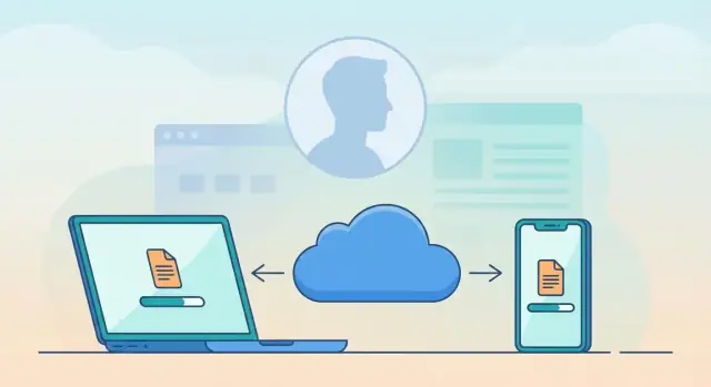
In simple terms, the loop is: you save a file in your Dropbox folder, it updates in the background, and the same file shows up on your other devices.
If you edit it on your laptop, it updates on your desktop. If you drop a photo in on your phone, it appears on your computer.
That’s it. No “export,” no special button, no mental checklist—just a folder that behaves the way people already understand folders.
Speed turns syncing into a reflex. If updates arrive quickly, users stop waiting and start trusting. Reliability turns that trust into a routine—people place more important work in Dropbox because it has earned the right to hold it.
A slow or flaky sync creates a new habit too, but it’s a bad one: double-checking, re-uploading, and keeping backup copies “just in case.”
The real test is what happens when life gets messy:
Word-of-mouth doesn’t spread because a product has more features. It spreads when someone can confidently say, “Put it in Dropbox—you won’t lose it.”
Trust is the shareable benefit, and sync quality is where that trust is earned.
Dropbox grew because people used it—not because they studied a long pitch deck or compared features on a marketing page. The product itself created the proof.
Once it worked for you in a real moment of need, you didn’t need convincing.
Dropbox’s key breakthrough wasn’t “cloud storage” as an idea—it was the first time a file showed up on another device automatically.
You save something on your laptop, open your desktop, and it’s already there. No emailing attachments. No USB drive. No “version_final_FINAL.” That single cross-device success turns syncing from a promise into a felt experience.
Product-led growth depends on guiding people to that “it just worked” moment quickly. Dropbox did this with simple, concrete steps that reduce confusion:
Each of these nudges users toward real usage, not passive browsing.
Sign-ups are easy to count—and easy to misread. A person can create an account and never reach the moment where Dropbox becomes valuable.
Activation is different: it’s whether the product delivered the core benefit. For Dropbox, that could be metrics like first file added, first successful sync to a second device, or first shared link created.
Those signals tell you if the product is doing the selling—or if it’s just collecting registrations.
Freemium is simple: you start for free, and you pay later—only if the product becomes valuable enough that you want more.
For a utility like file syncing, this matters because “trust” isn’t a marketing claim; it’s something users feel after the product quietly works day after day.
A good freemium model doesn’t tease people with a demo. It gives them the core job-to-be-done so they can build a real routine: install it, drop files in, forget about it, then notice their work is magically everywhere.
That’s where habit forms. By the time someone considers paying, they’re not betting on promises—they’re protecting a workflow they already rely on.
Freemium only works when the boundaries are obvious and fair. Users should know what they get for free and what triggers an upgrade—without surprises.
Examples of clear limits include caps on storage, number of devices, admin controls, or advanced sharing options. The key is that the product stays usable, while the paid plan feels like a natural expansion.
Packaging should make the next step feel safe:
When upgrades are predictable, people don’t feel tricked. They feel in control.
For syncing tools, value usually scales with usage: more files, more devices, more collaborators, more responsibility.
Freemium works best when pricing follows that curve—so paying feels less like a fee and more like a sensible investment in something you already use every day.
Dropbox’s referral program worked because it matched what the product already encouraged: sharing files and collaborating.
Utility software spreads best when someone solves a real problem and then naturally tells the next person, “Use this—it’ll make your life easier.” Dropbox didn’t have to invent a new behavior; it simply attached growth to an existing one.
A utility tool earns trust by being reliable, not flashy. Once Dropbox became the default “safe place” for files, recommending it felt like passing along a practical tip—like suggesting a good password manager or a great note app.
The user isn’t selling a brand; they’re helping a friend avoid frustration.
The reward was easy to understand at a glance: invite someone, both of you get more storage (or similar benefits).
That’s a powerful alignment. The referrer gets more of what they already want, and the new user gets an immediate boost that makes the product easier to adopt.
Three things matter more than the size of the reward:
Referral systems can backfire if they feel pushy or gameable. Spammy prompts train people to ignore you. Confusing rewards create support issues and distrust.
And misaligned incentives—like rewarding invites regardless of whether the invitee becomes an active user—can inflate signups while weakening long-term retention.
Dropbox’s referral loop succeeded because it respected normal use: help someone share and sync files, and growth happens as a side effect.
Dropbox didn’t need people to “broadcast” it. It got shared because work got shared.
The simplest moment in Dropbox is also the most powerful: you send a folder or a link so someone else can access a file.
That action isn’t marketing—it’s finishing the task. But it quietly introduces a new user to the product in a context where the value is obvious.
Instead of asking, “Want to try this app?”, you’re effectively saying, “Here’s the document you need.” The recipient doesn’t have to understand cloud storage to benefit. They just click, view, and move on—until the next time they need to upload a revision, add a file, or keep something in sync.
A gimmicky viral feature often demands extra behavior: invite five friends, post on social, share a badge. Collaboration workflows don’t.
Sharing a project folder, collecting photos from an event, handing off design assets, or distributing the latest deck are normal activities. Dropbox’s sharing worked because it reduced friction in these everyday handoffs—without forcing people to become promoters.
Many teams didn’t “choose” Dropbox in a meeting. One person used it to avoid emailing attachments, then shared a folder with coworkers.
Soon the team had a shared source of truth, and Dropbox became part of how work moved.
That’s product-led growth through utility: the product spreads along the same paths as collaboration.
Sharing only works when people feel in control. Dropbox supported that with clear permissions (view vs. edit), visible membership on shared folders, and the ability to undo mistakes—like removing access or restoring files after accidental deletions.
Those small safety cues turn sharing from a risk into a default behavior.
Dropbox didn’t win because people loved “cloud storage” as an idea. It won because it turned a stressful, error-prone chore—keeping files consistent—into a quiet daily habit.
The best utility software doesn’t demand attention; it earns repeat use by removing friction at moments that already matter.
Most Dropbox usage fits a basic loop:
Dropbox didn’t have to invent new reasons to open an app. The triggers show up naturally:
When software attaches itself to existing routines, it becomes harder to replace—not because it’s flashy, but because it’s present at the exact moment of need.
People come back when the product keeps its promise with minimal effort:
That combination creates a special kind of loyalty: not emotional attachment, but practical dependence. The product becomes a habit because it repeatedly prevents a small disaster.
Dropbox’s appeal was easy to explain: “Put a file here, see it everywhere.” Scaling that promise is harder than it sounds—because growth naturally pulls a product toward complexity.
As more people rely on a tool daily, requests multiply: better sharing controls, previews, comments, version history, admin tools, integrations.
Each one can be useful, but each also risks burying the original magic under menus and settings.
A practical rule is to treat the core workflow as sacred: add power features around it, not inside it. If syncing stops feeling effortless, no amount of extra functionality compensates.
Over time, devices and operating systems change how people work—new phones, new default cloud options, tighter security rules, different file behaviors.
Competitors also copy the basic idea, so the differentiator becomes reliability, speed, and trust rather than novelty.
That pressure can tempt teams to chase every trend. The better bet is to keep the “why” stable (simple, dependable access) while adapting the “how” (where and when it works).
Growth creates quiet problems that suddenly become headline issues:
If your product can’t be summarized in one plain sentence, it’s drifting.
For Dropbox, the promise stayed understandable—even as advanced options expanded behind the scenes.
Dropbox’s enduring lesson isn’t “add more features.” It’s “make one important job feel effortless, then let everyday use spread it.”
If you’re building a utility product, your advantage often comes from reducing friction so reliably that people stop thinking about the tool—and start relying on it.
This is also why many modern teams try to compress the path from idea → usable workflow. For example, with Koder.ai (a vibe-coding platform), teams can prototype and ship web, backend, or mobile apps through a chat interface—then iterate quickly with planning mode, snapshots, and rollback. The underlying principle mirrors Dropbox: minimize ceremony, protect the core workflow, and earn trust through consistency.
Start with a single, high-frequency job that users already attempt with messy workarounds. Then design the fastest path from “I’m curious” to “it worked for me” without requiring a tutorial.
Treat reliability as a feature. Users may not praise it in reviews, but they abandon products that fail silently or create doubt.
End with a practical prompt for your next planning session: what’s your product’s “sync folder” moment—the one simple behavior that, once tried, makes the habit stick?
Utility software does one core job reliably and stays out of the way. In the post’s framing, Dropbox is “plumbing”: it removes the recurring hassle of keeping files consistent across devices, so you stop managing files and start assuming they’ll be there when needed.
Because the product removed a small but frequent annoyance (moving the latest file between devices) with near-zero effort. When the behavior becomes “save to this folder” instead of “do a syncing process,” it turns into a default routine rather than a conscious task.
It’s the idea that syncing should fade into the background. Practically, that means:
When users don’t have to monitor the tool, they can focus on their work.
Simplicity here is “fewer decisions,” not “fewer capabilities.” A simple product can still have advanced features, but it protects a clean default path so new users can succeed immediately without understanding options, modes, or terminology.
A clear early promise is: “your files, everywhere.” That implies a single mental model and a single main workflow. If you can’t describe the product benefit in one plain sentence, it’s harder for users to understand, try, and remember.
The “aha moment” is the first time a file appears on a second device automatically after you save it. To get users there quickly, the post highlights a simple path:
That fast proof beats explanations or feature tours.
Because sign-ups measure intent, not value. Activation should track whether the user experienced the core benefit. For a syncing product, that might be:
These tell you whether the product is actually “doing the selling.”
Trust is what makes sync “invisible.” People only stop double-checking when the system is consistent over time. If trust breaks (missing files, conflicts, delays), users create defensive habits—extra backups, duplicate versions, constant monitoring—which destroys the “set it and forget it” experience.
The post calls out three that users notice immediately:
Handling these well is part of “sync quality,” which users remember and recommend.
Freemium reduces risk and lets users build a routine before paying. To work well:
People upgrade to protect a workflow they already rely on.