

Evan Spiegel and Snap: Camera UX, Identity, and Youth Culture
A practical look at how Evan Spiegel and Snap shaped Snapchat’s identity with camera-first UX, ephemeral design, and youth culture—and what teams can learn.
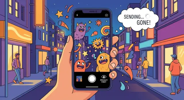
What Made Snap Different From the Start
Snapchat didn’t win by being a slightly better version of the social networks that came before it. From the earliest product choices, it pushed toward a different job-to-be-done: helping people communicate quickly, casually, and visually with the people they actually know—without turning every post into a permanent statement.
That difference matters because it explains why Snap could grow alongside much larger platforms. It also explains why certain decisions that looked “weird” at the time—like leading with the camera, de-emphasizing profiles, and making messages disappear—weren’t gimmicks. They were consistent with a clear point of view about what social should feel like.
Three lenses for understanding Snap’s early edge
To keep this analysis practical, we’ll look at Snap through three lenses that show up again and again in its product strategy:
- Product identity: the underlying “north star” of what the product is (and is not), beyond any single feature.
- Camera-first UX: treating the camera as the main input, not a tool you open after deciding to post.
- Youth culture: designing for fast feedback, inside jokes, low-friction sharing, and communication that feels private—even when it’s digital.
What this post is (and isn’t)
This is a product and user experience story, not founder mythology or gossip. The goal is to connect specific UX choices to outcomes: how people behaved, why they came back, and how Snap differentiated from feed-first networks.
Takeaways you can apply
If you build or market consumer apps, expect a few recurring lessons: pick a sharper identity than “social,” design around the fastest action (not the most obvious screen), and align incentives so users feel safe being imperfect. Those themes show up across Stories, ephemeral messaging, AR lenses, and Snap’s approach to growth and monetization.
If you want to pressure-test those lessons in your own product, speed matters. One practical approach is to prototype the defaults (first screen, capture-to-share flow, audience picker, discovery surface separation) before you debate feature lists. Tools like Koder.ai—a vibe-coding platform that can generate web, backend, and mobile app scaffolding from a chat—are useful here because you can stand up a working React + Go/PostgreSQL prototype (or Flutter for mobile) quickly, iterate on UX, and even snapshot/rollback variants while you compare behavioral outcomes.
Evan Spiegel’s Product Point of View
Evan Spiegel, as Snap’s co-founder and long-time CEO, has acted as a primary product driver: setting priorities, defining what “good” looks like in the app, and protecting the core idea of what Snapchat is for. That role matters because early social products can easily drift—copying competitors, optimizing for short-term metrics, or adding features that weaken the original purpose.
Founder intent as product identity
Founder intent isn’t about personality—it’s about clarity. When a product grows quickly, teams face constant pressure to expand into adjacent use cases. A strong product point of view helps answer practical questions: Who is this for? What behavior are we encouraging? What should feel effortless, and what should be intentionally absent?
For Snap, that intent consistently emphasized communication over broadcasting. Instead of treating the network as a public profile or a feed to curate, Snapchat centered on quick exchanges between friends. The product decisions that followed—prioritizing the camera, reducing friction to create, and making sharing feel more casual—reinforced that identity.
Communication and creativity as the core loop
Snap’s strategy leaned into two related behaviors:
- Communication: fast, lightweight messages that feel more like a conversation than a post.
- Creativity: playful tools that make it easy to express a mood, a joke, or a moment without needing production value.
This combination shaped how Snapchat differentiated from feed-first networks. The goal wasn’t to build the most permanent record of your life; it was to make sharing feel immediate and expressive. Over time, that product philosophy created a distinct expectation: Snapchat is where you talk and create with people you already know, not where you perform for everyone.
Camera-First as a Core UX Choice
Snap’s most consequential decision wasn’t a filter or a feature—it was the default screen. When you open Snapchat, you’re dropped straight into the camera. That single UX choice nudges a different mindset: you’re not arriving to browse; you’re arriving to make.
The “camera-first” default changes behavior
Starting on the camera shifts users from passive consumption to lightweight creation. The phone is already a camera people understand, so the first action is obvious: point, tap, send. There’s no need to search for a “post” button or decide what to say before you do anything.
This matters because behavior follows momentum. If the first screen invites you to create, you’re more likely to capture something small—your face, a moment, a joke—and share it quickly. Over time, that trains a habit built around expressing and reacting, not curating and optimizing.
A contrast with feed-first apps (without the rivalry)
Feed-first social apps begin by presenting other people’s content. That encourages evaluation: What did I miss? What’s trending? What’s getting likes? Even if you intend to post, you typically start by scrolling. Creation becomes a second step.
Snap flips that order. The feed is there, but it isn’t the front door. As a result, the product rewards immediacy over performance and conversation over broadcasting.
Creation-first lowers friction to share
When creation is the default, sharing can be small and frequent. You don’t need a perfect photo, a caption that lands, or the confidence that it will age well. A quick snap is “good enough” because the experience is designed for speed and spontaneity.
UI defaults teach users what the product is for
Most products educate through tutorials; Snapchat educated through layout. The first screen quietly answers: This app is for using your camera to talk to friends. That clarity reduces decision fatigue, aligns expectations, and reinforces Snap’s identity every time you open it.
Ephemeral Design and the Psychology of Low Stakes
Snap’s most misunderstood idea is also one of its most human: make sharing feel low-pressure. Ephemeral messaging wasn’t just a gimmick—it was a deliberate design choice that lowered the cost of being casual. When a message is expected to disappear, you don’t need perfect lighting, a clever caption, or a “worth it” moment. You can send something small, funny, messy, or in-between.
Why “disappearing” changes behavior
Ephemerality shifts the mindset from performance to conversation. Instead of posting for an imagined audience, you’re responding to a person. That creates a different emotional tone: quicker replies, more spontaneity, and more frequent communication.
It also helps explain why Snap became a home for humor and fast feedback. If the content isn’t going to sit on your profile indefinitely, you’re more willing to experiment. The product effectively tells you: this is okay to send even if it’s not perfect.
The trade-off: less permanence, fewer “portfolio posts”
There’s a clear downside to this philosophy. When content isn’t meant to last, it’s less useful for building a public archive of your best moments. Feed-first networks encourage “portfolio” posting—high-effort updates that look good over time and signal identity to a broad audience. Ephemeral design, by contrast, prioritizes presence over permanence.
That trade-off is a product identity decision: Snap optimizes for everyday closeness, not a polished record.
Ephemeral UX is an expectation, not a secrecy promise
It’s important to separate user experience from security guarantees. “Disappearing” is the default expectation in the interface, not a promise of secrecy. Recipients can still capture content (for example, via screenshots or another device), and platforms may retain some data for safety, legal, or operational reasons. The key is what the product encourages: lower-stakes sharing—not risk-free sharing.
Product Identity: Not a Feature, a North Star
Snap’s product identity is the clear idea it wants to occupy in your mind: “a camera for talking to friends,” not “a public stage for building an audience.” That identity isn’t a tagline—it’s a decision filter. When it’s sharp, everything from feature design to default settings has a direction.
Identity makes decisions faster (and easier)
A consistent identity reduces endless debate because it answers a simple question: does this make private, playful, camera-based communication better? If yes, it fits. If it pushes the app toward public broadcasting, follower-chasing, or polished self-presentation, it’s suspect.
That’s why Snap can invest heavily in creativity tools—Lenses, filters, drawing, stickers—without turning into a generic photo editor. Those tools support the identity: quick expression between friends, not perfection for strangers.
Examples of identity in feature choices
Messaging on Snap works best when it feels lightweight and responsive. The goal isn’t to produce permanent, searchable conversation history; it’s to keep the exchange moving.
Private sharing is prioritized over public posting. Even when Snap offers formats that can reach beyond close friends, the product’s center of gravity stays with smaller groups and direct communication.
Creation is built into the flow. You don’t “go somewhere else” to make content; the camera is the starting point, which reinforces what the app is for.
Identity shows up in tone, visuals, and defaults
Product identity is also emotional. Snap’s playful tone, informal visuals, and fast interactions communicate “low pressure” from the first tap. Defaults do a lot of work here: what opens first, what’s emphasized in navigation, and what feels frictionless all quietly teach users how the app wants to be used.
When identity is treated as a north star, features stop being a checklist—and start feeling like parts of one coherent product.
Stories: A Format That Matched the Medium
Stories worked because they translated casual camera use into a simple narrative: “here’s what happened,” told in a handful of quick clips. Instead of asking people to craft a post worthy of a profile grid, Stories made everyday moments—walking to class, a joke with friends, a weird snack—feel complete when strung together for a day.
A narrative format for ordinary life
A Story is just a sequence. That sounds basic, but it’s the point: each snap is a sentence, and the full Story is a tiny chapter. The structure lowers the pressure to be perfect, while still giving the viewer context. One clip can be throwaway; three clips become a moment.
Why it fits a camera-first workflow
Because Snap opens to the camera, the “capture → add → share” loop is immediate. Stories slot into that loop without requiring extra decisions:
- Take a snap when something happens.
- Add a caption, doodle, or sticker if you want.
- Drop it into “My Story” and move on.
The medium (fast, vertical, in-the-moment video) and the mechanic (append to a sequence) reinforce each other. You don’t need to leave the camera to participate.
Personal Stories vs discovery experiences
Personal Stories are primarily about friends: lightweight broadcasting to people who already know you. That’s different from broader viewing surfaces—curated publisher content and public, topic-based collections—where the goal is entertainment and discovery rather than relationship maintenance.
The split matters: friends’ Stories feel like social context (“what are my people up to?”), while discovery formats feel like programming (“what should I watch?”).
Time-boxed content shapes habits
Stories being time-limited (typically 24 hours) changes viewing behavior. People check in regularly to avoid missing updates, and they watch in a “tap-through” rhythm that rewards short clips and clear sequencing. For creators, the clock encourages frequent, low-stakes posting: you can experiment today without worrying it will define your profile next month.
AR Lenses and Play as a Growth Engine
Snap’s Lenses weren’t built to “pretty up” photos. They were creativity tools that turned the camera into a toy, a costume rack, and a mini studio—all inside an app people already opened to talk to friends. That shift matters: when creation is fun, people don’t need a reason to post. The Lens is the reason.
Creativity you can use in a message
A good Lens gives you a clear prompt: try this face, this voice, this world effect. You don’t have to plan a post or write a caption. You just point the camera, tap, and something happens. That immediacy lowers the effort barrier, especially for everyday moments that would never make it into a polished feed.
AR that drives participation (not just viewing)
AR shines when it invites action. People test a Lens, then send it to a friend to get a reaction, or post it to see who plays along. Many Lenses are inherently social—jokes you “perform,” challenges you copy, or visual bits that only make sense once someone responds.
That creates a tight loop:
- Create with a Lens
- Send/post
- Get reactions (screenshots, replies, remixes)
- Create again, faster
The loop is playful, but it’s also behavioral design: fast feedback makes the next creation feel irresistible.
Performance and simplicity are the hidden feature
AR only becomes mainstream when it works instantly. If Lenses take too long to load, lag on older phones, or require too many steps, the moment is gone. Snap’s growth depended on keeping AR lightweight, easy to find, and predictable to use—because the best creative tool is the one that never interrupts the conversation.
In practice, Lenses became a growth engine because they produced shareable moments at high frequency—without demanding “content creator” effort from ordinary users.
Youth Culture: Private Sharing, Humor, and Fast Feedback
Snap’s early fit with teens and young adults wasn’t about chasing “young people” as a demographic—it was about matching how many already communicate: quickly, visually, and with tight control over who sees what.
Private and semi-private by default
A lot of youth communication happens in spaces that feel like rooms, not stages: one-to-one chats, small group threads, and friend lists that are actively curated. Sharing there is less about broadcasting a perfect identity and more about keeping a conversation moving.
Snap aligned with that by making it easy to send something to one person, a few friends, or a chosen audience—without turning every post into a public statement. The value isn’t secrecy; it’s relevance. A joke that works in one friend group doesn’t need to travel.
Humor, slang, and visual shorthand
Youth culture often signals belonging through humor and speed: quick reactions, playful exaggeration, and references that expire fast. Slang and in-jokes work like compression—they pack meaning into a small package. Visual communication does the same: a face, a gesture, a messy bedroom background, a screenshot, a doodle.
The camera-first flow supports this kind of “visual shorthand.” Instead of writing a paragraph, you can send a look, a moment, or a punchline.
“Authentic” often means informal
In practice, “authentic” frequently means context-specific: something that makes sense to your friends right now. It can be unpolished, weird, or ordinary—because it’s made for people who already share the context.
Fast feedback creates momentum
Quick replies, streaks, and lightweight reactions turn sharing into a loop: send, get a response, riff, repeat. That immediacy rewards spontaneity and keeps communication feeling alive—more like hanging out than publishing.
Friends, Messaging, and Habit Loops
Snap’s social graph was never mainly about “audience building.” It centered on the people you actually talk to—friends you already know, not followers you’re trying to impress. That choice reshaped what users shared, how often they shared, and how it felt to open the app.
Close friends sharing vs. public posting
Public posting encourages broadcasting: you publish something “worth it” and hope it performs. Close-friends sharing is different. You send a moment to a specific person (or small group) because it’s funny, timely, or relevant to them.
That shift reduces the need for a perfect caption, a polished photo, or a “brand-safe” personality. It’s more like conversation than content.
Messaging as an anti-performance mechanic
When the default interaction is a message, the psychological stakes drop. A Snap can be messy, silly, or unremarkable—and still be welcome because it’s part of an ongoing relationship. There’s less pressure to look successful or insightful, and more permission to be casual.
Snap’s emphasis on friend networks also changes feedback. Instead of chasing broad approval, you’re reacting to a handful of people whose opinions matter because they’re personal, not public.
Habit loops: replies, quick reactions, and return visits
Messaging naturally creates lightweight loops:
- A Snap invites a reply, which invites another Snap.
- Quick reactions (emoji-like responses, short messages) make it easy to acknowledge something without “writing a post.”
- Streak-like patterns reward consistency by making interaction visible, turning “we talk often” into a simple ritual.
These mechanics encourage frequent check-ins because they lower the effort required to participate.
Habits without manipulation
Designing habits doesn’t have to mean exploiting users. The healthier version focuses on clarity and control: make it obvious what’s happening (e.g., what a streak means), avoid punishing missed days with excessive guilt, and prioritize interactions users already value—talking to friends—over tricks that create empty engagement.
How Snap Differentiated From Feed-First Social Networks
Snapchat’s core bet wasn’t just “social, but with a camera.” It was a different answer to what social is for. Feed-first networks optimize for publishing to an audience: you post, the algorithm distributes, and the content is judged in public.
Snap optimized for talking—with pictures as the default language. That shift makes the app feel more personal because the social unit is usually a friend or small group, not a follower base. The interface reinforces it: you don’t arrive to a scoreboard of likes; you arrive to people.
Friends first, but not friends only
Even in a friend-centric product, people still want something to watch. Snap separated those needs: friend communication stays intimate, while discovery (publisher content, Spotlight-style entertainment, curated surfaces) provides “lean-back” consumption without turning every friend interaction into a performance.
That separation matters. In feed-first apps, friend posts compete with professional creators for attention, often pushing users toward passive scrolling. Snap tries to keep creation lightweight and conversational, while letting discovery live in its own lane.
The trade-offs are real
- Creator reach vs. intimacy: feed-first systems reward broadcasting; Snap’s strengths show up in smaller, repeat interactions.
- Permanence vs. spontaneity: permanent posts encourage polish and self-editing; ephemerality lowers the stakes and invites quick, imperfect sharing.
A simple comparison framework
When you evaluate any social product, ask four questions:
- Who is the primary audience? (friends, followers, or “everyone”)
- What is the default action? (message, post, or scroll)
- Where does discovery live? (mixed into the main feed or separated)
- What’s the memory model? (permanent archive or designed-to-disappear)
Snap’s differentiation becomes obvious when those defaults point to conversation over broadcast.
Trust, Safety, and Privacy Expectations
Communication apps sit on a tightrope: people want the comfort of privacy while still wanting the social upside of being seen. That tension is especially strong for younger users, who often share more frequently but also feel social risk more intensely—screenshots, rumors, misinterpretation, or content resurfacing later.
Privacy vs. social sharing: a real trade-off
“Private” doesn’t mean “isolated.” Users still want reactions, inside jokes, and fast back-and-forth. The product challenge is to let sharing feel lightweight without letting it become careless. Design choices that reduce permanence can lower anxiety, but they also raise new questions: What if someone crosses a line? What if a message is unwanted? What if social pressure escalates?
Safety basics without turning the app into a rulebook
Most healthy social products rely on a few common controls—simple, findable, and consistent. Without getting into any one app’s implementation, the building blocks typically include:
- Reporting flows that are quick, explain what happens next, and don’t punish good-faith reporting
- Blocking and muting that clearly stop contact and reduce repeat harassment
- Account controls that help users manage who can contact them, who can see activity, and how discoverable they are
These tools aren’t just “policy.” They’re part of the everyday UX.
Why trust is part of product identity
For communication apps, trust is not a compliance checkbox—it’s the reason people keep talking. If users don’t believe the product will protect their boundaries, they self-censor, leave, or move conversations elsewhere. Trust also shapes culture: the safer it feels to be casual and imperfect, the more authentic and frequent the sharing becomes.
Best-practice principles for youth-facing teams
Prioritize clarity over cleverness: explain audience, visibility, and consequences in plain language.
Make safety actions easy at the moment of discomfort, not buried in settings.
Design for recovery: allow users to undo, exit, or reset social situations without drama.
Measure “harm reduction” alongside growth: retention is meaningless if users stay anxious.
Monetization Without Breaking the Experience
Snap’s challenge wasn’t just “add ads.” It was to make money without turning a camera-first, friend-centered product into a billboard. For social products, revenue works best when it behaves like part of the flow: it should feel native to how people already create, watch, and reply.
Balancing revenue with UX
Snap’s core loop is quick creation and quick consumption. That means monetization has to respect tempo. If an ad slows you down, blocks the camera, or feels like a bait-and-switch, it taxes the very habit you’re trying to monetize.
A practical rule: optimize for session quality first (speed, clarity, low friction), then monetize the “attention moments” that already exist—transitions, pauses, and story viewing—rather than interrupting creation.
Ad formats that fit Stories and vertical video
Conceptually, the best-aligned formats match the medium:
- Full-screen vertical video that looks like a Story, because it uses the same screen language.
- Sponsored tiles or placements that sit alongside content choices, not on top of messaging.
- Interactive ads that borrow from creation tools (swipe, tap, try-on), so they feel like something you can do, not just watch.
Why brand fit matters
Snap’s tone is personal, fast, and playful. Ads that match that pacing—short, clear, mobile-native, often creator-led—tend to perform better and feel less invasive. When a brand shows up with “TV energy” (slow intros, tiny text, heavy polish), it breaks immersion.
Actionable lessons
- Set defaults that protect the core loop (camera speed, reply paths, minimal friction).
- Let product identity guide monetization choices: if it doesn’t feel native, it’s a tax.
- Treat creation tools as the ad interface (AR, templates, interactive CTAs).
- Choose partners and formats that fit the culture and cadence your users expect.
FAQ
What made Snap different from other social networks from the start?
Snap’s early differentiation was a consistent product identity: a camera for talking to friends rather than a public stage.
That identity shaped defaults (camera-first), content expectations (casual), and social mechanics (messaging over broadcasting), so the experience felt fundamentally different—not just feature-different.
Why is “camera-first” UX such a big deal in Snap’s strategy?
Opening directly to the camera nudges users to create first instead of scroll first.
Practically, it reduces decision friction (no “what should I post?” moment), increases small frequent shares, and trains a habit loop built around quick capture → send → reply.
How does disappearing content change user behavior?
Ephemerality lowers the psychological cost of sharing: imperfect, silly, or mundane moments feel acceptable when they aren’t framed as permanent statements.
It shifts behavior from “performing for an audience” to “responding to a person,” which increases spontaneity and conversational back-and-forth.
Does “ephemeral” mean content is private or cannot be saved?
No. The post frames ephemerality as a UX expectation, not a security guarantee.
Recipients can still capture content (e.g., screenshots or another device), and platforms may retain some data for safety/legal needs. The practical takeaway is: design for low stakes, but communicate limits clearly.
What does “product identity” mean here, and how do teams use it?
Product identity is a decision filter—what the product is for and therefore what it should avoid.
A useful test is: does this make private, playful, camera-based communication better? If it pushes the app toward public follower-building or polished portfolio posts, it likely conflicts with the north star.
Why did Stories work so well for Snapchat?
Stories fit the medium because they turn quick, vertical captures into a simple narrative sequence.
They work well with camera-first behavior:
- capture a moment
- add light context (text/doodle/sticker)
- append to a day-long sequence
The 24-hour clock encourages frequent, low-pressure posting and regular viewing check-ins.
How did AR Lenses become a growth engine instead of just a gimmick?
AR Lenses make creation inherently fun, so users don’t need a “worthy” moment to share.
They also drive social loops: try a Lens → send/post → get reactions → remix/try another. For this to work at scale, performance matters—slow load times break the conversational tempo.
What does “designing for youth culture” mean in product terms?
Snap aligned with patterns common in youth communication: small-group sharing, inside jokes, fast feedback, and visual shorthand.
Design implications include:
- easy audience control (1:1, groups, curated friend lists)
- tools for quick expression (camera, doodles, stickers)
- interaction that feels like “hanging out,” not publishing
How do friends-first messaging and habit loops drive retention?
Messaging makes the default interaction a relationship event (a reply) rather than a performance metric (likes).
Habit loops come from lightweight reciprocity:
- a snap invites a response
- quick reactions reduce effort
- streak-like rituals make frequency visible
A healthier approach is to keep mechanics understandable and avoid punishing users for missing a day.
How can Snap monetize without breaking a camera-first experience?
Monetization works best when it respects the app’s tempo and protects the core loop (fast camera → send/reply).
Practical guidelines:
- monetize “attention moments” (e.g., transitions in viewing) rather than blocking creation
- use formats native to the medium (full-screen vertical video)
- make ads feel interactive when appropriate (AR/try-on)
- avoid slow, TV-style creative that breaks pacing