Jul 21, 2025·8 min
Event Websites for Weddings & Parties: RSVP, Maps, Schedules
Learn how to build an event website for weddings or parties with RSVP, maps, and schedules—plus FAQs, guest updates, and mobile-friendly tips.
Learn how to build an event website for weddings or parties with RSVP, maps, and schedules—plus FAQs, guest updates, and mobile-friendly tips.
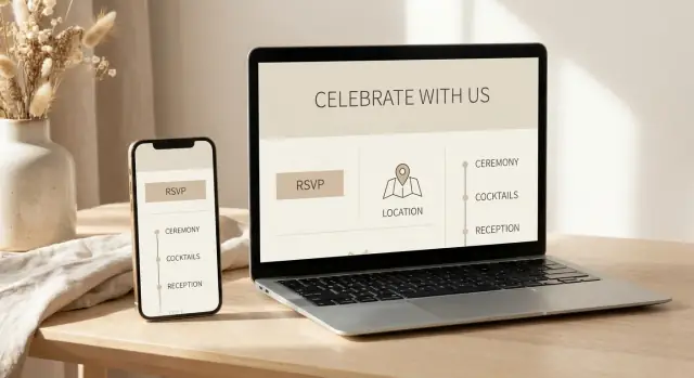
An event website is a simple, shareable place where all the key details for your wedding or party live—date, location, schedule, RSVP, and updates. Instead of sending the same answers in ten different texts, you point guests to one link that stays current.
Most guests aren’t looking for a “perfect” site—they want clarity. A good event website quickly answers:
When these basics are easy to find on a mobile-friendly page, guests feel more confident—and you get fewer last-minute calls.
Group chats and email chains are helpful until important info gets buried. A single source of truth helps prevent:
It also makes it easier for co-hosts, family members, or planners to share consistent information.
A single-page site works best for smaller events with one venue and a straightforward timeline—think “invite details + RSVP + map.”
A multi-page site is better when you have multiple events (welcome drinks, ceremony, brunch), travel notes, or lots of FAQs. Separating information into pages keeps the main details fast to scan while still covering everything guests need.
A good event website is less about “more pages” and more about “fewer dead ends.” Guests should be able to answer three questions quickly: what’s happening, where to go, and what you need from them.
Home (or Welcome)
Keep this page scannable: event name, date, city/venue name, and a clear call to action (“RSVP here”). This is also the right place for a short note on what kind of event it is (wedding, birthday, anniversary, engagement party) so guests understand the vibe.
RSVP
Your online RSVP page is the engine of guest list management. Link to it prominently from the Home page and keep it uncluttered. If guests can’t find it in five seconds, they’ll text you instead.
Schedule
An event schedule page prevents a lot of “what time should I arrive?” questions. Even if you only have two items (ceremony + reception, or dinner + after-party), it’s worth having a dedicated page.
Travel / Map
Include the venue address, directions and parking notes, and any ride-share or public transit tips. A clear wedding website map (or party map) section is especially helpful for out-of-town guests and anyone driving at night.
FAQs
This page reduces repetitive messages. Put the most common questions here (timing, dress code, plus-ones, kids, parking, food restrictions) and update it as new questions pop up.
Contact
Give one clear way to reach the right person (you, a partner, or a planner). If you don’t want calls, don’t list a phone number—use email or a simple form.
Registry / Gifts
Great for weddings, optional for parties. Keep it simple: a short note and a couple of links.
Dress code
If attire matters, a dedicated page can be clearer than burying it in FAQs. A few examples (“cocktail,” “garden formal,” “theme colors optional”) help more than long explanations.
Photos
A gallery page can be a fun place to share engagement photos or throwback pictures. After the event, it can also point guests to where you’ll share albums.
After-party
Include this only if it’s relevant to many guests. If it’s invite-only, keep it private (see below).
Avoid pages that create obligations or confusion:
If something changes often (like shuttle timing), don’t scatter it across three pages—keep one source of truth.
Some details don’t belong on an open link:
If your platform allows it, password-protect these pages or hide them from the main menu.
A clean top navigation usually looks like:
Home • RSVP • Schedule • Travel/Map • FAQs • Contact
Then place “nice-to-have” pages (Registry, Dress Code, Photos) as secondary links or buttons so guests see the essentials first.
A good online RSVP should feel effortless for guests and give you clean, usable data. The trick is keeping the form short while still capturing what you actually need to make decisions.
Start with the basics:
If you need extras (allergies, dietary needs, song requests), add them as optional fields and label them clearly as optional.
Use plain, specific wording and avoid “wedding-insider” shorthand.
Instead of: “Will you attend?”
Try: “Can you make it to the reception on Saturday, May 18?”
For meal choices, include what the guest will recognize:
If children are invited, say so directly: “Kids are included in your RSVP.” If they aren’t, use a polite line like: “We’re keeping the celebration adults-only.”
If you have a ceremony, reception, brunch, and/or after-party, list each one separately with its own Yes/No. Keep the order chronological and match the invitation wording.
A simple pattern:
After submission, show a confirmation that reduces follow-up texts:
That one screen can prevent a surprising amount of confusion later.
A schedule page should answer one thing quickly: “Where do I need to be next, and when?” If guests have to zoom, scroll forever, or decode vague labels, they’ll rely on texts—and you’ll spend the day repeating yourself.
For each item, include start time, end time (or “ends around”), and location. If you don’t know an end time, use a friendly estimate so people can plan rides and childcare.
A simple format works best:
If your event spans more than one place (or more than one day), group the schedule by day first, then list items in order. Keep venue names consistent so guests recognize them.
Example structure:
If there are optional events, label them clearly: “Optional”, “Everyone welcome”, or “Family only.”
Small notes prevent big confusion. Add short, practical guidance right under the relevant item:
Use short labels, plenty of whitespace, and consistent time formatting (e.g., always “4:00 PM,” not “4pm”). Keep notes to one line when possible, and avoid paragraphs inside the timeline. If you must include details, tuck them behind clear headings like Transportation or Dress code so the main timeline stays clean.
Nothing creates day-of chaos faster than guests circling the block, texting “Where are you?” or showing up at the wrong entrance. Your event website can prevent most of that with a clear, scannable directions section.
If you can, embed a map right on the page. If not, add a prominent “Get directions” link that opens in a guest’s preferred maps app.
Keep it simple: one venue, one tap. If your event has multiple locations (ceremony, reception, after-party), give each its own mini block with a map link so guests don’t accidentally navigate to the wrong spot.
Don’t assume the venue name is enough—many places have multiple buildings or similarly named properties.
Include:
If the pin in common map apps lands on a back alley or staff entrance, call that out directly and provide a corrected note.
A few lines here save a lot of frustration:
If there’s a shuttle, include pickup points and a link to the schedule page (or a brief summary if it’s only one route).
When public transportation is a good option, mention the nearest stop and a reasonable walk time (for example, “7–10 minutes on sidewalks”). For out-of-town guests, add a quick estimate from common starting points like the main hotel or airport—keep it broad so it stays accurate.
Done well, your directions section becomes a calm, confident “You’ve got this” for every guest—especially the ones arriving in formalwear and a hurry.
A good FAQ page saves you from repeating the same answers in twenty different text threads. It also reduces guest anxiety: people are more likely to show up on time and prepared when the “small details” are easy to find.
Focus on questions that affect planning, comfort, and timing. The most useful FAQs usually cover:
If something causes confusion once, it belongs in the FAQ.
Guests don’t need long explanations—they need clear instructions with a friendly tone.
Instead of: “Please be on time.”
Try: “Please arrive between 4:15–4:40 PM so you have time to park and find a seat. The ceremony begins at 5:00 PM sharp.”
Instead of: “No kids.”
Try: “We love your little ones, but this will be an adults-only celebration. Thank you for arranging childcare.”
Specific times, locations, and boundaries prevent awkward follow-up questions.
Don’t hide FAQs at the bottom of the site. Link them in the main navigation as “FAQ” or “Questions,” and add a short “Most asked” block near your RSVP or schedule pages.
If you’re sending email or text updates, include a line like: “More answers here: /faq” so people learn to check the site first.
Weddings: “Is the ceremony indoors or outdoors?” “Can I take photos?” “Is there a shuttle?” “What time should I arrive?” “Are there reserved seats?”
Birthdays/parties: “Is it a surprise?” “What’s the vibe/dress code?” “Can I bring a friend?” “Is there food for dietary needs?”
Reunions: “Which day should I come if I can’t attend everything?” “Are kids welcome?” “Where are people staying?” “What’s the plan if it rains?”
Keep the FAQ updated as new questions pop up—your future self will thank you.
An event site often collects more personal information than you realize—names, plus-ones, dietary needs, and sometimes travel plans. A few simple choices can keep your wedding event website or party website helpful without oversharing.
If your site includes anything that could identify where people will be (or where you live), treat it as private. Password-protect the whole site, or keep sensitive pages invite-only.
Common candidates for protection:
Avoid publishing home addresses, personal phone numbers, or full names in a way that’s searchable. For directions, use a venue name and general area, then provide exact details only to invited guests. If you’re sharing parking instructions, keep it practical (where to enter, which lot) without adding unnecessary personal context.
For online RSVP and guest list management, collect the minimum that helps you plan:
If you’re exporting data to a spreadsheet or sharing it with vendors, limit access to the latest version and delete old copies. Guests appreciate knowing their information won’t float around forever.
Add one clear contact method for updates: a dedicated email address or a simple form (“Fix my RSVP details”). Mention it near your RSVP confirmation so guests can quickly correct typos, plus-one changes, or special needs without back-and-forth.
Most guests will open your event site from a phone—often while juggling travel, bags, or a group chat. A mobile-first layout isn’t a “nice to have”; it’s what makes your RSVP, schedule, and directions usable when it matters.
Start with a single-column layout that fits small screens without zooming. Keep the most important actions visible near the top.
Make your key buttons large and unmistakable:
Aim for generous spacing between buttons and links—mis-taps are a common reason people give up and text you instead.
Choose a simple font and use a size that’s comfortable on mobile (generally 16px+ for body text). Keep paragraphs short, and avoid placing important details in script fonts.
For accessibility, use high-contrast text (dark text on a light background or vice versa). If you’re using color to communicate meaning (like “Ceremony” vs. “Reception”), pair it with labels so it still works for guests with color-vision differences.
Your RSVP form should be easy to complete on a phone: large input fields, clear labels, and minimal typing. If you use dropdowns, keep the options short and recognizable.
Open the site on multiple devices (iPhone/Android, plus a laptop) and try the full flow: RSVP → confirmation → directions. Then share a simple URL that’s easy to type and easy to remember (and avoid long, messy query strings).
A polished wedding event website (or party website) doesn’t need fancy graphics—it needs clear information, consistent formatting, and an RSVP that’s impossible to miss. Small choices here make guests feel confident they’re reading the “official” details.
Photos add warmth, but they shouldn’t slow down your online RSVP or make the event schedule page hard to load.
Place one strong hero photo near the top of the homepage, then use a few smaller images on supporting pages (like “Details”). Keep galleries short—think highlights, not a full album.
If you’re adding engagement or party photos:
Most guest confusion comes from tiny inconsistencies—especially around names, dates, and timing.
Pick a single style and stick to it:
A quick trick: copy the final venue address from your maps app once, paste it everywhere, and don’t retype it.
Too much copy is the #1 reason guests miss key info. Keep paragraphs short and move extra details into your event FAQs.
Also watch for:
Before you text or email the link:
These tweaks take minutes, but they’re what make a wedding website checklist feel “done,” not “almost done.”
Even a well-planned wedding or party gets last-minute tweaks: a shifted start time, a rain plan, a different entrance, or parking changes. The goal isn’t to message more—it’s to update one source of truth and point everyone to it.
If guests don’t know where to look, they’ll rely on hearsay. Pick a simple, repeatable pattern:
A banner is especially useful because it’s hard to miss, and it doesn’t require guests to search through old messages.
Site banner: Best for everyone, including guests you don’t have phone numbers for. Keep it brief and visible.
Email/text link: Best for making sure people actually notice the change. Use one message per update, not a thread.
Group chat: Best for the inner circle (wedding party, family, close friends). Don’t rely on it as the only channel—some guests won’t be included.
When something changes, update pages in the order guests experience the event:
That sequence prevents confusion like “I saw the new time, but where do I go now?”
People ignore information that feels stale. Add a small line near the top of the relevant page:
Last updated: Saturday, May 18 at 2:10 PM
It reassures guests they’re looking at the latest details and reduces the number of texts you’ll get asking, “Is this still correct?” Keep the note short—no need to document every edit, just the most recent change.
A good event website isn’t just a pretty link—it’s your control center for turning “maybe” into an accurate headcount you can hand to the venue.
Before RSVPs start rolling in, decide what you’ll actually need to know. The most useful numbers are:
Tracking attendance by event matters more than people expect—someone might skip the ceremony but join the reception, and your seating, shuttles, and catering depend on those details.
Pick a deadline that works backward from vendor needs. If your caterer needs numbers 10 days out, set your RSVP deadline 2–3 weeks before that.
Then plan reminders:
Keep reminder wording consistent with your website labels (“Reception RSVP,” “Meal Choice,” etc.) so guests aren’t trying to interpret what you mean.
Once RSVPs are mostly in, do a quick cleanup pass: confirm missing meal choices, resolve unnamed plus-ones, and check duplicates. Then export or summarize for:
If you’re choosing a platform or deciding which tier includes exports, compare options on /pricing.
If you’re late in the planning process—or you just don’t want to wrestle with templates—vibe-coding tools can help you ship a clean, mobile-friendly event site quickly.
For example, Koder.ai lets you create simple web apps from a chat-style prompt (pages like RSVP, schedule, travel/map, and FAQs), then iterate quickly as details change. It’s also useful if you want practical features like source code export, deployment/hosting, custom domains, and snapshots/rollback so you can confidently update the site without breaking what already works.
For more templates and planning tips (like reminder wording and RSVP checklists), continue on /blog.
An event website is a single, shareable “source of truth” for your date, locations, schedule, RSVP, and updates. Instead of repeating details in texts and group chats, guests can check one link that stays current—especially helpful for day-of directions and timing changes.
Use a single-page site if your event is small, has one venue, and a simple timeline (details + RSVP + map). Choose a multi-page site if you have multiple events (welcome drinks, ceremony, brunch), travel notes, or lots of FAQs—separate pages keep the essentials fast to scan without burying important info.
A clean baseline that works for most weddings and parties is:
This setup answers what’s happening, where to go, and what you need from guests—without dead-end pages.
Collect only what you’ll actually use:
Add extras like allergies or song requests as optional fields so the form stays quick on mobile.
Be specific and remove guesswork:
Plain language reduces follow-up texts and incomplete responses.
List each event separately with its own Yes/No, in chronological order, matching your invitation wording. If something is limited or invite-only, label it directly (e.g., “Sunday Brunch: Yes/No (limited seating)”) so guests understand what applies to them.
Use a scannable timeline with start time, end time (or estimate), and location for each item. Add short notes only where they prevent confusion, like:
Keep formatting consistent so it’s easy to read on a phone.
Give each location its own clear block with:
If map pins often land in the wrong place, call it out and provide the corrected instruction so guests don’t navigate to a back entrance.
Keep sensitive details off an open link, such as:
If your platform supports it, password-protect the whole site or hide private pages from the main navigation.
Use one repeatable system:
Adding a brief “Last updated” line on key pages helps guests trust they’re viewing the latest info.