May 03, 2025·8 min
From Intent to App: When AI Builds UI, State, and APIs
A story of a mobile app idea becoming a working product as AI generates UI, manages state, and connects backend services end to end.
A story of a mobile app idea becoming a working product as AI generates UI, manages state, and connects backend services end to end.
A founder leans back after another end-of-quarter scramble and says: “Help field reps log visits and set follow-ups fast, so nothing slips without adding admin work.”
That single sentence holds a real user problem: notes get captured late (or never), follow-ups get missed, and revenue quietly leaks through the cracks.
This is the promise of an AI-assisted build: you start with intent, and you get to a working mobile app faster—without hand-wiring every screen, state update, and API call from scratch. Not “magic,” not instant perfection, but a shorter path from idea to something you can actually run on a phone and put in someone’s hands.
This section (and the story that follows) isn’t a technical tutorial. It’s a narrative with practical takeaways: what to say, what to decide early, and what to leave open until you’ve tested the flow with real users.
In plain terms, intent is the outcome you want, for a specific audience, within clear constraints.
Good intent is not a feature list. It’s not “build me a mobile CRM.” It’s the sentence that tells everyone—humans and AI alike—what success looks like.
When you’re clear on intent, you can aim for an MVP that’s more than clickable screens. The target is a shippable app with real flows and real data: users can sign in, see today’s accounts, log a visit, attach notes/photos, set a next step, and handle the common exceptions.
Everything that comes next—requirements, information architecture, UI, state, backend integration, and iteration—should serve that one sentence.
Maya is the PM and accidental founder of this project. She’s not trying to reinvent mobile apps—she’s trying to ship one before a quarterly deadline makes the opportunity vanish.
The “team” is small enough to fit on one calendar invite: Maya, one designer who can spare a few hours a week, and a single engineer who’s already maintaining two other apps. There’s no time to write a 40-page spec, debate frameworks, or run a month of workshops. Still, the expectations are real: leadership wants something usable, not a demo.
Maya’s starting artifacts are humble:
There’s also one crucial sentence in her notes: “If a user can’t finish the main task in under two minutes on a phone, we haven’t built the right thing.”
For this MVP, “done” is a single user journey that works end-to-end:
No fancy dashboards. No hidden menus. No “we’ll polish it later” screens that block the flow.
The app has to connect to an existing backend—APIs that weren’t designed for mobile and have uneven documentation. Budget is tight, so every new screen has to justify itself.
Some guardrails are non-negotiable: audit logs, clear consent where needed, and no sensitive data stored casually on the device.
And here’s the tension: Maya has ten good ideas and maybe ten working days. Every hour spent debating options is an hour not spent getting the core journey into someone’s hands.
The goal isn’t to write a perfect spec. It’s to get to testable clarity fast—what problem we’re solving, for whom, and how we’ll know it worked.
You start with one messy sentence:
“I want an app that helps our field reps log visits and follow up.”
Then you ask the AI to tighten it:
Prompt: “Rewrite this as a problem statement and add 3 success metrics. Keep it short.”
AI output (edited):
Problem statement: Field reps lose follow-ups because visit notes and next steps are captured late (or not at all), leading to missed revenue and inconsistent customer experience.
Success metrics:
Now we have a target the team can aim at, not just a feature wish.
If you’re using a vibe-coding workflow (for example, in Koder.ai, where you describe the product in chat and generate a working app iteratively), this is the moment that pays dividends: a tight intent + metrics becomes the “source of truth” for everything the system generates next.
Next, extract roles and tasks:
User roles:
Top tasks:
Turn those into a few user stories with acceptance criteria:
To protect the first release:
Anchor every decision to one flow:
Open app → “Log Visit” → pick customer → add note/photo → choose next step + due date → save → follow-ups appear in “Today.”
If a request doesn’t support this flow, it waits for the next release.
Once the “north star” flow is clear, AI can translate it into an information architecture (IA) that everyone can read—without jumping into wireframes or engineering diagrams.
For most MVPs, you want a small set of screens that fully supports the primary job-to-be-done. AI will usually propose (and you can tweak) a concise list like:
That list becomes the skeleton. Anything outside it is either a later release or a “secondary flow.”
Instead of debating patterns abstractly, the IA calls out navigation as a sentence you can validate:
If onboarding exists, the IA defines where it starts and where it ends (“Onboarding finishes at Home”).
Each screen gets a lightweight outline:
Empty states are often where apps feel broken, so draft them intentionally (for example: “No visits logged today yet” plus a clear next step).
The IA flags conditional views early: “Managers see an extra tab,” or “Only Ops can edit account details.” This prevents surprises later when permissions and state are implemented.
The output is typically a one-page flow plus per-screen bullets—something a non-technical stakeholder can approve quickly: what screens exist, how you move between them, and what happens when data is missing.
Once the flow is agreed, AI can produce first-pass wireframes by treating each step as a “screen contract”: what the user needs to see, what they can do next, and what information must be collected or displayed.
The output usually starts rough—greyscale blocks with labels—but it’s already structured around content needs. If a step requires comparison, you’ll get a grid or card layout. If it’s about progression, you’ll see a clear primary action and a lightweight summary.
Component choices aren’t random. They’re task-driven:
AI tends to make these decisions based on the verbs in the intent: browse, choose, edit, confirm.
Even at this stage, good generators apply basic constraints so the screens don’t look “AI-ish”:
Copy drafts appear alongside the UI. Instead of “Submit,” buttons become “Save visit” or “Schedule follow-up,” reflecting the user’s job-to-be-done.
This is where a product owner, designer, or marketer steps in—not to redraw everything, but to adjust tone and clarity:
You don’t just end with pictures. The handoff is typically either a clickable prototype (tap-through screens for feedback) or generated screen code that the team can iterate on in the build-test loop.
If you’re building in Koder.ai, this stage usually becomes concrete quickly: the UI is generated as part of a working app (web in React, backend in Go with PostgreSQL, and mobile in Flutter), and you can review the real screens in one place while keeping the flow doc as your guardrail.
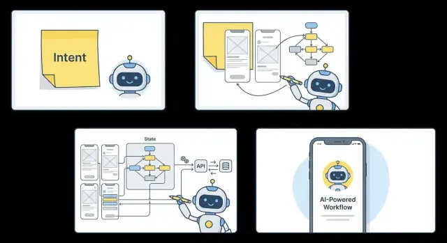
After the UI is sketched, the next question is simple: what does the app need to remember, and what should it react to? That “memory” is state. It’s why a screen can greet you by name, keep a counter, restore a half-written form, or show results sorted the way you like.
AI typically starts by defining a small set of state objects that travel through the whole app:
The key is consistency: the same objects (and names) power every screen that touches them, instead of each screen inventing its own mini-model.
Forms aren’t just inputs—they’re rules made visible. AI can generate validation patterns that repeat across screens:
For each async action (sign in, fetch items, save a visit), the app cycles through familiar states:
When these patterns are consistent across screens, the app feels predictable—and far less fragile—when real users start tapping in unexpected ways.
A flow is only real when it reads and writes real data. Once the screens and state rules exist, AI can translate what the user does into what the backend must support—then generate the wiring so the app stops being a prototype and starts being a product.
From a typical user journey, the backend requirements usually fall into a few concrete buckets:
AI can pull these directly from UI intent. A “Save” button implies a mutation. A list screen implies a paginated fetch. A filter chip implies query parameters.
Instead of building endpoints in isolation, the mapping is derived from screen interactions:
POST /visitsGET /accounts?cursor=...PATCH /visits/:idPATCH /followups/:idIf you already have a backend, the AI adapts to it: REST endpoints, GraphQL operations, Firebase/Firestore collections, or a custom internal API. If you don’t, it can generate a thin service layer that matches the UI needs (and nothing extra).
AI will propose models from the UI copy and state:
Visit { id, accountId, notes, nextStep, dueAt, createdAt }But a human still confirms the truth: which fields are required, what’s nullable, what needs indexing, and how permissions work. That quick review prevents “almost right” data models from hardening into the product.
Integration isn’t complete without failure paths treated as first-class:
This is where AI accelerates the boring parts—consistent request wrappers, typed models, and predictable error states—while the team focuses on correctness and business rules.
The first “real” test isn’t a simulator screenshot—it’s a build on an actual phone, in someone’s hand, on imperfect Wi‑Fi. That’s where the early cracks show up fast.
It’s usually not the headline feature. It’s the seams:
This is useful failure. It tells you what your app actually depends on.
When something breaks, AI is most helpful as a cross-layer detective. Instead of chasing the issue separately in UI, state, and APIs, you can ask it to trace the path end-to-end:
profile.photoUrl, backend returns avatar_url.Because the AI has the flow, the screen map, and the data contracts in context, it can propose a single fix that touches all the right places—rename a field, add a fallback state, and adjust the endpoint response.
Every test build should answer: “Are we getting closer to the metric?” Add a small set of events that match your success criteria, for example:
signup_started → signup_completedfirst_action_completed (your activation moment)error_shown with a reason code (timeout, validation, permission)Now feedback isn’t just opinions—it’s a measurable funnel.
A simple rhythm keeps things stable: daily build + 20-minute review. Each cycle picks one or two fixes, and updates UI, state, and endpoints together. That prevents “half-fixed” features—where the screen looks right, but the app still can’t recover from real-world timing, missing data, or interrupted permissions.
Once the happy path works, the app has to survive real life: tunnels, low battery mode, missing permissions, and unpredictable data. This is where AI helps by turning “don’t break” into concrete behaviors the team can review.
Start by labeling each action as offline-safe or connection-required. For example, browsing previously loaded accounts, editing drafts, and viewing cached history can work offline. Searching the full dataset, syncing changes, and loading personalized recommendations usually need a connection.
A good default is: read from cache, write to an outbox. The UI should clearly show when a change is “Saved locally” versus “Synced,” and offer a simple “Try again” when connectivity returns.
Permissions should be requested at the moment they make sense:
The key is graceful alternatives, not dead ends.
AI can enumerate edge cases quickly, but the team still chooses the product stance:
Security basics: store tokens in the platform’s secure storage, use least-privilege scopes, and ship with safe defaults (no verbose logs, no “remember me” without encryption).
Accessibility checks: verify contrast, minimum tap targets, dynamic text support, and meaningful screen reader labels—especially for icon-only buttons and custom components.
Shipping is where a promising prototype either becomes a real product—or quietly stalls. Once AI has generated the UI, state rules, and API wiring, the goal is to turn that working build into something reviewers (and customers) can install confidently.
Start by treating “release” as a small checklist, not a heroic sprint.
Even if the MVP is simple, metadata matters because it sets expectations.
Plan the launch like an experiment.
Use internal testing first, then a staged release (or phased rollout) to limit blast radius. Monitor crash rate, onboarding completion, and key action conversion.
Define rollback triggers ahead of time—e.g., crash-free sessions drop below a threshold, sign-in failures spike, or your primary funnel step rate drops sharply.
If your build system supports snapshots and quick rollback (for example, Koder.ai includes snapshots/rollback alongside deployment and hosting), you can treat “undo” as a normal part of shipping—not a panic move.
If you want help turning your MVP checklist into a repeatable release pipeline, see /pricing or reach out via /contact.
When AI can draft screens, wire state, and sketch API integrations, the work doesn’t disappear—it shifts. Teams spend less time translating intent into boilerplate, and more time deciding what’s worth building, for whom, and to what standard.
AI is especially strong at producing cohesive output across layers once the flow is clear.
AI can propose; people decide.
Speed only helps if the code remains legible.
If you’re generating the first version in a platform like Koder.ai, one practical maintainability unlock is source code export: you can move from “fast generation” to “team-owned codebase” without rewriting from scratch.
With an MVP shipped, the next iterations usually focus on performance (startup time, list rendering), personalization (saved preferences, smarter defaults), and deeper automation (test generation, analytics instrumentation).
For more examples and related reading, browse /blog.
Intent is a single sentence that clarifies:
It’s not a feature list; it’s the definition of success that keeps UI, state, and APIs aligned.
A good intent statement is specific and testable. Use this structure:
Example: “Help small clinic managers confirm appointments automatically so no-shows drop without adding admin work.”
“Shippable” means the app completes one core journey with real data:
If users can’t complete the main task quickly on a phone, it’s not ready.
Ask the AI to rewrite your idea into:
Then edit the output with your domain reality—especially the numbers—so you’re measuring outcomes, not activity.
Focus on:
Keep acceptance criteria observable (e.g., “saved timestamp,” “next step required OR note required”) so engineering and QA can validate quickly.
Cut anything that doesn’t support the north-star flow. Common MVP exclusions include:
Write an explicit “out of scope” list so stakeholders know what’s intentionally delayed.
Start with 3–7 core screens that fully support the primary job:
Define navigation in plain language (tabs vs. stack) and include empty states so the app doesn’t feel broken with no data.
State is what the app must remember and react to. Common MVP state objects:
Work backwards from screens:
GET /items (often paginated)POST or PATCHDELETEHave AI propose schemas, but you should confirm required fields, permissions, and naming mismatches (e.g., vs. ) before they harden into the product.
Decide per action whether it’s offline-safe or connection-required. A practical default:
For permissions, ask at the moment of need (camera when tapping “Add photo,” notifications after opting into reminders) and provide a fallback (manual entry, in-app reminders) instead of dead ends.
Also standardize async states: loading → success → failure, and keep user input on failure.
photoUrlavatar_url