Aug 15, 2025·8 min
Guest checkout vs customer accounts: choose for D2C
Guest checkout vs customer accounts: learn the tradeoffs for D2C, then follow a phased rollout plan with clear metrics for conversion, retention, and support load.
Guest checkout vs customer accounts: learn the tradeoffs for D2C, then follow a phased rollout plan with clear metrics for conversion, retention, and support load.
This decision is less about features and more about timing. Guest checkout helps a first purchase happen with the fewest steps. Customer accounts make the second, third, and tenth purchase easier, and they give you more ways to recognize and reward returning buyers.
People often frame guest checkout vs customer accounts as a binary choice. It isn’t. You can start with a clean guest flow, then add account benefits once you have proof shoppers actually want them.
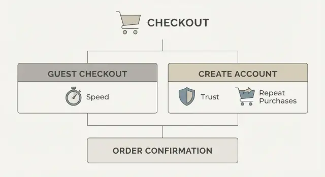
A quick definition helps:
Guest checkout usually means someone can pay without creating a password. You may still ask for an email (receipts and shipping updates) and shipping details (because you need them).
An account means the shopper can sign in later to see orders, save addresses, track returns, and get perks. Accounts can be password-based or passwordless (like a one-time code), but either way they add an extra step.
That extra step is the real risk. Checkout is a fragile moment. One more field, one more screen, or one more decision can drop conversion fast, especially for first-time buyers who are still deciding if they trust you.
A practical way to frame it:
You don’t need to build everything at once. Start with the simplest flow that still feels trustworthy, then add accounts when you can tie them to clear value (faster reorders, easier returns, points, or early access).
For most D2C brands, the early goal is simple: turn curious visitors into first-time buyers. That’s why the default answer is often “start with guest,” then add accounts once you’ve earned repeat behavior.
Guest checkout usually wins when the shopper is trying to finish fast, not “start a relationship.” Common cases include first-time buyers, gift purchases, mobile shoppers who hate long forms, impulse buys from social traffic, and short seasonal campaigns where speed matters more than retention.
Accounts start to matter when the product naturally brings people back. If you sell subscriptions, replenishment items (skincare, supplements, pet food), or anything with a high repeat rate, accounts can remove effort on the second purchase. They also help when customers need to manage orders, returns, or multiple shipments, because “where’s my order?” contacts often drop when people can self-serve.
A quick way to decide: look at what percent of orders are from new customers today. If most orders are new-customer orders, forcing account creation is usually a tax on your main growth engine. If repeat orders are already a big share, accounts can be a helpful upgrade, especially if “sign in” feels optional and rewarding, not required.
A practical rule: if a shopper can buy in under a minute on mobile as a guest, you’re protecting conversion. Add accounts when you can explain the payoff in one sentence (faster reorders, tracking, perks) and deliver it immediately.
Choosing between guest checkout and customer accounts is mostly a choice between reducing friction today and building convenience for repeat customers tomorrow. Both can work, but they pull your business in different directions.
Guest checkout tends to lift first-purchase completion. It’s quicker, especially on mobile, and it avoids two common blockers: “create a password” and “I forgot my password.” It can also feel safer because shoppers don’t have to commit to a relationship before they trust you.
Accounts shine after the first order. They make reordering easier with saved addresses and payment preferences, give customers order history, and reduce back-and-forth when someone asks, “Where is my order?” or “What size did I buy last time?” Returns also get smoother because purchases are easier to find.
Here’s the trade in plain terms:
A shopper who buys a gift once benefits from guest checkout. A shopper who buys the same skincare every month will value an account if it truly saves time (easy reorders, easy returns) and doesn’t bombard them with emails.
The key is to earn the account: keep it optional at checkout, then offer clear, practical benefits after purchase.
Before you choose a direction, decide what you’re optimizing for in the next 30 to 60 days: fewer drop-offs today, or more data for future marketing. For most early-stage D2C brands, fewer drop-offs is the win.
First decision: will an account be optional or required? If you’re still learning your market, keep accounts optional. A required account adds a hard stop right when the buyer is trying to pay.
Next, get strict about what data you truly need at checkout. Most brands only need enough to take payment and deliver the order. Everything else can wait until after the customer has their confirmation.
Build choices that prevent regret later:
A good rule: ask for commitment only after you’ve delivered value. After a first order, “Save your details for next time” and “Track returns faster” turns accounts into a perk, not a toll.
Also decide how you’ll treat returning customers without blocking new ones. A small sign-in prompt at the top of checkout can work, but avoid a full-page login gate.
If you’re building quickly, Koder.ai can help you prototype both flows and compare them without turning it into a big redesign. The product point stays the same either way: remove hard stops.
If you’re unsure, start with guest checkout. It gives you the cleanest read on product, price, and shipping without signup friction. You can still capture the one thing you truly need on day one: an email for receipts and updates.
Launch guest checkout with email receipt, clear delivery updates, and simple order tracking. Make sure support can locate an order using email plus order number. This phase answers one question: can new shoppers buy smoothly?
After checkout, offer a one-click prompt to set a password and save details. Avoid extra forms. The customer already gave you name, address, and email, so don’t ask again. The message should be about convenience, not commitment.
Now you earn the right to push accounts by making them useful. Good early perks are practical and easy to explain: quick reorders, saved addresses and cards (if you support it), and faster returns or exchanges.
Subscriptions, loyalty points, and personalized support can help, but they also add rules and support load. Add them only when you can show they improve repeat purchase, not just account creation.
Build a rollback plan for every phase. If conversion drops after a change, revert quickly and learn why:
If you’re building fast, a platform like Koder.ai can help you ship each phase as a small, reversible change instead of a big redesign.
Treat this as an experiment with clear pass-fail signals. The goal isn’t “more sign-ups.” The goal is more completed orders with fewer problems.
Start with a small set of weekly metrics, and compare guest vs logged-in flows side by side:
Then add hidden costs that often show up after you push accounts:
A concrete way to use these: if you launch guest checkout first, you might set a target like “conversion up 10% and time to checkout down 20%, with no increase in address errors.” Only after you hit that baseline should you add account perks.
When you introduce accounts later, success looks different: conversion should stay flat or improve, while logged-in share rises because the benefits are real (faster reorders, saved addresses), not because you forced a login.
One warning: track metrics by traffic source and device. A change that helps desktop email traffic can still hurt mobile social traffic, and averages can hide that.
The biggest risk is “testing” a bundle of changes and guessing what caused the result. Keep the experiment clean so you can trust the answer.
Run an A/B test where only one thing changes. If you’re testing guest checkout, don’t also redesign the whole checkout page, change shipping prices, or add new payment methods in the same release.
Before you start, set a baseline period (how checkout performs today) and a test period that matches normal shopping cycles. For many D2C brands, that means at least 1 to 2 full weeks, and longer if you have weekend-heavy traffic or frequent promos. Avoid running the test during a big sale unless that’s the only time you sell.
Write down decision rules in advance so you don’t move the goalposts:
Then segment results. Guest checkout might help new customers on mobile from paid ads, but do little for returning customers on desktop.
At minimum, compare:
If one segment improves while another gets worse, you may need different defaults (for example, guest by default on mobile, account nudges after purchase).
Most checkout drop-offs aren’t about price. They happen when people feel slowed down, uncertain, or trapped. The biggest conversion killers usually come from small UX choices that add friction at the worst moment.
A common one is forcing account creation before payment without a clear payoff. If the shopper doesn’t understand what they get right now (faster checkout next time, order tracking, easy returns), it feels like a tax.
Another is asking for too much, too early. Phone number, date of birth, and extra marketing checkboxes can wait until after the order. During payment, every extra field raises the chance someone quits or makes a typo.
Some stores technically offer guest checkout but hide it. If “Continue as guest” is small, below the fold, or behind an extra step, many shoppers assume they must create an account and leave.
Confusing sign-in paths also hurt. Mixing email login, magic links, and social login without clear labels can make people wonder, “Did I already create an account?” That uncertainty leads to retries, cart abandonment, or support tickets.
Finally, not planning recovery flows from day one is a silent failure. If a buyer can’t reset a password easily, or reset emails arrive late or not at all, they won’t come back for repeat purchases.
A quick sanity-check before launch:
Example: a small skincare brand that asks for phone number and account creation on the first screen often sees mobile shoppers bail. Switching to guest-first, then offering account perks on the thank-you page, usually reduces friction without giving up long-term retention.
Most shoppers don’t have a strong opinion about accounts. They react to what you put in front of them at the moment they want to pay. If the choice feels confusing or pushy, they leave.
Make the decision obvious with two clear paths. Put them side by side, give them the same visual weight, and use plain labels. Avoid guilt language like “No thanks, I hate saving money” or “Continue as guest (not recommended).”
A simple pattern that works:
Reassurance text does a lot of work when it’s specific. Tell people what the account is for, and what it isn’t. “Create an account to track orders and reorder faster” is clear. “No spam. Marketing emails are optional” is often enough.
Be careful with consent. Account creation and marketing signup are different choices. If you need an email for receipts, say so. If you want promotional emails, ask separately and make it opt-in.
A clean approach is to keep one checkbox only for marketing, with copy like: “Email me offers and new drops (optional).” Don’t pre-check it. Don’t bundle it into “Create an account.”
After purchase is often the best time to invite an account, because you can attach it to a real benefit. Keep it to one concrete perk, not a long list. For example, on the confirmation page: “Want faster reorders? Create a password to save your details and track this order.”
If you sell consumables, “Reorder in 2 taps” is a strong post-purchase prompt. If you sell limited drops, “Get restock alerts in your account” can work, but only if it’s true and used.
A small D2C skincare brand is getting most sales from paid social ads. Most visitors are first-time buyers on mobile, and the top goal is simple: get the first purchase without friction. They decide to default to guest, then earn accounts later.
They launch a clean checkout with guest as the primary path, and a low-pressure option to save details after purchase (not before). They keep the form short, use clear error messages, and only ask for account creation on the thank-you page.
What they measure in week 1 to 2:
They invest in accounts only when returning behavior is real. A simple trigger could be: at least 20 to 30% of sessions are returning visitors for 2 to 3 weeks, and email-driven traffic is growing.
Phase 2 adds a few clear perks: faster reorders, saved addresses, order tracking, and easier returns. They still let people check out as a guest, and they avoid forcing sign-in.
Example outcome: overall conversion stays stable, guest remains the majority, but the share of logged-in checkouts grows slowly as repeat buyers opt in.
If metrics worsen, they don’t guess. They revert, simplify, and re-test:
If they need to ship and test changes quickly on a custom stack, a build tool like Koder.ai can help create variants and roll back cleanly when results dip.
A checkout decision only pays off if the experience matches what you intended. This checklist catches common issues before customers do.
Guest checkout should be a single, clear path. The fastest way to lose sales is to say “guest” but still make people hunt for it.
After you confirm the flow, write down what “good” looks like in numbers (baseline conversion, expected support volume, repeat rate). That prevents arguments based on opinions later.
Check results daily for the first 1 to 2 weeks. Small UX problems show up fast, and you can fix them before they become “normal.”
Pick your phase based on the metrics. If guest checkout lifts conversion but support spikes, add lightweight post-purchase tools first (order lookup, easy edits). If repeat buying is flat, introduce account perks that save time, like saved addresses or faster reorders, and measure whether they increase second orders.
If you want to prototype and iterate quickly, Koder.ai (koder.ai) can help you draft guest and account screens through a chat-driven build workflow, test the copy and steps, then export the source code when you’re ready to implement.
Default to guest checkout if you’re optimizing for first purchases.
A required account adds an extra decision and usually more steps (password, verification, “forgot password”), which can reduce completion—especially on mobile and for first-time buyers.
Offer guest checkout as the primary path when most orders are from new customers, impulse traffic, or mobile shoppers.
Accounts become more valuable when you already see frequent repeats (refills, subscriptions, staples) or when customers regularly need to manage orders and returns.
Make accounts optional and invite them after purchase.
A simple pattern is: guest checkout now → on the thank-you page, offer “Save your details for next time” with one quick step (password or one-time code).
Collect only what’s required to take payment and deliver the order:
Move everything else (birthday, preferences, marketing opt-ins, profile fields) to post-purchase or account settings.
Keep the guest option obvious and equal in visual weight to sign-in.
Avoid hiding it behind small text or an extra click. If people can’t immediately see “Checkout as guest,” many assume they’re forced to create an account and leave.
Use clear, specific copy tied to immediate value.
Examples:
Avoid guilt language or anything that makes guest checkout feel like a bad choice.
Passwordless sign-in (one-time code) usually reduces friction because it avoids password creation and resets.
If you use passwords, keep setup minimal and make password reset fast and reliable, or you’ll generate support tickets and drop-offs.
Track a small set of metrics weekly:
For accounts added later, also watch repeat purchase rate and the share of logged-in orders (it should rise because it’s useful, not because it’s forced).
Run a clean A/B test where only one thing changes.
Predefine:
Segment results by device and new vs returning customers so averages don’t hide mobile losses.
Common conversion killers include:
Fixing these often improves conversion more than adding new features.