

How AI Turns Loose Ideas into Screens, Logic, and Flows
Learn how AI can turn brainstorms into organized app screens, user flows, and simple logic—helping teams move from ideas to a clear plan faster.
What “screens, logic, and flows” actually mean
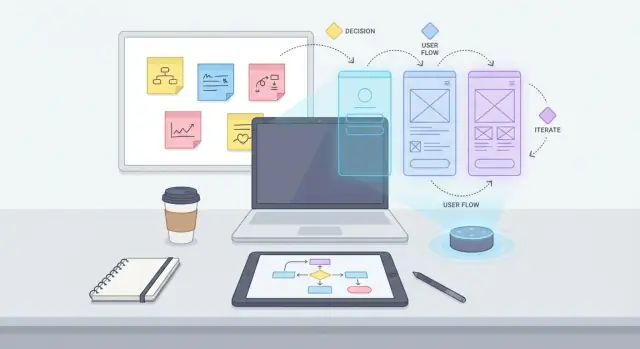
When people say “turn the idea into screens, logic, and flows,” they’re describing three connected ways to make a product plan concrete.
Screens: what the user sees
Screens are the pages or views a user interacts with: a sign-up page, a dashboard, a settings page, a “create task” form. A screen isn’t just a title—it includes what’s on it (fields, buttons, messages) and what it’s for (the user’s intent on that screen).
Flows: the path to a goal
Flows describe how a user moves between screens to complete something. Think of flows as a guided route: what happens first, what happens next, and where the user ends up. A flow usually includes a “happy path” (everything goes smoothly) plus variations (forgot password, error state, returning user, etc.).
Logic: rules, decisions, and system behavior
Logic is everything the system decides or enforces behind the scenes (and often explains on the screen):
- Rules (password requirements, plan limits)
- Decisions (send the user to onboarding or skip it)
- States (logged out vs. logged in, trial vs. paid)
- Edge cases (duplicate email, weak connection, empty data)
How they fit together in a product plan
A practical product plan ties all three together:
- Screens define the building blocks.
- Flows define how those blocks connect to accomplish user goals.
- Logic defines what’s allowed, what changes based on conditions, and what the user sees when things don’t go as expected.
AI is helpful here because it can take messy notes (features, wishes, constraints) and propose a first pass at these three layers—so you can react, correct, and refine.
Small example: sign up → onboarding → first task
Imagine a simple task app:
- Screens: Sign Up, Verify Email, Onboarding Questions, Create First Task, Task List.
- Flow (happy path): Sign Up → Verify Email → Onboarding → Create First Task → Task List.
- Logic: If email is already used, show “account exists” with a login option; if verification is skipped, restrict access; if onboarding is incomplete, prompt later; after creating the first task, show a confirmation state and then the Task List.
That’s the core meaning: what users see, how they move, and what rules govern the experience.
Why raw ideas often get stuck before they become a plan
Raw product ideas rarely show up as a neat document. They arrive as scattered pieces: notes in a phone app, long chat threads, meeting takeaways, quick sketches on paper, voice memos, support tickets, and “one more thing” thoughts added right before the deadline. Each piece can be valuable, but together they’re hard to turn into a clear plan.
The messy middle: duplicates, contradictions, and gaps
Once you collect everything in one place, patterns appear—and so do problems:
- The same idea is described five different ways (“add saved items,” “wishlist,” “favorites,” “bookmarks”).
- Requirements conflict (“guest checkout” vs. “login required for security”).
- Key steps are missing (“What happens after payment fails?” “Where does a user see past invoices?”).
These issues aren’t a sign the team is doing something wrong. They’re normal when input comes from different people, at different times, with different assumptions.
Unclear goals create messy flows
Ideas get stuck when the “why” isn’t firm. If the goal is fuzzy (“make onboarding better”), the flow becomes a grab bag of screens: extra steps, optional detours, and unclear decision points.
Compare that with a goal like: “Help new users connect their account and complete one successful action in under two minutes.” Now the team can judge every step: does it move the user toward that outcome, or is it noise?
Without clear goals, teams end up debating screens instead of outcomes—and flows become complicated because they’re trying to satisfy multiple purposes at once.
The hidden cost: rework later
When structure is missing, decisions get deferred. That feels fast at first (“we’ll figure it out in design”), but it usually shifts the pain downstream:
A designer creates wireframes that reveal missing states. Developers ask for edge cases. QA finds contradictions. Stakeholders disagree on what the feature was supposed to do. Then everyone backtracks—rewriting logic, redoing screens, retesting.
Rework is expensive because it happens when many pieces are already connected.
“More ideas” isn’t the same as “organized ideas”
Brainstorming produces volume. Planning requires shape.
Organized ideas have:
- a clear goal and success criteria
- a small set of user tasks
- a consistent vocabulary (one term per concept)
- explicit steps, decisions, and outcomes
AI is most useful at this stuck point—not to generate even more suggestions, but to turn a pile of input into a structured starting point the team can build from.
How AI captures, cleans up, and clusters your input
Most early product notes are a mix of half-sentences, screenshots, voice memos, and “don’t forget this” thoughts scattered across tools. AI is useful because it can turn that mess into something you can actually discuss.
Step 1: Summarize and normalize messy notes
First, AI can condense raw input into clear, consistent bullets—without changing the intent. It typically:
- rewrites shorthand into full sentences (e.g., “add save later” → “Users can save items to revisit later”)
- standardizes terms (e.g., “client/customer/user” → pick one, then apply it everywhere)
- separates filler from decisions, questions, and requirements
This cleanup matters because you can’t group ideas well if they’re written in ten different styles.
Step 2: Cluster ideas into named groups
Next, AI can cluster similar notes into themes. Think of it as automatically sorting sticky notes on a wall—then suggesting labels for each pile.
For example, it might create clusters like “Onboarding,” “Search & Filters,” “Notifications,” or “Billing,” based on repeated intent and shared vocabulary. Good clustering also highlights relationships (“these items all affect checkout”) rather than just matching keywords.
Step 3: Detect duplicates and near-duplicates
In brainstorms, the same requirement often appears multiple times with small variations. AI can flag:
- exact duplicates (copy/paste repeats)
- near-duplicates (same idea, different wording)
- overlapping scope (“email alerts” vs “notification settings”)
Instead of deleting anything, preserve the original phrasing and propose a merged version, so you can choose what’s accurate.
Step 4: Extract key entities you’ll reuse later
To prepare for screens and flows, AI can pull out entities such as:
- users and roles (admin, guest, buyer)
- actions (create, approve, export)
- screens (settings, profile, cart)
- data fields (email, address, plan type)
Human review is still required
Clustering is a starting point, not a decision. You still need to review group names, confirm what’s in/out of scope, and correct any incorrect merges—because one wrong assumption here can ripple into your screens and user flows later.
From clusters to an initial screen map (information architecture)
Once your ideas are clustered (for example: “finding content,” “saving,” “account,” “payments”), the next step is turning those clusters into a first-pass map of the product. This is information architecture (IA): a practical outline of what lives where, and how people move around.
Turn clusters into app sections
AI can take each cluster and propose a small set of top-level sections that feel natural to users—often the kind of things you’d see in a tab bar or main menu. For instance, a “discover” cluster might become Home or Explore, while “identity + preferences” might become Profile.
The goal isn’t perfection; it’s picking stable “buckets” that reduce confusion and make later flow work easier.
Create a first-pass screen inventory
From those sections, AI can generate a screen list in plain language. You’ll typically get:
- Core screens (e.g., Home feed, Search results, Item detail, Profile)
- Supporting screens (Filters, Notifications, Saved items)
- Utility screens (Sign in, Forgot password, Permissions prompts)
This screen inventory is useful because it exposes scope early: you can see what’s “in the product” before anyone starts drawing wireframes.
Suggest navigation structure (in human terms)
AI can also propose how navigation might work, without getting too design-heavy:
- Tabs for frequent destinations (Home, Search, Saved, Profile)
- A menu for less frequent items (Settings, Help, Legal)
- Deep links for direct entry points (opening a specific item from an email)
You can review these suggestions based on your users’ priorities—not on UI trends.
Identify missing screens you’ll need later
AI can flag screens teams often forget, like empty states (no results, nothing saved), error states (offline, payment failed), Settings, Help/Support, and confirmation screens.
Keep it iterative
Start broad: pick a small number of sections and a short screen list. Then refine boundaries—split “Home” into “Home” and “Explore,” or move “Notifications” under Profile—until the map matches real user expectations and your product goals.
How AI proposes user flows from goals and tasks
A useful user flow starts with intent, not screens. If you feed AI a messy brainstorm, ask it to first extract user goals—what the person is trying to accomplish—and the tasks they’ll do to get there. That reframes the conversation from “What should we build?” to “What must happen for the user to succeed?”
1) Start from goals, then pick one flow
Have AI list the top 3–5 goals for a specific user type (new user, returning user, admin, etc.). Then choose one goal and ask for a flow that’s narrowly scoped (one outcome, one context). This prevents “everything flows” that nobody can implement.
2) Generate a clear happy path
Next, ask AI to produce a happy path step-by-step: the simplest sequence where everything goes right. The output should read like a story with numbered steps (e.g., “User selects plan → enters payment → confirms → sees success screen”).
3) Add branches where reality happens
Once the happy path is stable, branch into common alternatives:
- Skip (onboarding, optional steps)
- Edit (change details before confirming)
- Cancel (exit mid-way)
- Retry (failed payment, weak connection)
Ask it to label which steps are user choices (buttons, selections, confirmations) versus automatic steps (validation, saving, syncing). That distinction helps teams decide what needs UI, what needs messaging, and what needs background logic.
4) Convert to a shareable diagram description
Finally, convert the flow into a simple diagram description your team can paste into docs or tickets:
Start: Goal selected
1. Screen: Choose option
2. Screen: Enter details
3. System: Validate
   - If invalid -> Screen: Error + Fix
4. Screen: Review & Confirm
5. System: Submit
   - If fail -> Screen: Retry / Cancel
6. Screen: Success
End
This keeps conversations aligned before anyone opens Figma or writes requirements.
Turning flows into clear logic: rules, states, and edge cases
A user flow shows where someone can go. Logic explains why they can (or can’t) go there, and what the product should do when things go wrong. This is often where teams lose time: flows look “done,” but decisions, states, and error handling are still implicit.
AI is useful here because it can turn a visual or written flow into a plain-language “logic layer” that non-technical stakeholders can review before design and development.
Translate steps into rules and permissions
Start by rewriting each step as a small set of if/then rules and permission checks. The goal is clarity, not completeness.
Examples of key decisions that change the flow:
- Logged in vs logged out: If logged out, redirect to Sign in; after success, return to the original step.
- Role/permission: If user is “viewer,” hide Edit actions; if “admin,” allow edits and approvals.
- Eligibility: If account is past due, block checkout and show billing screen.
When AI drafts these rules, label them with human-friendly names (e.g., “R3: Must be signed in to save”). This makes discussions easier in review meetings.
Define states: loading, empty, error (and “success”)
Every screen in a flow should have explicit states. Ask for a checklist per screen:
- Loading: what the user sees, whether actions are disabled, and what triggers “loaded.”
- Empty: what “no data yet” means and what the primary next action is.
- Error: message tone, retry behavior, and whether errors are blocking or non-blocking.
Capture data requirements early
Flows become real when you specify the data behind them. AI can extract a first pass like:
- What must be saved (draft vs final), and where (device, server, both)
- What must be validated (formats, required fields, uniqueness)
- What must be synced and how conflicts are handled
Make edge cases explicit (without scaring people)
List “unhappy paths” in plain language:
- Offline mode, timeouts, retries
- Duplicate submissions (double taps), idempotency notes
- Invalid input, expired links, stale sessions
To keep logic readable for non-technical stakeholders, format it as a short “Decision + Outcome” table and keep jargon out. If you need a lightweight template for this, reuse the same structure across features so reviews stay consistent (see /blog/prompt-templates-for-flows).
Keeping screens consistent: components, patterns, and copy
Once you have a draft screen map and a few user flows, the next risk is “every screen feels invented from scratch.” AI can act as a consistency checker: it can spot when the same action has three names, when similar screens use different layouts, or when microcopy changes tone.
Reusable components by purpose
Propose a small component set based on what your flows repeat. Instead of designing per-screen, standardize building blocks:
- Buttons: primary vs secondary vs destructive (e.g., “Save,” “Cancel,” “Delete account”).
- Cards/list items: consistent structure for titles, metadata, status, and actions.
- Forms: label placement, required markers, inline validation, and helper text.
- Empty states: what to show when there’s no data yet (with a clear next step).
This keeps wireframes and later UI work faster—and reduces logic bugs, because the same component can reuse the same rules.
Consistent naming for screens and actions
Normalize your vocabulary into a simple naming system:
- Screen names: Verb + Object (“Create project,” “Edit profile,” “Review order”).
- Actions: one preferred term (“Sign in” vs “Log in”) used everywhere.
Produce a glossary and flag mismatches across screens and flows.
Microcopy that supports the flow
Even early on, draft basic microcopy:
- Labels and helper text (“Password must be at least 12 characters”).
- Error messages that explain what happened and how to fix it (“Card declined—try another payment method”).
- Confirmation and success states (“Project created. Invite teammates?”).
Accessibility and brand-pattern reminders
Attach reminders per component: keyboard focus states, clear language, and contrast requirements. Also flag where patterns should match your existing brand guidelines (terminology, tone, button hierarchy), so new screens don’t drift away from what users already recognize.
Collaboration and iteration: using AI without losing alignment
AI speeds up collaboration only if everyone is looking at the same “current truth.” The goal isn’t to let the model run ahead—it’s to use it as a structured editor that keeps your plan readable as more people weigh in.
Format the same plan for different audiences
Start with one master document, then generate views for each group without changing the underlying decisions:
- Exec summary: problem, target user, expected outcomes, key risks, timeline assumptions.
- Team plan: screen map, primary user flows, logic rules, open questions, dependencies.
- Design/dev handoff notes: states, edge cases, API assumptions, content requirements.
Reference specific sections (e.g., “Based on ‘Flow A’ and ‘Rules’ below, write an exec summary”) so outputs stay anchored.
Turn feedback into action items—and log decisions
When feedback lands in messy forms (Slack threads, meeting notes), paste it in and produce:
- a list of action items (owner, due date, affected screens/flows)
- a decision log (decision, rationale, date, who agreed)
- a list of open questions to resolve before the next iteration
This reduces the classic “we discussed it, but nothing changed” gap.
Versioning: what changed and why
Each iteration should include a short changelog. Generate a diff-style summary:
- What changed: screens added/removed, steps reordered, new rules or constraints
- Why: user feedback, business requirement, technical limitation
- Impact: which flows or screens need re-review
Review checkpoints to prevent AI drift
Set explicit checkpoints where humans approve the direction: after the screen map, after the main flows, after logic/edge cases. Between checkpoints, instruct AI to only propose, not finalize.
Share a single source of truth
Publish the master doc in one place (e.g., /docs/product-brief-v1) and link out from tasks to that doc. Treat AI-generated variations as “views,” while the master remains the reference everyone aligns on.
How to validate flows before design and development
Validation is where “nice-looking flowcharts” turn into something you can trust. Before anyone opens Figma or starts building, pressure-test the flow the way real users will.
1) Generate quick scenarios (3–5 realistic tasks)
Create short, believable tasks that match your goal and audience (including one “messy” task). For example:
- “A returning user updates their shipping address right before checkout.”
- “A new user tries to complete the same task with no saved data.”
- “A user makes a mistake (wrong code, missing field) and tries again.”
Run each scenario through your proposed user flow step by step. If you can’t narrate what happens without guessing, the flow isn’t ready.
2) Use a per-screen checklist (inputs, outputs, error states)
Draft a checklist for every screen in the flow:
- Inputs: what the user can type/select/upload
- Outputs: what the system shows/changes/saves
- System states: loading, empty, success, partial success
- Error states: validation errors, network failure, permission issues
This surfaces missing requirements that otherwise appear during QA.
3) Spot dead ends and unclear decisions
Scan your flow for:
- screens with no next step
- decisions without criteria (e.g., “if eligible” but what defines eligible?)
- transitions that skip confirmation, feedback, or recovery
4) Validate against the goal: fewer steps, fewer surprises
Propose a “shortest path” and compare it to your current flow. If you need extra steps, make them explicit (why they exist, what risk they reduce).
5) Draft questions for interviews and stakeholder reviews
Generate targeted questions like:
- “Where would you expect to find X?”
- “What would you do if you saw this error?”
- “What information would you need before continuing?”
Bring those questions into your review doc or link them to your next section on prompt templates at /blog/prompt-templates-turning-brainstorms-into-screens-and-flows.
Prompt templates: turning brainstorms into screens and flows
A good prompt is less about “being clever” and more about giving AI the same context you’d give a teammate: what you know, what you don’t, and what decisions you need next.
Template 1: Clean summary + shared vocabulary
Use this when you have messy notes from a workshop, call, or whiteboard.
You are my product analyst.
Input notes (raw):
[PASTE NOTES]

Task:
1) Rewrite as a clean, structured summary in plain English.
2) Extract key terms and define them (e.g., “account”, “workspace”, “project”).
3) List any contradictions or duplicates.

Constraints:
- Platform: [iOS/Android/Web]
- Timeline: [date or weeks]
- Must-haves: [list]
- Non-goals: [list]
Output format: headings + short bullets.
Template 2: Cluster ideas into themes (with labeled assumptions)
This converts “everything we said” into buckets you can turn into screens.
Cluster the items below into 5–8 themes.
For each theme: name it, include the items, and propose a goal statement.

Important:
- If you infer anything, put it under “Assumptions (AI)” and label each A1, A2...
- Also output “Open Questions” we must answer to confirm/deny assumptions.

Items:
[PASTE LIST]
Template 3: Draft screen map + flows (multiple options)
Ask for at least two levels so stakeholders can choose complexity.
Based on these themes and goals:
[PASTE THEMES/GOALS]

Create:
1) An initial screen list grouped by area (IA draft).
2) Two user flow options:
   - Option A: simplest viable flow
   - Option B: advanced flow with power-user paths
3) For each option: entry points, success end state, and failure/edge paths.
4) Output an “Open Questions” list for the next meeting.

Constraints:
Platform: [ ]
Must-haves: [ ]
Compliance/permissions: [ ]
If you reuse the same templates, your team will start producing inputs in a consistent format—which makes the AI outputs easier to compare and iterate.
Where a platform like Koder.ai fits
If your end goal is not just planning but shipping, it helps to connect these artifacts (screens, flows, and logic) to implementation. Koder.ai is a vibe-coding platform that can take a structured plan and help you move from “draft flows” to working web, backend, or mobile apps via chat—especially when you treat the AI output as a reviewable spec first, then generate incrementally. Features like planning mode, snapshots, and rollback can be useful when you’re iterating on flows and logic and want to keep a clear history of what changed.
Limits and best practices: staying in control of the output
AI is great at accelerating structure—turning messy notes into draft screens, rules, and flows. But it will also confidently fill in gaps when information is missing. The safest mindset is simple: AI proposes, your team decides.
Know the common risks
Most problems come from hidden assumptions. AI may:
- infer user goals that weren’t stated, or miss edge cases that matter to your business
- mirror biased inputs (for example, defaulting to a “power user” perspective and ignoring accessibility needs)
- over-simplify real constraints (legal, pricing, permissions, data availability), creating flows that look clean but can’t be built
Treat every output as a hypothesis—especially anything that sounds like a requirement (“Users will…”, “The system should…”).
Handle privacy and sensitive data
When brainstorming with AI, don’t paste:
- customer names, emails, phone numbers, addresses, account IDs
- internal financials, contracts, unreleased roadmap details
- support transcripts or sales calls unless explicitly approved
Instead, anonymize and summarize (“User A”, “Enterprise customer”, “Refund scenario”) and keep sensitive context in your team docs.
Keep human ownership (and a single source of truth)
Assign a clear owner for the flow and logic (often the PM or designer). Use AI drafts to speed up writing, but store decisions in your canonical place (PRD, spec, or ticketing system). If you want, link supporting docs with relative links like /blog/flow-walkthrough-checklist.
Add quality gates before you move on
A lightweight checklist prevents “pretty but wrong” outputs:
- Requirements review: Are goals, constraints, and actors explicitly stated?
- Flow walkthrough: Can someone follow each path without guessing?
- Copy review: Do labels match your product language and reduce ambiguity?
Define success criteria for the AI output
A good AI-assisted flow is:
- Clear: another person can explain it back to you.
- Testable: you can write acceptance criteria from it.
- Low-friction for handoffs: fewer gaps between product, design, and engineering.
If it doesn’t meet these criteria, prompt again—using your corrections as the new input.
FAQ
What exactly counts as a “screen” in a product plan?
Screens are the individual views a user interacts with (pages, modals, forms). A useful screen definition includes:
- The user’s intent on that screen
- The key UI elements (fields, buttons, messages)
- The states it must handle (loading/empty/error/success)
If you can’t describe what the user is trying to accomplish on the screen, it’s usually not a real screen yet—just a label.
What’s the difference between a screen and a flow?
A flow is the step-by-step path a user takes to reach a goal, typically across multiple screens. Start with:
- One user type (new user, returning user, admin)
- One clear outcome (“create first task,” “pay invoice,” “reset password”)
Then write a numbered happy path, and only after that add branches (skip, edit, cancel, retry).
What does “logic” mean in the context of screens and flows?
Logic is the rules and decisions that determine what the system allows and what the user sees. Common categories include:
- Rules: requirements and limits (password length, plan caps)
- Decisions: routing (show onboarding or skip)
- States: logged out vs logged in; trial vs paid
- Edge cases: duplicate email, offline, partial data
If a flow says where users go, logic explains why and what happens when it fails.
Why do raw product ideas often get stuck before becoming a plan?
Because early input is usually scattered and inconsistent—notes, chats, sketches, last-minute ideas—so it contains:
- Duplicates (“wishlist” vs “favorites”)
- Contradictions (“guest checkout” vs “login required”)
- Missing steps (“what happens after payment fails?”)
Without structure, teams defer decisions until design/dev, which increases rework when gaps surface later.
How can AI help clean up messy notes without changing the meaning?
Yes—AI is particularly good at a first “cleanup pass”:
- Rewriting shorthand into clear bullets
- Standardizing vocabulary (pick one term per concept)
- Separating requirements, decisions, and open questions
Best practice: keep the original notes, and treat the AI version as an editable draft you review and correct.
How does AI “cluster” ideas, and what should I watch out for?
AI can cluster similar items into themes (like sorting sticky notes) and help you:
- Name each cluster (e.g., “Onboarding,” “Billing,” “Notifications”)
- Flag near-duplicates and overlaps
- Highlight relationships (which ideas affect the same screen/step)
Human review matters: don’t auto-merge items unless the team confirms they’re truly the same requirement.
How do you go from clusters to an initial screen map (IA)?
Turn clusters into a draft information architecture (IA) by asking for:
- Top-level sections (tabs/menu categories)
- A screen inventory (core, supporting, utility screens)
- Navigation assumptions (tabs vs menu vs deep links)
A good IA draft reveals scope early and surfaces forgotten screens like empty states, error states, settings, and help/support.
How do you get AI to propose useful user flows (not vague flowcharts)?
Use a goal-first prompt:
- Ask AI to extract 3–5 user goals for one user type.
- Pick one goal and generate a single, narrow flow.
- Have AI label steps as user choice vs automatic system step.
- Add common branches (skip, edit, cancel, retry).
This keeps flows implementable and prevents “everything flows” that collapse under their own scope.
How do you turn a flow into clear rules, states, and edge cases?
Translate the flow into reviewable logic by asking for:
- If/then rules and permission checks (with rule IDs like R1, R2)
- Per-screen state checklists (loading/empty/error/success)
- Data needs (what’s saved, validated, synced)
- Unhappy paths (timeouts, expired links, duplicate submissions)
Formatting it as “Decision → Outcome” keeps it readable for non-technical stakeholders.
How can teams collaborate with AI without losing alignment or version control?
Use AI to produce “views” of the same master plan, but keep one source of truth:
- Maintain a master doc (PRD/spec) and link to it from tickets.
- Generate role-specific outputs (exec summary, team plan, handoff notes) that reference the master.
- Ask AI to convert feedback into action items and a decision log.
- Add a short changelog each iteration (what changed, why, impact).
This prevents drift where different people follow different AI-generated versions.