Dec 22, 2025·8 min
How React Reshaped Frontend Architecture with Components
React popularized component-based UI, declarative rendering, and state-driven views—moving teams from page-centric code to reusable systems and patterns.
What Changed When React Arrived
React didn’t just introduce a new library—it changed what teams mean when they say “frontend architecture.” In practical terms, frontend architecture is the set of decisions that keep a UI codebase understandable at scale: how you split the UI into parts, how data moves between them, where state lives, how you handle side effects (like fetching data), and how you keep the result testable and consistent across a team.
Component thinking, in one sentence
Component thinking is treating every piece of UI as a small, reusable unit that owns its rendering and can be composed with other units to build whole pages.
The shifts React encouraged
Before React became popular, many projects were organized around pages and DOM manipulation: “find this element, change its text, toggle this class.” React pushed teams toward a different default:
- State-driven UI: you update state, and the UI updates as a result.
- Composition over wiring: you assemble screens by nesting and combining components rather than stitching behaviors across unrelated files.
- Reuse as a first-class goal: shared UI patterns become components instead of copied markup.
These ideas changed day-to-day work. Code reviews started asking “where does this state belong?” instead of “which selector did you use?” Designers and engineers could align on a shared component vocabulary, and teams could grow libraries of UI building blocks without rewriting entire pages.
Bigger than React
Even if a team later moves to another framework, many React-shaped habits remain: component-based architecture, declarative rendering, predictable data flow, and a preference for reusable design system components over one-off page code. React made these patterns feel normal—and that influenced the broader frontend ecosystem.
Before React: Page-Centric UIs and DOM-First Code
Before React, many teams built interfaces around pages, not reusable UI units. A common setup was server-rendered templates (PHP, Rails, Django, JSP, etc.) that produced HTML, with jQuery sprinkled on top for interactivity.
The typical stack: templates + jQuery + plugins
You’d render a page, then “activate” it with scripts: datepickers, modal plugins, form validators, carousels—each with its own markup expectations and event hooks.
The code often looked like: find a DOM node, attach a handler, mutate the DOM, and hope nothing else breaks. As the UI grew, the “source of truth” quietly became the DOM itself.
Behavior scattered across layers
UI behavior rarely lived in one place. It was split between:
- Server views (conditional rendering, partials, feature flags)
- HTML (data-* attributes, inline handlers, hidden fields)
- JavaScript (jQuery selectors, global state, plugin initialization)
A single widget—say, a checkout summary—might be partially built on the server, partially updated with AJAX, and partially controlled by a plugin.
Common pain points
This approach worked for small enhancements, but it produced recurring problems:
- Duplicated UI: the same “component” rebuilt in multiple templates and pages
- Inconsistent state: loading spinners, disabled buttons, and error messages drifting out of sync
- Fragile DOM code: minor markup changes breaking selectors and event wiring
Early MV* as a bridge
Frameworks like Backbone, AngularJS, and Ember tried to bring structure with models, views, and routing—often a big improvement. But many teams still mixed patterns, leaving a gap for a simpler way to build UIs as repeatable units.
The Big Idea: UI as a Function of State
React’s most important shift is simple to say and surprisingly powerful in practice: the UI is a function of state. Instead of treating the DOM as the “source of truth” and manually keeping it in sync, you treat your data as the source of truth and let the UI be the result.
What “state” means in everyday apps
State is just the current data your screen depends on: whether a menu is open, what’s typed into a form, which items are in a list, which filter is selected.
When state changes, you don’t hunt through the page to update several DOM nodes. You update the state, and the UI re-renders to match it.
Why this reduces manual DOM work
Traditional DOM-first code often ends up with scattered update logic:
- Change a checkbox → update a label
- Add an item → update the list and the empty-state message
- Submit a form → disable the button, show a spinner, handle errors
With React’s model, those “updates” become conditions in your render output. The screen becomes a readable description of what should be visible for a given state.
A small relatable example
function ShoppingList() {
  const [items, setItems] = useState([]);
  const [text, setText] = useState("");

  const add = () => setItems([...items, text.trim()]).then(() => setText(""));

  return (
    <section>
      <form onSubmit={(e) => { e.preventDefault(); add(); }}>
        <input value={text} onChange={(e) => setText(e.target.value)} />
        <button disabled={!text.trim()}>Add</button>
      </form>

      {items.length === 0 ? <p>No items yet.</p> : (
        <ul>{items.map((x, i) => <li key={i}>{x}</li>)}</ul>
      )}
    </section>
  );
}
Notice how the empty message, button disabled state, and list contents are all derived from items and text. That’s the architectural payoff: data shape and UI structure align, making screens easier to reason about, test, and evolve.
Components as the New Building Blocks
React made “component” the default unit of UI work: a small, reusable piece that bundles markup, behavior, and styling hooks behind a clear interface.
Instead of scattering HTML templates, event listeners, and CSS selectors across unrelated files, a component keeps the moving parts close together. That doesn’t mean everything must live in one file—but it does mean the code is organized around what the user sees and does, not around the DOM API.
What a component really is
A practical component usually includes:
- Structure (what it renders)
- Interaction (handlers, state, effects)
- Styling hooks (class names, variants, tokens)
The important shift is that you stop thinking in terms of “update this div” and start thinking in terms of “render the Button in its disabled state.”
Encapsulation = easier maintenance and clearer ownership
When a component exposes a small set of props (inputs) and events/callbacks (outputs), it becomes easier to change its internals without breaking the rest of the app. Teams can own specific components or folders (for example, “checkout UI”) and improve them confidently.
Encapsulation also reduces accidental coupling: fewer global selectors, fewer cross-file side effects, fewer “why did this click handler stop working?” surprises.
Components map to product concepts
Once components became the main building blocks, code started mirroring the product:
- Button (primary/secondary, loading, icon)
- Modal (open/close, focus trap, escape key)
- CheckoutForm (validation, submission, error states)
This mapping makes UI discussions easier: designers, PMs, and engineers can talk about the same “things.”
Impact on file structure
Component thinking pushed many codebases toward feature- or domain-based organization (for example, /checkout/components/CheckoutForm) and shared UI libraries (often /ui/Button). That structure scales better than page-only folders when features grow, and it sets the stage for design systems later.
Declarative Rendering and Why JSX Made It Stick
React’s rendering style is often described as declarative, which is a fancy way of saying: you describe what the UI should look like for a given situation, and React figures out how to make the browser match that.
“Describe the end result, not the steps”
In older DOM-first approaches, you typically wrote step-by-step instructions:
- find an element
- create a new node
- set its text
- append it
- update or remove it later
With declarative rendering, you instead express the result:
If the user is logged in, show their name. If they’re not, show a “Sign in” button.
That shift matters because it reduces the amount of “UI bookkeeping” you have to do. You’re not constantly tracking which elements exist and what needs updating—you focus on the states your app can be in.
Why JSX helped it catch on
JSX is essentially a convenient way to write UI structure close to the logic that controls it. Instead of splitting “template files” and “logic files” and then jumping between them, you can keep related pieces together: the markup-like structure, the conditions, small formatting decisions, and event handlers.
That co-location is a big reason React’s component model felt practical. A component isn’t just a chunk of HTML or a bundle of JavaScript—it’s a unit of UI behavior.
“Isn’t this mixing HTML and JS?”
A common concern is that JSX mixes HTML and JavaScript, which sounds like a step backward. But JSX isn’t really HTML—it’s syntax that produces JavaScript calls. More importantly, React isn’t mixing technologies as much as it’s grouping things that change together.
When the logic and the UI structure are tightly linked (for example: “show an error message only when validation fails”), keeping them in one place can be clearer than scattering rules across separate files.
Declarative rendering isn’t only JSX
JSX made React approachable, but the underlying concept extends beyond JSX. You can write React without JSX, and other frameworks also use declarative rendering with different template syntaxes.
The lasting impact is the mindset: treat UI as a function of state, and let the framework handle the mechanics of keeping the screen in sync.
Reconciliation and the Virtual DOM (Without the Myths)
Ship a prototype today
Get your app running with Koder.ai deployment and hosting when you are ready to share.
Before React, a common source of bugs was simple: the data changed, but the UI didn’t. Developers would fetch new data, then manually find the right DOM nodes, update text, toggle classes, add/remove elements, and keep all of that consistent across edge cases. Over time, “update logic” often became more complex than the UI itself.
React’s big workflow shift is that you don’t instruct the browser how to change the page. You describe what the UI should look like for a given state, and React figures out how to update the real DOM to match.
What “reconciliation” actually means
Reconciliation is React’s process of comparing what you rendered last time with what you rendered this time, then applying the smallest set of changes to the browser DOM.
The important part isn’t that React uses a “Virtual DOM” as a magic performance trick. It’s that React gives you a predictable model:
- You write render logic as if you’re rebuilding the UI from scratch.
- React updates the DOM incrementally so users don’t pay the full rebuild cost.
That predictability improves developer workflow: fewer manual DOM updates, fewer inconsistent states, and UI updates that follow the same rules across the app.
Keys: the practical takeaway
When rendering lists, React needs a stable way to match “old items” to “new items” during reconciliation. That’s what key is for.
{todos.map(todo => (
  <TodoItem key={todo.id} todo={todo} />
))}
Use keys that are stable and unique (like an ID). Avoid array indexes when items can be reordered, inserted, or deleted—otherwise React may reuse the wrong component instance, leading to surprising UI behavior (like inputs keeping the wrong value).
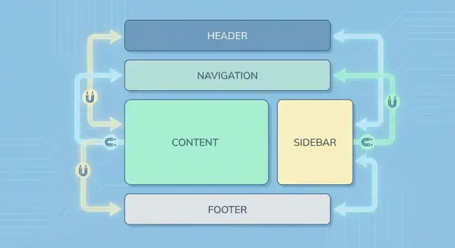
One-Way Data Flow: A Simpler Mental Model
One of React’s biggest architectural shifts is that data flows in one direction: from parent components down to children. Instead of letting any part of the UI “reach into” other parts and mutate shared state, React encourages you to treat updates as explicit events that move upward, while the resulting data moves downward.
A simple parent/child example
A parent owns the state, and passes it to a child as props. The child can request a change by calling a callback.
function Parent() {
  const [count, setCount] = React.useState(0);

  return (
    <Counter
      value={count}
      onIncrement={() => setCount(c => c + 1)}
    />
  );
}

function Counter({ value, onIncrement }) {
  return (
    <button onClick={onIncrement}>
      Clicks: {value}
    </button>
  );
}
Notice what doesn’t happen: the Counter doesn’t modify count directly. It receives value (data) and onIncrement (a way to ask for change). That separation is the core of the mental model.
Clearer boundaries, fewer side effects
This pattern makes boundaries obvious: “Who owns this data?” is usually answered by “the closest common parent.” When something changes unexpectedly, you trace it to the place where state lives—not through a web of hidden mutations.
Props vs state as an organizing principle
- State: the component’s private, changeable data (the source of truth).
- Props: inputs passed in from the outside (read-only from the receiver’s perspective).
That distinction helps teams decide where logic belongs and prevents accidental coupling.
Reuse and testing get easier
Components that rely on props are easier to reuse because they don’t depend on global variables or DOM queries. They’re also simpler to test: you can render them with specific props and assert output, while stateful behavior is tested where the state is managed.
Composition Over Inheritance in Real Projects
Kickstart a UI library
Prototype a component library structure and iterate without weeks of setup work.
React nudged teams away from “class hierarchies for UI” and toward assembling screens from small, focused pieces. Instead of extending a base Button into ten variations, you typically compose behavior and visuals by combining components.
What composition looks like day to day
A common pattern is building layout components that don’t know anything about the data they’ll contain:
PageShellfor header/sidebar/footerStack/Gridfor spacing and alignmentCardfor consistent framing
These components accept children so the page decides what goes inside, not the layout.
You’ll also see lightweight wrappers like RequireAuth or ErrorBoundary that add a concern around whatever they wrap, without changing the wrapped component’s internals.
When you need more control than “just children,” teams often use a slot-like approach via props:
Modalwithtitle,footer, andchildrenTablewithrenderRoworemptyState
This keeps components flexible without exploding the API surface.
Why inheritance tends to hurt
Deep inheritance trees usually start with good intentions (“we’ll reuse the base class”), but they become hard to manage because:
- behavior is split across multiple levels (“where is this style coming from?”)
- changes to a base class ripple into unrelated screens
- overrides pile up, and the “generic” base becomes a grab bag
Modern composition tools: hooks
Hooks made composition even more practical. A custom hook like useDebouncedValue or usePermissions lets multiple feature components share logic without sharing UI. Pair that with shared UI primitives (buttons, inputs, typography) and feature components (CheckoutSummary, InviteUserForm), and you get reuse that stays understandable as the app grows.
State Management: From Local State to Shared Stores
React made it natural to start with local component state: a form field value, a dropdown being open, a loading spinner. That works well—until the app grows and multiple parts of the UI need to stay in sync.
Why sharing state gets hard
As features expand, state often needs to be read or updated by components that aren’t in a direct parent-child relationship. “Just pass props” turns into long chains of props through components that don’t really care about the data. This makes refactoring riskier, increases boilerplate, and can lead to confusing bugs where two places accidentally represent the “same” state.
Common approaches teams use
1) Lifting state up
Move the state to the nearest common parent and pass it down as props. This is usually the simplest option and keeps dependencies explicit, but it can create “god components” if overused.
2) Context for shared, app-wide concerns
React Context helps when many components need the same value (theme, locale, current user). It reduces prop drilling, but if you store frequently changing data in context, it can become harder to reason about updates and performance.
3) External stores
As React apps became larger, the ecosystem responded with libraries such as Redux and similar store patterns. These centralize state updates, often with conventions around actions and selectors, which can improve predictability at scale.
Choosing what fits
Prefer local state by default, lift state when siblings need to coordinate, use context for cross-cutting concerns, and consider an external store when many distant components depend on the same data and the team needs clearer rules for updates. The “right” choice depends less on trends and more on app complexity, team size, and how often requirements change.
Tooling and Workflows React Popularized
React didn’t just introduce a new way to write UI—it nudged teams toward a component-driven workflow where code, styling, and behavior are developed as small, testable units. That shift influenced how frontend projects are built, validated, documented, and shipped.
Component-driven development as a daily workflow
When the UI is made of components, it becomes natural to work “from the edges inward”: build a button, then a form, then a page. Teams started treating components as products with clear APIs (props), predictable states (loading, empty, error), and reusable styling rules.
A practical change: designers and developers can align around a shared component inventory, review behavior in isolation, and reduce last-minute page-level surprises.
The tooling stack that became the norm
React’s popularity helped standardize a modern toolchain that many teams now consider table stakes:
- Bundlers and dev servers for fast local iteration (hot reload, code splitting)
- Linting and formatting to keep large component codebases consistent
- Type checking (often TypeScript) to make component props and state harder to misuse
- Test runners plus component-focused testing utilities
Even if you don’t choose the same tools, the expectation remains: a React app should have guardrails that catch UI regressions early.
As a newer extension of this “workflow-first” mindset, some teams also use vibe-coding platforms like Koder.ai to scaffold React frontends (and the backend around them) from a chat-driven planning flow—useful when you want to validate component structure, state ownership, and feature boundaries quickly before spending weeks on hand-built plumbing.
“Component docs” and isolated previews
React teams also popularized the idea of a component explorer: a dedicated environment where you render components in different states, attach notes, and share a single source of truth for usage guidelines.
This “Storybook-style” thinking (without requiring any specific product) changes collaboration: you can review a component’s behavior before it’s wired into a page, and you can validate edge cases deliberately instead of hoping they appear during manual QA.
If you’re building a reusable library, this pairs naturally with a design system approach—see /blog/design-systems-basics.
Workflow impact on releases
Component-based tooling encourages smaller pull requests, clearer visual review, and safer refactors. Over time, teams ship UI changes faster because they’re iterating on well-scoped pieces instead of navigating tangled, page-wide DOM code.
Design Systems and Reusable Component Libraries
Add a real backend quickly
Pair your React UI with a Go and PostgreSQL backend generated from the same chat.
A design system, in practical terms, is two things working together: a library of reusable UI components (buttons, forms, modals, navigation) and the guidelines that explain how and when to use them (spacing, typography, tone, accessibility rules, interaction patterns).
React made this approach feel natural because “component” is already the core unit of UI. Instead of copying markup between pages, teams can publish a <Button />, <TextField />, or <Dialog /> once and reuse it everywhere—while still allowing controlled customization through props.
Why React maps so well to UI libraries
React components are self-contained: they can bundle structure, behavior, and styling behind a stable interface. That makes it easy to build a component library that’s:
- Documented: each component can have examples and usage notes
- Versioned: changes can be released incrementally without rewriting the app
- Composable: small pieces combine into bigger patterns (e.g., form fields + validation + layout)
If you’re starting from scratch, a simple checklist helps prevent “a pile of components” from turning into an inconsistent mess: /blog/component-library-checklist.
Consistency wins: accessibility, theming, shared behavior
A design system isn’t just visual consistency—it’s behavioral consistency. When a modal always traps focus correctly, or a dropdown always supports keyboard navigation, accessibility becomes the default rather than an afterthought.
Theming also gets easier: you can centralize tokens (colors, spacing, typography) and let components consume them, so brand changes don’t require touching every screen.
For teams evaluating whether it’s worth investing in shared components, the decision often ties to scale and maintenance costs; some organizations connect that evaluation to platform plans like /pricing.
Testing, Performance, and Common Architecture Pitfalls
React didn’t just change how we build UIs—it changed how we evaluate quality. Once your app is made of components with clear inputs (props) and outputs (rendered UI), testing and performance become architectural decisions, not last-minute fixes.
Testing gets simpler when boundaries are real
Component boundaries let you test at two useful levels:
- Unit tests: Verify a component renders correctly for a given set of props and state (including edge cases). You can treat components like small “UI functions.”
- Integration tests: Render a small tree (a form plus its validation message, a list plus filters) and confirm that user behavior produces the right UI changes.
This works best when components have clear ownership: one place that owns state, and children that mostly display data and emit events.
Performance is architecture, not micro-optimizations
React apps often feel fast because teams plan performance into the structure:
- Code splitting: Load only what a route or feature needs, so initial load stays small.
- Memoization: Prevent unnecessary re-renders when inputs haven’t changed (use it intentionally, not everywhere).
- Lazy loading: Defer heavy widgets (charts, editors) until the user actually needs them.
A useful rule: optimize the “expensive” parts—large lists, complex calculations, and frequently re-rendered areas—rather than chasing tiny wins.
Pitfalls to watch for
Over time, teams can drift into common traps: over-componentizing (too many tiny pieces with unclear purpose), prop drilling (passing data through many layers), and fuzzy boundaries where no one knows which component “owns” a piece of state.
When you’re moving quickly (especially with auto-generated or scaffolded code), the same pitfalls show up faster: components multiply, and ownership gets blurry. Whether you’re coding by hand or using a tool like Koder.ai to generate a React app plus a backend (often Go with PostgreSQL), the guardrail is the same: keep state ownership explicit, keep component APIs small, and refactor toward clear feature boundaries.
What’s next (and what lasts)
Server Components, meta-frameworks, and better tooling will keep evolving how React apps are delivered. The lasting lesson is unchanged: design around state, ownership, and composable UI building blocks, then let testing and performance follow naturally.
For deeper structure decisions, see /blog/state-management-react.
FAQ
What does “frontend architecture” mean in the context of React?
React reframed frontend architecture around a few core decisions:
- splitting UI into reusable components
- making the UI state-driven (data is the source of truth)
- using composition to build screens
- adopting one-way data flow to clarify ownership
The practical effect is less manual DOM bookkeeping and clearer boundaries for teams and tooling.
What is “component thinking” in one practical definition?
Component thinking means treating each UI piece as a small, reusable unit that owns its rendering and can be composed into larger screens. Practically, a component bundles:
- structure (what it renders)
- interaction (handlers, state, effects)
- styling hooks (classes/variants/tokens)
This shifts work from “update this DOM node” to “render this component for this state.”
Why did React reduce the need for manual DOM manipulation?
In DOM-first code, the DOM often becomes the source of truth, so you manually keep multiple elements in sync. In React, you update state and render based on it, so conditions like loading spinners, disabled buttons, and empty states naturally stay consistent.
A good litmus test: if you’re writing many “find element and toggle class” steps, you’re fighting the model; if the UI falls out of state, it’s usually a state ownership issue.
What were the biggest pain points of pre-React, DOM-first architectures?
Before React, many apps were page-centric: server-rendered templates plus jQuery and plugins. Behavior was scattered across server views, HTML attributes, and JS initializers.
Common issues included:
- duplicated UI across templates/pages
- fragile selectors that broke when markup changed
- inconsistent UI state (spinners/errors/buttons drifting out of sync)
React pushed teams toward reusable components and predictable updates.
What does “declarative rendering” mean, and why does it matter?
Declarative rendering means describing what the UI should look like for a given state, not how to mutate the DOM step by step.
Instead of:
- create node → set text → append → later remove
You express conditions in render output (e.g., “if logged in show name else show sign in”), and React handles updating the real DOM.
Why did JSX help React’s model catch on?
JSX made it convenient to colocate UI structure with the logic that controls it (conditions, formatting, handlers). That reduces the back-and-forth between separate template and logic files.
JSX isn’t HTML; it compiles to JavaScript. The key benefit is organizational: grouping things that change together (UI + behavior) in one component tends to be easier to maintain.
What is React reconciliation, and what’s the real point of keys?
Reconciliation is how React compares the previous render output to the new one and applies the smallest set of DOM updates.
The practical takeaway is predictability: you write render logic “as if” you rebuild the UI from scratch, and React updates incrementally.
For lists, use stable unique key values (like IDs). Avoid array indexes when items can be inserted/reordered, or you may get mismatched component instances (e.g., inputs keeping the wrong value).
How does one-way data flow simplify React app architecture?
One-way data flow means data passes from parent to child via props, while children request changes via callbacks.
This clarifies boundaries:
- state lives in the owner component (source of truth)
- props are read-only inputs for children
Debugging often becomes “find where state lives” instead of chasing hidden mutations across unrelated code.
What does “composition over inheritance” look like in real React projects?
Composition means assembling behavior by combining components rather than extending class hierarchies.
Common patterns include:
How should teams approach state management as a React app grows?
A practical progression is:
- Local state for component-specific UI (inputs, toggles, spinners)
- Lift state up when siblings must coordinate
- Context for cross-cutting concerns (theme, locale, current user)
- External stores (e.g., Redux-like patterns) when many distant components depend on shared data and you need stricter update rules
Choose based on app complexity and team needs, not trendiness.