Apr 10, 2025·8 min
How to Build a Mobile App for Context-Based Personal Prompts
Learn how to design and build a mobile app that delivers personal prompts based on time, place, activity, and habits—while protecting privacy.
Learn how to design and build a mobile app that delivers personal prompts based on time, place, activity, and habits—while protecting privacy.
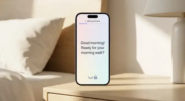
Context-based personal prompts are small, timely messages your app shows when a user is in a situation where the prompt is likely to help. Instead of blasting reminders at fixed times, the app uses context signals (like time, location, activity, calendar, or recent behavior) to decide when to nudge.
A few easy-to-picture prompts:
The key idea: the prompt is tied to a moment, not just a clock.
Most context-aware prompts aim for one of these outcomes:
This guide focuses on how to plan and build the app: choosing context signals, designing privacy-friendly data flows, creating a prompt engine, and delivering notifications without irritating users.
It won’t try to sell you on vague “AI magic,” or promise perfect predictions. Context systems are messy, and the win is incremental usefulness.
A good context-based prompts app should feel:
A context-based prompts app can do a lot, but your first version should do a few things extremely well. Start by choosing one primary use case (for example: “help me stay focused at work” or “help me journal consistently”), then build a small, high-quality prompt library around that.
Pick a handful of people you’re designing for and write down the moments where they’d actually welcome a nudge:
Use categories that match real intent, not features: health, focus, journaling, errands, learning. Even if you expand later, a clean set makes setup faster and recommendations clearer.
Write prompts like a supportive coach: short, specific, and easy to act on.
Default to fewer prompts than you think. A practical starting point is 1–3 prompts/day, a cooldown window (e.g., no repeats within 3–4 hours), and a weekly cap per category. Make “pause prompts for today” easy to access.
Your app gets “context” from signals the phone can sense or infer. The goal isn’t to collect everything—it’s to pick a small set that reliably predicts when a prompt will feel helpful.
Time: morning/evening routines, end-of-day reflection, weekly check-ins.
Location: “arrived home” journaling, “at the gym” motivation, “near grocery store” shopping reminder.
Motion / activity: walking vs. driving vs. stationary helps you avoid interrupting someone at the wrong moment.
Device state: screen on/off, Do Not Disturb, battery level, headset connected—great for delivering prompts when the user is available.
Calendar: before/after meetings, commute windows, travel days.
Weather (optional): rainy-day mood prompts, outdoor habit nudges, but treat as a bonus rather than a core dependency.
To keep scope realistic, define a minimal set you can ship confidently:
This split helps you avoid complex logic before you’ve validated that users even want context-based prompts.
Mobile OSes limit background work to protect battery. Design for:
Be careful not to infer or label sensitive attributes (health status, religion, identity, relationships) from context. If a signal could imply something personal, either don’t use it, or make it strictly opt-in with clear wording and an easy off switch.
Privacy isn’t a checkbox for a context-aware mobile app—it’s a core product feature. If people don’t feel safe, they’ll disable permissions, ignore prompts, or uninstall. Design your app so it works with the least data possible and makes control obvious.
Start with zero optional permissions and earn access as the value becomes clear.
Prefer on-device processing for context detection and prompt selection. It reduces sensitive data leaving the phone, works offline, and feels more trustworthy.
Server processing can help with cross-device sync, advanced analytics, and improving prompt ranking, but it increases risk and compliance overhead. If you use the server, send derived signals (e.g., “commute=true”) rather than raw trails (e.g., GPS coordinates), and avoid storing anything you don’t need.
Plan user controls from day one:
Add a simple retention rule: store only what you need, for as long as needed. For example, keep raw events for 7–14 days for debugging, then keep only aggregated preferences (like “prefers evening prompts”)—or delete entirely if the user opts out.
A context-based prompts app lives or dies by its data model. If you keep it simple and explicit, you’ll be able to explain “why did I get this prompt?” and debug odd behavior without guesswork.
Treat every detected signal as an event your app can reason about. A minimal structure might include:
arrived_home, walking, calendar_meeting_start, headphones_connectedYou can also store small metadata (e.g., location label “Home”, motion “Walking”), but avoid logging raw GPS trails unless you truly need them.
A rule connects context to a prompt. Model rules so they can be evaluated the same way every time:
Add an enabled flag and a snoozed until field so user actions translate cleanly into state.
Keep personalization separate from rules so users can change behavior without rewriting logic:
Context can be missing (permissions denied, sensors off, low confidence). Plan fallbacks such as:
This model gives you predictable behavior now and room to grow later.
The prompt engine is the “brain” that turns messy real life into a timely, helpful nudge. Keep it understandable and deterministic enough that you can debug it, while still feeling personal.
A practical flow looks like this:
Even good prompts become annoying if they’re too frequent. Add guardrails early:
Start simple, then evolve:
Every delivered prompt should carry a short “Why am I seeing this?” line. Example: “You usually reflect after workouts, and you finished one 10 minutes ago.” This builds trust and makes user feedback (“less like this”) actionable.
An on-device-first architecture keeps context detection fast, private, and dependable—even when the user has no signal. Treat the cloud as an add-on for convenience (sync) and learning (aggregated analytics), not as a dependency for core behavior.
All of this should work without login.
Keep the server thin:
When there’s no network:
When connectivity returns, a background sync uploads the queued events and resolves conflicts. For conflicts, prefer last-write-wins for simple preferences, and merge for append-only data like prompt history.
Use OS-native schedulers (iOS BackgroundTasks, Android WorkManager) and design for batching:
Sync what improves continuity, not raw sensor data:
This split gives users a consistent experience across devices while keeping the most sensitive context processing on-device.
A context-based prompts app only works if it feels effortless. The best UX reduces decisions at the moment a prompt arrives, while still letting users shape what “helpful” means over time.
Design the home screen around today’s prompts and quick follow-through. A simple structure works well:
Keep each prompt card focused: one sentence, one primary action. If a prompt needs more context, hide it behind “Why am I seeing this?” rather than showing it by default.
Avoid onboarding that feels like a questionnaire. Start with a small set of defaults, then offer an Edit Rules screen that looks like everyday app settings:
Name rules in plain language (“After work wind-down”) instead of technical conditions.
Add an Activity Log that shows what fired, when, and what the app detected (“Prompt sent because: arrived at gym”). Let users:
Include readable text sizes, high-contrast options, large tap targets, and clear button labels. Support reduced motion, avoid relying on color alone, and ensure key flows are usable with screen readers.
Notifications are where a helpful prompts app can quickly turn into a nagging one. The goal is to deliver the right prompt at the right moment—and make it effortless to ignore when the moment isn’t right.
Start with the least intrusive option and only escalate when it genuinely improves the experience.
A good rule: if the prompt can be decided on-device, send it as a local notification.
Add a few high-impact controls that prevent annoyance more than they reduce engagement:
Make these controls accessible from the first prompt experience (“Too many? Adjust frequency”) so users don’t need to hunt through menus.
Notification text should answer three questions fast: why now, what to do, and how long it will take.
Keep it short, avoid guilt, and use verbs that invite action:
If you can’t explain “why now” in a few words, it’s often a sign the trigger is too weak.
A tap should never drop users onto a generic home screen. Deep link directly to the relevant prompt, pre-filled with the detected context and an easy way to correct it.
For example: tap notification → Prompt screen with “Triggered by: Arrived at gym • 6:10pm” plus actions like Do now, Snooze, Not relevant, and Change this rule. That last option turns irritation into a clean feedback signal for your personalization loop later.
Personalization should feel like the app is listening—not guessing. The safest path is to start with clear rules, then let users steer improvements through lightweight feedback and simple settings.
After a prompt, offer quick actions that take one tap:
Keep the wording plain and show immediate results. If someone taps “Not helpful,” don’t force a long survey. A small optional follow-up like “Wrong time” or “Wrong topic” is enough.
Use feedback to tune rules and ranking in ways you can describe. Examples:
When changes happen, make them visible: “We’ll show fewer work prompts before 9am” or “We’ll prioritize shorter prompts on busy days.” Avoid hidden behavior that shifts unpredictably.
Add a small “Preferences” area with controls for:
These settings act as a clear contract: users should know what the app is optimizing for.
Don’t infer sensitive traits (health, relationships, finances) from context data. Only personalize in sensitive areas when users explicitly enable it, and provide an easy way to disable it without losing the rest of their setup.
Context-based prompts feel “smart” only when they fire at the right moment—and stay quiet when the moment isn’t right. Testing needs to cover both: correctness (did it trigger?) and restraint (did it avoid triggering?).
Start with fast, repeatable simulator tests so you can iterate without leaving your desk. Most mobile dev tools let you simulate location changes, time shifts, connectivity changes, and background/foreground transitions. Use these to validate your rules and ranking logic deterministically.
Then do real-world walks and drives. Simulators won’t capture messy signals like GPS drift, spotty cellular, or motion sensors that behave differently when the phone is in a pocket, bag, or mounted in a car.
A practical approach is to create a small “test script” for each prompt type (e.g., “arrive at gym,” “commute begins,” “evening wind-down”) and run it end-to-end on actual devices.
Context systems fail in boring, predictable ways—so test those early:
The goal isn’t perfect behavior—it’s sensible behavior that never surprises or annoys.
Instrument outcomes so you can tell whether prompts are helping:
These signals help you tune your ranking and throttling without guessing.
Even an MVP should include basic crash reporting and startup/performance metrics. Context detection can be battery-sensitive, so track background CPU/wake-ups and ensure your app stays responsive when triggers evaluate in the background.
An MVP for a context-based prompts app should prove one thing: people will accept timely prompts and act on them. Keep the first release narrowly focused so you can learn quickly without shipping a maze of settings.
Aim for a small set of prompts, a few context signals, and clear user control:
Start with value, not permissions. In the first screen, show a realistic example notification and the benefit (“Short prompts at the moments you choose”). Then:
If you’re trying to validate the experience quickly, a vibe-coding platform like Koder.ai can help you prototype the core pieces (prompt library UI, rules editor, activity log, and a thin backend) from a chat-driven spec—then iterate on copy and guardrails without rebuilding everything from scratch. It’s especially useful for getting a React-based web dashboard (for internal testing), a Go + PostgreSQL backend (for sync/remote config), and exportable source code you can hand off to a mobile team once the MVP behavior is proven.
Your screenshots and copy should reflect what the app actually does on day one: how many prompts per day, how easy it is to snooze, and how privacy is handled. Avoid implying perfect accuracy; describe controls and limits.
Ship analytics that respects privacy: counts of prompts delivered, opened, snoozed, disabled, and time-to-action. Add an in-app “Was this helpful?” after a few uses.
Plan weekly iterations for defaults and prompt copy, then monthly iterations for new triggers. Use a simple roadmap: improve accuracy, expand prompt library, then add advanced personalization once the core loop is working.
They’re small, timely nudges that fire when a relevant situation is detected (time, location, activity, calendar, device state, recent behavior) rather than at a fixed time.
The goal is to show a prompt when it’s most likely to be useful—like right after a meeting ends or when you arrive home.
Start with one primary goal (e.g., consistent journaling or better focus), then build a small prompt library around “help moments” where a nudge is genuinely welcome.
A tight first version is easier to tune, test, and explain to users.
Prioritize signals that are reliable, low-battery, and easy to explain:
Treat weather and other extras as optional bonuses.
Use strict guardrails from day one:
Default to fewer prompts than you think; users can always turn it up.
Prefer on-device processing for detecting context and selecting prompts. It’s faster, works offline, and keeps sensitive data from leaving the phone.
If you add a server for sync or analytics, send derived signals (e.g., “commute=true”) instead of raw location trails, and keep retention tight.
Ask for the minimum permissions, only when a feature needs them (“just-in-time”), and explain the benefit in one sentence.
Include clear controls like:
Design so the app is still useful with limited permissions.
Model three things explicitly:
Keeping these separate makes behavior predictable and makes “Why did I get this?” easy to answer.
Use a deterministic flow:
Add a short “Why am I seeing this?” explanation to build trust and support debugging.
Match the channel to urgency and intrusiveness:
Deep-link taps directly to the exact prompt with context and quick actions (Do, Snooze, Not relevant, Change rule).
Test both correctness and restraint:
Measure quality signals like open rate, snoozes, disables, and “Helpful/Not helpful” feedback—not just whether a trigger fired.