Jul 26, 2025·8 min
How to Build a Mobile App for Daily Learning Notes
Plan, design, and launch a mobile notes app that supports daily learning with quick capture, tags, reminders, sync, and privacy-first features.
Plan, design, and launch a mobile notes app that supports daily learning with quick capture, tags, reminders, sync, and privacy-first features.
Before you sketch screens or choose tools, get specific about what this app is meant to do for someone—and what it is not. A daily learning notes app is less about writing long documents and more about capturing small insights reliably, then turning them into memory.
A “daily learning journal” can serve a few clear groups, each with different expectations:
You don’t need to build for everyone at once—pick a primary user and make the default experience feel tailored.
The main promise should be simple: open the app and record today’s learning in under 30 seconds. That means the default note should be lightweight (a few lines, maybe a prompt), and the app should reduce friction:
Daily notes only matter if they’re easy to revisit. Aim for three outcomes:
Write down measurable success criteria early so product decisions stay focused. Examples:
If your success metric is “users capture one learning daily,” you’ll prioritize speed and reliability over complex formatting—exactly the trade-off a focused app should make.
Before you design screens or pick features, map the everyday situations your app must support. User stories keep you focused on outcomes (“I captured it”) instead of UI details (“I tapped three buttons”). For a daily learning journal, prioritize speed, clarity, and retrieval.
1) Quick Add (capture-first)
This flow is for “I’m in the hallway” moments: open app → cursor ready → type (or voice) → optional single tap for a tag → save automatically. Avoid extra decisions and fields.
2) Full Entry (reflect-and-structure)
This is for end-of-day sessions: create note → add title → add tags → highlight key takeaway → optional attachment/formatting → set reminder or review date. The goal is richer context without feeling like homework.
3) Find & Use (retrieval-first)
Home/search bar → results list → filter by tag/date → open note → quick actions (edit, add tag, pin, mark reviewed). This flow directly addresses messy notes and hard-to-find info.
Support adjustable font size, clear contrast, large tap targets, and voice input for capture. Also ensure search and tagging work well with screen readers and keyboard navigation where applicable.
Your data model is the “contract” your app keeps with users: what a note is, what can be attached to it, and how it stays searchable and reliable over time. A clear model also reduces painful migrations later.
For a Note, common fields include:
For Reminder: scheduled_time, timezone, repeat rules, and completion status.
Notes and tags are typically many-to-many: one note can have many tags, and one tag can belong to many notes. Implement this with a join table/collection (e.g., NoteTag).
Attachments are usually one-to-many from Note → Attachment.
Review Sessions are often one-to-many from Note → Review Session (each review creates a record).
Sync the data that defines the note (text, tags, reminder metadata). Store heavy binaries (attachments) locally first, then upload in the background.
Keep some items local-only by design: full-text search index, temporary drafts, and caches. This keeps the app fast offline while still syncing the user’s actual content reliably.
A daily learning notes app feels simple when the structure is predictable: one place to write today’s note, one place to find things later, and one place to review. Before drawing UI screens, decide the small set of “jobs” the app must support every day—capture, recall, and reflect.
A four-tab layout is usually enough and keeps people oriented:
This keeps “writing” one tap away while still making retrieval and reflection first-class.
Start with a small, complete set of screens that covers the main flow:
Show today’s note at the top (or a big “Start today’s note” button if empty), then recent notes for quick context, plus quick actions (new note, add checklist item, add tag, set reminder).
A lightweight template reduces blank-page friction. Include prompts such as:
Decide early whether you support Markdown or rich text. Either way, nail the basics: headings, bullet lists, checklists, and a clear save state. Keep formatting controls minimal.
A read-friendly view with metadata (date, tags, reminder) and a single obvious edit button.
Define where creation happens (Today vs. global “+”), how back navigation works, and what the empty states say. These details shape the whole app more than fancy visuals.
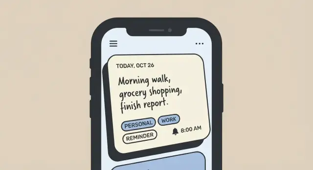
The note creation screen is where your app either becomes a daily habit or gets ignored. Optimize for speed, clarity, and the feeling of “I can finish this in seconds,” while still supporting richer notes when the user has time.
Make “New note” reachable in one tap from anywhere (a floating button, a persistent tab, or a long-press shortcut).
Keep required fields to a minimum—ideally none beyond the note body. Title can be optional and generated automatically (first line, date, or a short summary). Default the cursor into the text area, show the keyboard immediately, and autosave continuously so users never worry about losing a thought.
A practical layout for daily learning notes:
Tags are only useful if adding them is frictionless. Provide:
Make tags selectable chips so users can tap multiple quickly. Avoid forcing tag management during capture—editing/merging tags can live elsewhere.
Support common additions: images, PDFs, and links. Keep the attach flow consistent (one button, then choose type).
Define a storage limits strategy early. For example: compress images by default, cap per-note attachment size, and show a friendly warning before hitting limits. If you offer cloud backup later, make it clear what’s stored locally vs. synced.
Users will want control over their knowledge. Offer export/share from the note menu:
If you nail fast capture, painless tagging, and dependable attachments, the rest of the app becomes easier to love.
A daily learning journal is most valuable when you can capture notes anywhere—on a commute, in a basement classroom, or during a quick break. Treat offline as the default: the app should open instantly, show your latest notes, and let you create, edit, tag, and search without waiting for a network.
Store changes locally first (a local database works well) and mark them as “pending sync.” The UI should assume success: let users keep writing, even if the internet drops mid-edit. When connectivity returns, sync should happen quietly in the background.
Decide early whether you support:
Be explicit in onboarding and settings. Surprises around sync are a trust-killer.
Conflicts happen when the same note is edited on two devices before syncing.
Sync should be event-driven and polite: batch changes, avoid constant polling, and schedule work when the OS allows it (e.g., after the app is opened, when the device is charging, or on Wi‑Fi if the user prefers). Provide a clear “Sync now” action plus visible status like “Last synced 10 minutes ago.”
A daily learning journal only works if you can reliably pull up the right idea when you need it. Search and organization aren’t “nice to have” note-taking app features—they’re what turn a pile of notes into a usable mobile notes app.
Start with full-text search across note titles and bodies, and include tags in the same query so users don’t have to guess where something was stored.
Aim for:
People often remember when they wrote something, what topic it belonged to, or how important it felt. Add simple filters that map to those mental shortcuts:
Pair filters with sorting options that support review habits:
Search should stay fast even as the note database grows. Plan an indexing strategy early: index commonly queried fields (title, body, tag names, updated date, favorite flag). If you support offline first notes, keep the search index on-device so results don’t depend on connectivity.
Caching matters too. Cache recent searches and the last result set so users can jump back instantly. Also precompute lightweight “preview” text (first N characters without formatting) to avoid heavy rendering while scrolling.
When done well, search and organization make cloud sync notes feel invisible—your content is simply there, quickly findable, and ready to review.
A daily learning notes app gets real value when it helps people return consistently—without turning into a guilt machine. Reminders, streaks, and review workflows should be lightweight, optional, and easy to tune.
Let users pick a reminder time and make timezone handling explicit. Store reminders in a “local time + timezone” format so travel doesn’t break routines. Include practical controls:
Also support “nudge later” actions (e.g., remind me in 1 hour) so people can keep their intent without being interrupted.
Streaks can motivate some users and stress others. Make them opt-in and frame them as progress, not punishment. Keep configuration minimal:
Avoid leaderboards or complex gamification unless your audience asks for it.
Add a review loop so notes don’t vanish into storage. Two approachable options:
Write notifications like a friendly assistant:
Keep language specific, allow easy snooze, and always include an off switch.
Your tech stack should match your team’s skills and the product’s must-haves: fast note capture, offline reliability, and safe syncing. Picking tools you can ship with (and maintain) beats chasing the newest framework.
Native (Swift for iOS, Kotlin for Android) is a strong choice if you want the best platform feel, top performance, and deep OS integrations (widgets, share sheets, background tasks). The tradeoff is building everything twice.
Cross-platform (Flutter or React Native) can speed up development with a shared codebase and consistent UI. It’s especially attractive for a notes app because most screens are form-and-list driven. The tradeoff is that some platform-specific features may require custom native modules.
A practical rule: if you have one small team and need to launch quickly on both platforms, start cross-platform. If you already have iOS/Android specialists or you depend heavily on platform-only features, go native.
For offline-first notes, local storage is not optional.
If you offer cloud sync, plan for:
Use a clear structure like MVVM or Clean Architecture so UI, storage, and sync don’t get tangled. Keep “note editing” logic independent from screens, and hide database/network details behind simple interfaces. This makes it easier to add features like tags, reminders, and encryption later without rewriting the app.
If your goal is to validate the UX quickly—capture flow, tagging UI, search, and basic sync—you can prototype an MVP with a vibe-coding platform like Koder.ai. Instead of assembling the entire pipeline manually, you can describe screens and flows in a chat interface and iterate rapidly.
Koder.ai is particularly useful when you want a modern, production-oriented stack without spending weeks on scaffolding:
It also supports source code export, deployment/hosting, custom domains, snapshots, and rollback—handy while you’re refining requirements and testing what users actually do in a daily learning journal.
Security and privacy are easiest to get right when they’re part of the first draft—not a patch after you’ve shipped. A daily learning notes app often contains personal reflections, work details, and routines, so users need to feel safe the moment they start typing.
Start by deciding how people will access their notes.
A practical approach is to support device-only mode from day one, and let users add an account later when they want sync.
Assume devices can be lost or borrowed. Protection at rest should include:
Be clear about what app lock does and doesn’t do. It prevents casual access, but it’s not the same as encrypting each note with a secret only the user knows.
Any time notes leave the device, protect them with TLS (standard secure connections). If you’re considering end-to-end encryption, weigh tradeoffs early:
Keep your privacy posture simple and visible:
Getting these decisions right early reduces risk, builds trust, and keeps future features from accidentally weakening privacy.
Quality is mostly about trust: users must feel safe writing a thought quickly and finding it later, even if their phone is offline, low on space, or switching time zones.
Focus your test suite on the actions people do every day:
Automate these flows with UI tests where possible, and back them up with unit tests for parsing, indexing, and sync conflict rules.
A notes app fails in unglamorous situations, so simulate them intentionally:
Make sure reminders and streak logic doesn’t double-count or skip days when time changes.
Define an analytics plan that tracks feature use while protecting privacy:
note_created, search_used, reminder_setSet up crash reporting early so you can fix real-world issues quickly. Add basic performance monitoring for slow app starts, lag when saving, and search time. Treat every crash in the note editor or sync pipeline as a top-priority bug, because it directly affects user confidence.
A good launch is less about a big splash and more about making sure new users succeed in their first five minutes. Plan for a small, controlled beta first, then expand once the basics feel smooth.
Focus your beta on the moments where people typically drop off:
Keep beta feedback structured: ask 3–5 questions after a week of use (not after the first session).
Treat store assets like part of the product:
Add a lightweight in-app feedback option (thumbs up/down on key moments, plus “Tell us what happened”). Publish short update notes inside the app so users see progress.
For prioritization, bias toward what improves retention: anything that helps users create notes faster, find them reliably, and trust sync. Use requests as input, but decide based on patterns—especially recurring friction in week-one usage.
Start by picking a primary user (students, self-learners, or professionals) and writing one clear promise, such as: “Capture today’s learning in under 30 seconds.” Then define 2–3 measurable success metrics like 7/30-day retention, days per week with a saved note, and % of sessions that end with a saved note.
Treat Quick Add as the default: open app → cursor ready → type/voice → optional tag → autosave. Remove decisions (no required title, minimal fields) and use smart defaults like today’s date and last-used tags.
Design these first:
Start with a small set of core entities:
A simple four-tab structure is often enough:
“Writing” should always be one tap away.
Pick one early and commit, because it affects editing, export, and rendering:
Whichever you choose, nail basics like lists, checklists, and a clear save/autosave state.
Use an offline-first approach:
This keeps capture reliable even with flaky networks.
For notes, avoid silent overwrites:
Ship full-text search early and make it fast:
Index commonly queried fields and keep the search index on-device for offline speed.
Keep habit features gentle and optional:
Always include an off switch for notifications and gamification.
Keep it extensible, but ship the minimum fields first.