Sep 11, 2025·8 min
How to Build a Mobile App for Digital Warranty Storage
Step-by-step guide to plan, design, and build a mobile app for storing warranties and receipts with scanning, reminders, secure storage, and cloud sync.
Step-by-step guide to plan, design, and build a mobile app for storing warranties and receipts with scanning, reminders, secure storage, and cloud sync.
A digital warranty app exists because people don’t lose important paperwork once—they lose it repeatedly, in different places. Receipts fade, warranty cards get tossed with packaging, and confirmation emails end up buried under years of promotions. Then a screen cracks, a vacuum stops working, or a return window is about to close, and suddenly you’re hunting across drawers, photo galleries, inboxes, and retail accounts.
The core pain isn’t “documents are hard.” It’s that proof of purchase and warranty details are scattered, time-sensitive, and often needed under stress.
A good warranty storage app makes a simple promise:
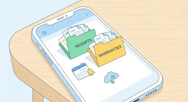
This is not just “cloud storage.” It’s a purpose-built system for proof + dates + fast retrieval.
You’ll get the most value if you regularly buy, own, or manage items with warranties and return periods:
These situations happen often and should guide your product decisions:
If your app helps users get from “something broke” to “here’s the right document and the deadline” in under a minute, you’ve solved the real problem.
Before you pick features or screens, decide what success looks like for the first release. A digital warranty app wins when it removes friction: people should be able to capture a warranty the moment they buy something, without thinking.
Make a single, measurable promise for the core experience: a user can save a warranty (receipt + basic product info + end date) in under 30 seconds. This goal should shape every decision—camera flow, form fields, defaults, and what can be postponed.
To support that goal, define what counts as “saved.” For an MVP, it might mean: one document image stored, key fields extracted or entered, and a reminder scheduled.
For the MVP, focus on the shortest path from purchase to a searchable record.
MVP (“done”):
Later versions: product registration, multi-document bundles (manual + serial plate), sharing with family, advanced categorization, extended warranty tracking.
Be explicit about what the app supports on day one—e.g., electronics, appliances, furniture, and tools—so your labels, defaults, and examples feel tailored (serial number hints for electronics, model number hints for appliances, etc.).
Pick a small set you’ll review weekly:
These metrics keep the team aligned and prevent “feature creep” from replacing the core value.
Picking features is where a warranty app either stays delightfully simple or turns into a cluttered file cabinet. Start with what users do most often: capture proof of purchase, find it quickly, and get help before coverage expires.
Add a warranty should be fast: product name, retailer, purchase date, warranty length, and optional serial number.
Store the receipt as a photo/PDF plus key extracted fields (date, total, store) so it’s searchable later.
Search should match how people remember things. Support search by product name, brand, retailer, and “where did I buy this?”-style filters. A simple tag system (e.g., Kitchen, Tools, Baby) beats deep folder trees.
Reminders are the payoff: warranty expiration, return window, and “register your product” nudges. Let users choose timing (e.g., 30/7/1 days before) and silence reminders per item.
Export/share should produce something a support agent accepts: share a single warranty packet (receipt + warranty card + notes) as a PDF, or send via email/messages.
Product registration links can be stored per item (manufacturer URL + required fields checklist). If you support extended warranty tracking, keep it simple: provider, plan ID, start/end dates, and claim phone number.
People often need proof at a store counter with weak signal. Cache “critical docs” locally: the receipt image/PDF preview, warranty end date, and claim instructions. When offline, allow viewing and sharing; queue uploads until the connection returns.
Use readable typography (avoid tiny metadata text), strong color contrast for dates/status labels, and large tap targets for scan/share actions. Support voice input for product name/notes where the device allows it, and don’t rely on color alone to indicate “expiring soon.”
A digital warranty app is only as useful as the information it can retrieve quickly. A clear data model helps you support scanning, search, reminders, exports, and future features without constantly migrating messy fields.
Start with an Item (the thing the user owns) and attach documents that prove purchase and coverage. Keep fields structured where you’ll want filtering or reminders, and keep free-form text for notes that don’t fit cleanly.
Item fields (structured): product name, brand, model, serial number, purchase date.
Why: these fields power search (“Samsung fridge”), de-duplication (serial number), and warranty start calculations (purchase date).
Store warranty details separately from the item so you can handle multiple warranties per item (manufacturer + extended plan).
Warranty fields: duration, start date, coverage notes, provider contact.
Why: duration + start date enable reliable expiration dates. Coverage notes help users answer “Is the battery included?” Provider contact puts support one tap away.
Users trust the app when it preserves evidence.
Attachments: receipt images/PDFs, warranty cards, manuals.
Why: OCR can miss details, but the original file is the source of truth. Store attachment metadata too (type, created date, page count) for faster previews and filters.
Add lightweight metadata that improves browsing without forcing users to fill forms.
Metadata: tags, categories, store, price, currency, location (optional).
Why: tags/categories support flexible filing (“Kitchen”, “Work gear”). Store + price help returns and insurance claims. Location is optional because it can feel sensitive—use it only if it clearly improves retrieval (e.g., “stored in garage”).
If a value drives search, sorting, filtering, or notifications, make it a structured field. If it’s mainly for human reference, keep it as a note and rely on attachments for proof.
A warranty storage app succeeds or fails on one simple promise: you can find the right document in seconds, even when you’re stressed (at a service desk, on hold with support, or packing for a move). That means your screens and flows should prioritize speed, clarity, and “I can’t mess this up” interactions.
Start with a small set of screens that cover 90% of user needs:
Avoid feature clutter on the Home screen. Home should answer: “What do I need right now?” and “Where is my stuff?”
The most important flow is adding a receipt or warranty. Keep it predictable:
Photo → Crop → OCR → Confirm → Save
If OCR fails, don’t dead-end. Save the image anyway and allow manual entry later.
People don’t remember filenames. They remember context.
Repairs often require multiple files. Add an action like Share → Generate PDF package that bundles:
Then allow email or messaging share. This single feature can turn your app from “storage” into “support-ready,” especially for users dealing with repair centers.
Scanning is the make-or-break moment for a digital warranty app. Users will try it at a kitchen counter, in a car, under warm lighting, with curled paper and shiny ink. If capture is slow or the results look wrong, they’ll stop trusting the app.
Start with a camera experience that “just works” without requiring photography skills.
For warranty storage, perfect transcription isn’t required. What users actually search and filter by is usually a small set:
Build your OCR step to return both the extracted value and a confidence score, so the UI can decide what must be reviewed.
Assume OCR will be wrong sometimes. Provide a quick edit screen with:
The goal is a fast confirmation flow, not a spreadsheet.
Not every receipt starts on paper. Add:
Treat all sources the same after ingestion: normalize the image/PDF, run OCR, then route to the same review screen for consistency.
Reminders are the part of a digital warranty app that users feel every day—so they need to be helpful, not noisy. Treat reminders as a user-controlled feature with clear defaults, easy editing, and predictable timing.
Start with a small set of high-value reminder types:
A simple rule: reminders should be tied to a specific item (product + receipt/warranty document) and be editable from that item’s detail screen.
Give users clear settings rather than hiding them behind OS prompts:
Keep a per-item override (e.g., silence reminders for low-value items) so users don’t have to choose between “all” and “nothing.”
Dates are surprisingly fragile. Store expiration dates in an unambiguous format (e.g., ISO date plus time zone rules), then display them in the user’s locale (MM/DD vs DD/MM). Be careful around daylight savings changes—schedule reminders for a safe local hour (like 9:00 AM) instead of midnight.
For users who live in their calendar, offer “Add to calendar” on the warranty screen. Create an event for the expiration date (and optionally the return-window deadline), with a short title like “Warranty ends: Dyson V8.” Don’t require calendar access for core app functionality.
A warranty app is only useful if people can trust that their documents won’t disappear when they switch phones, reinstall the app, or use a second device. That trust starts with clear account choices and predictable syncing.
Most people want to scan a receipt immediately, without making decisions. Consider offering guest mode for quick capture, then gently prompting users to create an account when they try to sync, add reminders, or save multiple documents.
If you require sign-in from the start, make it frictionless: “Continue with Apple/Google” plus email. Whatever you choose, explain the tradeoff in one sentence: guest mode is faster, accounts protect data across devices.
Sync problems usually show up when someone edits the same warranty on two devices: they change the product name on their tablet, then update the expiration date on their phone.
Set a clear, user-friendly rule:
Also communicate syncing status: “Saved on device” vs “Synced to cloud.” For a document app, that tiny label reduces anxiety.
People reinstall apps after phone repairs, upgrades, or lost devices. Build a restore flow that’s boring (in a good way): sign in, choose what to restore, and confirm.
Include these cases in your plan:
If you support guest mode, consider an optional “Export backup” (e.g., a local file) for users who never create accounts.
Receipts and PDFs can get large fast. Set practical caps (for example, maximum pages per document and a max MB per attachment), and apply automatic compression for photos while keeping text readable.
Be transparent: show remaining storage, warn before hitting limits, and offer a path to upgrade or clean up (e.g., delete duplicate scans).
Receipts and warranty PDFs can reveal more than people expect—names, emails, partial card details, home addresses, even store locations. Treat this data like personal paperwork: store only what’s needed, protect it by default, and make privacy choices easy to understand.
Use TLS for all network traffic so uploads, downloads, and sync can’t be read on public Wi‑Fi. On the storage side, encrypt documents “at rest” (in the database/object storage and in any server backups). If you generate thumbnails or OCR text, encrypt those too—leaks often happen through secondary copies.
Rely on device-level encryption, but also offer an in-app lock with PIN and/or biometrics. Make it optional, but easy to turn on during onboarding. For extra safety, hide document previews in the app switcher and lock sensitive screens after a short period of inactivity.
Don’t ask for a full profile if you can avoid it. For many apps, an email is enough for account recovery. If you store product serial numbers or purchase prices, explain why and allow users to delete items (and their OCR text) permanently.
Request permissions only when needed (camera when scanning, photos when importing, notifications when setting reminders). In the pre-prompt screen, clearly explain the benefit: “Scan receipts faster,” “Import warranty PDFs,” “Get reminders you control.” Provide a fallback path when a permission is denied (manual entry, upload later, or reminders via email).
Your tech stack should match the product’s “shape”: lots of document capture, reliable search, and safe syncing across devices. Aim for boring, proven choices—especially for storage and authentication.
If you need the best camera capture and the smoothest document UI, native (Swift/Kotlin) is hard to beat.
If you need to ship faster with one codebase, cross-platform is usually the sweet spot:
A practical approach is cross-platform for most screens + native modules for camera/OCR performance hot spots.
If you want to validate the MVP quickly (flows, data model, reminders, and sharing) before investing in a full engineering cycle, you can also prototype this kind of app on Koder.ai. It’s a vibe-coding platform where you build web, backend, and mobile apps through chat—useful for generating a working baseline (for example, Flutter for mobile screens, and a Go + PostgreSQL backend) that you can iterate on, export as source code, and later productionize.
Use a layered model:
Keep documents offline-first: users should still find warranties in a basement or at a store counter.
Many apps start with on-device OCR, then offer “improve text” via cloud OCR when users opt in.
You’ll want lightweight tools from day one:
Design the architecture so these tools can evolve without rewriting the app core.
Testing a digital warranty app isn’t just about “does it crash?” You’re verifying that scanning, text recognition, and reminders behave predictably across messy real-life conditions—crumpled receipts, glare, and time zones.
Start with the most important journey: Add warranty → extract key fields → save → find later.
Track an accuracy score (for example: “% of scans where purchase date and merchant are correct without edits”). Repeat tests after every OCR model or camera change.
Search is where users notice mistakes fastest.
Also verify that undo/edit flows don’t create duplicates or lose attachments.
Receipts are image-heavy, so performance needs explicit checks.
Set measurable targets such as “list opens in under 1 second with 500 items” and “scan screen opens without lag,” and test on at least one older device model.
A warranty storage app can feel “done” when scanning works on your phone—but launch success depends on everything around that moment: onboarding, store assets, support, and what you measure after users arrive.
Aim for a first session that takes under a minute.
Include a sample item (a mock receipt + warranty card) so people can explore without permission prompts or personal data.
Add scan tips right where they matter: good lighting, fill the frame, avoid glare, and hold still for a second. Keep it skimmable.
Place privacy notes early: what’s stored on-device vs. in the cloud, how deletion works, and whether OCR text is sent to servers. This reduces hesitation before users scan their first real receipt.
Before you submit, ensure your listing answers “Why should I install this?” in seconds:
Also verify edge cases: offline startup, first-time permission prompts, and what happens if scanning fails.
Track the funnel around your core value:
Log where people abandon (especially between OCR preview and confirmation). Pair events with non-sensitive metadata like device model, OS version, and scan duration—never the receipt contents.
Use feedback and analytics to prioritize:
Ship small updates frequently, and write release notes that highlight improvements users can feel immediately.
Start by solving the “under stress” moment: users need proof + key dates + fast retrieval when something breaks or a return window is closing.
A good north-star is: get from “this item failed” to “here’s the receipt/warranty and the deadline” in under a minute.
The best early adopters are people who manage lots of purchases across places:
Design your defaults and examples around these real scenarios so the app feels immediately relevant.
For an MVP, define “saved” as: a document attached + essential fields captured + optional reminder scheduled.
Keep required fields minimal:
Everything else (serial number, model, manuals, extended plans) can be optional or postponed until later.
Use one measurable promise: a user can add a warranty in under 30 seconds.
Track a small weekly set:
These metrics help prevent feature creep from replacing the core value.
Focus on the “use it every week” set:
If any feature slows capture or retrieval, it’s likely not MVP-critical.
Store structured fields for anything you’ll filter, sort, or notify on, and keep everything else as notes.
A practical split:
Use a predictable flow and avoid dead-ends:
Key rules:
The goal is confirmation, not perfect transcription.
Treat reminders as user-controlled and item-specific:
Respectful reminders keep users opted in long-term.
Build for weak-signal store counters and basements:
Make sync status explicit (“Saved on device” vs “Synced to cloud”) to reduce anxiety.
Protect receipts like personal paperwork:
Trust is a feature—especially for documents that may include addresses or payment details.
This structure supports multiple warranties per item (manufacturer + extended plan) without hacks.