Mar 20, 2025·8 min
How to Build a Mobile E‑Commerce App: Plan, Design, Launch
A practical guide to building a mobile e-commerce shopping app: features, UX, payments, backend, security, testing, launch, and growth.
A practical guide to building a mobile e-commerce shopping app: features, UX, payments, backend, security, testing, launch, and growth.
Before you think about screens or features, get the app’s purpose clear enough that your team could repeat it from memory.
Write a single sentence that includes who it’s for and what it sells. Examples:
If you can’t write the sentence, your scope will drift.
E-commerce apps can optimize for different outcomes, and your choices will affect everything from onboarding to checkout:
Pick 1–2 primary goals and treat the rest as secondary so you don’t build conflicting flows.
Your v1 should do one thing well: let real customers browse, buy, and receive order updates. Everything else is optional until it proves its value.
A practical MVP test is: “Can we start selling within 6–10 weeks with acceptable support effort?” If not, the scope is probably too large.
Define targets before development starts:
These metrics guide what you prioritize in v1—and what you delay without regret.
A shopping app succeeds when it serves a specific group of shoppers better than existing options. Before you plan features or pick an ecommerce app tech stack, get clear on who you’re building for and why they’ll choose you.
Start with a tight definition of your ideal customer. Include practical details you can validate:
A “shopping app for everyone” usually leads to generic decisions, especially in product catalog design and merchandising.
List 5–10 direct competitors (same category) plus 2–3 indirect ones (different category, similar audience). Then read reviews in the App Store/Google Play and capture patterns:
Turn this into a simple table of strengths/weaknesses. These insights will later guide ecommerce app features and your app testing checklist.
Choose one primary differentiator and one supporting benefit. Examples:
Be specific enough that it changes real product decisions—onboarding, merchandising, checkout, promotions, or post-purchase.
Outline how orders will be fulfilled and how you’ll earn money:
Decisions here shape your margins, delivery promises, refunds, and the post-purchase experience—so confirm them early.
Choosing platforms isn’t a technical decision first—it’s a customer and budget decision. Start by looking at where your buyers already shop: iOS-heavy audiences are common in higher-income markets, while Android often dominates in many countries and price-sensitive segments. If your marketing plan focuses on one region or channel, that may narrow the choice quickly.
If you can afford it, launching on both platforms reduces friction for customers and makes paid acquisition easier. But if budget or timeline is tight, pick one platform for the first release—and design everything (brand, catalog, backend, analytics) so adding the second platform later is straightforward.
A practical option is a phased rollout: launch in a pilot region (or to a smaller customer segment), validate fulfillment, returns, and support workflows, then expand once operations are stable.
Native apps (Swift for iOS, Kotlin for Android) usually give the smoothest performance and the best access to device features (camera scanning, biometrics, Apple/Google Pay nuances). They can cost more because you maintain two codebases.
Cross-platform apps (like React Native or Flutter) can reduce development time and help you ship features faster with a shared codebase. For many shopping use cases—catalog browsing, search, cart, account—cross-platform is often a strong fit.
If your priority is speed from idea to a working MVP, teams also increasingly use “vibe-coding” platforms like Koder.ai to prototype and ship quickly from a chat-driven workflow. It can be a practical way to validate your catalog, checkout flow, and admin needs early—then export source code and continue with a traditional engineering pipeline when you’re ready.
If you’re still validating demand, consider starting with a fast mobile web experience or a PWA, then move to a native or cross-platform app once repeat purchasing and retention justify the investment. This also lets you refine product catalog design and checkout flows before committing to app store releases.
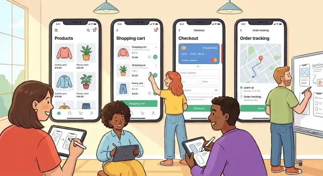
A shopping app succeeds or fails on how quickly people can find what they want, trust what they see, and complete a purchase without friction. Before visual design, define the journey in plain steps and make sure the structure of the app supports it.
Start with the “happy path” and keep it simple:
Then add the common side paths that affect conversion: editing the cart, saving items for later, checking delivery costs, and returning to the product list without losing filters.
Your navigation should make product discovery effortless. Most e-commerce apps rely on a bottom tab bar (or similar) that highlights:
Within categories, invest in filters and sorting (price, rating, size, availability), and make them easy to clear. Favorites should be one tap from any product card—many users “shop later,” and this feature keeps them coming back.
Create wireframes for key screens (home, search results, product page, cart, checkout, tracking). Wireframes help you verify hierarchy, key actions, and content density before branding, photography, and UI effects distract the team.
Set minimum text sizes, clear contrast, and consistent button styles. Ensure tap targets are comfortable (especially for “Add to cart” and checkout actions), and avoid hiding essential info behind tiny icons. Good accessibility also reduces support issues and improves conversion.
Before you choose a tech stack or start designing screens, decide what your first version must do well. The goal isn’t to cram in every idea—it’s to ship a shopping app that lets people find products, trust the details, and complete a purchase without friction.
Your catalog is the foundation of most ecommerce app features. Prioritize clear product pages and consistent data so everything else (search, recommendations, pricing) works smoothly.
Key essentials:
Many users won’t browse—they’ll search. Strong discovery usually outperforms fancy animations.
Include:
The cart isn’t only for buying—it’s also a staging area.
Make sure users can:
If you’re trying to build an ecommerce app that sells, checkout deserves extra attention.
At minimum, provide:
Your app isn’t “done” when the order is placed. The experience after checkout drives repeat purchases, ratings, and support costs.
Let people buy without hurdles. For many stores, guest checkout increases conversion because it removes a decision (“Do I want an account?”) at the worst moment.
Still, accounts are valuable—just introduce them at the right time:
Your user profile should be practical, not decorative. Prioritize:
Keep editing flows fast—customers often update details right before purchasing.
Start with self-serve, then make it easy to reach a human:
Use push notifications for events customers expect: order confirmation, shipping updates, delivery, and refund completion. For restocks or price drops, require explicit opt-in and add frequency controls—spam turns installs into uninstalls.
Checkout is where you either earn money or lose it. The goal is simple: make paying feel quick, familiar, and safe—without surprises.
Start with the basics: major credit/debit cards. Then add what your audience expects based on region and device habits—mobile wallets (Apple Pay/Google Pay), and local options where they’re common (for example, bank transfer flows, cash-on-delivery, or regional wallet providers).
A good rule: don’t make “payment method” a decision your customer has to solve. If your competitors offer two or three popular options, you should too.
Use a trusted payment provider to handle sensitive payment details and reduce your compliance burden. This also speeds up development and lowers risk. Your app should never store raw card data—no card numbers, CVVs, or magnetic stripe data—anywhere in your database or logs.
Most providers support tokenization and hosted payment components so the customer enters details in a secure flow while your app receives a token to complete the charge.
Small friction adds up on mobile. Keep forms short, use autofill, and avoid forcing account creation. Show a clear breakdown early (items, shipping, taxes, discounts) and keep it visible through the final step.
Trust signals help: recognizable payment logos, a clear returns policy link, and concise security messaging. Also make totals unambiguous—no last-second fees.
Payments aren’t always instant or successful. Plan for:
The post-payment screen should always confirm what happened (“Paid,” “Pending,” “Failed”) and what’s next. If you’re building an ecommerce app meant to scale, these details reduce support tickets and protect revenue.
A shopping app is only the visible layer. Most of the work that keeps orders flowing happens behind the scenes—where products are managed, payments are verified, and shipping labels are created.
At a minimum, plan for four building blocks:
You can buy a commerce platform (faster setup), use a headless commerce backend (more flexibility with a custom app), or build custom services (maximum control, higher cost and maintenance). A practical approach is to start with a platform/headless backend, then add custom services only where you truly differentiate—like recommendations, bundling logic, or unique fulfillment rules.
If the admin tools are weak, operations become slow and error-prone. Your admin panel should cover:
Even a simple MVP benefits from a clear integration plan:
Design these as replaceable components so you can switch providers without rewriting the app.
Security isn’t a “nice to have” for a shopping app—it protects customers, reduces chargebacks, and prevents operational headaches. The goal is to keep data safe without adding friction to buying.
Start with fundamentals that cover most real-world risks:
A common weak spot is the admin side. Use separate roles and “least access” permissions:
Also require 2FA for staff accounts and audit key actions (refunds, price changes, exports).
Collect only what you truly need to fulfill orders (shipping, contact, payment confirmation). Be clear about:
Plan for failure: backups, centralized logging, monitoring/alerts, and a simple incident response plan (who investigates, who communicates, what gets shut off).
If you process cards, align with PCI DSS (often easiest by using a compliant payment provider and not storing card data). If you sell in regulated regions, cover GDPR/CCPA basics (privacy policy, data access/deletion requests), and follow app store rules for permissions and tracking.
A shopping app can have great products and still lose sales if it feels slow or unstable. Performance isn’t something you “add” at the end—it’s a set of targets and habits you bake into design, development, and hosting from the start.
Pick a few measurable goals you can track on real devices (not just a developer laptop):
These targets make trade-offs easier (for example: fewer animations, smaller images, or simplified layouts on low-end phones).
Most e-commerce screens are image-heavy, so images are usually your biggest win:
Also consider a CDN for faster delivery and to reduce load on your servers.
Offline doesn’t mean “fully usable without internet,” but it should fail gracefully:
Traffic spikes happen: holidays, flash sales, email blasts, influencer mentions. Prepare by:
Your app is judged in seconds: does it load fast, feel stable, and let people buy without friction? Testing isn’t a final step—it’s how you protect revenue and reviews.
Cover the happy path first, then the “messy real life” situations that cause most support tickets:
Define release thresholds before you start testing so decisions are objective:
Run a simple progression:
Before submitting to the stores, prepare:
If you want fewer “big bang” releases, bake in safety mechanisms such as snapshots, quick rollback, and repeatable deployments. Platforms like Koder.ai include snapshot/rollback workflows and source code export, which can help teams iterate faster while keeping releases reversible.
The first release is your baseline. From there, you learn what helps users discover products, trust checkout, and come back—and you ship improvements in small, measurable steps.
Start with the store page: a clear title, accurate keywords, and screenshots that show the core flow (browse → product page → cart → checkout). Use short captions that explain benefits, not features.
After launch, actively earn reviews. Prompt only after a positive moment (for example, a successful delivery confirmation or a second purchase). Avoid interrupting checkout or first-time onboarding—those prompts often reduce conversions.
Install analytics before release and track the full journey:
Add events for key friction points (coupon applied, shipping calculated, address validation errors). This turns opinions into evidence: you can see whether issues are happening on specific devices, app versions, or payment methods.
Referrals, loyalty programs, and personalized offers can work well, but keep them simple and respectful. Make rewards easy to understand, set limits to prevent abuse, and be cautious with personalization—relevance matters more than frequency.
Review metrics and feedback weekly, then prioritize: fix conversion blockers first, then usability improvements, then new features. Keep a short “next release” list so you ship consistently.
If you’re deciding what to include next or need help scoping iterations, see /pricing for options.
Start with one sentence that includes who it’s for and what it sells. Then pick 1–2 primary business goals (e.g., revenue, retention, AOV, repeat purchases) so you don’t build conflicting flows.
A simple check: if the team can’t repeat the purpose from memory, the scope will drift.
A practical v1 should let real customers:
Treat everything else (advanced recommendations, loyalty, complex personalization) as optional until it proves value.
Define targets before development so prioritization is objective. Common, useful metrics:
Instrument events for key friction points (coupon errors, address validation failures, shipping cost shown) so you can diagnose drop-offs, not guess.
Choose a narrow audience definition you can validate (location, habits, price sensitivity, device behavior). Then read competitor app reviews and look for repeated pain points (navigation, search, hidden fees, checkout issues).
Turn findings into a simple strengths/weaknesses list and pick one primary differentiator (e.g., faster delivery in a region, curated selection, transparent pricing).
Base it on where your buyers are and your budget/timeline:
In general:
Decide based on your timeline, budget, and any must-have device features (camera scanning, wallet nuances, biometrics).
Make discovery and decision-making effortless:
Keep pricing consistent across list → product page → cart → checkout to avoid trust-breaking surprises.
Reduce drop-offs by making checkout fast and predictable:
Plan for edge cases like failed payments, retries, pending bank methods, duplicate taps (idempotency), and partial refunds.
Use a trusted payment provider and never store raw card data (card number, CVV) in your database or logs. Prefer tokenization/hosted payment components so sensitive entry happens in a secure flow.
Offer the payment methods your customers already use (cards first, then Apple Pay/Google Pay and relevant local methods).
Plan the “behind the scenes” parts early:
Before release, run a staged rollout and set quality gates (crash-free sessions, payment success rate, order accuracy). If you need help scoping costs and iterations, see /pricing.