Apr 07, 2025·8 min
How to Build a Mobile App for Micro‑Learning Reminders
A practical step-by-step guide to design, build, and launch a micro-learning reminder app: content model, notifications, streaks, analytics, and privacy.
A practical step-by-step guide to design, build, and launch a micro-learning reminder app: content model, notifications, streaks, analytics, and privacy.
A micro‑learning reminder app is a tiny daily practice tool: it delivers a 1–5 minute lesson, prompts the user at the right time, and makes it easy to complete (or reschedule) without guilt. The goal isn’t to “teach everything” in the app—it’s to make learning happen consistently.
Your app should help users:
Before you design screens, define a small set of metrics that match the habit you’re building:
These metrics will influence everything—from notification frequency to lesson length.
Micro‑learning apps live and die by reminders, so platform behavior matters.
Plan for an end‑to‑end structure: definition → content model → scheduling logic → notifications → UX → motivation → backend/sync → analytics → privacy → testing → launch → post‑release improvements.
Keeping this roadmap visible prevents feature drift and keeps the product focused on daily learning.
A micro‑learning reminder app succeeds when it feels like it was made for someone specific. If you try to serve “everyone who wants to learn,” your reminders, content, and progress signals become too generic to stick.
Most micro‑learning apps cluster around a few high‑value audiences:
Each group has different tolerance for notifications, different “win conditions,” and different content formats (flashcards vs. scenario questions vs. policy checkpoints).
Write use cases as real moments, not features:
Create 2–3 lightweight personas, each with a single job statement, e.g.:
“When I have a spare minute, help me review the most forgettable items so I can stay confident without planning study sessions.”
These statements guide notification wording, session length, and what “success” means.
Pick one primary promise and design everything around it:
Your promise determines product goals and metrics. For example, “consistency” cares about weekly active days and streak recovery; “mastery” cares about long‑term recall and spaced repetition performance.
A reminder app is only as good as the “unit” it reminds people to complete. If your content is too big, users postpone it. If it’s too small or repetitive, they stop caring.
Aim for micro‑content that can be finished in 30–90 seconds and still feels meaningful.
Choose a small set of formats you can execute consistently:
Limit formats early so your UI stays fast and your content team doesn’t need five different production pipelines.
A practical hierarchy keeps both navigation and analytics clean:
Topic → Module → Lesson → Item
Design items to be reusable. The same flashcard can appear in multiple lessons, or return later as a review.
Your content model should match how content gets made:
Tags make reminders feel relevant without rewriting content:
Later, these tags can drive “quick sessions,” smarter review mixes, and better recommendations—while keeping the core content model stable.
Scheduling is where a micro‑learning reminder app either becomes a helpful coach—or an annoying alarm. Treat it as product logic, not just a cron job.
Most apps start with one of three models:
A practical path is to launch with fixed schedules + windows, then add adaptive timing once you have enough behavioral data.
Simple reminders work when the goal is consistency: daily vocabulary, a short quiz, a reflection prompt.
Spaced repetition is for long‑term memory. If a user answers correctly, the item returns later; if they struggle, it returns sooner. Your logic can start basic (e.g., 1 day → 3 days → 7 days → 14 days) and evolve into per‑item intervals.
Build rules that protect attention:
Handle time zones automatically (travel shouldn’t break habits). Let users set a preferred cadence (3×/week vs. daily).
For routine detection, keep it lightweight: learn from “when they tend to complete a session” and shift the next window subtly—while offering an obvious toggle like “Use smart timing” so users stay in control.
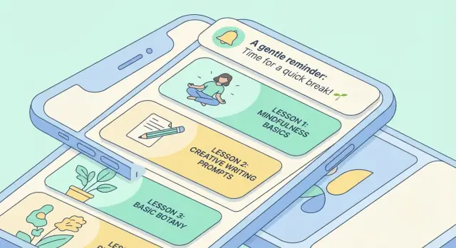
Push notifications are a privilege: users keep them on only if every message feels timely, relevant, and easy to act on. The goal isn’t “more notifications”—it’s fewer, better ones that reliably deliver the next tiny learning step.
Local notifications are scheduled on the device. They’re great for predictable daily reminders (e.g., “8:15 AM learning prompt”), work offline, and avoid server delays. The downside: if the user changes phones, reinstalls the app, or the OS limits background scheduling, reliability can suffer.
Push notifications are sent from your server (often via Firebase Cloud Messaging / APNs). They’re better for dynamic timing (e.g., “review is due now based on your schedule”), cross‑device consistency, and re‑engagement campaigns. The downside: delivery is not guaranteed (Do Not Disturb, battery restrictions), and overuse is the fastest way to get disabled.
Many micro‑learning apps use local notifications for routine habits and push for schedule changes or critical nudges.
Write copy that answers: What is it? How long will it take? What happens if I tap?
Guidelines:
A tap should land the user on the specific micro‑lesson or review card, not the home screen. Use deep links like /lesson/123 or /review?set=verbs-1 so the session starts immediately.
If the item is unavailable (deleted, synced later), fall back to the closest safe screen with a clear explanation.
Where supported (Android notification actions, iOS categories), add quick actions:
These controls reduce friction and prevent “disable notifications” moments when the timing is inconvenient.
Micro‑learning only works when the daily session feels effortless. Your UX should assume users are busy, interrupted, and often using the app one‑handed.
Design around a small set of predictable screens:
A fast session is mostly about removing tiny delays:
Assume users will get a call mid‑lesson. Save state automatically:
Use readable font sizes, strong contrast, and clear tap targets. Ensure VoiceOver/TalkBack can read the lesson content and buttons in a sensible order, and avoid relying on color alone to communicate “correct/incorrect.”
Motivation in a micro‑learning app isn’t about flashy rewards—it’s about helping users show up for 60 seconds, then leave feeling “that was worth it.” The best features support consistency while staying tied to learning progress.
Streaks can be powerful, but they shouldn’t create anxiety. Consider a “learning days” streak (days with any completed card) plus a softer “consistency score” (e.g., last 7 days) so one missed day doesn’t feel like failure.
Add gentle nudges when a streak is at risk: “2 minutes keeps your week on track.” Keep the tone supportive and avoid guilt.
Offer simple goals that fit micro‑sessions:
Let users pick (or auto‑suggest) a goal based on past behavior. If someone averages two sessions a week, a seven‑day target will backfire.
Badges work best when they reflect real learning milestones, not endless tapping:
Avoid over‑gamification like random loot or streaks that only measure app opens. Users should feel they’re getting smarter, not grinding.
People miss days. Build a recovery flow that reduces friction:
If you add sharing, keep it optional and lightweight: share a milestone badge or weekly summary, not leaderboards. The goal is encouragement, not comparison.
Your tech stack should support one key promise: a fast, reliable daily session—even when the user has spotty connection or hasn’t opened the app in a week. Choose your client approach first, then define the core modules, and only then pick the backend.
Native (Swift for iOS, Kotlin for Android) is a strong choice when you want best‑in‑class push notification handling, background scheduling nuances, and platform‑polished UX.
Cross‑platform (Flutter or React Native) can reduce cost and keep feature parity across iOS/Android. Flutter tends to deliver consistent UI performance; React Native can be faster if your team is already deep in JavaScript/TypeScript.
A practical rule: if reminder interactions are “the product,” lean native or plan extra time for platform‑specific work in a cross‑platform setup.
If you want to validate the full loop quickly (content → reminders → lesson player → analytics), a vibe‑coding platform like Koder.ai can be useful for prototyping: you can iterate through flows in a chat interface, generate a React web app or Flutter mobile app, and keep the option to export source code once the product shape is right.
Keep the app modular so reminders, learning logic, and content can evolve without a rewrite:
Firebase works well for push (FCM), analytics, auth, and quick iteration. Supabase is attractive if you prefer Postgres and SQL access. A custom API (e.g., Node/Go) makes sense when you need complex learning rules, custom billing, or strict data residency.
Design offline‑first from day one: cache lessons locally, write progress to a local store, and sync in the background. When conflicts happen (two devices), prefer “append‑only” events and resolve by timestamp/version rather than overwriting user progress.
For teams that want a conventional stack without building everything from scratch, Koder.ai commonly generates React on the front end and Go + PostgreSQL on the back end, which maps well to an offline‑first model with a clean sync API.
A micro‑learning reminder app feels simple on the surface, but the backend keeps progress consistent across devices, makes “due” reviews trustworthy, and prevents users from losing streaks when they reinstall.
Start with a small set of entities you can evolve:
Even if you use a managed backend like Firebase, define these as if you could move later. It reduces messy migrations.
Treat progress as a stream of completion events (e.g., “reviewed item X at 08:12, outcome=correct”). From events you can compute:
Storing the raw event and the derived fields gives you both: auditability (why did something happen?) and speed (show “due now” instantly).
Two common options:
For micro‑learning, an event log is usually safer: offline sessions can sync later without overwriting other progress. You can still store a “current state” snapshot per item for quick loading.
Plan lightweight tooling for:
If you build with Koder.ai, consider using planning mode to lock the data model and admin workflows before generating screens and APIs—then rely on snapshots/rollback while you iterate on schema and sync rules.
Analytics should answer one question: is the app helping people learn with less effort? That means tracking behavior end‑to‑end and pairing product metrics with simple learning signals.
Start with a small, consistent event taxonomy and resist adding “nice‑to‑have” events you’ll never use.
Track key milestones and outcomes:
lesson_started and lesson_completed (include lesson_id, duration, and whether it was scheduled or user‑initiated)reminder_sent and reminder_opened (include channel, local send time, and notification variant)answer_correct, answer_incorrect, and item_reviewed to measure learning, not just usageKeep properties human‑readable, and document them in a shared spec so product, marketing, and engineering interpret metrics the same way.
A funnel should tell you where users get stuck, not just how many users you have. A practical baseline is:
install → onboarding_completed → first_lesson_completed → day_7_retained
If day‑7 retention is weak, break it down further: did users receive reminders, open them, and complete sessions after opening?
Experiments work when they’re tied to a choice you’re willing to make. High‑impact tests for a micro‑learning reminder app include:
Define a primary metric (e.g., day‑7 retention) and a guardrail (e.g., notification disable rate).
A useful dashboard shows a few trends weekly: retention, completion rate per reminder open, and learning progress (accuracy over time or reduced time‑to‑correct). If it doesn’t change what you build next, it doesn’t belong on the dashboard.
Trust is a feature. A micro‑learning reminder app sits close to daily routines, so users need to feel confident that reminders, progress, and personal data aren’t being misused.
Start with a “minimum viable profile.” For many apps, that’s just an account identifier (or anonymous ID), learning progress, and a device token for push notifications.
Make a habit of documenting each data field:
If a field doesn’t clearly improve the learning experience, don’t collect it.
Ask for permissions in context—right before they’re needed. For notifications, explain the benefit (“daily 30‑second review reminders”) and offer choices (time window, frequency).
For analytics, avoid hiding behind legal text. Give a simple toggle:
Make these settings reachable in two taps from the main screen. If people can’t control it, they’ll disable notifications or uninstall.
Plan “end of relationship” flows from day one:
Write plain‑language summaries in‑app, then link to the full policies at /privacy and /terms.
Keep the promise consistent: what you say in onboarding, what you request in permissions, and what you do on the backend should match exactly.
Shipping a micro‑learning reminder app isn’t only about “does it work?” It’s about “does it keep working at 7:30am, every day, for everyone?” Testing and launch planning should focus on reliability, edge cases, and fast feedback loops.
Reminders are where apps quietly fail. Build a small test matrix and run it on real devices (not just simulators):
Log each scheduled notification (locally) with an ID so QA can compare “scheduled vs. delivered.”
Daily learning sessions are short, so performance matters. Run end‑to‑end QA on:
Confirm the app still opens quickly, loads today’s card, and doesn’t block the session on sync.
Your listing is part of onboarding. Prepare:
Treat release day as the start of measurement:
Ship small updates frequently, and prioritize anything that reduces missed reminders or failed sessions.
A micro-learning reminder app is a daily practice tool that delivers a 1–5 minute lesson at the right time and makes it easy to complete or reschedule.
The focus is consistency: help users do the next tiny step without planning a study session.
Define success early with a small set of habit-aligned metrics, such as:
These metrics should directly influence lesson size, reminder cadence, and UX choices.
Pick the platform based on how critical reminder reliability and iteration speed are:
If reminders are “the product,” plan extra time for platform-specific notification work.
A practical starting schema is:
Keep the Item small enough to finish in 30–90 seconds, and design items to be reusable (e.g., the same flashcard can appear in lessons and later reviews).
Choose a small set of formats you can ship consistently, such as:
Limiting formats early keeps the UI fast and avoids multiple content production pipelines.
Common approaches are:
A safe rollout is fixed schedules + windows first, then add adaptive timing once you have enough data and clear user controls (like a “Use smart timing” toggle).
Use simple reminders when the goal is consistency (do a small session daily).
Use spaced repetition when the goal is long-term memory: correct items return later; difficult items return sooner. You can start with a simple interval ladder (e.g., 1 → 3 → 7 → 14 days) and evolve into per-item intervals.
Use local notifications for predictable routines because they work offline and avoid server delays.
Use push notifications for dynamic timing, cross-device consistency, and re-engagement (but delivery isn’t guaranteed and overuse gets you disabled).
Many apps combine both: local for the daily habit, push for schedule changes or critical “due now” nudges.
Write copy that answers: what it is, how long it takes, and what happens if I tap.
Good patterns:
Always deep link to the exact next step (e.g., ), not the home screen.
Design for speed and interruption:
Also build guardrails: , , and a to protect attention.
/lesson/123