Nov 15, 2025·8 min
How to Build a Mobile App for Quick Daily Checkpoints
Learn how to build a mobile app for quick daily checkpoints: define the MVP, design fast inputs, pick a tech stack, add reminders, and measure engagement.
Learn how to build a mobile app for quick daily checkpoints: define the MVP, design fast inputs, pick a tech stack, add reminders, and measure engagement.
A “daily checkpoints” app is a tiny, repeatable moment where someone records a few signals about their day—without turning it into a long journaling session. Think of it as micro journaling with structure: short, consistent inputs that are easy to keep doing.
Daily checkpoints usually fall into a few familiar categories:
The key isn’t the category—it’s the experience: each checkpoint is quick to answer and consistent day to day.
Your app should make a clear promise: log today in under 10 seconds. That means:
If it feels like “work,” people will postpone it—and then skip it.
Define a primary routine: morning, commute, or before bed. These moments have different constraints:
Make one of these contexts your default, then ensure everything (inputs, notifications, screen brightness, copy tone) supports that context.
Most daily check-in apps fail for the same reasons:
A good daily checkpoints app reduces effort and emotional pressure—so returning tomorrow always feels easy.
The easiest way to stall a daily check-in app is trying to support every habit style at once: mood tracking, workouts, meals, hydration, reflections, goals, and more. For v1, pick one primary use case and design everything around it.
Start with one clear promise, such as: “Answer 3 questions per day in under 30 seconds.” Three questions is enough to feel meaningful, but small enough that people will still do it on busy days.
Examples of tight v1 formats:
Your MVP roadmap should include success metrics that tell you whether the product is genuinely useful, not just downloaded.
Focus on:
These metrics guide trade-offs. If time-to-complete rises, your UX for quick inputs likely needs simplification.
A few early decisions prevent weeks of rework:
Pick constraints that match your promise for a daily check-in app.
Keep a short brief visible to the whole team. Include: who it’s for, the one daily behavior you’re enabling, the “done in under X seconds” goal, and the metrics above.
When you’re unsure about a feature, the brief should make the answer obvious: does it protect speed and daily completion, or does it slow the core habit down?
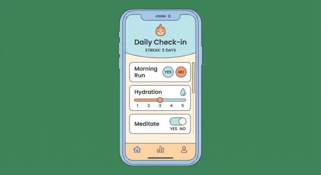
Great checkpoint design is less about fancy features and more about removing friction. A daily checkpoint should feel like answering a few quick prompts, not filling out a form.
Different questions need different inputs. Keep the set small and predictable so people can build muscle memory.
Common checkpoint types:
A useful rule: every checkpoint should be answerable in under two seconds, except optional notes.
Aim for a straight line with no decisions. When the app opens, it should immediately show today’s checkpoints in a single, scroll-light screen.
Avoid interruptions like popups, long tutorials, or “rate us” prompts during completion.
People miss days. Make skipping feel neutral so they return tomorrow.
Include a gentle option like “Not today” or “Skipped”, and never force a reason. If you ask why, make it optional and tag-based.
Notes are valuable, but they must be secondary. Offer a small “Add note” affordance after the main answers, and allow saving with zero text. The fastest path should always be: answer → done.
Speed is a feature in a daily check-in app. The best UX makes the “right” action feel effortless, even when the user is tired, busy, or distracted.
Aim for a one-screen flow where the user can complete today’s entry without navigating away. Keep the controls visible at once: questions, inputs, and a clear finish action.
Large tap targets matter more than fancy visuals. Use a thumb-friendly layout (primary controls in the lower half of the screen), generous spacing, and clear labels so users don’t have to aim carefully.
Typing is slow and mentally expensive. Prefer quick inputs:
If you allow text, keep it optional and lightweight: “Add a note (optional)” with a short field that can expand.
Users should never wonder what to do next. Put a prominent “Check in” button on the home screen, and a clear “Done” (or “Save”) action on the check-in screen.
Avoid secondary actions competing for attention; tuck settings and history behind smaller buttons.
Support dynamic text size, sufficient contrast, and screen reader labels for every input and button. Don’t rely on color alone to convey meaning (pair colors with icons or text).
When there’s no data yet, don’t add extra steps. Show a short, friendly explanation and a single action: “Do your first check-in.” Include an example entry so users instantly understand what “good” looks like.
A daily check-in app succeeds when people can open it and finish in seconds. That starts with simple navigation and a small, predictable set of screens.
Use four primary destinations:
Avoid extra tabs like “Community” or “Challenges” early on. If a feature doesn’t help someone complete today’s checkpoint, it probably shouldn’t sit in the main navigation.
A practical screen map for an MVP:
Day 1 (first success): Open app → see 1–3 checkpoints → answer → calm confirmation (“Saved”) → done. The goal is confidence, not motivation speeches.
Day 7 (forming a routine): The user expects Today to look identical each day. Keep the check-in flow stable. Put optional review (History/Insights) off the main path.
After a missed week (re-entry): Don’t greet them with failure. Show Today as normal, and place a small, non-judgmental note in History like “Last entry: 7 days ago.” Offer a single action: “Check in now.”
If you show streaks, keep them subtle:
Your tech stack should match the app’s promise: fast daily inputs, reliable reminders, and data you can trust. The best choice is usually the one your team can ship and maintain with the least risk.
Native apps tend to feel “right” on each platform: smoother animations, best keyboard behavior, and fewer odd edge cases with notifications and background work.
Choose native if you expect heavy use of platform features (widgets, deep system integrations), or if you already have strong iOS/Android developers. The trade-off is building and maintaining two codebases.
Cross-platform can be a great fit for a daily check-in app because the UI is relatively simple and consistent across devices.
Pick Flutter if you want a highly consistent UI and performance with one codebase. Pick React Native if your team is comfortable with JavaScript/TypeScript and you want to share skills with web work. The trade-off is occasional platform-specific work (especially around notifications and background sync).
If your biggest risk is time-to-first-release, a vibe-coding platform like Koder.ai can help you move from UX outline to a working prototype quickly. You describe the flow in chat (Today screen, 3 questions, reminders, History), and Koder.ai can generate a real app stack—web with React, backend in Go with PostgreSQL, and mobile in Flutter—then let you iterate in “planning mode” before changing code.
It’s especially useful for daily checkpoints because the product is defined by a handful of screens, a clean data model, and reliability features (offline queue, sync, export). You can also export source code, deploy/host, attach custom domains, and use snapshots/rollback to keep experiments safe while you tune retention.
At minimum: push notifications, analytics (to learn which screens slow people down), and crash reporting (to catch issues quickly). Treat these as first-class requirements, not add-ons.
Even a simple app benefits from a backend for user profiles, checkpoint templates, multi-device sync, and exports.
A clean data model is: definitions (questions/checkpoint templates) plus events (daily check-ins with timestamps and answers). This structure makes sync and future insights much easier.
Estimate not just build time, but ongoing maintenance: OS updates, notification quirks, and sync bugs. If your team is strongest in one stack, leaning into that often beats a “perfect” technology choice.
Your data model should make daily check-ins fast to save, easy to query for insights, and resilient when you change questions later. A clean structure also makes offline sync much simpler.
A practical starting set of entities:
This separation lets you update templates without rewriting old history, and store answers in a flexible way (text, number, boolean, single-select, multi-select).
Daily apps live or die by “what counts as today.” Store:
2025-12-26) computed using the user’s time zone at the moment of entryUse localDate for streaks and “did I check in today?” logic. Use timestamps for ordering, sync, and debugging.
Questions will change—wording tweaks, new options, new fields. Avoid breaking old entries by:
Common endpoints:
lastSyncAt, push pending local entriesCache templates and recent entries on-device so the app opens instantly and works without a connection.
A queue of “pending submissions” plus conflict rules (often “latest submittedAt wins”) keeps sync predictable.
If your app depends on a perfect connection, people will miss check-ins—and then they stop trusting the habit. Offline support isn’t a “nice to have” for daily checkpoints; it’s part of making the experience feel dependable.
Design the check-in flow so it always works, even with airplane mode on:
A simple rule: if the user can see the “Saved” state, it should be saved somewhere durable on the device.
When connectivity returns, sync should happen automatically and politely:
Be selective about sync triggers: opening the app, a short background task, or after a new check-in is usually enough.
If someone checks in on a phone and later edits on a tablet, you need a predictable rule. Common options:
For daily checkpoints, a practical approach is last write wins plus a small “Edited” indicator, and (if you allow it) keeping the previous version in an internal history for recovery.
Build trust with small touches:
A checkpoint app succeeds when people stop thinking about the app and simply rely on it every day.
Notifications are part product feature, part relationship. If they feel demanding or irrelevant, people turn them off—and they rarely come back on. The goal is to help users remember their own intent, with just enough prompting to make the daily checkpoint effortless.
Start with a small set of reminder types that cover most real-life routines:
Keep “smart” features opt-in. Many people prefer predictability.
Timing controls should be visible and easy to adjust later:
A good pattern: one primary daily reminder, plus a light backup nudge only inside the user’s chosen window.
Defaults matter more than settings screens. Aim for minimal interruption:
Also give a clear in-app path to adjust reminders. If people can’t tune them, they disable them.
Good notification text reduces decision-making. Treat it like a micro-UX surface:
Examples:
If you use multiple reminder types, vary the copy slightly so it doesn’t feel like a nagging loop.
People stick with a daily check-in app when they can quickly answer two questions: “Did I do it?” and “Is it getting easier?” For v1, keep insights simple and tightly tied to daily entries.
Start with a small set that reinforces the habit:
If you add more than a few metrics, insight screens turn into dashboards—and dashboards are slow.
Charts should be a quick glance, not a puzzle. Use:
Consider a “Show chart” toggle so the default view stays fast for people who only want to check in.
Avoid telling users why something happened. Instead, describe what changed in plain language:
Use simple, human summaries near the top:
These cues make progress feel real—without adding extra steps to the daily flow.
A daily check-in app can feel “lightweight,” but it often stores highly personal information. Good privacy design isn’t only about compliance—it’s about earning trust and reducing your own risk.
Start by writing a minimal data policy for the MVP: what you store, why you store it, and how long you keep it. If a field doesn’t directly support the core experience (saving today’s checkpoint and showing the user their history), don’t collect it.
Also be careful with “accidental data,” like detailed device identifiers, precise location, or verbose analytics events. Keep logs sparse, and avoid sending raw user text to third parties.
Consider an anonymous mode where the user can use the app without creating an account. For some audiences, local-only storage (no server sync) is a feature, not a limitation.
If you do support accounts, make it optional and explain the trade-off: convenience versus exposure.
Use HTTPS for all network traffic and pin down insecure edge cases (no HTTP fallbacks). For stored data:
If you support accounts or server sync, add settings to delete data (and actually delete it, including backups on a clear schedule). Provide export in a simple format so users can take their entries with them. Clear controls reduce support burden and build confidence.
Shipping is the start of the real work. A daily checkpoints app lives or dies on whether people can complete a check-in quickly, remember to return tomorrow, and still feel good about it a week later.
Don’t track “everything.” Track the path that matters:
If drop-off is steep between first open and first check-in, onboarding or first-run UI is the likely issue. If day 2 is weak, reminders and timing are usually the problem.
Analytics should help you answer “why,” not just “how many.” Events worth instrumenting:
Keep event names consistent and include simple properties (platform, app version, timezone offset) so you can compare releases.
Test one change at a time and decide success metrics up front. Good candidates include reminder time suggestions, notification copy, and small UI wording changes.
Avoid too many variants; you’ll dilute results and slow learning.
Simulators miss real-world issues: delayed notifications, low-power mode, flaky networks, and background restrictions.
Cover edge cases like time zone changes, daylight saving time, and crossing midnight during a check-in.
Before each release, validate crash-free sessions, notification delivery rates, and that check-ins save correctly offline and after reconnecting.
After release, review metrics weekly, prioritize one or two improvements, ship, and repeat.
A daily checkpoints app is micro-journaling with structure: users answer a small, consistent set of prompts (often 1–3) in seconds.
The goal is a repeatable daily signal (mood, energy, a habit yes/no), not a long-form reflection.
Design for a clear promise like “log today in under 10 seconds.” That usually requires:
If it feels like work, users will delay it—and then skip it.
Start with one primary routine and optimize for its constraints:
Pick one as the primary and make everything else secondary.
The most common reasons are:
Solve these with reminders, a one-screen check-in, and shame-free “Skipped/Not today” options.
Trying to support every habit style in v1 bloats setup, adds decisions, and slows completion.
A strong MVP is one tight format (e.g., 3 questions/day) that you can optimize for speed, reliability, and retention before expanding.
Use metrics that reflect whether the habit is easy and repeatable:
These guide trade-offs: if completion time rises, simplify inputs and screens.
Choose input types that are answerable in ~2 seconds:
Keep the set small and consistent so users build muscle memory.
Provide a neutral option like “Skipped” or “Not today” and don’t force an explanation.
If you ask for a reason, make it optional and tag-based. The product goal is re-entry tomorrow, not perfect streaks.
A reliable model is:
CheckpointTemplate (questions schema)Make check-ins offline-first: save locally immediately, mark as pending, and sync quietly later.
For conflicts, start with last write wins plus an “Edited” indicator. Ensure uploads are idempotent so retries don’t create duplicates.
DailyEntry keyed by localDate plus submittedAt (UTC)questionId (not display text)This supports question changes, clean sync, and simple insights without breaking history.