Dec 23, 2025·8 min
How to Build a Website for a Product Hunt–Style Launch Page
Learn how to plan, design, and publish a Product Hunt–style launch page that captures emails, explains value fast, loads quickly, and is ready for launch day.
Learn how to plan, design, and publish a Product Hunt–style launch page that captures emails, explains value fast, loads quickly, and is ready for launch day.
A Product Hunt–style launch page is a single, focused page designed to make strangers “get it” fast—and take one next step. It’s not a full website with five dropdown menus, and it’s not a pitch deck in paragraph form. Think: clear promise, quick proof, simple action.
A launch page is a lightweight marketing page built around a specific moment (Product Hunt, beta opening, new feature drop). It highlights the product’s core value, shows what it looks like, answers obvious questions, and nudges visitors to act.
It isn’t:
Your #1 job is conversion: turn visitors into an email signup, a trial, a “Get the app” click, or a calendar booking—whatever matches your product and stage.
That goal should be obvious above the fold (headline + one sentence + one button). If you have multiple equal-weight CTAs, you’re usually forcing people to decide before they understand.
Once the page has a clear next step, it should also:
Choose a launch page when you have one main offer, you’re driving traffic from a single channel (like Product Hunt), and you want a tight, measurable funnel.
Choose a full marketing site when you have multiple audiences, multiple products/plans, heavy SEO ambitions, or when buyers need deeper proof (case studies, comparisons, docs) before converting.
If you’re unsure, start with a launch page—you can expand it into a full site later without wasting your best “first impression” traffic.
Before you design anything, decide what “success” means for this page. A Product Hunt–style launch page is not a brochure—it’s a focused conversion machine. If you try to make it do five things, it will do none of them well.
Choose a single primary action and make everything on the page support it:
Once you pick it, commit: one button label, one form, one “next step.” Secondary links (like “Read docs”) should be visually quieter.
Your headline should answer, in plain language: who it’s for + the outcome + why you’re different.
A quick test: if someone reads your headline for 3 seconds and can’t explain what you do, rewrite it. Keep it specific enough to disqualify the wrong people.
List 2–3 real groups you expect on launch day, and write the #1 problem they want solved.
Example format:
This keeps your copy focused and prevents generic “for everyone” messaging.
Track a small set of numbers you’ll actually use:
You’ll use these metrics later to decide what to change first: headline, CTA, or traffic quality.
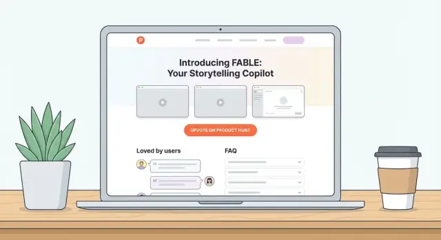
A Product Hunt–style launch page isn’t a full website. It’s a guided reading path that helps a visitor understand your value quickly and take one action (join, request access, or buy).
Start with a hero that answers three questions fast: what it is, who it’s for, and why it’s better.
Keep this area tight. If someone only reads the hero, they should still get it.
Next, walk people through the story in small, scannable chunks:
Each block should have a bold mini-heading and 2–3 sentences max.
Use a simple grid (3–6 items). Lead with benefits, then back them up with one concrete detail.
Example format: “Ship updates faster” → “One-click release notes + automatic changelog.”
Add 2–4 annotated screenshots or a short video (30–60 seconds). Place it right after the benefits so readers can confirm what you promised.
Close with:
If you need more pages, keep them lightweight and linked in the footer (e.g., /privacy, /terms, /pricing).
People skim launch pages like a feed. Your job is to make the value obvious before they scroll, hesitate, or start doubting.
Use a simple formula:
Outcome + audience + differentiator
Examples:
If your headline needs a second sentence to make sense, it’s usually too vague.
Your subhead should define the product without buzzwords:
Example:
“A simple feedback portal that collects feature requests, helps you prioritize, and keeps users updated automatically.”
Avoid generic button labels like “Submit.” Use:
Action + outcome
Examples:
Keep one primary CTA above the fold. If you add a second, make it clearly secondary (e.g., “Watch 60-sec demo”).
Real urgency works: “Early access spots for 200 testers” (only if true). Prefer clarity over pressure: “Launching on Jan 15 — join to get the invite.”
Draft small alternatives you can swap in minutes:
This makes later testing faster without rewriting the whole page.
People decide fast on a Product Hunt launch page. Your visuals should answer three questions at a glance: What is it? How does it work? Why should I care? Aim for clarity over polish—clean, readable screens beat cinematic graphics.
Choose the lightest format that still communicates the experience:
If you do video, add 2–3 key screenshots underneath so visitors who don’t press play still get the story.
Instead of dumping random screenshots, build a mini narrative:
Helpful patterns include before/after, problem → solution, or A → B → C (input, magic, output). Keep UI text legible—don’t shrink images so much that users can’t read them on mobile.
A screenshot without context is just a rectangle. Add one-sentence captions that translate features into value.
Bad: “Dashboard view.”
Better: “See every customer conversation in one place—no more switching tabs.”
Captions also help skimmers and make your page easier to understand when images load slowly.
Speed matters for a launch page website. Export images at the size they’ll display (avoid serving 4000px images into a 900px container), and compress aggressively.
Alt text should describe what’s shown and why it matters. Good alt text helps screen readers and supports SEO for landing pages.
Example: Alt: Create a Product Hunt launch page with a hero headline, email waitlist form, and social proof section.
Keep alt text specific, not spammy—use your keywords naturally only when they fit.
Your launch page only needs one “next step,” and email is usually the best one. It’s portable (not tied to any platform), easy to measure, and gives you a way to follow up before and after Product Hunt.
Decide what people get for leaving their email: a waitlist spot, beta access, a launch discount, a free template, or early feature access. Put that offer right next to the form so visitors don’t have to guess.
If you have multiple offers, choose one primary and move the rest to a secondary link (for example, “Get updates instead”).
Ask for email and, at most, one optional question (e.g., “What are you hoping to use this for?”). Every extra field reduces signups.
Add a clear privacy note under the button, like: “No spam. Unsubscribe anytime.” Link it to /privacy so it’s easy to verify.
After signup, send an automated confirmation email. If you operate in regions or industries where consent needs to be explicit, use double opt-in—just keep the email copy short and clear.
Also create a dedicated thank-you page (e.g., /thanks) instead of only showing an inline success message. That page lets you:
This is the smallest “funnel” that still feels polished: page → signup → confirmation → thank-you page → occasional updates.
Your launch page tool choice should optimize for one thing: shipping a clean, editable page without surprises on launch day. Pick the option that matches your timeline, budget, and who will maintain the page after it’s live.
No-code is the fastest path to “live and polished.” It’s ideal if you need a strong visual page, quick edits, and minimal engineering time.
Use it when:
Trade-offs: customization is limited to the platform, and some advanced performance tweaks can be harder.
A CMS works well if you’ll pair the launch page with a blog, changelog, or ongoing content. WordPress can be quick if you keep the theme and plugins simple.
Use it when:
Trade-offs: too many plugins can slow the site and increase the odds of conflicts right before launch.
A coded page gives maximum control over speed, SEO markup, and custom interactions. It’s best if you already have engineers available and a deployment workflow.
Use it when:
Trade-offs: slower to change copy unless you add a CMS; more moving parts.
If you want the flexibility of a custom build but don’t want to start from a blank repo, a vibe-coding platform can be a practical middle path.
For example, Koder.ai lets you create a launch page website (and even the surrounding app) from a simple chat: describe the sections you want (hero + benefits + screenshots + FAQ + email waitlist), iterate on copy/layout quickly, and then deploy with a custom domain. It also supports snapshots and rollback, which is exactly what you want before a Product Hunt spike—change fast, but revert instantly if something breaks.
If you outgrow the page later, you can export the source code and keep building.
Buy a short, memorable domain. Point DNS to your host (usually A/AAAA records or a CNAME), then enable SSL so the page loads on HTTPS. Most modern hosts issue certificates automatically—confirm it’s active before you share the link.
Choose hosting that’s fast, reliable, and supports instant rollbacks (or versioned deployments). On launch day, you want the ability to revert in minutes if something breaks.
Whatever stack you choose, reduce breakage risk by limiting plugins, third-party scripts, and heavy integrations. Add only what you truly need for launch, then expand after the page is stable.
A Product Hunt–style launch page has one job: get people to understand the value fast and take action. If the page is slow, awkward on mobile, or invisible in search and social shares, you lose that moment.
Treat performance as a feature. A simple checklist goes a long way:
If you only measure one thing, watch Core Web Vitals—especially LCP (how fast the main content appears).
Most Product Hunt traffic is mobile. Design for small screens first:
Accessibility also improves conversions.
Even if SEO isn’t your main acquisition channel yet, you want clean basics:
If you need a deeper checklist later, link out to your own guide like /blog/landing-page-seo-basics.
If you can’t measure what visitors do on launch day, you’ll end up guessing which message, channel, or CTA actually worked. Set up analytics early, confirm it’s collecting data, and decide on a few simple events that map to your goal (usually: signups).
GA4 is the default choice and integrates well with ad platforms. If you prefer privacy-focused options, Plausible or Fathom are popular and easier to read.
Whatever you choose, install it once and verify it’s firing on:
Pageviews alone won’t tell you if the page is doing its job. Track a few high-signal events:
Name events clearly (e.g., cta_click_primary, waitlist_submit, scroll_75) so they’re readable in reports.
Decide on a UTM convention before you post anywhere.
Example:
utm_source: producthunt, x, linkedin, newsletterutm_medium: launch, social, emailutm_campaign: ph_launch_2026_01This makes it obvious which posts and communities drove real signups—not just clicks.
You don’t need a complex BI setup. A simple dashboard (or a weekly spreadsheet) should answer:
If you operate in regions like the EU/UK, you may need a cookie banner and consent controls—especially for GA4 or ad pixels. Privacy-focused analytics may reduce the need for consent popups, but confirm requirements for your region and setup.
A Product Hunt–style launch page is often the first time people meet your product—and they’re deciding fast whether it’s real, safe, and worth their time. Trust elements answer those questions without turning the page into a wall of claims.
Start by gathering proof you can defend. That means quotes from real users, logos you have permission to display, and numbers that can be verified (not “10x better” with no context).
When you use testimonials, format them clearly so they read like evidence, not marketing:
If you want an “As seen on” row, only include it if it’s accurate. If you haven’t been featured yet, skip it—forced credibility markers can backfire.
People don’t always need full pricing on launch day, but they do want to know whether you’re in the right ballpark. If you’re confident, add a simple signal like:
Avoid vague phrases like “Affordable” or “Pricing depends” unless you immediately explain what it depends on (users, usage, features). If pricing isn’t ready, be explicit: “Pricing is being finalized—join the waitlist for early access and first details.”
A good FAQ removes friction for the exact questions people hesitate on, especially for a new product. Keep answers short, concrete, and skimmable.
Prioritize objections like:
Treat the FAQ as the last mile of conversion: it should make the next step (your CTA) feel safer, clearer, and more predictable.
A Product Hunt–style launch page gets a burst of traffic and attention in a short window. Pre-launch QA is about removing friction: people should land, understand, and take action without errors, confusion, or missing pages.
Before you share the link anywhere, verify the basics:
Read the page out loud once. Then check:
At minimum, add:
Submit the form yourself (and ask a friend to do it too):
Decide in advance:
If your tooling supports snapshots (for example, Koder.ai’s snapshot + rollback flow), do one practice run before launch day so you’re not learning under pressure.
Launch day is less about “going live” and more about running a tight feedback loop. Your page should already be stable, fast, and clear—now your job is to drive the right people to it, learn quickly, and keep the page fresh.
Prepare everything you’ll need so you’re not writing under pressure:
Keep these in a shared folder so anyone on the team can help post and reply.
Traffic rarely “just happens.” Build a plan with a few high-intent sources:
Make the ask clear: visit, try the product, and leave feedback.
Plan small page updates so you can react without redesigning:
Reply quickly and politely—even to tough comments. Capture repeated questions and convert them into:
Use real data to guide changes: tighten the headline, adjust the CTA text, and clarify pricing signals if people hesitate.
Once things settle, consider adding a lightweight /blog or /changelog to keep momentum and give you a place to answer common questions in depth.
A Product Hunt–style launch page is a single, focused page built for a launch moment (Product Hunt, beta opening, feature drop).
Its job is to help strangers understand your product quickly and take one next step (signup, trial, demo, purchase)—not to act like a full multi-page marketing site.
Pick a primary action that matches your stage:
Then make the entire page support that single action.
Use a plain-language formula: Outcome + audience + differentiator.
A quick check: if someone can’t explain what you do after 3 seconds of reading the headline, it’s too vague. Aim to be specific enough to disqualify the wrong visitors.
A simple structure that works:
Use the lightest media that still communicates the experience:
If you use video, add a few key screenshots underneath for visitors who don’t press play.
Keep it short: email + (optional) one question.
Make the offer explicit next to the form (e.g., “Get early access” or “Launch discount”). Add a short privacy note like “No spam. Unsubscribe anytime.” linking to /privacy.
If possible, send users to a dedicated /thanks page so you can track conversions cleanly and set expectations.
The best signal is a ballpark expectation, not a wall of plans.
Good options:
If pricing isn’t ready, say so clearly and tell people what they’ll get by joining (e.g., “Join the waitlist to get early pricing details”). Avoid vague words like “affordable” without context.
Choose based on speed to ship and who will maintain it:
Optimize for reliability on launch day and the ability to make fast fixes.
Install analytics early and track a few high-signal events:
Use consistent UTMs (source/medium/campaign) so you can attribute signups to Product Hunt vs. other channels. A dedicated /thanks page makes measurement much easier.
Run a fast QA pass the day before:
Keep everything skimmable and mobile-friendly.
Launch traffic is unforgiving—remove friction before you share the link.