Aug 11, 2025·8 min
How to Build a Website for Personal Finance Education
Learn how to plan, build, and launch a personal finance education website with the right structure, content, tools, SEO, trust signals, and monetization options.
Learn how to plan, build, and launch a personal finance education website with the right structure, content, tools, SEO, trust signals, and monetization options.
Before you pick a platform or write your first post, get specific about who your site is for and what you want readers to be able to do after learning from you. A clear audience and a small set of learning goals will shape everything: your topics, examples, tone, and the pages you prioritize.
“Everyone” is too broad for personal finance. Choose a primary audience you can picture:
Write a one-sentence learner profile (e.g., “A 28-year-old freelancer with inconsistent income who wants a repeatable monthly plan”). Use it to decide which questions to answer—and which to skip.
Strong education sites are built around a few measurable outcomes. Examples:
If a topic doesn’t support your outcomes, it’s probably a future idea—not a launch priority.
Decide whether you’re providing general education, sharing personal experience, or offering personalized help. Add clear boundaries like “educational content, not individualized financial advice,” especially if you discuss investing, debt strategies, or taxes.
Pick a few signals that your teaching is working: email signups, course sales, consult bookings, time on page, or completion rates for a lesson series. Metrics help you improve based on learner behavior—not guesses.
A personal finance education website is easier to build (and easier for readers to trust) when it starts with a tight niche. “Personal finance” is huge; a focused starting point helps you create a clear curriculum, attract the right audience, and stand out from bigger sites.
Pick one specific situation and solve it end-to-end. For example: budgeting on irregular income (freelancers, gig workers, seasonal jobs). This niche naturally creates a set of lessons, templates, and examples that feel personal and practical.
A good niche is:
Make a simple list of 5–10 competitor sites: big publishers, popular creators, and smaller blogs. Then scan just a few things:
This isn’t about copying. It’s about understanding what your readers already expect—and where you can teach more clearly.
Look for “teaching gaps,” not just topic gaps. Examples:
Your value proposition should fit in one sentence. Choose an angle such as:
When your niche + angle are clear, every new page is easier to plan—and readers immediately understand who your site is for.
A personal finance education website works best when it feels like a guided course, not an endless feed of posts. Make it obvious where a beginner should start—and how they should progress without getting overwhelmed.
Pick a small set of “big buckets” that match how people think about money. A practical starting set is:
Keep these categories consistent across your navigation, your “Start Here” page, and your internal links. If you add too many early, visitors won’t know what to click.
Create a simple path that mirrors skill-building:
Start Here → Foundations → Intermediate topics
On each page, add a “Next lesson” link so readers don’t drop off after one article.
Resource hubs turn one-time visitors into repeat learners. Create a dedicated section for templates, calculators, checklists, and reading lists (e.g., “Budget template,” “Debt snowball tracker,” “Tax document checklist”). Link to it from your main nav and within relevant lessons.
Use blog posts for timely questions and narrow topics, guides for evergreen step-by-step learning (the backbone of your curriculum), and courses for structured, multi-lesson programs with progress tracking. If you’re not offering courses yet, format guides like mini-modules so you can evolve later.
A personal finance education website should feel like a course, not a maze. Before you write more lessons, decide what every visitor should see first, what they should do next, and where they can go when they’re ready to explore.
Your homepage needs one simple statement that answers:
Add one primary call to action: Start here (link to /start-here) or Join the newsletter (link to /newsletter).
Keep these pages easy to find in your header or footer:
For topic hubs (like budgeting, debt, credit, investing), use a consistent layout:
Every lesson page should include:
This structure helps people learn faster—and helps you grow repeat visits and newsletter signups.
Your platform choices affect how easy it is to publish lessons, organize a curriculum, and get found in search. Aim for tools that won’t fight you when you add new modules, update a calculator, or refresh an old post.
Look for a platform that supports pages + a blog + SEO controls (titles, meta descriptions, clean URLs) and makes it simple to create navigation.
A few common paths:
Whatever you choose, confirm you can publish evergreen pages (e.g., “Start Here,” “Budgeting 101,” “Resources”) and blog posts for ongoing content.
If you want a faster “build from a plan” approach—especially when you need interactive resources like calculators, template downloads, and a members area—tools like Koder.ai can be a practical option. It’s a vibe-coding platform that lets you create web apps through chat (rather than building everything by hand), which can be useful when your finance curriculum needs simple tooling (budget planners, trackers, gated resources) alongside content.
If your platform needs hosting, prioritize reliability and support over the cheapest option. For your domain, pick something:
If possible, secure the matching handles for your newsletter and social profiles to stay consistent.
Set up analytics early so you can learn what lessons people actually finish and which pages earn newsletter sign-ups. Use a cookie/consent banner if required in your region, and link to clear Privacy Policy and Terms pages in the footer (see /blog/trust-and-disclosures for guidance).
Schedule a monthly 20-minute check:
A personal finance education site should feel calm, predictable, and easy to scan. When readers are learning about budgets, debt, or investing, the design shouldn’t compete for attention—it should guide them.
Use readable typography and strong contrast for accessibility. Choose one simple font pair (one for headings, one for body), keep body text comfortably large, and avoid light gray text on white backgrounds.
A few practical checks:
Create consistent lesson layouts (summary, steps, examples, FAQ). This helps learners know what to expect and where to find what they need.
A repeatable template might look like:
This structure also makes updating and expanding your money lessons curriculum easier over time.
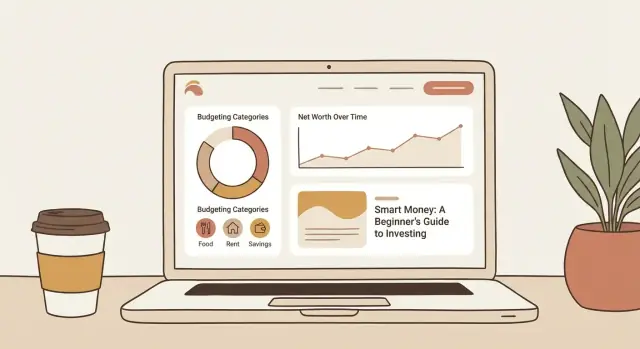
Add visuals that teach (simple charts, tables, sample budgets). Prefer explainers over decoration: a pie chart showing a 50/30/20 budget, a table comparing debt payoff methods, or a sample budget with categories and ranges.
Design for mobile first (short paragraphs, scannable headings, sticky table of contents). Most learners will read between errands or on commutes, so keep paragraphs tight, use informative subheadings, and consider a sticky mini-TOC for longer lessons so people can jump to “Example” or “FAQ” instantly.
A personal finance education website works best when each page helps someone do something: make a decision, fill in a template, or take a next step. Aim for lessons that are specific, actionable, and easy to practice within 15–30 minutes.
Begin with a small set of “core curriculum” articles that you can reference from future posts. A solid starter sequence is:
Write these as step-by-step guides, not opinion pieces. If you recommend rules of thumb, explain when they don’t apply.
Readers learn faster with numbers. Include realistic scenarios and make them adjustable (e.g., “If your take-home pay is $3,500… now change it to yours”). Add a brief disclaimer near examples: you’re providing educational information, not individualized financial advice.
Free resources turn a lesson into a habit. Create simple, editable downloads like a budget template and a debt payoff tracker, and link them from the relevant lessons. Keep file naming clear and consistent so people can find them again.
Consistency beats intensity. Pick weekly, biweekly, or monthly publishing—and protect time for updates. Finance guidance ages quickly; revisiting your foundational content can be as valuable as publishing something new.
SEO for a personal finance education website is mostly about matching beginner questions with clear, structured answers. If your lessons are easy to scan and easy to navigate, search engines (and learners) will usually reward you.
Look for “first-time” queries people type when they’re confused, not when they’re ready to buy. Examples include “how to budget,” “what is APR,” “how does a credit card work,” and “emergency fund how much.”
A simple approach:
Your title should say exactly what the learner will get. Keep it specific and plain.
For meta descriptions, summarize the payoff in one sentence and set expectations. This improves clicks from search results without overpromising.
Internal links help people move from concept → practice. They also help search engines understand which pages are foundational.
Link deliberately:
Example internal link patterns: “Next: /budgeting/track-expenses” or “See all: /budgeting/”.
Many finance queries trigger definition boxes, step lists, or quick tables. Give search engines snippet-friendly formatting:
Keep answers direct, then expand with explanations and examples underneath.
Trust is the foundation of a personal finance education website. Readers are making real decisions with their money, so your site should feel transparent, careful, and grounded in evidence.
Create a short disclosure statement and link it in your header/footer (for example, /disclosures). Also repeat the essentials on pages where it matters.
Include:
You don’t need fancy certifications to teach budgeting basics—but you do need accuracy and honesty. Add an “About” page (/about) that states what you’ve done (e.g., “paid off debt,” “managed a household budget,” “worked in banking”) and what you haven’t. If you have credentials, list them plainly and avoid implying you can provide professional advice unless you’re licensed to do so.
When you define terms, quote stats, or reference rules (tax brackets, retirement limits, credit scoring factors), cite primary or reputable sources—government sites, major regulators, established financial institutions, and recognized research organizations. A simple “Sources” line at the end of each article builds credibility fast.
Finance outcomes depend on income, debt, location, timing, and risk. Instead of promising results (“you will save $500/month”), show ranges (“many people save 5–15% by…”) and explain the factors that change the outcome. This keeps your content trustworthy and protects readers from unrealistic expectations.
Email is the easiest way to turn one-time readers into learners who actually finish your lessons. Social posts disappear fast; a newsletter gives you a direct line to people who raised their hand and said, “Help me with money.”
Create one small, practical freebie tied to your first learning steps—something people can use in 10 minutes:
Keep it focused. A lead magnet should solve one early problem, not cover everything.
A welcome sequence sets expectations and gently pushes people into your curriculum. Aim for one email every 1–2 days:
Each email should point to one clear page (a lesson, resource, or start-here hub) so learners don’t stall.
Not everyone needs the same “next lesson.” Add one question at signup (or a “click to choose” email) to segment people by goal: debt payoff, saving, investing basics. Then you can send more relevant lessons and fewer generic blasts—which usually means higher opens and fewer unsubscribes.
Place signup forms where readers naturally think, “I want this”:
As your list grows, treat your newsletter like a weekly class: one topic, one action step, one link to continue learning on your site.
Monetizing a personal finance education website works best when it feels like a natural extension of what you already teach for free. The goal isn’t to gatekeep basics—it’s to offer structured support, accountability, and time-saving guidance for people who want to move faster.
Beginners usually need low-friction, low-risk options first: a mini-course, a paid template pack, or a short group workshop. More advanced learners are better candidates for memberships, premium courses, or coaching. A simple way to align this is to create a “Next step” page (e.g., /start-here) that suggests options based on where someone is stuck.
If you use affiliates, publish a clear disclosure page (e.g., /disclosures) and follow these rules:
Free articles and lessons should still be complete and useful. Paid products should feel like the organized, step-by-step version: checklists, exercises, templates, office hours, feedback, and a clear path from “confused” to “done.”
A personal finance education website is never “done.” The goal of launch isn’t perfection—it’s getting a solid, trustworthy version live so you can learn what real readers need and improve quickly.
Before you share your site widely, make sure the essentials are in place:
Do a quick walkthrough on your phone and a laptop:
Keep momentum with a realistic plan:
Set a monthly rhythm:
Small, consistent upgrades compound—just like good money habits.
Start by writing a one-sentence learner profile (who they are, what’s hard for them, and what they want).
Then pick 1–2 measurable outcomes (e.g., “stick to a budget for 30 days” or “set up an emergency fund plan”). Use those to decide what content belongs in your launch—and what can wait.
A niche gives you clarity and trust. Pick one situation you can solve end-to-end (like budgeting on irregular income).
A strong niche is:
Write a one-sentence promise that combines:
Example: “Step-by-step budgeting lessons for freelancers, with templates you can reuse every month.”
If it won’t fit in one sentence, it’s probably still too broad.
Build it like a guided course:
Add a visible Next lesson link on every page so readers don’t stop after one article.
Most sites work best with a small set of predictable pages:
Keep navigation simple, and make one primary call to action on the homepage (usually “Start here” or “Join the newsletter”).
Choose a platform that supports pages + a blog + SEO controls (clean URLs, titles, meta descriptions) and makes navigation easy.
If you want speed and low maintenance, a hosted builder can work. If you want maximum flexibility, a CMS like WordPress is common. If selling lessons immediately is the priority, consider a course-focused platform.
Use a repeatable lesson template so readers can scan and act:
Also design mobile-first: short paragraphs, tappable buttons, and a table of contents for long lessons.
Start with a small “core curriculum” you can reference everywhere:
Make each lesson help the reader do something in 15–30 minutes and include a tool (template, checklist, or tracker) when possible.
Focus on beginner-intent questions and answer them with clean structure:
Then build internal links that mirror your curriculum (lesson → next lesson → resource hub). Keep titles specific and avoid clickbait.
Use clear disclosures and verifiable sources.
Include:
Avoid guarantees; teach in ranges and scenarios instead.