Jul 21, 2025·8 min
How to Build a Website for Your Software Migration Guide
Learn how to structure, design, and publish a clear software migration guide website—templates, navigation, SEO, and long-term maintenance tips.
Define Audience, Scope, and Success Criteria
A migration guide website is only useful if it helps people make better decisions quickly. Before you write a single page, define the goal in plain terms: reduce risk, align teams, and speed up execution. This goal becomes the filter for what you publish (and what you leave out).
Identify your primary audiences
Most migration projects have multiple readers with different questions and time budgets. Name them explicitly so your content doesn’t drift:
- IT / engineers: prerequisites, environments, integration details, rollback steps
- Project managers: milestones, dependencies, RACI, status signals
- End users / operations: what changes, what stays the same, training and support
- Executives / sponsors: impact, risk controls, readiness, go/no-go criteria
If you can’t describe each audience’s top 3 questions, the site will likely feel generic.
Set the scope (and non-scope)
Write a short “What this site covers” statement, then add a matching “What this site does not cover.” For example: the site may cover supported paths, data mapping, and validation, but not custom consulting advice, third‑party vendor contracts, or every edge case.
This keeps the guide credible and prevents endless one-off additions that confuse readers.
Define what “done” looks like
Success criteria should reflect real outcomes, not page counts. Examples include:
- Successful cutover completed within the planned window
- Adoption: target users can complete key tasks in the new system
- Validation: data checks and acceptance tests pass
Add a “Start here” path for busy readers
Create a single entry page (e.g., /start-here) with the minimum steps to get oriented: who this guide is for, recommended migration path, critical prerequisites, and where to find the migration checklist page. This reduces overwhelm and gets stakeholders aligned early.
Plan the Information Architecture (IA) for the Guide
A migration guide succeeds when readers can find the right instruction in seconds—especially under deadline pressure. Information architecture (IA) is the plan that makes your content predictable: the same types of pages always live in the same places, with URLs that “look” like the work someone is trying to do.
Start with a simple top-level flow
For most software migrations, a clear, phase-based structure works best:
- Plan → Prepare → Migrate → Validate → Operate
This keeps the site aligned with how migrations actually run, and it helps non-technical readers understand where they are in the journey.
Decide where reusable assets live (and keep them out of the steps)
Checklists, templates, and FAQs are high-value—but they shouldn’t clutter step-by-step pages.
Create dedicated hubs that you can link to from many places, for example:
/guide/checklists/for “migration checklist page” content (cutover, rollback, data verification)/guide/templates/for spreadsheets, email drafts, stakeholder comms, meeting agendas/guide/faq/for repeated questions and edge cases
This reduces duplication and makes updates safer when requirements change.
Use a consistent URL pattern that matches intent
Pick a URL scheme early and stick to it. A good default is:
/guide/<phase>/<topic>/- Example:
/guide/prepare/data-export/
Consistent URLs make your migration documentation site easier to navigate, easier to search, and easier to maintain over time.
Plan separate paths for “overview” vs “step-by-step” readers
Not everyone reads a migration guide the same way. Stakeholders often want outcomes, risks, and timelines, while implementers want exact steps.
Support both by providing:
- Overview pages per phase (what, why, prerequisites, success criteria)
- Step-by-step pages per task (do this, then that, expected result, troubleshooting)
Link between them prominently so readers can switch modes without losing their place.
Include an “at a glance” page for stakeholders
Add a single summary page that answers stakeholder questions quickly: scope, timeline, key decisions, ownership, risk areas, and a short status checklist. Place it high in the structure (for example, /guide/at-a-glance/) and link to it from the guide home.
When your website structure mirrors real migration phases—and separates reference material from procedures—your content becomes easier to trust and faster to use.
Design the Content Outline by Migration Phase
A migration guide reads best when it mirrors how people actually run migrations. Instead of organizing by product features, organize by phases—so readers can open the site at the phase they’re in and immediately see what to do next.
Start with the migration phases (as your primary chapters)
Create one top-level section per phase, each with a consistent set of pages (overview, checklist, deliverables, and “what good looks like”):
- Discovery: current-state inventory, dependencies, risk register, stakeholder interviews
- Design: target architecture, data mapping, security model, acceptance criteria
- Build: environment setup, configuration steps, automation scripts, migration runbooks
- Test: test plan, test data strategy, performance checks, UAT sign-off
- Cutover: cutover plan, communications, downtime expectations, go/no-go checklist
- Post-migration: verification, monitoring, training, decommissioning legacy systems
If you use checklists, keep them as dedicated pages (e.g., a “Cutover checklist” page) so they’re easy to print or share.
Add prerequisite pages that prevent confusion
Before people reach phase content, give them a short “Start here” set:
- Terminology (what you mean by tenant, environment, wave, cutover)
- Roles and responsibilities (who approves, who executes, who supports)
- System requirements (access, network rules, supported versions, tools)
Document decision points where they happen
Migrations involve forks in the road. Put decision pages directly inside the relevant phase:
- In Discovery/Design, document big-bang vs phased migration, including criteria, risks, and a recommendation template.
- In Test/Cutover, include a go/no-go decision page with required inputs (test results, rollback readiness, stakeholder sign-off).
Make room for real-world scenarios and recovery
Add a “Common scenarios” hub that adapts the same guide for:
- Small orgs with limited IT support
- Regulated orgs (audit evidence, approvals, retention)
- Multiple regions/time zones (waves, comms, support coverage)
Finally, treat troubleshooting and rollback as first-class content, not an appendix: link rollback steps from every phase checklist, and keep a single “Rollback procedure” page that’s easy to find during incidents.
Create Repeatable Page Templates
Templates turn a migration guide from a pile of pages into a predictable experience. Readers shouldn’t have to “learn” your documentation on every page—they should recognize the structure instantly, find what they need, and know what to do next.
1) Migration overview page template
Use one consistent overview format for every migration (or every major phase). Keep it scannable:
- Who it’s for: roles and teams impacted
- What’s changing: systems, data, and user-facing impacts
- Timeline: key dates, freeze windows, and dependencies
- Risks: top failure modes and how you’ll mitigate them
- Prerequisites: access, tools, accounts, and approvals required
End with clear calls to action, like “Start pre-migration checks” linking to /checklists/pre-migration.
2) Step page template (the workhorse)
A step page should read like a recipe, not an essay. Recommended sections:
- Goal: one sentence describing the outcome
- Inputs: what you need before starting (files, credentials, permissions)
- Steps: numbered actions with expected results
- Outputs: what should exist when finished (records created, settings updated)
- Verification: how to confirm it worked (screens, reports, sample queries)
- Time estimate: set expectations for planning
Add a small “Troubleshooting” callout only when there are known common errors.
3) Checklist template
Checklists reduce coordination failures. Structure them as a table with:
- Task (short, actionable)
- Owner (role or team)
- Status (Not started / In progress / Blocked / Done)
- Links to the relevant step pages
This makes your “migration checklist page” usable in meetings and easy to print.
4) Reference template
Reference pages should be strict and factual. Include:
- Fields / definitions (data mapping notes)
- API limits and rate policies
- Supported versions
- Constraints and edge cases
5) FAQ template
Keep answers short, then link deeper:
- One-paragraph answer
- “Learn more” links to step, checklist, or reference pages
If you want, create these templates as starter pages in your CMS so every new page begins with the right structure.
Build Navigation, Search, and Reader Flow
A migration guide succeeds when readers can answer two questions instantly: “Where am I?” and “What should I do next?” Good navigation reduces drop-off, cuts support tickets, and helps non-technical readers stay confident as they move step-by-step.
Define global navigation that matches user intent
Keep your top navigation simple and task-oriented. A solid baseline is:
- Guide (the main, sequential path)
- Checklists (printable or scannable readiness and cutover lists)
- Templates (emails, comms plans, data mapping sheets)
- Troubleshooting (common errors and quick fixes)
- Release notes (what changed since last time)
This structure helps different audiences—project owners, admins, and stakeholders—find what they need without digging through the full guide.
Use left-side navigation for a clear step-by-step path
For the main Guide, use a left-side navigation that groups steps into meaningful phases (for example: Prepare → Test → Migrate → Validate). Make the grouping visible so readers feel progress, not just a long list of pages.
If possible, highlight:
- The current step
- Completed vs. upcoming steps
- Estimated time or “you’ll need” prerequisites on each step page
Add search that works like a helper, not a trap
Place a prominent search box near the top of the page, and enable autocomplete if your platform supports it. Autocomplete nudges people toward the right wording (e.g., “SSO”, “data export”, “rollback”) and reduces “no results” frustration.
Reinforce orientation with breadcrumbs and step links
Use breadcrumbs so readers can backtrack without losing context.
At the bottom of each step page, include clear “Next step” and “Previous step” links. This small detail keeps momentum and prevents readers from bouncing back to the menu every time they finish a task.
Write for Clarity and Add the Right Visuals
Turn checklists into a tool
Create a print-friendly migration checklist page with simple progress tracking using Koder.ai.
A migration guide succeeds when people can act on it quickly. Write as if your reader is smart but busy: short sentences, one idea per paragraph, and a clear “what to do next” at the end of each page.
Define acronyms the first time you use them (for example, “SSO (single sign-on)”). Prefer plain verbs (“export,” “map,” “validate”) over abstract phrases. If you must use a product-specific term, add a one-line explanation right under it.
Use visuals that reduce misunderstandings
Visuals are most helpful when they explain boundaries and flows. Add simple diagrams for:
- Data flow (where data originates, transforms, and lands)
- System boundaries (what is in scope vs. out of scope)
- Identity/auth flows (who authenticates where)
Keep each diagram caption actionable: state what the reader should notice (“Customer IDs are generated in the new CRM, not imported”). If the visual is non-obvious, add a 2–3 sentence explanation below it.
Add mapping tables where readers expect them
Field and object mapping is easier to scan in a table than in prose. Use a consistent structure like:
| Old field | New field | Transform rule | Example |
|---|---|---|---|
acct_id | accountId | Pad to 10 digits | 123 → 0000000123 |
Include edge cases (empty values, special characters, time zones) because those are where migrations fail.
Provide copy-paste snippets (and say when to use them)
Readers love “ready to run” blocks, but they need context: prerequisites, where to run it, and what success looks like.
# Export users from the old system
oldsys export users --format=csv --out=users.csv
Standardize warnings and prerequisites
Use the same callout style every time for prerequisites, warnings, and “stop/rollback” conditions. Consistency helps readers spot risk before they click “Run” or send an email template.
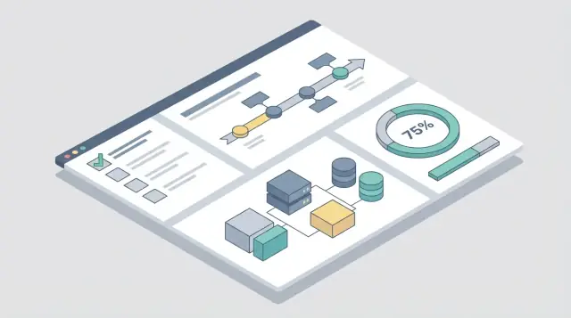
Add Helpful Interactive Elements (Without Complexity)
Interactive features can make a software migration guide website feel “alive”—but only if they reduce work for the reader. The goal isn’t to build an app; it’s to turn key pages into tools people can use during planning, execution, and verification.
Start with the “doable” interactions
Interactive checklist (printable + downloadable): Put a checklist on the page for quick progress tracking, and add downloads for teams that live in spreadsheets. Offer:
- A printable view (clean layout, minimal navigation)
- CSV download
- A “Copy to Google Sheet” link (or a simple template link)
Place the checklist near the top of your migration checklist page so it becomes the default starting point.
Timeline or milestones view: Many readers need to translate guidance into a plan. Add a lightweight “milestones” block that groups tasks by phase (Discover → Prepare → Migrate → Validate → Optimize). Keep it simple: one line per milestone with estimated effort ranges and dependencies.
Help readers choose a path
Decision helper questionnaire: A short, non-technical questionnaire (5–8 questions) can recommend a migration path (lift-and-shift vs. re-platform vs. phased migration). Keep results explainable: show why the recommendation happened and link to the relevant path page.
Make success measurable
Validation forms (“how to verify success”): Turn “done” into observable checks. Provide fill-in fields for baseline vs. after values (response time, error rate, user sign-ins, data reconciliation counts). Readers can paste the results into their internal status reports.
Make troubleshooting faster
Troubleshooting filters: Instead of a long FAQ, let readers filter by symptom (e.g., “login failures”), phase (e.g., “cutover”), or component (e.g., “database”). Keep filters static and fast—no complex backend required.
If you’re unsure whether to add an interaction, use one rule: it should save time on a real migration call.
Choose the Website Platform, Hosting, and Workflow
Save with credits
Share what you built or refer teammates and earn credits to keep experimenting in Koder.ai.
The best migration guide sites feel simple to readers because the underlying choices are clear: where content lives, how it’s published, and who maintains it.
Pick a platform that matches your team
Static site generator (SSG) (e.g., content in Markdown, site built into HTML).
- Pros: fast, low hosting cost, easy to version in Git, great for “steps + checklists.”
- Cons: usually needs someone comfortable with a build process; previews and editing can feel less “Word-like.”
Dedicated docs platform (hosted documentation tools).
- Pros: quick setup, built-in navigation/search, roles/permissions often included, less engineering effort.
- Cons: monthly cost, theming limits, content portability varies.
CMS (like WordPress or a headless CMS).
- Pros: familiar editor, flexible pages, easy approvals.
- Cons: performance and consistency depend on configuration; versioning and “docs-style” navigation may take extra work.
A practical rule: if your guide will change frequently and multiple people will edit it, a docs platform or CMS usually reduces friction. If you want a lightweight, highly versioned guide, an SSG is often ideal.
Where Koder.ai can help (without turning your docs into a software project)
If you want to move faster than a traditional “spec → build → iterate” cycle, a vibe-coding platform like Koder.ai can be a practical option for the interactive parts of a migration documentation site. For example, teams use it to prototype:
- A print-friendly / downloadable migration checklist page with simple progress tracking
- A decision helper questionnaire that routes readers to the right migration path
- A searchable docs UI that follows your chosen website structure for documentation
Because Koder.ai can generate web apps via chat (with React on the frontend and Go + PostgreSQL on the backend when needed), it’s useful when your guide needs lightweight tooling—without committing to a long custom development pipeline. You can also export the source code for internal review or long-term maintenance.
Hosting and deployment basics
For SSGs, CDN/static hosting is simplest: you publish pre-built files and the CDN serves them quickly. For CMS or dynamic docs tools, you’ll use server hosting (managed hosting is typically worth it).
Keep deployment predictable: one button or one pipeline that builds and publishes the site. If possible, set up a preview for each change so reviewers can read the update before it’s public.
A simple content workflow (draft → review → publish)
Define three stages and stick to them:
- Draft: author writes/updates a page.
- Review: a migration SME checks accuracy; a non-technical reviewer checks clarity.
- Publish: release the update with a short changelog note.
Access control and ownership
If some content must be private (internal runbooks, vendor credentials, or customer-specific steps), plan access control early: separate “public” and “private” areas, or publish a second internal site.
Finally, assign documentation ownership (one primary owner plus backups) and an update cadence (e.g., monthly during migration, quarterly afterward). Without named owners, migration documentation ages fast.
Optimize for SEO and Discoverability
SEO for a migration guide isn’t about chasing generic traffic—it’s about being findable at the exact moment someone is planning or stuck in a move. Aim for “migration intent” searches and make each page clearly answer one step.
Build a migration-intent keyword list
Start with queries that include a source, destination, and task. Examples:
- “how to migrate from X to Y”
- “X to Y migration checklist”
- “export data from X” / “import into Y”
- “X to Y migration troubleshooting”
Use these phrases to decide what pages you need (prerequisites, step-by-step tasks, validation, rollback, and common errors).
Match titles and headings to the step name
People skim search results. Make your page title and H1 explicit and consistent with your navigation label.
Good: “Step 3: Migrate Users from X to Y”
Avoid vague: “User Setup” (it won’t rank, and it’s not reassuring).
Strengthen internal linking between steps
Internal links guide readers and help search engines understand the structure.
Link:
- From each step to its prerequisites and next step
- From steps to relevant troubleshooting pages (“If you see error 403, read
/troubleshooting/error-403”) - From troubleshooting pages back to the exact step they unblock
Keep links practical and close to the point where readers need them.
Keep URLs and metadata clean
Use readable URLs that match the step names, such as:
/checklist/steps/migrate-users/troubleshooting/permission-errors
Write concise meta descriptions that state who the step is for, what it does, and the outcome (think: one-sentence promise).
Add a glossary page for long-tail searches
A glossary helps non-technical readers and captures searches like “what is a migration token” or “data mapping definition.” Link glossary terms from the steps, and include short, plain-language definitions on /glossary.
Measure Use, Collect Feedback, and Improve
A migration guide isn’t “done” when it’s published. The fastest way to make it genuinely useful is to watch how people use it, then fix what slows them down.
Instrument the guide with simple analytics
Start with a small set of events that map to real reader intent. For a software migration guide website, the most actionable signals are:
- Analytics events for search terms, page exits, and checklist downloads
- Steps that cause drop-offs or repeated visits (often a sign the instructions are unclear or prerequisites are missing)
Keep events consistent across pages so you can compare sections and spot patterns (for example: “Data export” pages get the most exits).
Make feedback effortless (and visible)
Readers will only give feedback when it’s quick and clearly welcomed.
- Include a “Was this helpful?” prompt at the end of each page, with a one-click Yes/No and an optional comment box.
- Add a lightweight feedback form for longer notes (for example, “What were you trying to do?”). Link it from the footer or a
/supportpage. - Create a “report an issue” link per page for fast corrections (broken steps, outdated UI labels, typos). Pre-fill the page URL and title so you don’t waste time clarifying.
Turn signals into improvements
Set a simple triage rule: anything that blocks progress (wrong step order, missing permissions, failed command) gets fixed first. Next, rewrite sections where analytics show repeated backtracking, and add clarifying examples or a short “Common mistakes” paragraph.
Establish a review cadence
Set a review cadence based on feedback volume and product changes. As a baseline, review high-traffic pages monthly and the full migration documentation site quarterly. Tie reviews to release notes so the guide stays aligned with what users see in the product.
Plan for Versioning, Updates, and Long-Term Maintenance
Prototype the interactive parts
Get a working React web app for your migration guide tools in hours, then iterate with your team.
A migration guide is only helpful if it stays aligned with the product people are actually migrating from and to. Versioning and maintenance aren’t “nice to have” tasks you do later—they’re what keeps the guide trustworthy and prevents support tickets caused by stale instructions.
Make version clarity impossible to miss
If your software has multiple supported versions, add a version selector or very clear version labels on every relevant page (for example, “Source: v3.2 → Target: v4.0”). Don’t hide this information in an intro paragraph—readers typically land deep in the guide from search.
If you can’t implement a selector yet, use prominent labels near the title and in callout notes like “Applies to v4.0+”. Consistency matters more than fancy UI.
Establish an update policy tied to releases
Define how updates happen and who owns them, then tie changes to product releases and migration tooling updates. Avoid overpromising a schedule (“updated weekly”); instead, use a policy readers can trust, such as:
- Updated alongside major/minor releases
- Patched when migration tooling changes or a critical issue is found
Publish the policy on a small “About this guide” page (e.g., /migration-guide/about) so expectations are clear.
Track changes and protect old links
Maintain a changelog that records documentation updates and migration tooling changes. Keep it brief and practical: what changed, who it affects, and the date.
When procedures become outdated, archive them instead of deleting. Mark them as “Archived” and explain what replaced them. Most importantly, keep redirects from old URLs to the new location to prevent broken links—especially for pages that were shared in tickets, emails, or bookmarks.
Add lightweight QA checks
Set up simple content QA before publishing:
- Broken link checks
- Missing headings (to keep navigation and search usable)
- Stale screenshots (flagged by age or by release)
These checks prevent gradual decay and keep long-term maintenance manageable rather than overwhelming.
Cover Accessibility, Security, and Compliance Basics
A migration guide is often used under pressure: during cutovers, incident bridges, and late-night validation. That’s exactly when small “basics” (accessibility, security, compliance) prevent real friction—like someone being unable to navigate the site by keyboard, or a well-meaning example exposing a credential pattern.
Accessibility: make it usable for everyone
Start with fundamentals you can apply across every page template:
- Use a clear heading hierarchy (H2 for major sections, H3 for subsections) so screen readers can scan the page structure.
- Ensure sufficient color contrast for text, links, and callouts—especially “warning” blocks.
- Add meaningful alt text to diagrams and screenshots (“Network flow showing source → staging → target”) rather than “image.”
- Test keyboard navigation: users should be able to tab through navigation, skip to content, open menus, and use search without a mouse.
If you publish diagrams with key information, include a short text summary beneath them. It helps accessibility and makes skimming easier for non-technical readers.
Security: examples should be safe by default
Migration documentation regularly includes snippets of config, CLI commands, and sample datasets. Treat all examples as if they could be copied into production:
- Never include real customer names, internal hostnames, IPs, API keys, tokens, or log extracts.
- Use realistic placeholders and obvious redactions (e.g.,
REDACTED_TOKEN,example.company,10.0.0.0/24).
Add “security notes” where steps can create risk: permissions required to run tools, safe credential handling (env vars, secret managers), and what to check in audit logs after the run.
Compliance: call out the rules that change the plan
If your audience operates in regulated environments, include a brief compliance callout on relevant pages:
- Data retention and deletion requirements during migration and rollback
- Regional storage and cross-border transfer constraints
- Evidence requirements (what screenshots/logs to keep, for how long)
Support strict internal processes
Some teams must attach plans to change requests. Offer printable/exportable formats (PDF export, print-friendly pages, or a “download checklist” view). For checklists, consider a dedicated /migration-checklist page that prints cleanly and doesn’t rely on interactive-only UI.