Nov 01, 2025·8 min
How to Build a Website for an Industry Glossary and Learning Hub
Learn how to plan, structure, and launch an industry glossary and learning hub website: taxonomy, CMS, search, SEO, workflows, and launch checks.
Learn how to plan, structure, and launch an industry glossary and learning hub website: taxonomy, CMS, search, SEO, workflows, and launch checks.
Before you pick a CMS or design a homepage, get specific about what this glossary and learning hub is for. A clear goal keeps the site focused, makes prioritization easier, and prevents you from publishing dozens of definitions that don’t actually help anyone.
Most glossary hubs serve more than one purpose. Decide your “primary” job and the supporting jobs.
Write this as a one-sentence mission, e.g., “Explain core concepts in plain language and guide readers to the right next step.”
Glossary readers are not all the same person. Typical segments include:
Pick the top 1–2 segments to design around first. You can still serve others, but you can’t optimize every page for everyone.
Your glossary should address real questions, not just “A means B.” Gather input from:
Aim for questions like: “When would I use this?”, “How is it different from X?”, and “What’s the common mistake?”
Choose metrics that match your goals, such as organic traffic, time on page, scroll depth, newsletter sign-ups, demo requests, or deflected support tickets. Define what “good” looks like for the first 90 days.
Set boundaries so the site ships:
A practical approach: launch with a glossary plus a small set of “starter guides” that link out from the most important terms.
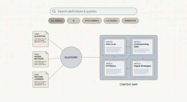
Information architecture (IA) is the map of your learning hub: what content exists, how it’s grouped, and how people move between pages. A clear IA keeps visitors oriented and makes it easier to expand over time.
Start by deciding what you will publish—not in detail, just the “buckets”:
IA is mostly about relationships. For example:
Write down these connections as simple rules. This prevents orphan pages and helps you plan navigation that matches how people learn.
A practical, familiar structure usually works best:
If you need inspiration, sketch your top-level pages as a sitemap before touching design.
Use a minimum set of tags and filters, such as:
Define what “launch-ready” means. A common v1 is: one glossary hub, 5–10 categories, 50–150 terms, a small set of guides, and an A–Z index. You can always expand—without reworking the structure.
A glossary feels “easy” until you have 30 terms written by different people. A content model is what keeps every entry consistent, scannable, and trustworthy—without forcing your writers into a rigid mold.
Define one default template for every term page, even if some fields are occasionally empty. A practical structure looks like:
This makes pages predictable for readers and easier to maintain for your team.
Required fields prevent “thin” entries and help with quality control. Consider making these mandatory:
Optional fields can add depth where it’s genuinely helpful: industry variants, region-specific usage, or “see also” notes.
Glossaries become learning hubs when entries teach context, not just definitions. Add structured learning blocks such as:
These sections also give you repeatable places to add internal links to deeper pages like /learn/topic.
Write down simple rules: tone (neutral and helpful), reading level, preferred length ranges (e.g., definition 30–60 words; full page 250–600), capitalization, and how you format examples.
Pick stable patterns and stick to them:
Changing URLs later creates redirects, broken links, and diluted internal linking—so decide once, then build around it.
A glossary and learning hub succeeds when it’s easy to publish, update, and connect entries—not when it uses the fanciest framework. Start by choosing a CMS approach that matches your team’s skills and editing needs.
You have three common paths:
If you’re unsure, choose the option your editors can use confidently next week.
Glossaries change frequently, so prioritize operations over bells and whistles:
If your main bottleneck is building the site itself (not the writing), a vibe-coding platform like Koder.ai can be a practical shortcut. You can describe the structure in chat (glossary index, category pages, term template, A–Z browsing, and “related terms” blocks) and generate a working web app quickly—typically with a React front end and a Go + PostgreSQL backend under the hood.
For glossary teams, the operational features matter as much as the initial build: source code export, deployments/hosting, custom domains, planning mode for scoping, and snapshots with rollback for safer iteration.
Glossary pages often need tables, diagrams, formulas, and comparison callouts. Confirm your platform supports:
Performance matters for both readers and search visibility, so avoid heavy plugins and oversized assets.
Set up staging vs. production so editors can test changes safely. Ensure automatic backups, a clear restore process, and restricted admin access (ideally with SSO or 2FA).
A glossary isn’t just a list of definitions—it’s a learning experience. Good UX helps people get oriented quickly, understand a term in context, and confidently choose what to read next.
Most visitors arrive with one of four intents, so design for all of them:
Keep these entry points consistent across the glossary index and individual term pages so users don’t feel stuck.
Glossary pages should feel familiar from one term to the next. A strong default structure includes:
Aim for quick comprehension: short paragraphs, minimal jargon, and examples that match real-life scenarios.
Help people keep learning without forcing them to search again:
These blocks should feel like helpful recommendations—not distractions.
Learning content works best when it feels credible and calm:
The goal is a page that teaches first—and converts only when it naturally fits.
A glossary is only useful if people can find the right definition quickly—and then keep learning with minimal effort. Search, filters, and cross-linking turn a pile of pages into a navigable learning hub.
Glossary search should be fast and typo-tolerant. Users often arrive with half-remembered spellings, acronyms, or industry shorthand.
Prioritize these capabilities:
If your glossary is a learning hub, consider a single search box that can return multiple content types (terms, articles, videos, FAQs), with clear labels so people understand what they’re clicking.
Filters help users browse when they don’t know the exact term. Keep them simple and based on real needs:
Use filters on both your directory pages (A–Z, categories) and your learning hub listings. For term pages themselves, “related terms” and “next up” modules act like implicit filters.
Cross-linking is what turns a definition into a journey. Two features matter most:
Auto-suggest internal links while editing: when editors mention a term that exists, prompt them to link it. This keeps linking consistent without relying on memory.
Structured “Related terms” and “Learn more” blocks: don’t rely only on links inside the body text. Curate 3–8 relevant items so the page stays scannable.
Aim for a mix: close neighbors (synonyms, parent/child concepts) plus one deeper guide for context.
A blank search page is a dead end. Build a “no results” experience that offers:
If you allow it, add a lightweight “Request a term” form to capture demand.
Glossaries commonly hit naming conflicts. Decide your rules early:
This prevents competing pages from confusing users (and search engines) while keeping the glossary inclusive of how people actually search.
A glossary can rank extremely well—if each page clearly matches what people search for and if your site explains the topic better than a one-line definition.
Do keyword research for each concept to find:
This research should inform what you name the page and what you include on it. If users are comparing or troubleshooting, a two-sentence definition won’t satisfy them.
For term pages, keep titles simple and intent-matching:
Meta descriptions should promise the value on the page (plain-language definition, a real example, and links to related terms). Avoid clever copy that doesn’t match the query.
Internal links are the difference between isolated definitions and a learning hub.
Set a rule: every term links to 3–8 related terms when relevant (synonyms, prerequisites, common next steps). Keep anchors natural (“access control”, not “click here”). Also link from guides back to the exact terms they mention.
If you want a consistent structure, add “Related terms” and “Learn next” blocks to the template.
Glossaries often fail because they create dozens of near-duplicate pages. Instead:
If a term can’t support meaningful content, consider covering it inside a broader page rather than publishing a weak standalone entry.
Build hub pages that group terms and guides (e.g., “Identity & Access Management Glossary” + beginner guide + key terms). These hubs help search engines understand your structure and help readers discover content quickly. Add them to your navigation and link to them from term pages.
Great content can still underperform if search engines can’t crawl it cleanly or users abandon pages that feel slow. For a glossary + learning hub, technical decisions should make every definition page easy to discover, understand, and use.
Structured data won’t replace good writing, but it helps search engines interpret page purpose.
Example for a guide page:
{
  "@context": "https://schema.org",
  "@type": "Article",
  "headline": "What Is Zero Trust?",
  "datePublished": "2025-01-10",
  "dateModified": "2025-01-12"
}
Decide early how glossary URLs appear in your sitemap(s) and navigation.
If you have thousands of terms, it can be helpful to:
sitemap-glossary.xml (plus a sitemap index).Glossaries are prone to duplicate URLs (case changes, parameters, category paths). Set a single canonical format and enforce it:
/glossary/zero-trust/)Speed and usability are part of SEO.
Optimize performance by keeping image sizes small, enabling caching, and avoiding heavy scripts on term pages.
Confirm accessibility essentials: sufficient contrast, keyboard navigation for A–Z and filters, visible focus states, and readable typography (especially for definition text and examples).
A glossary and learning hub earns trust by staying consistent and correct over time. That doesn’t happen by accident—it needs a lightweight workflow, clear ownership, and a few non-negotiable quality checks.
You don’t need a large editorial department, but you do need clarity on who does what:
If one person wears multiple hats, keep the roles distinct in your process so reviews don’t get skipped.
A short checklist prevents most quality issues without slowing you down:
Over time, this checklist becomes your baseline for consistency across hundreds of pages.
Glossary entries go stale—product names change, regulations update, and best practices shift. Set a cadence:
Maintain a simple change log (“Updated definition,” “Added example,” “Replaced outdated standard”) so teams can trust what changed and why.
The best term ideas often come from real questions:
Capture these in a single backlog with priority signals (traffic potential, customer impact, strategic relevance).
Create a short style guide: tone, capitalization, how to handle acronyms, example format, and linking rules. This reduces rewrites and keeps your glossary feeling like one coherent product—not a collection of mismatched pages.
A glossary and learning hub can support revenue without turning into a sales brochure. The goal is simple: keep definitions genuinely helpful, then offer a “next step” for readers who want to go deeper.
Avoid gating core definitions behind forms. If someone has to “request access” to understand a term, they’ll bounce—and you’ll lose the trust that makes monetization possible later. Save lead capture for optional extras that build on the definition.
Use light-touch offers that match the reader’s intent:
Keep forms short. One email field often outperforms long forms on educational pages.
Good CTA placement respects the learning flow:
If you recommend product pages, keep it contextual and specific, with relative links like /features or /pricing.
Instead of adding a generic “Buy now” everywhere, map a subset of terms to relevant product capabilities. For example, an entry about a process can link to a feature that supports that process—plus 1–2 related terms to continue learning.
If your product is how readers build things (not just how they learn), you can also offer a relevant “build it” next step. For instance, if a guide teaches how to structure documentation or a glossary system, you can point to a tool like Koder.ai as a way to turn that structure into a deployed app (with code export) rather than leaving readers with theory only.
Measure beyond pageviews. Track newsletter sign-ups, demo requests, and assisted conversions (when a glossary visit happens before a conversion). This helps you invest in the terms that educate and move people toward the right product decision.
A glossary and learning hub is never really “done.” The goal of launch day is to ship a solid baseline, then use real data to decide what to expand, fix, and refresh.
Before you announce anything, make sure the fundamentals are in place:
Do one focused QA pass before launch and another shortly after:
This is also the moment to standardize how acronyms, capitalization, and examples are written so the hub feels cohesive.
Set up lightweight dashboards (in your analytics tool or BI) that answer practical questions:
Pair this with a simple monthly report: “new terms added, terms updated, biggest traffic movers, top search queries, and notable 404s.”
Use your data to guide the next cycle of work:
If you’re building on a platform that supports snapshots and rollback (for example, Koder.ai), you can iterate more aggressively on navigation and templates because it’s easier to revert changes that don’t perform.
Schedule ongoing care so the hub doesn’t decay:
If you treat your glossary like a product—launch, learn, iterate—you’ll steadily grow trust, traffic, and usefulness without needing a massive rebuild.
Start with a one-sentence mission that names the primary job (education, lead capture, support reduction, or authority) and the “next step” you want readers to take.
Example: “Explain core concepts in plain language and guide readers to the right next step.”
Pick 1–2 primary segments and design for them first:
You can still serve others, but optimization gets messy if every page tries to satisfy everyone.
Use real inputs, not brainstorming:
Prioritize questions like “When would I use this?”, “How is it different from X?”, and “What’s the common mistake?”
Choose metrics that match your goal and define a 90-day baseline.
Examples:
A practical v1 is:
Ship a clean structure first; expand content without changing the foundation.
Use a consistent template so entries stay scannable and trustworthy:
Add optional learning blocks like “Why it matters” and “Common mistakes” when they genuinely help.
Lock them before publishing to avoid redirects and broken internal links later.
Common patterns:
/glossary/term-name/learn/topicBe consistent about trailing slashes (always on or always off) and enforce one canonical format.
Choose the approach your editors can use confidently next week:
Prioritize drafts/previews, versioning, roles/permissions, and scheduled publishing—those matter more than fancy frameworks for glossary operations.
Build for the four common intents:
On term pages, keep the structure predictable (definition box near the top, short sections, clear headings) and add “See also”/“Learn next” blocks to encourage exploration.
Avoid thin or duplicate pages by design:
This keeps the site useful for readers and clearer for search engines.