May 30, 2025·8 min
How to Build a Mobile App for Crowdsourced Reviews
A practical guide to planning, designing, and launching a crowdsourced review app: key features, moderation, UX patterns, tech choices, and growth.
Define Your Use Case, Audience, and Niche
Before you design screens or pick a tech stack, decide what your app is for and who it’s for. Crowdsourced review apps work best when they make one specific decision easier—and make it obvious why your reviews are more useful than existing alternatives.
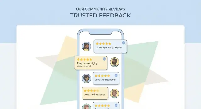
Examples of crowdsourced review apps
Crowdsourcing can apply to many “review objects,” such as:
- Places: restaurants, gyms, parks, clinics (often location-based)
- Products: gadgets, skincare, niche gear (often with photos and specs)
- Services: home cleaning, tutors, mechanics (appointment context and pricing matter)
- Employers: culture, compensation ranges, interview experiences
Primary users and what they need
Most review platforms serve three audiences:
- Reviewers: want a quick way to share an experience, get recognition, and feel heard
- Readers: want trustworthy, relevant, recent information to make a decision fast
- Business owners/admins: want accurate listings, a way to respond, and visibility into issues
Define the core job-to-be-done (and success)
Write a one-sentence promise, like: “Help parents find kid-friendly cafés nearby with reliable recent feedback.”
Define success with measurable signals, for example:
- Readers find what they need (search-to-view rate, save/share rate)
- Reviews are useful (helpful votes, low bounce from review pages)
- Supply grows (new reviewers per week, repeat reviewers)
Pick a niche and review object
Start narrow: one city, one category, one user type, one review object. A focused niche makes discovery, quality control, and community norms easier—and gives you a realistic path to seeding content.
Assumptions to validate first
Validate these before building:
- People will review without incentives (or what incentive is acceptable)
- You can reach enough supply (reviewers) in your first niche
- Readers care about your differentiator (e.g., “verified visit,” “expert tags,” “family-friendly”)
- Businesses won’t overwhelm the system (or can be managed with clear policies)
Decide the Core Features and User Flows
Before you add screens or features, agree on the smallest set of actions that make your app useful on day one. For a crowdsourced reviews app, that’s usually: people can find something, read what others said, and add their own experience.
Must-have user flows (MVP)
At minimum, map these end-to-end flows so product, design, and engineering stay aligned:
- Sign up / log in (plus “continue as guest” if you allow it)
- Find an item/place (browse categories, search, or nearby)
- Read reviews (ratings, sorting, filters, reviewer context)
- Write a review (text + rating, optional photos, “would you recommend?”)
- Report content (spam, harassment, conflict of interest, wrong place)
A simple rule: every screen should clearly answer “what can I do next?”—read, compare, contribute, or report.
Decide what’s public vs. account-only
Most review apps keep reading public to reduce friction, but require an account for actions that affect others:
- Requires account: writing reviews, rating helpfulness, uploading photos, reporting, saving favorites
- Public: browsing, search, reading reviews, viewing aggregate ratings
If you allow guest reading, use soft prompts (e.g., “Sign in to write a review”) instead of hard blocking.
“Add a new place/item”: allow, gate, or restrict
Letting users add new listings can accelerate growth, but it also increases spam and duplicates. Common options:
- Open: anyone can add (fastest, highest risk)
- Gated: only after trust signals (e.g., verified email, a few approved reviews)
- Restricted: curated catalog or partner-fed listings
Admin and support flows
Outline internal tools early: moderation queue, edit requests, duplicate merges, user bans/appeals, and review takedowns. These flows prevent support from becoming your bottleneck later.
Sketch 2–3 key screens
Create quick drafts (even low-fidelity) for:
- Item page (rating summary + top reviews + “Write review”)
- Write review (rating first, then text, then optional extras)
- Report/flag (simple category + optional note)
These sketches act as a shared contract for what you’re building—and what you’re intentionally not building yet.
Design the Review and Rating Data Model
A clean data model is what lets your app scale from “a few opinions” to a trusted library of user-generated reviews. Store reviews in a way that supports sorting, moderation, anti-fraud, and future features without constant rewrites.
Core entities to model
Start with a small set of building blocks and clear relationships:
- User: profile, verification signals (email/phone), and reputation stats
- Item/Place: the thing being reviewed (product, restaurant, service). If it’s location-based, store address + coordinates
- Review: the written content tied to a user and an item/place
- Rating: the numeric/choice score(s) attached to a review
- Photo: images linked to a review (and optionally to an item/place)
- Vote: helpful/not helpful (or up/down) votes on a review
- Report: flags for abuse, spam, conflicts of interest, etc.
Keep IDs stable and avoid duplicating item/place records—deduping is much harder later.
Rating system choices
A 5-star scale is familiar and easy to aggregate. Thumbs up/down is simpler and can feel faster on mobile. If your niche needs nuance, consider multi-criteria ratings (e.g., “Quality,” “Value,” “Service”), but limit to 3–5 criteria to avoid review fatigue.
Whatever you choose, store both the raw rating values and the derived aggregates (average, count) so you can rebuild summaries if rules change.
Review fields that matter
Beyond title + text, common fields improve filtering and trust:
- Pros/cons (structured text)
- Tags (controlled list when possible)
- Visit/purchase date (or “verified purchase/visit” indicator)
- Context like price range, party size, or usage duration (niche-dependent)
Sorting, aggregation, and freshness
Plan for multiple sorts: Most recent, Most helpful, and Highest/lowest rating. Aggregations should support averages, rating distributions (how many 1-star vs 5-star), and time-based views (e.g., “last 30 days”) to balance “recent” against “helpful.”
Edits, deletes, and version history
Users will fix typos—or try to rewrite history. Decide early:
- Allow edits within a window (e.g., 15 minutes) or anytime with limits
- Use soft deletes for reviews/photos so moderation can audit
- Store a lightweight version history (previous text + timestamp) when trust matters, especially for contested items and reported reviews
Build Trust: Anti-Fraud and Reputation Signals
Trust is the product in a crowdsourced reviews app. If people suspect reviews are paid, copied, or posted by bots, they’ll stop using the app—no matter how good the UI is.
Reduce fake reviews at the door
Start with lightweight friction that stops most abuse without punishing real users:
- Email and/or phone verification (with re-verification for suspicious activity)
- Device checks to spot obvious repeat offenders (e.g., many new accounts from one device)
- Velocity limits that slow down spam: caps like “max X reviews per hour/day,” “max Y ratings without text,” and cooldowns after account creation
These controls work best when they’re mostly invisible to normal users, but firm when behavior looks automated.
Reputation signals that improve ranking
Instead of treating every review equally, calculate a reviewer reputation score and use it in sorting and spam detection. Useful signals include:
- Account age (new accounts are higher risk)
- Review history (consistent, detailed reviews across time and categories)
- Helpfulness votes (weighted to reduce coordinated voting)
You don’t have to show the full score. You can expose simple badges like “New reviewer” vs. “Top contributor,” while using richer signals behind the scenes.
Helpfulness voting—without turning it into a game
“Was this helpful?” voting improves reading quality and lets great reviews rise. Add abuse controls like limiting votes per user/day, detecting vote rings, and down-weighting votes from brand-new or low-reputation accounts.
When you rank by “Most helpful,” consider time decay so older reviews don’t permanently dominate.
Detect duplicates and patterns
Spam is often repetitive. Use automated checks to flag:
- Near-identical text across multiple listings
- Reviews from the same device across many accounts
- Repeated phrasing patterns (template-style reviews)
Flagged reviews can be held for moderation rather than instantly removed.
Reporting and response SLAs
Let users report reviews and profiles with clear reasons (spam, harassment, conflict of interest). Set internal response SLAs (for example: critical reports in 24 hours, standard in 72 hours) and communicate outcomes where possible to reinforce that reports matter.
Set Up Moderation and Community Guidelines
Moderation is the safety net that keeps a crowdsourced reviews app useful instead of noisy or hostile. The goal isn’t to police opinions—it’s to remove content that harms people, violates laws, or makes the ratings unreliable.
Define clear, simple rules
Write rules in plain language and organize them around concrete examples. Cover what’s allowed (honest first-hand experiences), what’s removed (hate, threats, doxxing, spam), and what needs special handling (medical claims, accusations of crimes, content about minors).
Include “sensitive” categories that trigger extra review, such as:
- Personal data (phone numbers, addresses, license plates)
- Photos of people without consent
- Defamation risk (naming employees, alleging illegal activity)
Use layered moderation (not one big gate)
Combine three levels:
- Auto-filters: block obvious spam, profanity slurs, repeated links, and personally identifiable information patterns
- Community reports: let users flag reviews and photos with a reason (spam, harassment, conflict of interest, privacy, etc.)
- Human review: a moderator makes final calls for edge cases and appeals
Design a moderation queue that prioritizes risk
Your queue should sort by severity and reach. Prioritize items that are:
- Reported by multiple users
- Attached to high-traffic listings
- Flagged for privacy or safety reasons
- Newly posted by low-reputation accounts
Standard actions (and an appeal path)
Give moderators a consistent toolkit: remove, hide pending edits, warn, temporary suspend, shadow-ban (for clear spam), and a simple appeal process with a short explanation shown to the user.
Make guidelines easy to find at the right moments
Keep guidelines lightweight and link them from key screens: review composer, report flow, profile, and onboarding. A dedicated page like /community-guidelines and /reporting helps set expectations without interrupting normal use.
UX Patterns for Writing and Reading Reviews
Pick a Pricing Tier
Choose Free, Pro, Business, or Enterprise as your team and traffic grow.
Great review apps feel effortless in two moments: when someone writes a review, and when someone tries to decide what to do next based on what they read. The goal is speed without sacrificing clarity.
Make writing a review fast (without feeling “form-y”)
Start with a lightweight first step: a star rating (or thumbs up/down), then progressively reveal fields. Use prompts that match the category—e.g., restaurants: “What did you order?” “Wait time?”; salons: “Service type?” “Stylist?” This reduces thinking time and improves consistency across reviews.
Templates help people get started: a short “Pros / Cons / Tip” structure, or sentence starters like “Best for…”, “Avoid if…”. Keep many fields optional (photos, price paid, visit time), but make them easy to add in one tap.
Prevent empty or low-quality posts
A few gentle constraints can dramatically improve usefulness:
- Set a minimum text length (even 80–120 characters) and show a live counter so it doesn’t feel like a surprise
- If someone leaves only a rating, prompt: “Add one detail to help others—what stood out?”
- Use category-specific nudges (“Mention sizing” for clothing, “Mention noise level” for cafés) to steer toward concrete information
Also consider a quick “Was this your experience?” confirmation for sensitive categories, and warn users when they paste repeated content (often a spam signal).
Review browsing that answers questions quickly
Readers usually want the “gist” first, then specifics. Show highlights at the top: average rating, distribution, and a few common themes (e.g., “Fast delivery”, “Friendly staff”). Then offer clear sorting: Most helpful, Most recent, Highest, Lowest.
Filters should match real intent: rating ranges, review type (with photos), visit date, and relevant attributes (family-friendly, wheelchair accessible). Keep filters sticky and easy to clear.
Credibility cues that build trust
Display signals near each review, not hidden in a profile:
- Verified badge (purchase/visit/booking verification where possible)
- Reviewer stats (number of reviews, helpful votes, expertise in this category)
- Timestamps (“Visited 2 weeks ago” is more meaningful than “Posted May 3”)
These cues help users weigh opinions without forcing them to read every word.
Accessibility basics that improve everyone’s experience
Use readable font sizes, strong contrast, and large tap targets—especially for stars, filters, and “Helpful” actions. Support dynamic text sizing, provide clear focus states, and avoid relying on color alone to communicate rating or status.
Discovery: Categories, Search, and Location Features
Discovery is where a review app either feels instantly useful—or like a pile of disconnected opinions. Your goal is to help people find the “right” place or item in a few taps, even if they don’t know the exact name.
Organize content with categories, tags, and attributes
Start with a simple category tree (e.g., Restaurants → Pizza, Services → Plumbers). Keep it shallow at MVP: 8–15 top-level categories is usually enough.
Then add:
- Tags for flexible concepts (e.g., “family-friendly,” “quiet,” “late-night”)
- Attributes for structured filtering (e.g., price range, delivery, wheelchair access, outdoor seating, “supports Apple Pay”)
Attributes should be consistent and easy to filter on. Tags can be user-generated, but consider curated “featured tags” to prevent messy duplicates (“kid friendly” vs “kids-friendly”).
Search that forgives imperfect typing
Search is often the most-used feature in a review app. Plan for:
- Autocomplete (suggest items, categories, and common queries as users type)
- Synonyms (“soda” vs “pop,” “chemist” vs “pharmacy”)
- Typo tolerance for misspellings and transposed letters
Also decide what search returns first: exact name matches, nearby results, or “best-rated.” Many apps blend these with a simple scoring rule, then expose sorting options like “Nearest,” “Top rated,” and “Most reviewed.”
Location: maps, nearby, radius filters, and city pages
For local reviews, location features drive relevance:
- A Nearby feed with a radius filter (e.g., 1 km / 5 km / 20 km)
- Map view for scanning clusters
- City and neighborhood pages for browsing (helpful for SEO and sharing, e.g. /city/austin)
Handle duplicates and wrong locations
If users can add places/items, you’ll get duplicates and bad pins. Build lightweight tools early:
- “This is a duplicate” and “Location is wrong” reporting
- A merge flow that preserves reviews and check-ins
- Soft prompts like “Did you mean one of these?” during place creation
Plan for internationalization
If multi-region growth is likely, design for multiple languages and address formats now: store names separately from localized descriptions, avoid hard-coded currencies, and support region-specific synonyms and units.
Engagement, Notifications, and Retention Loops
Launch a Testable Build
Deploy and host your app when you are ready to test with real users.
Engagement in a crowdsourced reviews app should feel like a conversation, not a constant ping. The goal is to help users get value from their contributions (and from others’), while keeping notifications relevant and easy to control.
Notifications that feel timely (not noisy)
Start with triggers that map to clear user intent:
- Replies: someone replies to your review, comment, or Q&A question
- Votes: your review hits a milestone (e.g., “10 people found this helpful”) rather than every single vote
- Follows: a user follows you, or you follow a place/category and new activity happens
- Moderation outcomes: your review was approved, edited, or removed—with a short reason and a link to guidelines
Add preferences early: per-notification toggles, quiet hours, and a simple “reduce notifications” option. This builds trust and lowers uninstall risk.
User-to-user interactions that improve content
Reviews get better when they invite follow-up:
- Comments for clarifications (“Was it crowded on weekends?”)
- Owner responses (for businesses/places) with rules: disclose affiliation, no harassment, no incentives
- Q&A as a lightweight way to gather facts before someone visits or buys
Design these interactions to surface the most useful information, not the loudest—e.g., highlight answers from verified visitors or consistently helpful reviewers.
Gamification, without rewarding spam
Points and badges can help users understand what “good participation” looks like, but avoid paying users for volume. Safer options include:
- Badges for completeness (photos, pros/cons, context like “visited with kids”)
- Streaks for reading and saving (not just posting)
- Reputation boosts tied to helpfulness votes and low report rates
Onboarding that gets the first win
A good checklist is short and action-based: pick interests/locations → follow 3 reviewers or places → save a list → write a first review using a guided template. Aim for one meaningful action in the first session.
Retention loops users actually want
Strong loops are utility-driven:
- Saved lists/bookmarks (“Want to try”, “Best coffee near work”)
- Personalized recommendations based on follows, saves, and viewed categories
- Gentle nudges to update a review after time (“How was it on your second visit?”) rather than constant prompts to post more
Choose a Tech Stack and High-Level Architecture
Your tech stack should match your timeline, team skills, and the kind of review experience you want (text-only vs. photo-heavy, local-only vs. global, real-time vs. “refresh to update”). A simple, well-structured architecture is usually better than a fancy one—especially for an MVP.
If you want to move fast without locking yourself into a no-code ceiling, a vibe-coding workflow can help you prototype the full loop (search → item page → review composer → moderation queue) before committing to months of engineering. For example, Koder.ai lets teams build web, backend, and mobile apps from a chat-driven interface, with the option to export source code later—useful when you’re iterating quickly but still want long-term ownership.
Mobile app: iOS, Android, or cross-platform
If you need the best native feel and have two teams, build separate iOS (Swift) and Android (Kotlin) apps. If you want to ship faster with one codebase, choose a cross-platform approach:
- Flutter: consistent UI across devices, strong performance, great for design-heavy apps
- React Native: large ecosystem, easier if your team already knows JavaScript/TypeScript
(If your roadmap includes both a web admin dashboard and a mobile client, it can help to standardize: for instance, Koder.ai commonly pairs a React web app with Flutter for mobile, depending on your delivery needs.)
API layer: REST vs. GraphQL (and when real-time matters)
For most review apps, REST is the easiest to maintain and debug. GraphQL can be helpful when screens need many different slices of data (business, reviews, photos, author badges) and you want to reduce over-fetching.
Real-time updates are optional. Consider them if you have live comment threads, active moderation, or “new reviews near you.” Options include WebSockets or managed real-time products; otherwise, standard polling and “pull to refresh” is fine.
Data and storage: what goes where
Use a relational database (PostgreSQL/MySQL) for core entities: users, places/items, reviews, ratings, votes, reports, and moderation states. This makes querying and analytics more reliable.
For media:
- Store photos/videos in object storage (e.g., S3-like storage)
- Use a CDN for fast delivery and create multiple image sizes for performance
Search and indexing
Discovery often makes or breaks review apps. You can start with basic DB search, but plan for dedicated search as you scale:
- Managed search service (Elastic/Algolia/Meilisearch hosting) for fast full-text search, typo tolerance, and filters
- DB search (Postgres full-text) for a simpler early version
Admin and moderation tools
Don’t try to moderate from a phone. Build a small web dashboard for admins and moderators: queued reports, user history, review edits, and one-click actions (hide, restore, ban, escalate).
If you use a rapid build platform, prioritize features that reduce operational risk: role-based access control for moderators, audit logs, and safe deployment practices. Tools like Koder.ai also support snapshots and rollback, which can be useful when you’re shipping frequent changes and can’t afford to break posting or reporting flows.
Privacy, Security, and Compliance Basics
Privacy and security aren’t “nice-to-haves” for a crowdsourced reviews app. They’re part of the product experience: users won’t contribute if they feel exposed, and businesses won’t trust the platform if abuse is easy.
Permissions: ask only when needed
Mobile permissions should be contextual. If location improves relevance, request it when a user taps “Nearby” or starts a location-based review—not on first launch. Same idea for camera/photos: ask when they press “Add photos.” Provide a clear one-sentence reason before the system prompt, and keep the app useful even if they decline.
Collect less data, and explain it clearly
Minimize what you store: an email or phone for login might be enough, and anything beyond that should have a specific purpose. Get explicit consent where required, and describe what happens in plain language (what you collect, why, how long you keep it, and how users can delete it).
Place links to /privacy and /terms inside the app settings, not hidden on a website. Also include a simple “Data & account” area where users can request deletion or export if you support it.
Content ownership, takedowns, and audit trails
User-generated reviews and photos create real obligations. Define who owns uploads, what license users grant you to display them, and how takedown requests work (copyright, harassment, personal info). Keep internal audit logs for edits, removals, and moderator actions so you can resolve disputes consistently.
Security basics that prevent easy abuse
Use secure authentication (modern session handling, strong password rules, optional 2FA) and encrypt traffic in transit (HTTPS/TLS). Add rate limiting to slow down spam, scraping, and credential stuffing. Protect sensitive endpoints (login, review posting, image upload) with extra scrutiny.
Finally, write policies for humans: short, readable, and aligned with what the app actually does—then keep them updated as features evolve.
MVP Plan, Testing, and Analytics Setup
Model Reviews Data Fast
Generate a Go and PostgreSQL backend for users, places, reviews, votes, and reports.
Your MVP should prove one thing: people can quickly find a place/product and confidently leave a useful review. Everything else is optional until you’ve validated that loop.
Define MVP scope
Start with 1–2 core categories (for example: “Coffee shops” and “Gyms” or “Local services”). Fewer categories makes search, taxonomy, and moderation simpler, and helps you seed content faster.
Keep social features minimal. Skip following, DMs, and complex feeds. If you add anything, make it lightweight—like “helpful” votes and a basic user profile with review count.
Set measurable goals (so you know what “working” means)
Pick a small set of metrics you can move within weeks:
- First review rate: % of new users who submit a review within 7 days
- Search-to-review conversion: % of users who search, view an item, then start a review
- Time to first value: time from install to reading a relevant review
Define target thresholds before launch (e.g., “25% first review rate”). That prevents endless debating later.
Testing plan: usability + QA fundamentals
Run 5–8 short usability sessions focused on the review flow: find an item → read reviews → write one. Watch for friction around star rating, photo upload, and “what should I write?” prompts.
For QA, maintain a simple checklist and device matrix (popular iOS/Android versions, small/large screens). Verify offline/poor network behavior and edge cases like editing or deleting a review.
Analytics events to instrument from day one
Track the funnel with clear events:
- sign_up
- search
- view_item
- start_review
- submit_review
Add properties like category, location, and whether photos were attached. This makes drop-offs actionable.
Plan content seeding
Seed enough listings and starter reviews so the app feels useful immediately. You can do this via invited contributors, partnerships, or curated initial content—clearly labeled when appropriate—so early users don’t hit empty states.
Launch, Growth, and Iteration Roadmap
A review app lives or dies by momentum: enough real reviews to be useful, plus enough trust to keep people contributing. Treat launch as a staged rollout, not a single day.
App Store & Play Store basics
Before marketing, tighten your store presence:
- Clear screenshots that show the core loop: discover → read → write
- Keywords aligned to what people actually search (category + location + “reviews”)
- Policy checks: user-generated content rules, reporting tools, and privacy disclosures. If you support businesses, be explicit about how replies and takedown requests work
Soft launch (reduce risk)
Start small so you can fix issues without damaging ratings.
Pick one city, campus, or narrow category (e.g., “coffee shops in Austin”) and run an invite-only beta via local groups or a waitlist. Your goal is to validate:
- Can users find places/items easily?
- Do they finish writing a review?
- Are there early abuse patterns (spam, competitors, revenge reviews)?
Early growth channels
Once retention looks healthy, scale acquisition:
- Partnerships: local creators, community orgs, niche directories
- SEO landing pages for “best X in Y” that funnel to the app (and/or web view)
- Referral loops: invite credits, “follow a friend,” or contributor badges that unlock perks
If you decide to reward contributors, keep incentives tied to quality signals (helpfulness, low report rate) rather than raw volume. Some platforms—including Koder.ai itself—run “earn credits” programs for content creation and referrals; the key is to apply the same principle in your app: rewards should reinforce trust, not spam.
Operations: keep the lights on
Plan moderation staffing and response times from day one. Define escalation paths for harassment, legal requests, and high-risk content. Publish simple expectations in your guidelines and link them from the report flow.
Iteration cadence
Ship on a predictable rhythm (e.g., every 2 weeks). Prioritize fixes from store reviews and in-app feedback, and track metrics like activation, review completion rate, fraud reports, and 30-day retention to decide what to build next.
FAQ
How do I choose the right niche for a crowdsourced reviews app?
Start narrow: one city, one category, and one clear “review object” (place, product, service, employer). Write a one-sentence promise (job-to-be-done) and validate that:
- You can seed enough initial listings and reviews
- Readers actually care about your differentiator (e.g., verified visit)
- Reviewers will contribute with acceptable incentives (or none)
A focused niche makes discovery, moderation, and community norms much easier early on.
What are the must-have features for a reviews app MVP?
A practical MVP loop is: find something → read reviews → write a review → report issues. Build end-to-end flows for:
- Sign up/log in (optionally guest reading)
- Search/browse/nearby discovery
- Item page with rating summary and sorting
- Review creation (rating + text; photos optional)
- Reporting (spam, harassment, wrong place, conflict of interest)
If a screen doesn’t clearly lead to the next step, it’s usually extra for MVP.
Should reviews be readable without an account?
Keep reading public to reduce friction, and gate actions that affect others behind an account. A common split:
- Account required: writing reviews, helpful votes, uploads, reporting, saving favorites
- Public: browsing, search, reading reviews, aggregate ratings
Use soft prompts like “Sign in to write a review” rather than hard blocks for casual readers.
Should I let users add new places/items?
There are three standard approaches:
- Open: anyone can add listings (fast growth, high spam/duplicates)
- Gated: allow creation after trust signals (verified email, a few approved reviews)
- Restricted: curated catalog or partner-fed listings (cleanest, slower growth)
If you expect heavy spam or local business manipulation, start gated or restricted and loosen later.
What should the review and rating data model include?
Model the essentials with clear relationships:
- User, Item/Place, Review, Rating, Photo, Vote, Report
Store both and (average, count, distribution). Use stable IDs and plan for deduping early—merging duplicated places later is painful without consistent identifiers.
Which rating system should I use (stars vs thumbs vs multi-criteria)?
Pick the simplest scale that matches your niche:
- 5-star: familiar, easy to summarize and compare
- Thumbs up/down: fastest on mobile, less nuance
- Multi-criteria: useful for complex decisions (limit to 3–5 criteria)
Whatever you choose, support sorting (most recent/helpful/high/low) and show rating distributions so users can judge consistency, not just the average.
How do I prevent fake reviews and spam early on?
Combine lightweight friction, detection, and ranking:
- Verification (email/phone) and basic device/rate limits
- Velocity caps (reviews per hour/day, cooldown after signup)
- Duplicate/pattern checks (near-identical text, repeated templates)
- Reputation signals (account age, review history, helpfulness votes)
Use reputation mostly behind the scenes for sorting and spam scoring; expose simple badges if needed.
What moderation policies and tools do I need from day one?
Write plain-language rules focused on safety and reliability:
- Allow first-hand experiences and opinions
- Remove hate/threats, doxxing, spam, and harassment
- Flag sensitive content (personal data, photos without consent, accusations)
Implement layered moderation:
- Auto-filters for obvious abuse
- User reporting with clear categories
How can I design the review-writing UX to get higher-quality submissions?
Make writing fast with progressive disclosure:
- Ask for rating first, then reveal prompts
- Use category-specific nudges (wait time, price range, party size, sizing)
- Provide templates (Pros/Cons/Tip) and keep most fields optional
Add gentle quality controls:
- Minimum text length with a live counter
- Prompt for one concrete detail if someone posts only a rating
What tech stack and architecture works best for a review app MVP?
A solid baseline architecture is:
- Mobile: native (Swift/Kotlin) or cross-platform (Flutter/React Native)
- API: REST for simplicity; GraphQL if screens need many data slices
- Database: relational (Postgres/MySQL) for users, items, reviews, votes, reports
- Media: object storage + CDN + multiple image sizes
- Search: start with DB search, plan for managed search (Elastic/Algolia/Meilisearch) as you scale
Also build a simple web admin dashboard early for moderation queues and user history.