Nov 20, 2025·8 min
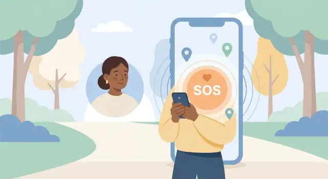
How to Build a Personal Safety App with Emergency Alerts
Step-by-step guide to plan, design, and build a personal safety mobile app with SOS alerts, location sharing, and reliable notifications—safely and responsibly.
Step-by-step guide to plan, design, and build a personal safety mobile app with SOS alerts, location sharing, and reliable notifications—safely and responsibly.
A personal safety app only works if it solves a specific, real-world problem for a specific group of people. “Emergency alerts” is a feature; the product is the moment of fear, confusion, or urgency where someone needs help fast.
Start by picking 1–2 primary audiences—not everyone. Each group behaves differently and faces different risks:
Write down where they are, what device they use, and who they expect help from (friends, family, coworkers, security, or emergency services).
List the top situations you want to handle, then rank them by frequency and severity. Examples:
This list becomes your “alert types” and informs UI decisions like silent alerts, quick triggers, and default messages.
Define success in measurable terms—for example: time to send an SOS, time to reach a trusted contact, percent of alerts delivered, or reduction in “I don’t know what to do” moments. Also include a softer metric: peace of mind (often captured via retention and user feedback).
Decide whether the first version focuses on:
Be explicit about budget, team size, timeline, supported countries (SMS costs and emergency number differences), and whether you can operate 24/7. These constraints will shape every technical and product decision that follows.
A personal safety app fails when it tries to do everything at once. Your MVP should focus on one simple promise: a user can trigger an SOS and their trusted people quickly receive an alert with the user’s live location.
A strong v1 goal could be: “Send an SOS with the user’s location to emergency contacts in under 10 seconds.”
That goal keeps the team honest. It also makes tradeoffs easier: every feature must either shorten time-to-alert, increase delivery reliability, or reduce accidental triggers.
For an emergency alert to be useful, it needs more than “send.” Build your MVP around three outcomes:
This turns your panic alarm app from a one-way message into a small, reliable protocol.
Write down exclusions early to prevent scope creep. Common “not in v1” items for a personal safety app MVP:
You can still mention these in your roadmap—just don’t build them before the core SOS flow is dependable.
Keep user stories concrete and testable:
Turn the above into a compact checklist:
If you can’t explain v1 on a single page, it’s probably not an MVP.
Emergency alerts only work when the user can trigger them instantly, understand what will happen next, and trust that the app will follow through. Your MVP should focus on a small set of actions that are fast under stress and clear in their outcomes.
The SOS action should be usable with one hand and minimal attention.
Once triggered, confirm with a loud, simple state change (screen color, vibration pattern, large text) so the user knows the alert is active.
Contacts are your alert’s delivery list, so setup must be straightforward and reliable.
Allow users to:
Avoid burying this in settings. Make “Who gets my SOS?” a prominent, editable screen.
Location is often the most valuable payload, but it needs to be purposeful.
Offer two modes:
Let users choose an update frequency (battery vs accuracy). Keep defaults conservative and explain them in plain language.
A check-in flow catches problems without requiring a panic moment.
Example: “Arrive safe” countdown.
This is also a great low-friction feature to encourage regular use.
If you include notes, photos, or audio, make it optional and clearly labeled.
Evidence tools can help, but they must never slow down sending the emergency alert.
When someone taps an SOS button, they may be panicked, injured, or trying not to draw attention. Your UX has one job: make the “right” action easy and the “wrong” action hard—without adding friction that prevents help.
Keep onboarding short and plain-spoken. Explain what the app does (send an alert to selected contacts and share location if enabled) and what it does not do (it is not a replacement for calling emergency services, may not work without connectivity, GPS can be imprecise indoors).
A good pattern is a 3–4 screen walkthrough plus a checklist at the end: add emergency contacts, set a PIN (optional), choose alert delivery (push notifications and/or SMS), and test the alert.
Design the SOS button like a panic alarm app control:
Avoid hidden menus. If you support multiple actions (call, message, start recording), keep SOS as the primary action and place secondary options behind a “More” sheet.
False alerts reduce trust and can annoy emergency contacts. Use lightweight safeguards that still feel fast:
Choose one primary prevention method; stacking all three can make the SOS button too slow.
People need immediate feedback. Show status in plain language with strong visual cues:
If delivery fails, present one obvious next step: “Retry,” “Send via SMS,” or “Call emergency number.”
Accessibility is not optional for a personal safety app:
These patterns reduce mistakes, speed up action, and make alerts feel predictable—exactly what you want in an emergency.
A personal safety app can only work if people trust it. Privacy isn’t just a legal checkbox here—it’s part of keeping users physically safe. Design your controls so they’re clear, reversible, and hard to trigger by accident.
Ask for permissions only when the user tries a feature that needs them (not all on first launch). Typical permissions include:
If a permission is denied, provide a safe fallback (e.g., “Send SOS without location” or “Share last known location”).
Location sharing should have a simple, explicit model:
Make this visible on the SOS screen (“Sharing live location with Alex, Priya for 30 minutes”) and provide a one-tap Stop Sharing control.
Store only what you need to deliver the service. Common defaults:
Explain these choices in plain language and link to a short privacy summary (e.g., /privacy).
Privacy controls can protect users from someone nearby:
Be direct: sharing location can expose where someone lives, works, or is hiding. Users should be able to revoke access instantly—stop sharing in-app, remove a contact’s access, and get guidance to disable permissions in system settings. Make “Undo/Stop” as easy as “Start.”
Emergency alerts are only useful if they arrive quickly and predictably. Treat delivery as a pipeline with clear checkpoints, not a single “send” action.
Write down the exact route an alert takes:
App → backend → delivery providers (push/SMS/email) → recipients → confirmation back to your backend.
This map helps you spot weak links (e.g., provider outages, phone number formatting issues, notification permissions) and decide where to log, retry, and fail over.
A good default mix is:
Avoid putting sensitive details in SMS by default. Prefer a short SMS that points to an authenticated view (or includes only what the user explicitly consented to share).
Track delivery as states, not a boolean:
Implement timed retries and provider failover (e.g., push first, then SMS after 15–30 seconds if no delivery/ack). Log every attempt with correlation IDs so support can reconstruct what happened.
When the user taps SOS with poor connectivity:
Protect recipients from spam and protect your system from misuse:
These safeguards also help during app store reviews and reduce accidental repeated sends under stress.
Your architecture should prioritize two things: fast alert delivery and predictable behavior when networks are flaky. Fancy features can wait; reliability and observability can’t.
Native (Swift for iOS, Kotlin for Android) tends to be the safest bet when you need dependable background behavior (location updates, push handling, battery controls) and quick access to OS emergency permissions.
Cross‑platform (Flutter, React Native) can speed up development and keep one shared UI codebase, but you’ll still write native modules for critical pieces like background location, push notification edge cases, and OS-level restrictions. If your team is small and time-to-market matters, cross-platform can work—just budget for platform-specific work.
If your priority is moving from prototype to testable MVP quickly, a vibe-coding workflow can help you iterate on UI and backend together. For example, Koder.ai lets teams create web, server, and mobile app foundations via chat (with planning mode, snapshots/rollback, and source code export), which can be useful for rapidly validating an SOS flow before investing in deeper platform-specific optimizations.
Even an MVP needs a backend that can store and prove what happened. Typical core components include:
A simple REST API is fine to start; add structure early so you can evolve without breaking the app.
Implementation-wise, many teams do well with a straightforward stack (e.g., Go + PostgreSQL) because it’s predictable under load and easy to observe—an approach that also aligns with how Koder.ai structures backends when generating production-ready scaffolding.
For live location sharing during an incident, WebSockets (or a managed real-time service) usually give the smoothest experience. If you want to keep things simpler, short-interval polling can work, but expect higher battery and data usage.
Pick a map provider based on pricing for map tiles + geocoding (turning coordinates into addresses). Routing is optional for many safety apps, but it can add cost quickly. Track usage from day one.
Plan separate environments so you can test critical flows safely:
Location is often the most sensitive part of a personal safety app. Done well, it helps responders find someone quickly. Done poorly, it drains battery, breaks in the background, or creates new risks if data is misused.
Start with the least invasive option that still supports your core use case.
A practical default: no continuous tracking until the user starts an alert, then temporarily increase accuracy and frequency.
Users under stress won’t tweak settings. Pick defaults that work:
Both platforms restrict background execution. Design around it instead of fighting it:
Protect location as if it were medical data:
Give clear, fast controls:
If you want a deeper dive on permissions and consent screens, link this section to /blog/privacy-consent-safety-controls.
Accounts are more than “who you are”—they’re how the app knows who to notify, what to share, and how to keep the wrong person from triggering or receiving an alert.
Give users a few sign-in options, and let them choose what they can reliably use under pressure:
Make the SOS flow independent from re-authentication whenever possible. If a user is already verified on the device, avoid forcing another login at the worst moment.
A safety app needs a clear, auditable relationship between the user and recipients.
Use an invite-and-accept workflow:
This reduces misdirected alerts and gives recipients context before they ever receive an emergency notification.
Offer an emergency profile containing medical notes, allergies, medications, and preferred language—but keep it strictly opt-in.
Let users choose what gets shared during an alert (e.g., “share medical info with confirmed contacts only”). Provide a “preview what recipients see” screen.
If you target multiple regions, localize:
Include clear in-app help for recipients: what the alert means, how to respond, and what to do next. A short “Recipient guide” screen (linkable from the alert) can live at /help/receiving-alerts.
A personal safety app is only useful if it behaves predictably when the user is stressed, in a hurry, or offline. Your testing plan should focus less on “happy paths” and more on proving that emergency flows work in messy, real life conditions.
Start with the actions that must never surprise the user:
Run these tests against real services (or a staging environment that mimics them) so you can validate timestamps, payloads, and server responses.
Emergency use often happens when the phone is in a bad state. Include scenarios like:
Pay special attention to timing: if your app shows a 5-second countdown, verify it stays accurate under load.
Test across new and older devices, different screen sizes, and major OS versions. Include at least one low-end Android device—performance issues can change tap accuracy and delay critical UI updates.
Verify permission prompts are clear and only requested when needed. Confirm sensitive data isn’t leaking into:
Run short, timed sessions where participants must trigger and cancel an SOS without guidance. Watch for mis-taps, misunderstanding, and hesitation. If people freeze, simplify the UI—especially the “Cancel” and “Confirm” steps.
Shipping a personal safety app isn’t just about features—it’s about proving you handle sensitive data and time-critical messaging responsibly. Store reviewers will look closely at permissions, privacy disclosures, and anything that could mislead users about emergency response.
Be explicit about why you request each permission (location, contacts, notifications, microphone, SMS where applicable). Only request what you truly need, and request it “just in time” (e.g., ask for location access when the user enables location sharing).
Complete privacy labels/data safety forms accurately:
State plainly that the app is not a replacement for emergency services and may not work in all situations (no signal, OS restrictions, battery drain, disabled permissions). Place this:
Avoid claiming guaranteed delivery, “real-time” performance, or law-enforcement integration unless you actually provide it.
Treat alert delivery like a production system, not a best-effort feature:
Add internal alarms for elevated failure rates or delayed deliveries so you can react quickly.
Publish a simple support process: how users report issues, how to verify a failed alert, and how to request data export or deletion. Provide an in-app path (e.g., Settings → Support) plus a web form, and define response times.
Plan for “what if alerts don’t go out.” Create an incident runbook covering:
Operational readiness is what turns a safety app from a prototype into something people can trust under pressure.
Shipping a personal safety app isn’t just “publish to the store.” Your first release should prove the alert flow works end-to-end, that users understand it, and that defaults don’t put anyone at risk.
Start with a short checklist you can run every release:
Most safety apps benefit from free core functionality (SOS, basic contacts, basic location sharing) to build trust. Monetize with premium add-ons that don’t gate safety:
Partnerships work best when they’re operationally realistic: campuses, workplaces, neighborhood groups, and local NGOs. Focus messaging on coordination and faster notification—not guaranteed outcomes.
If you do content-driven growth, consider incentives that don’t compromise user trust. For example, Koder.ai runs an earn-credits program for educational content and referrals, which can be a practical way for early-stage teams to offset tooling costs while sharing build learnings responsibly.
Prioritize improvements that raise reliability and clarity:
Plan for continuous work: OS updates, notification policy changes, security patches, and incident-based feedback loops. Treat every support ticket about delayed alerts as a product signal—and investigate it like a reliability bug, not a “user issue.”
Start with one specific moment of need (fear, confusion, urgency) and 1–2 primary audiences (e.g., students walking at night, seniors living alone). Write down where they are, what phone they use, and who they expect help from (friends, family, security, or emergency services).
Rank scenarios by frequency and severity, then design the MVP around the highest-impact ones. Common v1 scenarios include:
Use measurable reliability and speed metrics, such as:
Then track “peace of mind” indirectly via retention and user feedback.
A practical MVP promise is: send an SOS with the user’s location to trusted contacts in under 10 seconds. That keeps scope tight and forces every feature to improve:
Build the alert flow as a mini protocol with three outcomes:
Use a single primary safeguard that stays fast under stress, such as:
Optionally add a short cancel window (5–10 seconds) after sending, but avoid stacking too many steps that slow real emergencies.
Use two modes:
Give a clear Stop Sharing control and conservative defaults (battery vs accuracy) explained in plain language.
Treat permissions as safety-critical UX:
Make consent specific and time-bound (who sees location, when, and for how long).
Use a pipeline with checkpoints:
Implement timed retries and failover, and log every attempt so you can reconstruct incidents.
Focus on messy real-world conditions, not just happy paths:
Run end-to-end tests against staging services, and validate the UI states (Sending / Sent / Delivered / Failed) are unambiguous.