May 14, 2025·8 min
How to Create a Mobile App for Smart Daily Check-Ins
Plan and build a mobile app for smart daily check-ins: define goals, design the flow, pick features, choose a tech stack, and launch with privacy in mind.
Plan and build a mobile app for smart daily check-ins: define goals, design the flow, pick features, choose a tech stack, and launch with privacy in mind.
A daily check-in app is a lightweight way to share a quick update at a consistent cadence—usually in under a minute. A smart daily check-in keeps that same low-friction routine, but adds small touches of “intelligence” so the experience becomes more relevant over time (without turning into a survey).
Smart check-ins are still simple: a tap, a slider, a short note, maybe a photo. The “smart” part is how the app adapts:
The goal is quick, consistent, low-friction updates that produce useful signals over time.
Smart check-ins work anywhere a small, repeated data point helps someone make better decisions:
It’s tempting to start with complex scoring, predictions, or dozens of question types. This guide focuses on building an MVP mobile app: a check-in flow people will actually complete, plus just enough logic to make it feel personalized. After launch, you’ll improve prompts, timing, and insights based on real usage.
This decision changes almost everything:
Be explicit early—your onboarding, data model, and permissions will depend on it.
Before you write requirements or screens, get specific about who the check-ins are for and what “better” looks like. Smart daily check-ins fail most often when the app tries to satisfy everyone with the same flow.
End user (the person checking in) wants speed, clarity, and psychological safety.
They need a check-in that takes under a minute, reminders they can control, and feedback that feels helpful (not judgmental). They also need to understand what data is collected and who can see it.
Manager/coach (the person supporting others) wants visibility without micromanaging.
They need trends over time, lightweight ways to follow up, and signals that highlight who needs attention today—without forcing them to read every entry.
Admin (the person running the program) wants control and consistency.
They need user and team management, templates, permissions, and basic reporting to prove the program is working.
Pick one primary outcome and design everything around it:
If you can’t state your primary outcome in one sentence, the app will drift into a “feature pile.”
A few practical metrics for a daily check-in app:
Also track opt-out rates for reminders and drop-off points during onboarding.
Be explicit about visibility:
Document this early—it affects UX, permissions, and trust throughout the product.
A smart daily check-in succeeds or fails on one thing: whether people actually finish it. Optimize for speed, clarity, and a small sense of reward.
Start with the minimum set that still produces useful signal. If your check-in takes longer than a quick text reply, completion rates usually drop.
A good rule:
Examples:
Different inputs fit different situations. Mix them carefully so the flow stays fast.
Pick a default schedule that matches the user’s reality:
Add a simple “snooze” and “I did it already” option to reduce annoyance.
Smart check-ins should feel helpful, not invasive:
Keep the logic transparent: “We’re asking this because you selected X.”
Decide whether users can:
If you allow it, label entries clearly (“Edited” / “Added later”) so trends and reports remain trustworthy—especially for an employee check-in app or shared reporting.
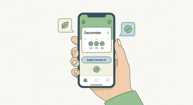
A daily check-in only works if it feels effortless. Your UX goal isn’t to impress—it’s to get someone from “I saw the prompt” to “I’m done” in under a minute, with zero confusion.
Map one “happy path” and design everything around it:
Open app → see today’s prompt → answer → submit → get a quick confirmation → optionally view a short summary.
Extra options (editing past days, advanced insights, settings) should stay out of the way until someone actively looks for them.
One action per screen makes check-ins feel light. If a screen has two primary buttons, you’re asking the user to think instead of respond.
Design for a quick, one-handed interaction:
Accessibility isn’t a “nice-to-have” for check-ins—it’s part of retention.
Make sure you cover the basics early:
Small wording changes can materially improve completion. Aim for friendly, direct prompts that remove uncertainty:
If you want inspiration, model your onboarding and prompts like a conversation—then tighten the language until it reads fast. (More on onboarding patterns at /blog/app-onboarding.)
People will check in on trains, in basements, or with spotty Wi‑Fi. Don’t punish them.
A forgiving flow builds trust—and trust is what turns a daily check-in into a habit.
An MVP for a daily check-in app should do one thing extremely well: help people complete a quick check-in and see something useful from it. Everything else is optional until you prove retention.
1) Onboarding that explains value in 30 seconds
Keep setup lightweight: what the app is for, how long a check-in takes, and what users get back (a clearer picture of patterns, not “more tasks”). Ask only for what you truly need on day one—typically a name, time zone, and a preferred check-in time. Delay permissions (notifications, contacts, calendar) until the moment they’re needed.
2) Reminders that respect real life
Push notifications are usually enough for an MVP. Add the basics that prevent annoyance: quiet hours, a “snooze” option, and an easy way to change reminder time. If your audience includes deskless teams or users with limited push reliability, consider SMS/email as an optional fallback—but keep it minimal.
3) A gentle motivation loop
Streaks and badges can work, but the tone matters. Use encouraging language (“Nice job checking in three days this week”) instead of guilt (“You broke your streak”). Small, positive nudges beat aggressive gamification for long-term trust.
4) Views that make the data feel worth entering
At minimum: a daily log, a weekly trends view (simple charts or summaries), and a place for notes. If you add searchable history, keep it fast and forgiving (search by keyword and date range).
For an employee check-in app, the MVP can support: group check-ins, a simple manager summary, and clearly labeled private notes (access-controlled). Avoid complex org charts and heavy analytics until you confirm adoption.
AI-generated insights, mood predictions, deep integrations (Slack/Teams), custom automation, and advanced dashboards are best postponed. If the core check-in habit isn’t sticky, extra features won’t fix it.
“Smart” can make a daily check-in app feel effortless—or make people feel monitored. The difference is clarity, restraint, and control.
Pick 1–2 intelligence benefits that directly reduce effort:
Avoid “smart” features that guess deeply personal causes (“you’re depressed”) or imply you know why something happened.
A few lightweight tactics that users typically accept:
People get uneasy when an app acts like it has secret knowledge. A simple rule: every suggestion should be explainable in one sentence.
Example microcopy:
“Suggested because you mentioned ‘late caffeine’ twice this week.”
Also, be careful with sensitive areas (health, relationships, finances, work performance). Don’t infer medical conditions, don’t label users, and don’t present guesses as facts.
Give users an easy way to correct the app:
This improves accuracy and signals respect.
Include a per-user setting to disable smart features (or parts of them). A good approach is tiered controls:
When users can dial intelligence up or down, the app feels supportive—not invasive.
Your tech choice should match what your check-in app needs on day one: how “mobile” it must feel, how fast you need to ship, and what your team can maintain.
Best when you need top-notch performance, deep OS integration (widgets, advanced notification actions, health sensors), or very polished UI.
Trade-off: you build (and maintain) two separate apps for iOS and Android, which usually means higher cost and slower iteration unless you have a larger team.
A common choice for a daily check-in app because you can share most of the code across iOS and Android while still publishing to the App Store and Google Play.
Trade-off: you may hit edge cases with certain device features, and some “native-feeling” details can take extra effort. For most MVPs, it’s a strong balance of speed and quality.
A PWA runs in the browser and can be “installed” to a home screen. It’s great if you want a fast launch, simple updates (no app store review for every change), and broad device support.
Trade-off: push notifications and background behavior are more limited (especially on iOS), and a PWA may feel less like a true mobile habit tracking app.
Most smart check-ins include:
If your goal is to validate retention quickly, a vibe-coding approach can help. With Koder.ai, you can describe the check-in flow, schedules, and roles in a chat-style “planning mode,” generate a working web app (React) plus backend (Go + PostgreSQL), and iterate on prompts and reminders without rebuilding from scratch. When you’re ready, you can export source code, deploy with hosting and custom domains, and use snapshots/rollback to safely test new check-in logic.
For authentication, plan for:
If you allow photos or attachments, decide where they live (cloud storage vs database), who can access them, and how long you keep them (for example, “delete attachments after 90 days” or “keep until the user deletes”). These choices affect privacy expectations, storage cost, and support burden.
If you’re unsure, many teams start cross-platform for an MVP, then go native only if real usage proves it’s necessary.
Trust is a feature in a daily check-in app. People are sharing feelings, habits, health notes, or work signals—and they’ll abandon the product if it feels like it’s collecting more than it needs.
Start with a “data diet”: capture the minimum information required to deliver the benefit you promised. If the app’s job is a mood check-in, you probably don’t need precise location, contacts, or microphone access.
A simple rule: if you can’t explain why you need a data point in one sentence, don’t collect it “just in case.” You can always add fields later, but you can’t easily undo a reputation for over-collection.
Avoid asking for permissions on first launch with no context. Instead, use just-in-time prompts:
Keep the language plain and user-centered: what you’ll do, what you won’t do, and how to change it later.
You don’t need security jargon, but you do need the fundamentals:
If you support an employee check-in app use case, be explicit about admin capabilities and audit trails.
Define who can see what, and when. For example: individual entries visible only to the user; managers see aggregated trends; HR sees flagged items only with consent or clear policy. Make these rules visible in the UI (not hidden in a legal page).
Give people control over their data:
A short, readable privacy page linked in settings (e.g., /privacy) reinforces that the app is designed to help—not to watch.
Retention is where a daily check-in app succeeds or quietly fails. The goal isn’t “more data”—it’s learning what helps people complete check-ins consistently, without feeling nagged.
Before tweaking UX, make sure you can see the basic behavior. Set up event tracking for a small, clear set of actions:
Keep event names consistent and include a few helpful properties (e.g., check-in type, day of week, reminder time). This will help you spot patterns like “people start but don’t finish” versus “people never open the reminder.”
If the app is slow, crashes, or fails to sync, retention drops regardless of how good your questions are. Monitor:
Treat these as product metrics, not just engineering metrics. A 2-second delay on the final submit button can be the difference between a habit and churn.
Run quick usability tests with 5–10 target users before building too much. Give them realistic scenarios (“It’s 9pm and you’re tired—do your check-in”) and observe:
Small fixes—like changing button labels or shortening one question—often improve completion more than adding new features.
Reminders are powerful but easy to overdo. If you run A/B tests, change one variable at a time:
Define your success metric upfront (e.g., completed check-ins per user per week) and avoid “winning” a test that boosts opens but increases skips or uninstalls.
Create a lightweight dashboard tied to the success metrics you defined earlier: completion rate, streak retention, reminder open-to-complete rate, and a few quality indicators (crashes, slow screens). Keep it visible to the whole team so each release has a clear hypothesis and measurable outcome.
A smart daily check-in app usually succeeds or fails in the first week after launch. Treat “launch” as the start of learning—not the finish line.
Prepare your store listing like a mini sales page, not a technical spec sheet.
Focus on:
Also confirm the basics: app name availability, icon, versioning, and any permission prompts are justified (especially notifications).
Start small so you can fix issues before they affect everyone.
A practical rollout checklist:
Add an in-app feedback option that’s always available (e.g., “Send feedback” in Settings).
After 7 days, trigger a short survey (2–3 questions):
Build your roadmap from real behavior: completion rate, streaks, notification opt-in, and drop-off points.
Keep a running list of:
If you offer plans, link pricing clearly from your site (/pricing). For ongoing education and release notes, publish updates in /blog.
A daily check-in app helps users submit a quick update at a consistent cadence—usually in under a minute. A smart daily check-in stays lightweight but adapts over time (e.g., avoids redundant questions, times nudges better, and summarizes patterns) so the experience feels more relevant without turning into a long survey.
Start by choosing one primary outcome, then measure it:
Also track onboarding drop-off so you can see whether people fail before they ever build the habit.
Keep the first version tiny:
Aim for under 30 seconds. If the check-in feels like a survey, completion rates typically drop.
Pick inputs that fit the moment and minimize typing:
Set a sensible default, then make it flexible:
Also include “I already did it” or “Not today” to reduce annoyance and prevent spammy nudging.
Use small, explainable logic that reduces effort:
Add transparency (“Suggested because you selected X”) and give users controls like Not relevant and Don’t ask again so the app stays supportive, not invasive.
Start with one clear “happy path”:
Open app → today’s prompt → answer → submit → quick confirmation → optional summary.
Keep advanced settings (editing, history search, templates) out of the way until users actively look for them. One primary action per screen usually beats “feature-rich” screens for retention.
Design for low trust bandwidth and spotty connectivity:
Reliability is retention—people won’t build a daily habit on a fragile flow.
Choose based on how “mobile” you need to be and how fast you must ship:
If you’re unsure, cross-platform is often a strong MVP default unless you need deep device features on day one.
Build trust with a “data diet” and clear visibility rules:
A readable privacy page (e.g., /privacy) and clear UI labels reduce anxiety and churn.
Mix types carefully so the flow stays fast and thumb-friendly.