May 08, 2025·8 min
How to Create a Website for a Research & Analytics Report Hub
Learn how to plan, structure, and launch a research or analytics report hub with clear navigation, strong SEO, fast performance, and a scalable content workflow.
Learn how to plan, structure, and launch a research or analytics report hub with clear navigation, strong SEO, fast performance, and a scalable content workflow.
A report hub isn’t just a page with PDFs. It’s a destination people return to because it reliably answers a few core questions: what you’ve published, what’s new, and what matters to them. Before you touch design, define the hub’s job in plain language (for example: “Help prospects evaluate our expertise” or “Give clients a self-serve library for quarterly insights”).
Different audiences look for different signals of credibility and value:
Write down your #1 audience and what a “successful visit” looks like for them (e.g., “find the latest benchmark for their industry and subscribe for updates”).
Be explicit about formats so you don’t build a hub that only works for one asset type:
This list will influence navigation, preview behavior, and gating decisions.
Pick a small set of metrics tied to outcomes, not vanity:
Decide what’s public vs. gated vs. internal-only using a simple rule: public for discoverability, gated for high-intent assets, internal for anything that creates risk (client-only benchmarks, draft data).
Sketch the path: search/social → report landing page → preview/key takeaways → read/download → next step (subscribe, request demo, related report). If you can’t describe that path in one sentence, the hub’s purpose isn’t clear yet.
A report hub succeeds when people can predict where things live and what each page is “about.” Start by defining your core content types (the things you will publish and maintain) and the relationships between them (how users browse and how search filters work).
Keep the first version simple and explicit. Most hubs benefit from these content types:
Choose a consistent structure early so you don’t need messy redirects later. A straightforward example:
/reports/<topic-name>/<report-title>If a report is better grouped by industry, you can still keep reports under /reports/ and rely on metadata (topics/industries) for browsing—URLs don’t need to encode every category.
Make every report page complete and consistent by standardizing what it includes:
This content model is what enables reliable search, filters, “related reports,” and clean SEO.
Decide whether updates create a new edition page or update in place. Either way, show a clear “Last updated” date and an edition label (e.g., “Q3 2025” or “2025 Edition”).
Set rules for titles and dates so sorting works:
YYYY-MM for monthsYYYY-Q# for quartersA report hub succeeds or fails on whether people can find what they need in a few clicks. Taxonomy is the system behind that discovery: categories (broad shelves), filters (narrowing controls), and tags (lightweight cross-links).
Pick 5–10 top-level categories that a first-time visitor can understand instantly. Use user language (what customers say) rather than internal team language (what departments say). If you’re unsure, scan:
A good rule: if a category needs a paragraph to explain, it’s not a category—it’s a filter or a tag.
Filters work best when they reflect common decision variables. Prioritize a small set that covers most needs:
Keep filter values consistent (for example, “United States” vs “USA” vs “US” will create messy duplicates). This is also where an “All” option and sensible defaults reduce friction.
Tags are helpful for cross-cutting themes (e.g., “pricing,” “forecast,” “consumer behavior”), but they can spiral into hundreds of near-duplicates. Put guardrails in place:
If filters include niche terminology (methodologies, industry jargon, acronyms), create a small glossary that defines each term in plain English. Link to it from filter tooltips or a “What do these mean?” link near the filters.
Ensure every report can surface related reports via at least one clear rule: same topic/category, same industry, or same year. This boosts discovery without asking users to restart their search.
Your report hub will feel “easy” (or frustrating) largely because of a handful of repeatable page templates. Get these right early, and every new report you publish becomes simpler to ship and easier to find.
Treat the homepage as a guided entry point, not a dumping ground. Include:
Listing pages are where most discovery happens, so they should feel predictable and fast.
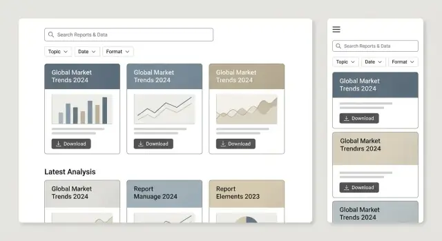
Show sorting (Newest, Most popular, A–Z), pagination (or “Load more”), and a clear result count (“42 reports”). Each card should include title, date, topic, and a one-line takeaway—enough to decide whether to click.
This is the decision page. Include an executive summary near the top, a preview of key charts or findings, and obvious download/read options (PDF, web version, interactive dashboard embed if you have one). Also add “Related reports” to keep people moving.
Topic pages act as mini-hubs. Write a short intro defining the topic, highlight “Best reports,” show “Latest updates,” and add internal links to related topics (e.g., /topics/customer-retention).
If credibility matters (it often does), author/team pages help. Include a short bio, areas of expertise, and all reports contributed—useful for trust and for repeat visitors following specific analysts.
Search is often the main navigation for a report hub—especially when you have dozens (or hundreds) of publications. The goal isn’t “fancy search,” it’s quick answers with minimal friction.
People will misspell acronyms, shorten report names, and forget exact titles. If your platform allows it, add typo tolerance (fuzzy matching) and synonyms (e.g., “AI” ↔ “artificial intelligence”). Even small touches—highlighting matched terms and showing results instantly—make search feel reliable.
At minimum, support search across:
If you publish recurring series, index the series name too—users often search for “Q2 outlook” more than a formal title.
Don’t force visitors to choose between a “Search page” and a “Browse with filters” page. Let them search and narrow results with filters (topic, date, format, region, industry, etc.) in the same view.
Keep filters sticky and show active chips so people can undo choices quickly.
A dead-end “No results” message wastes attention. Instead, offer:
Track on-site search queries and zero-result searches. These are direct signals for new content, missing tags, or confusing naming. Add this to your monthly review alongside traffic and conversions so the hub improves continuously, not just at launch.
The best report hub isn’t just a folder of files—it’s a reading experience. Format choices affect searchability, accessibility, and how easily someone can skim, share, and cite your work.
PDF-only is fastest to publish and preserves layout, but it’s harder to read on mobile and harder to link to specific sections.
HTML report pages are ideal for scanning, responsive charts, and deep-linking to headings. They also make it easier to add “related reports” blocks and update small sections without re-exporting a full document.
Both is often the sweet spot: publish an HTML summary (or full HTML report) and offer the PDF as a downloadable artifact.
Use clear, consistent file naming that matches what users see on the page, e.g.:
2025-q2-saas-benchmarks.pdf (not final_v7.pdf)Add prominent download buttons with file size and format (“Download PDF • 4.2 MB”). If you offer supporting data, label it plainly (“Download CSV (cleaned)”).
Structure pages with real headings (H2/H3), descriptive link labels (“Download the full report (PDF)”), and sufficient color contrast. If you include images (like a chart screenshot), provide meaningful alt text—or mark purely decorative images as decorative.
Keep charts legible on mobile: avoid tiny axis labels, prefer simplified “mobile” versions, and consider letting users tap to enlarge. Offer image downloads only when it helps reuse (e.g., press kits), and ensure the context/citation travels with the image.
Every report should include:
These elements reduce support questions and make your research easier to reference in meetings, articles, and procurement reviews.
SEO for a report hub is less about chasing phrases and more about making each report easy to understand, index, and navigate. If a human can quickly grasp what a report is about and find related material, search engines usually can too.
Give every report page a unique, specific title—think “2025 Retail Pricing Index: Q2 Findings (PDF + Dashboard)” rather than “Research Report.” Your meta description should summarize the value in one or two sentences: what the report covers, the geography/industry, and who it’s for.
For topic pages (collections like “Customer churn” or “Supply chain”), use titles that describe the theme and the benefit: “Churn Benchmarks and Retention Research” instead of repeating the same keyword across pages.
Use descriptive headings (H2/H3) and include a short summary near the top. A simple pattern works well:
This creates clear “chunks” that can appear in search snippets and helps users decide whether to download, read online, or share.
Internal linking is how you teach both readers and crawlers what belongs together.
Link between:
Also publish supporting articles in /blog or /insights that interpret findings and point to the source report. Example: /blog/what-the-data-shows-2025. These posts can target broader questions while your report pages target high-intent searches.
Generate XML sitemaps that include report pages and topic pages, and keep URLs stable. If the same report can be accessed via multiple paths (filters, campaigns, UTM links), set a canonical URL to the primary version so authority doesn’t split across duplicates.
Gating can help you fund research and build a qualified audience—but it can also frustrate users if it feels like a trap. The goal is simple: only gate when it genuinely matches the value being exchanged, and make the “what happens next” crystal clear.
Not everything should sit behind a form. Consider a tiered approach that supports both discovery and conversion.
A practical test: if someone can’t tell whether the report is useful without downloading it, you’re gating too early.
Keep forms short and set expectations. Ask for the minimum required to deliver the asset and route the lead.
Explain:
If you need more fields for sales, consider progressive profiling later rather than on the first download.
Some visitors aren’t ready to trade details yet. Provide a clear secondary action near the primary gate:
This keeps the page useful even for people who bounce off gating.
After form submission, send users to a dedicated thank-you page with:
This is also a great place to track conversions cleanly.
Decide—before launch—where leads go and who follows up:
If routing is unclear, gates generate busywork instead of revenue.
A report hub lives or dies on trust and speed. People arrive to answer a question quickly—if pages feel heavy or files seem risky, they leave.
Pick a few measurable goals and treat them as non-negotiable:
Report hubs often rely on thumbnails, cover images, and preview pages. Keep them quick:
Even a public report library needs solid fundamentals:
Treat report files like product releases:
Old reports still attract traffic.
A report hub lives or dies by consistency. A clear workflow keeps each release easy to find, easy to trust, and easy to maintain—especially when multiple teams contribute.
Assign named owners for each step so work doesn’t stall in “someone will do it” limbo:
Create a checklist that’s short enough to follow and strict enough to prevent messy releases. Typical items:
Consider keeping the checklist in your CMS template or in a shared doc linked from /blog.
Before publishing, run quick QA focused on real usage:
Use an editorial calendar for recurring releases (weekly insights, quarterly reports, annual indexes). Include deadlines for review and design so launch dates are predictable.
Document a rule: never change the original report URL. When updating, keep the page and add a visible “Updated on” note, a changelog section, and (if needed) a link to an archived PDF version. This preserves citations, bookmarks, and long-term trust.
If you don’t measure how people find, evaluate, and use reports, you’ll end up optimizing for opinions. A report hub is ideal for simple, repeatable analytics: every report is a “product page” with clear actions (read, download, share, cite, subscribe).
Track a small set of key events consistently across every template:
This lets you answer practical questions like: “Do people who search convert more?” and “Which filters cause drop-off?”
Create dashboards that your content and marketing teams can read at a glance:
A useful pattern is a “top reports” table plus “rising reports” (last 7–14 days) to spot trends early.
Use UTM-tagged links for campaigns, partner emails, and social posts so you can see which channels drive not just traffic, but meaningful actions (downloads and qualified form submits). Keep naming conventions short and consistent.
Run small experiments: swap homepage modules, test CTA copy and placement, and compare gating rules (e.g., gate only the PDF, not the web summary). Then review quarterly: prune unused tags, merge confusing categories, and refresh internal links on your top-performing pages to keep the hub compounding over time.
Launching a report hub is less about a “big reveal” and more about getting a solid version in front of real users quickly—then improving with evidence.
Aim for a hub that feels complete without being exhaustive: roughly 20–50 reports, organized into 5–10 topics, with simple filters (topic, year/quarter, format, and “new/updated”). That’s enough content for visitors to explore patterns, while small enough to maintain quality.
Keep the first release focused on what users expect:
Before investing in advanced features, make sure your core templates are consistent and your fundamentals are covered: descriptive titles, clean URLs, indexable landing pages, and internal linking between related reports and supporting articles (for example, /blog/how-we-ran-the-survey).
If you gate some reports, ensure there’s still enough public context for users (and search engines) to understand what the report contains.
If you want to ship a functional hub quickly—without wiring up React pages, Go services, PostgreSQL schemas, search, auth, and gating from scratch—tools like Koder.ai can help you scaffold and iterate via chat.
Koder.ai is a vibe-coding platform that can generate a report-hub foundation (web + backend + database), then refine details like taxonomy, gated downloads, and admin workflows. It also supports source code export, deployment/hosting, custom domains, and safer iteration with snapshots and rollback—useful when you’re evolving templates and metadata rules after launch.
Do a soft-launch with internal stakeholders (research, marketing, sales, support). Ask them to complete tasks like “find the latest report on X” or “compare reports from 2023 vs 2024,” and log where they get stuck.
A practical checklist includes: analytics tracking, redirects, PDF checks, form testing (if gated), mobile review, and page-speed sanity checks.
Treat launch as the start of a publishing cycle: newsletter announcements, social posts, partner sharing, and a handful of relevant /blog posts that point into the hub.
Once the hub is stable, expand intentionally: interactive dashboards, datasets/APIs, localization, and member areas. Only add what you can support long-term with ownership, documentation, and a maintenance schedule.
Start with one sentence that defines the hub’s job (e.g., “Help clients self-serve quarterly insights”). Then specify:
If you can’t describe the path from discovery → report page → next step, the purpose isn’t clear yet.
Pick a clear #1 audience and optimize the default experience for them:
Then add secondary affordances (filters, author pages, press-friendly citations) without cluttering the core journey.
Use a simple content model with reusable page types:
Define what fields each type stores (date, summary, key findings, format links, topics/industries) so templates and filters stay consistent as you scale.
Choose a stable, human-readable pattern early, such as:
/reports/<topic-name>/<report-title>Keep URLs simple and rely on metadata (topics, industries, regions) for browsing instead of encoding every category into the URL. If you later reorganize, use redirects and keep one canonical URL per report to avoid SEO dilution.
Decide upfront whether you:
2025-Q3)Either way, standardize naming so sorting and search work (e.g., YYYY-MM or YYYY-Q#), and avoid vague filenames like in favor of publish-ready names.
Keep taxonomy small and user-centered:
If filters include specialized terms, add a small glossary and link to it from tooltips or a “What do these mean?” link near filters.
Make search fast and forgiving, and combine it with filters in one results view:
Also design “no results” states to suggest broader queries, reset filters, and point to popular or recent reports.
A practical default is “both”:
Make downloads trustworthy by showing file size/format and keeping filenames aligned with the page (e.g., 2025-q2-saas-benchmarks.pdf). If you offer CSVs/datasets, label them clearly (e.g., “Download CSV (cleaned)”).
Use tiered gating so discovery still works:
Always provide an alternative CTA (newsletter, contact, demo) so the page is still useful if someone won’t fill out the form.
Instrument the same core events across all templates:
Use those insights to prune unused tags, fix confusing naming, adjust gating, and refresh internal links on top pages so the hub improves continuously—not only at launch.
final_v7.pdf