

How to Build a Mobile‑Optimized, Lightning‑Fast Website
Learn how to build a mobile-friendly website that loads fast: responsive layout, optimized images, lightweight code, caching, testing, and ongoing monitoring.
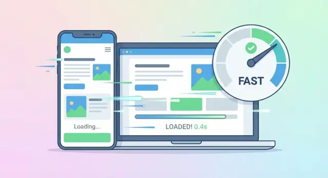
Why Mobile + Speed Matter (and What to Aim For)
Most visitors experience your site on a phone—often on a shaky connection, while multitasking. If the page feels slow or jumpy, they don’t “wait it out”—they leave. That’s why a mobile-optimized website and website speed optimization aren’t just technical nice-to-haves: they directly affect bounce rate, trust, and conversions (signups, purchases, calls, bookings).
Speed + usability = fewer drop-offs
On mobile, every extra second increases friction: buttons feel harder to tap, text is harder to scan, and the page can look “broken” while it loads. A fast, stable page keeps people moving—scrolling, reading, and completing actions instead of abandoning.
Core Web Vitals: Google’s user-experience yardsticks
Google’s Core Web Vitals are performance signals that map closely to what people feel:
- LCP (Largest Contentful Paint): how quickly the main content appears.
- INP (Interaction to Next Paint): how responsive the page feels when someone taps, types, or opens a menu.
- CLS (Cumulative Layout Shift): how much the layout jumps around while loading.
These metrics don’t replace great content, but they help ensure your content is actually usable on a phone.
What “fast enough” means (practical targets)
Set clear goals so decisions are easier later:
- LCP: aim for ≤ 2.5s on typical mobile connections.
- INP: aim for ≤ 200ms.
- CLS: aim for ≤ 0.1.
Also aim for a page that feels smooth: visible content appears quickly, interactions respond immediately, and nothing shifts under the user’s finger.
Common reasons sites feel slow on phones
Usually it’s not one big issue—it’s several small ones:
- Oversized images and missing lazy loading
- Too much JavaScript (heavy sliders, popups, trackers)
- Custom fonts that delay text rendering
- Layout shifts from late-loading ads, banners, or images without dimensions
- Slow hosting, weak caching, or too many third-party scripts
Audit Your Current Site on Real Devices
Before you redesign anything, get a clear picture of how your site behaves for real visitors. A desktop Chrome window on a fast connection can hide the exact problems mobile users feel: slow loading, jumpy layouts, and laggy taps.
Test on real phones (not just a desktop preview)
Open your key pages (homepage, a popular blog post, pricing/product page, checkout/contact) on at least one iPhone and one Android device if possible. Pay attention to what you notice without “hunting” for issues:
- Does the page feel slow before anything becomes usable?
- Do buttons respond instantly, or do taps feel delayed?
- Does the layout shift while content loads?
- Is any text too small, too close together, or hard to read?
Also test in different browsers (Safari + Chrome). Mobile Safari, in particular, can reveal font, sticky header, and viewport quirks that desktop testing won’t.
Run a Lighthouse audit and PageSpeed Insights
Next, run a Lighthouse audit in Chrome DevTools (Mobile mode) and check PageSpeed Insights. Don’t focus only on the score—use the report to find the biggest cost centers, such as:
- Large images and unoptimized media
- Too much JavaScript (slow interactivity)
- Render-blocking CSS
- Third-party scripts (chat widgets, trackers) delaying load
Write down the top 5 opportunities that appear repeatedly across important pages. Those recurring items are usually your best first fixes for website speed optimization.
Check Core Web Vitals: LCP, INP, CLS
Core Web Vitals translate “speed” into user experience:
- LCP: how fast the main content appears. High LCP often points to heavy images, slow server responses, or render-blocking resources.
- INP: how responsive the page feels when users tap, type, or click. Poor INP often indicates too much JavaScript or long tasks on the main thread.
- CLS: how stable the page is while loading. High CLS usually comes from images without dimensions, late-loading embeds, or fonts swapping in.
Track these metrics for your top pages. This becomes your “before” snapshot.
Measure on slow networks and low-end devices
Many users aren’t on perfect Wi‑Fi. In Chrome DevTools, simulate slower connections (3G/4G) and watch what breaks first. If you can, test on an older or lower-end Android device too—CPU limits can reveal INP problems that modern phones hide.
Create a simple baseline report
Keep it lightweight: a one-page doc or spreadsheet that lists, per page, your current LCP/INP/CLS, total page weight, and a few notes (e.g., “hero image is 1.8MB,” “chat widget blocks load”). You’ll use this baseline to prove each change improves real performance—not just a score.
Mobile-First Layout and UX Essentials
A fast site can still feel “slow” on mobile if people can’t read, tap, or find what they need. Mobile-first UX means designing for the smallest screen and touch input first—then enhancing for larger screens.
Start with a truly responsive layout
Use a responsive grid and fluid elements so the layout adapts cleanly to any screen size. Avoid fixed-width containers and components that overflow. Test common breakpoints (360–430px phones, small tablets) and make sure key sections don’t require pinch-zoom.
Make reading and tapping effortless
Prioritize legibility: comfortable font sizes, strong contrast, and generous line spacing. For touch, ensure tap targets (buttons, links, form inputs) are large enough and spaced apart so users don’t mis-tap—especially in menus, filters, and checkout/contact forms.
Prevent layout shifts (and user frustration)
Unexpected movement is one of the quickest ways to lose trust.
Reserve space for:
- Images (set width/height or aspect ratio)
- Ads, embeds, and video players
- Sticky UI elements (headers, cookie banners)
This keeps the page stable while it loads and improves Core Web Vitals, particularly CLS.
Keep navigation simple and thumb-friendly
Mobile navigation should be predictable:
- A sticky header for primary actions (menu, cart, contact)
- A clear, short menu structure (avoid deep nesting)
- Search where it’s genuinely useful (stores, content-heavy sites)
Design key pages mobile-first
Don’t just make the homepage responsive—design the pages that drive outcomes for mobile users:
- Home: clear value + primary CTA above the fold
- Product/service page: scannable sections, prominent pricing/next step
- Checkout/contact: minimal fields, helpful input types, clear error messages
If you need a checklist for page structure, see /blog/mobile-first-checklist.
Set a Performance Budget and Priorities
Speed work goes smoother when you treat performance like a budget, not a vague goal. A performance budget sets clear limits on what your pages are allowed to “spend” (bytes, requests, and time) so new features don’t quietly slow the site down.
Define your performance budget
Pick a small set of targets that are easy to measure and hard to argue with:
- Page weight: total bytes for the initial view (HTML + CSS + JS + images + fonts)
- Requests: how many network calls the page makes on first load
- Core Web Vitals: LCP, INP, and CLS
Write these down as pass/fail numbers. Example targets (adjust to your audience): LCP ≤ 2.5s, INP ≤ 200ms, CLS ≤ 0.1, plus a maximum total transfer size for the first view.
Pick 1–2 user journeys to optimize first
Trying to speed up everything at once usually means nothing ships. Choose the flows that matter most to the business, such as:
- Landing page → product page → checkout
- Landing page → signup
Measure these journeys on mobile and optimize them before secondary pages.
Decide what must load now vs. what can wait
For each key page, classify assets:
- Must load now: above-the-fold content, critical CSS, primary hero image, essential UI scripts
- Can wait: below-the-fold images, non-critical widgets, analytics extras, secondary carousels
This mindset leads naturally to tactics like lazy loading, deferring non-essential JavaScript, and loading third-party tools only after user interaction.
Document targets where everyone can see them
Add your budget and Core Web Vitals targets to a shared doc or project board, and link it in your dev process. Then treat any new component as a cost—if it exceeds the budget, something else must be trimmed.
Optimize Images Without Losing Quality
Images are often the biggest files on a page—and the easiest place to win back seconds of load time on mobile connections. The goal isn’t “make everything tiny.” It’s to deliver the right image, in the right format, at the right moment, with no surprise jumps.
Serve correctly sized images (use responsive srcset)
A common mistake is shipping a 2000px-wide desktop image to a 375px-wide phone. Instead, export a few sensible sizes and let the browser pick the best one.
<img
  src="/images/hero-800.jpg"
  srcset="/images/hero-400.jpg 400w,
          /images/hero-800.jpg 800w,
          /images/hero-1200.jpg 1200w"
  sizes="(max-width: 600px) 92vw, 1200px"
  alt="Your product in use"
  width="1200"
  height="675"
/>
This keeps mobile downloads small while preserving crisp visuals on larger screens.
Use modern formats (WebP/AVIF) when possible
Modern formats can dramatically reduce file size with minimal visible change.
- AVIF: best compression, sometimes slower to encode
- WebP: wide support and a strong default choice
Use a <picture> element so compatible browsers get the modern version, while others fall back gracefully:
<picture>
  <source type="image/avif" srcset="/images/hero-800.avif 800w" />
  <source type="image/webp" srcset="/images/hero-800.webp 800w" />
  <img src="/images/hero-800.jpg" alt="Your product in use" width="1200" height="675" />
</picture>
Compress images and remove unnecessary metadata
Compression should be part of your workflow (or build pipeline). Aim for “looks identical at normal viewing distance,” not pixel-peeping perfection.
Also strip metadata (like camera info) unless you truly need it—this reduces file size and can improve privacy.
Lazy-load below-the-fold images (without hurting UX)
Lazy loading is ideal for images users won’t see immediately. Keep above-the-fold images loading normally so the page doesn’t feel empty.
<img src="/images/gallery-1.webp" loading="lazy" alt="Gallery item" width="800" height="600" />
If a lazy-loaded image is important to perceived speed (e.g., the first visible image in a section), consider preloading it instead of lazy-loading.
Set width and height to prevent layout shifts
Unexpected layout movement is frustrating on mobile and can hurt Core Web Vitals. Always include dimensions (or ensure CSS reserves space) so the browser can allocate the correct area before the image arrives.
When you combine responsive sizing, modern formats, compression, and thoughtful lazy loading, you usually get the best of both worlds: fast pages and sharp visuals.
Make CSS and JavaScript Lightweight
Your CSS and JavaScript are often the biggest “hidden” reasons a mobile-optimized website feels slow. The goal is simple: ship less code, and ship it smarter.
Minify and compress what you send
Start with the basics: minify CSS/JS (remove whitespace and extra characters) and enable compression on the server. Modern stacks can serve files with Brotli (best) or gzip (good), which can cut transfer size dramatically—especially on mobile networks.
Remove what you don’t use
Many sites load styles and scripts “just in case.” That cost shows up on every page view.
- Unused CSS: If you’re using a framework (like Bootstrap or Tailwind), ensure your build exports only the classes you actually use.
- Unused JavaScript: If you import a whole library for one small feature, you pay for it everywhere. Prefer smaller utilities, or native browser features when they’re sufficient.
Avoid heavy libraries when a simpler option works
Before adding a slider, animation library, or UI kit, ask: “Can we do this with basic CSS, or a tiny script?” Replacing a large dependency can be one of the fastest wins in website speed optimization.
Load important code first
Make the first screen interactive quickly:
- Defer non-critical scripts (use
deferfor scripts that aren’t needed immediately) - Code-split so each page loads only what it uses
- Lazy load features below the fold (maps, carousels, widgets)
Reduce third-party tags
Chat widgets, trackers, and ad scripts can slow down Core Web Vitals and make performance unpredictable. Remove any you don’t truly need, and load the rest later (after user interaction or after the page is usable).
If you want a clear checklist, pair this work with a /blog/lighthouse-audit run to see which files are actually hurting your load time.
Fonts, Media, and UI Elements That Don’t Slow You Down
Even if your layout is clean and your images are optimized, fonts and “nice-to-have” UI effects can quietly add seconds to mobile load time. The goal is to show readable content immediately, then enhance the page without blocking it.
Fonts: fast, readable, and brand-safe
Start by loading fewer font files. Each weight (300/400/700) and style (italic) is usually a separate download—so pick the minimum your design truly needs.
If your brand rules allow it, system fonts are the fastest option because they’re already on the device. A modern system stack can still look polished.
Preload only the fonts that affect above-the-fold text (like your primary body font) so the browser doesn’t “discover” them late.
<link rel="preload" href="/fonts/Inter-400.woff2" as="font" type="font/woff2" crossorigin>
Always prevent invisible text by using font-display: swap, so visitors can read immediately while the custom font loads.
@font-face {
  font-family: "Inter";
  src: url("/fonts/Inter-400.woff2") format("woff2");
  font-display: swap;
}
Media: avoid “heavy by default” design
Large hero sliders, auto-play videos, and complex animations can dominate mobile bandwidth and CPU. Prefer a single static hero image (or a lightweight video that only plays on tap). If you need motion, favor subtle CSS transitions instead of large animation libraries.
UI elements: keep components simple and accessible
Choose UI components that render quickly: native inputs, simple navigation, and lightweight modals. This also tends to improve accessibility (clear focus states, larger tap targets, fewer moving parts).
If you’re using third-party widgets (chat, embeds, social feeds), load them only when needed (after consent or on interaction) so they don’t block the main page experience.
Caching, CDN, and Hosting Basics
Speed isn’t only about what you build in the browser—it’s also about how quickly your server can deliver files and pages, especially on mobile networks. A few practical infrastructure choices can remove seconds of waiting without changing your design.
Enable browser caching for static assets
Visitors shouldn’t re-download the same logo, CSS, or JavaScript on every page view. Configure browser caching (via Cache-Control headers) so static assets are stored locally.
Typical approach:
- Version your files (e.g.,
app.v3.css) and set a long cache time (30 days to 1 year) - Keep HTML caching shorter, since content changes more often
This is one of the simplest ways to make repeat visits feel instantly faster.
Use a CDN to serve files closer to users
A CDN (Content Delivery Network) copies your static files to servers around the world, so mobile users download them from a nearby location instead of crossing continents.
A CDN is especially helpful for:
- Images and videos (even with lazy loading)
- CSS/JS bundles
- Fonts (if you must use web fonts)
Many CDNs also support automatic compression and modern protocols, which can help your Core Web Vitals.
Turn on HTTP/2 or HTTP/3 when available
If your host supports it, enable HTTP/2 (or HTTP/3) to speed up how files are delivered over a single connection. This matters on mobile where latency is often the bottleneck.
You’ll usually get HTTP/2 automatically with HTTPS. HTTP/3 support depends on your provider and CDN.
Keep server response time low
A fast front-end still feels slow if the server takes too long to respond. Aim for:
- Hosting that isn’t overloaded
- Efficient database queries and minimal plugins
- Server-side caching so pages don’t rebuild every request
In Lighthouse reports, watch for Time to First Byte (TTFB) issues—slow TTFB often points to hosting or backend bottlenecks.
Cache full pages or fragments (when it makes sense)
If your pages don’t change per user, full-page caching can be a huge win. If only parts are dynamic (like a cart count), use fragment caching so most of the page is still served quickly.
Rule of thumb: cache the maximum you can, then carefully “punch holes” for truly dynamic content.
Network and Server Optimizations
A fast mobile experience isn’t only about what you ship in HTML/CSS/JS—it’s also about how quickly the first byte arrives and how efficiently each request travels over the network.
Cut redirects and round trips
Redirect chains are especially painful on mobile connections because every hop adds DNS, TLS, and request/response time.
- Remove “http → https → www → /home” style chains. Aim for a single redirect at most.
- Update internal links to point directly to the final URL (including canonical trailing slash rules).
Render key pages on the server (when it fits)
For critical content (home, product/service pages, top blog posts), prefer server-side rendering or static generation when suitable. Shipping a mostly-empty HTML shell and waiting on JavaScript to fetch content can delay LCP.
If you do use a JS framework, make sure key content is present in the initial HTML and hydrate progressively.
Make third-party connections cheaper
Analytics, chat widgets, video embeds, and A/B tools often create extra origins. For the ones that matter, add connection hints so the browser can prepare earlier:
<link rel="dns-prefetch" href="//example-third-party.com">
<link rel="preconnect" href="https://example-third-party.com" crossorigin>
Use these sparingly—preconnecting to too many origins can waste mobile bandwidth.
Avoid blocking requests in the <head>
Keep critical CSS small, defer non-essential scripts, and avoid loading heavy third-party tags before the page can render. When possible, move scripts to the end of the document or use defer.
Enable compression and modern protocols
Confirm your server sends compressed assets:
- Brotli for HTTPS (best for text assets)
- Gzip as a fallback
Also ensure HTTP/2 (or HTTP/3 if available) is enabled to reduce connection overhead and improve parallel loading on mobile networks.
Speed-Friendly Mobile Conversions
Fast pages don’t automatically convert—your interface still has to feel effortless on a small screen. The trick is to remove friction without adding heavy widgets, extra scripts, or distracting overlays that slow the page down.
Simplify forms (and make them feel shorter)
On mobile, every extra field is a reason to quit. Keep only what you truly need for the next step.
Use smart defaults where possible (country, quantity, shipping method), and take advantage of autofill by using the right input types (email, tel, name) and autocomplete attributes.
If you must collect more data, split it across steps—but keep navigation instant and avoid patterns that force extra page loads.
Validation that helps—not blocks
Validation should guide, not interrupt. Avoid “validate on every keystroke” patterns that freeze typing or cause layout jumps.
Prefer lightweight client-side checks that run on blur (when the field loses focus) or on submit, and show messages inline near the field. Keep error text short, specific, and stable in size so it doesn’t push the page around.
Tap-friendly buttons that are obvious
Your primary action should be easy to spot and easy to press:
- Make buttons large enough for thumbs, with generous padding
- Use clear labels (“Continue to shipping” beats “Next”)
- Keep the primary button visible without forcing precision scrolling
Also reduce accidental taps: don’t place destructive actions (like “Remove”) too close to “Pay” or “Submit.”
Pop-ups: minimal, mobile-safe, and fast
Pop-ups and interstitials can hurt both user trust and mobile flow. If you use them, keep them rare, small, and easy to dismiss.
Avoid loading heavy third-party scripts just to show a discount modal. Consider lighter alternatives like an inline banner or a small, non-blocking slide-in.
Accessibility basics that also improve conversions
Accessibility improvements often boost completion rates for everyone:
- Ensure readable contrast for text and buttons
- Add clear labels (not just placeholder text)
- Keep keyboard support in mind for users with external keyboards or assistive tech
When your conversion UI is simple, stable, and tap-friendly, you’ll get better results—and you’ll keep the page lean enough to stay fast on real mobile networks.
SEO Considerations for Mobile and Fast Pages
Google primarily evaluates your site as a mobile user would—so mobile usability and speed directly influence visibility. The good news: many “SEO improvements” are also user experience improvements.
Treat Core Web Vitals as SEO hygiene
Core Web Vitals (LCP, INP, CLS) aren’t just technical metrics—they map to how fast your main content appears, how responsive the page feels, and how stable the layout is.
- LCP: make the primary content (often a hero headline + image) load quickly.
- INP: keep interactions snappy by limiting heavy JavaScript.
- CLS: avoid layout jumps that frustrate users and hurt trust.
Make key content visible without heavy scripts
For SEO, ensure the main page content is available immediately, not hidden behind client-side rendering or large bundles.
Practical checks:
- Your primary headings, product/service summary, and pricing cues should appear even if JavaScript is delayed.
- Avoid gating meaningful text behind “Load more” widgets that require scripts to run.
- Use server-rendered or statically generated HTML where possible for critical pages.
Titles, meta descriptions, and structured page blocks
Fast pages still need clear relevance signals:
- Write unique titles that match intent and fit mobile SERPs (front-load the topic).
- Use meta descriptions to set expectations (speedy pages reduce bounces, but clarity prevents them).
- Structure content into scannable blocks: one clear H1, descriptive H2s, and short paragraphs.
Internal linking: clear, consistent, crawlable
Mobile users navigate differently, so make internal links obvious and lightweight.
Examples: link to /pricing, /contact, and key service pages from high-traffic pages—using descriptive anchor text rather than “click here.”
Prevent CLS from banners and cookie notices
Late-loading cookie notices, promo bars, and chat widgets often cause CLS spikes.
Reserve space for them from the start (or use overlays that don’t push content down), and avoid injecting large banners above the fold after the page is already visible.
Testing, Monitoring, and Keeping It Fast
Speed isn’t something you “finish”—it’s something you maintain. A few new images, a marketing tag, or a widget can quietly undo weeks of website speed optimization. The goal is to make performance checks part of your normal workflow, not a once-a-year cleanup.
Add performance checks before every release
Treat performance like a feature with pass/fail criteria.
- Add ongoing checks in CI or before releases with Lighthouse thresholds (for example, minimum scores plus pass conditions for Core Web Vitals-related audits).
- Run audits on key templates (homepage, product/service page, blog article, checkout/lead form) rather than only the homepage.
If you keep a performance budget, make the build warn (or fail) when bundles, images, or third-party scripts push you over the limit.
Track real-user metrics (RUM) in production
Lab tests are useful, but your visitors’ phones and networks are the truth.
- Track real-user metrics (RUM) to catch issues in production, especially spikes in LCP, INP, and CLS.
- Segment by device type and connection speed to spot “only slow on mid-range Android” problems.
Keep third-party scripts on a short leash
Analytics, chat widgets, A/B testing, and ad pixels often become the heaviest part of a mobile experience.
- Monitor third-party script impact over time (load time, long tasks, and total bytes).
- Remove duplicates, delay non-critical tags, and document who owns each script and why it exists.
Make content updates performance-safe
Create a simple “performance checklist” for content updates:
- Are new images compressed and sized correctly?
- Are embeds (video, maps) loaded only when needed?
- Did we add new fonts or sliders that could increase JavaScript?
Build fast by default (so you don’t have to “fix it later”)
If you’re starting from scratch, choosing a stack and workflow that encourages responsive web design and good defaults matters. For example, Koder.ai lets teams build web apps through a chat interface while still exporting real source code—so you can iterate quickly, then enforce performance budgets, SSR/static generation where it fits, and careful dependency choices as the product grows.
Schedule regular reviews
Plan regular reviews as pages and assets grow. A 30-minute monthly check on your top pages can prevent slowdowns from turning into a full rebuild.
FAQ
Why do mobile optimization and speed have such a direct impact on conversions?
A mobile-optimized, fast site reduces bounce rate and increases conversions because mobile visitors often have limited attention, smaller screens, and weaker connections. If pages feel slow, unresponsive, or visually “jumpy,” users leave before they read or buy.
What are Core Web Vitals, and what targets should I aim for?
They’re user-experience metrics that reflect what people feel:
- LCP: how fast the main content appears (aim ≤ 2.5s)
- INP: how responsive taps/typing feel (aim ≤ 200ms)
- CLS: how stable the layout is while loading (aim ≤ 0.1)
Use them as practical targets for “fast enough,” not just a score chase.
How should I audit my site for real mobile performance (not just desktop)?
Desktop testing can hide mobile problems. Do this:
- Open key pages on at least one iPhone and one Android
- Test in Safari and Chrome
- Watch for delays before the page is usable, missed taps, and layout shifts
- Simulate slow networks (3G/4G) in DevTools to see what breaks first
What are the most common reasons a site feels slow on phones?
Common culprits include:
- Oversized images (and missing lazy loading)
- Too much JavaScript (sliders, popups, trackers)
- Render-blocking CSS
- Custom fonts delaying text rendering
- Layout shifts from images/ads/embeds without reserved space
- Slow hosting, weak caching, or heavy third-party scripts
What does “mobile-first UX” mean in practice?
Design mobile-first by prioritizing readability and touch:
- Use a truly responsive layout (no overflow, no pinch-zoom)
- Make tap targets large and well-spaced (menus, forms, checkout)
- Keep navigation simple and thumb-friendly
- Ensure key pages (home, product/service, checkout/contact) are scannable and action-focused
If you want a structure checklist, reference /blog/mobile-first-checklist.
How do I prevent layout shifts (CLS) on mobile?
Reserve space before content loads:
- Set
width/height(or CSS aspect ratio) on images - Pre-allocate areas for ads, embeds, and video players
- Handle sticky headers/cookie banners so they don’t push content down after render
This directly improves CLS and prevents mis-taps caused by shifting buttons.
What’s the fastest way to optimize images without losing quality?
Use a responsive approach:
- Provide multiple sizes via
srcsetand let the browser choose - Prefer WebP or AVIF (with a fallback using
<picture>) - Compress and strip unnecessary metadata
- Lazy-load below-the-fold images, but keep critical above-the-fold images loading normally
Also include dimensions to avoid CLS.
How can I make CSS and JavaScript lighter for better mobile speed?
Focus on shipping less code and loading it later:
- Minify and enable Brotli/gzip
- Remove unused CSS/JS (don’t ship “just in case”)
- Avoid large libraries when a small script or CSS can do the job
- Use
defer, code-splitting, and lazy-loading for non-critical features - Keep third-party tags (chat, A/B tools, trackers) minimal and delayed when possible
What is a performance budget, and how do I set one?
A performance budget sets hard limits so pages don’t slowly get heavier over time. Track a few pass/fail numbers:
- Core Web Vitals (LCP/INP/CLS)
- Page weight for the initial view
- Request count on first load
Then optimize 1–2 key user journeys first (e.g., landing → product → checkout) and treat every new widget as a “cost.”
How do I keep the site fast after I’ve optimized it once?
Combine lab checks with real-user monitoring:
- Run Lighthouse/PageSpeed on key templates before releases (not just the homepage)
- Track RUM (real-user metrics) for LCP/INP/CLS in production
- Segment by device/network to catch “only slow on mid-range Android” issues
- Audit third-party scripts regularly and remove or delay anything that isn’t essential