

In-app search UX that feels instant: debounce, cache, relevance
In-app search UX can feel instant with debounce, small caches, simple relevance rules, and helpful no-results states, even without a search engine.
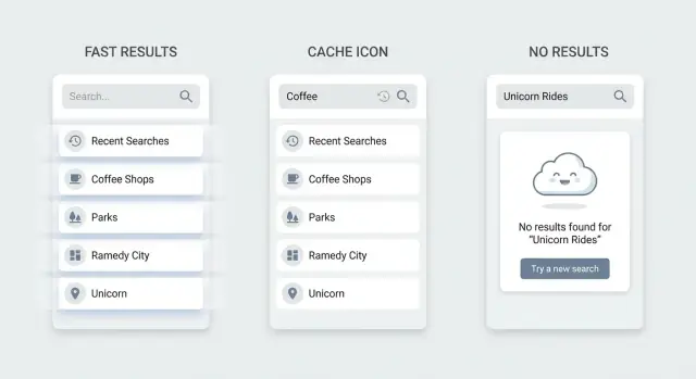
What makes in-app search feel slow or useless
People say search should feel instant, but they rarely mean zero milliseconds. They mean they get a clear response fast enough that they never wonder if the app heard them. If something visible happens within about a second (results update, a loading hint, or a steady searching state), most users stay confident and keep typing.
Search feels slow when the UI makes you wait in silence, or when it reacts in a noisy way. A fast backend doesn't help if the input lags, the list jumps around, or results keep resetting while someone types.
The most common bad search symptoms
A few patterns show up again and again:
- Typing lag: the cursor stutters because the app does too much work on every keystroke.
- Flicker: the list clears and refills repeatedly, so the user loses their place.
- Stale results: the UI shows results for an older query because requests return out of order.
- Wrong matches: the top result looks random, so users stop trusting search.
- Dead ends: No results gives no guidance, so users don't know what to try next.
This matters even with small datasets. With only a few hundred items, people still use search as a shortcut, not a last resort. If it feels unreliable, they switch to scrolling, filters, or they give up. Small datasets also tend to live on mobile and low-power devices, where unnecessary work on each keystroke is more noticeable.
You can fix a lot before adding a dedicated search engine. Most speed and usefulness come from UX and request control, not fancy indexing.
Make the interface predictable first: keep the input responsive, avoid clearing results too early, and show a calm loading state only when needed. Then reduce wasted work with debounce and cancellation so you don't run a search on every character. Add small caching so repeated queries feel immediate (like when users backspace). Finally, use simple ranking rules (exact match beats partial match, starts-with beats contains) so the top results make sense.
Set simple goals and boundaries for version 1
Speed fixes don't help if your search is trying to do everything. Version 1 works best when the scope, quality bar, and limits are explicit.
Pick a scope that matches the job
Decide what search is for. Is it a quick picker to find a known item, or is it for exploring a lot of content?
For most apps, searching a few expected fields is enough: titles, names, and key identifiers. In a CRM, that might mean contact name, company, and email. Full-text search across notes can wait until you see evidence people need it.
Define good-enough relevance
You don't need perfect ranking to ship. You do need results that feel fair.
Use rules you can explain if someone asks why something appeared:
- Exact match first ("Alex Kim" beats "Alexandra")
- Starts-with next ("pro" matches "Project")
- Contains after that ("jet" matches "Budget")
- Recently used or pinned items get a small boost
- Break ties by alphabetical order or recency
This baseline removes surprises and reduces the feeling of randomness.
Set limits upfront (and reflect them in the UI)
Boundaries protect performance and prevent edge cases from breaking the experience.
Decide early on things like a max results count (often 20-50), a max query length (like 50-100 characters), and a minimum query length before searching (often 2). If you cap results at 25, say so (for example, "Top 25 results") instead of implying you searched everything.
Plan for offline and bad connections
If the app may be used on trains, in elevators, or on weak Wi-Fi, define what still works. A practical version 1 choice is: recent items and a small cached list are searchable offline, while everything else needs a connection.
When the connection is poor, avoid clearing the screen. Keep the last good results visible and show a clear message that results may be out of date. This feels calmer than a blank state that looks like failure.
Debounce and request control without lag
The fastest way to make in-app search UX feel slow is to fire a network request on every keystroke. People type in bursts, and the UI starts flickering between partial results. Debounce fixes this by waiting a tiny moment after the last keypress before searching.
A good starting delay is 150-300ms. Shorter can still spam requests, longer starts to feel like the app is ignoring input. If your data is mostly local (already in memory), you can go lower. If every query hits the server, stay closer to 250-300ms.
Debounce works best with a minimum query length. For many apps, 2 characters is enough to avoid useless searches like "a" that return everything. If users often search by short codes (like "HR" or "ID"), allow 1-2 characters, but only after they pause typing.
Request control matters as much as debounce. Without it, slow responses arrive out of order and overwrite newer results. If a user types "car" and then quickly adds "d" to make "card", the "car" response can arrive last and push the UI backward.
Use one of these patterns:
- Cancel in-flight requests when a new query starts.
- Track a request ID and only render results from the latest request.
- Keep the last query string and ignore responses that don't match it.
While waiting, give instant feedback so the app feels responsive before results arrive. Don't block typing. Show a small inline spinner in the results area or a short hint like "Searching...". If you keep the previous results on screen, label them subtly (for example, "Showing previous results") so users aren't confused.
A practical example: in a CRM contact search, keep the list visible, debounce at 200ms, only search after 2 characters, and cancel the old request when the user keeps typing. The UI stays calm, results don't flicker, and users feel in control.
Caching basics that speed things up safely
Caching is one of the simplest ways to make search feel instant, because many searches repeat. People type, backspace, retry the same query, or bounce between a few filters.
Cache using a key that matches what the user actually asked for. A common bug is caching only by the text query, then showing incorrect results when filters change.
A practical cache key usually includes the normalized query string plus the active filters and sort order. If you paginate, include the page or cursor. If permissions differ by user or workspace, include that too.
Keep the cache small and short-lived. Store only the last 20-50 searches and expire entries after 30-120 seconds. That's enough to cover back-and-forth typing, but short enough that edits don't leave the UI feeling wrong for long.
You can also warm the cache by prefilling it with what the user just saw: recent items, last opened project, or the default empty-query result (often "all items" sorted by recency). In a small CRM, caching the first screen of Customers makes the first search interaction feel immediate.
Don't cache failures the same way as successes. A temporary 500 or a timeout shouldn't poison the cache. If you keep errors at all, store them separately with a much shorter TTL.
Finally, decide how cache entries become invalid when data changes. At minimum, clear relevant cache entries when the current user creates, edits, or deletes something that could appear in results, when permissions change, or when the user switches workspace/account.
Relevance basics with simple, explainable rules
If results feel random, people stop trusting search. You can get solid relevance without a dedicated search engine by using a few rules you can explain.
A simple scoring recipe
Start with match priority:
- Exact match (the whole field matches the query)
- Prefix match (starts with the query)
- Contains match (query appears anywhere)
- Token match (any word in the query matches any word in the field)
Then boost important fields. Titles usually matter more than descriptions. IDs or tags often matter most when someone pastes them. Keep the weights small and consistent so you can reason about them.
At this stage, light typo handling is mostly normalization, not heavy fuzzy matching. Normalize both the query and the text you search: lowercase, trim, collapse multiple spaces, and remove accents if your audience uses them. This alone fixes many why-didn't-it-find-it complaints.
Decide early how you treat symbols and numbers, because they change expectations. A simple policy is: keep hashtags as part of the token, treat hyphens and underscores as spaces, keep numbers, and strip most punctuation (but keep @ and . if you search emails or usernames).
Make ranking explainable. One easy trick is to store a short debug reason per result in logs: "prefix in title" beats "contains in description".
Local vs server search: a practical split
A fast search experience often comes down to one choice: what can you filter on the device, and what must be asked from the server.
Local filtering works best when the data is small, already on screen, or recently used: the last 50 chats, recent projects, saved contacts, or items you already fetched for a list view. If the user just saw it, they expect search to find it immediately.
Server search is for huge datasets, data that changes often, or anything private that you don't want to download. It's also needed when results depend on permissions and shared workspaces.
A practical pattern that stays stable:
- Show local matches first from what you already have.
- Start a server request in the background for wider coverage.
- Merge results when the response arrives (dedupe by ID).
- Keep the results container height stable so the page doesn't jump.
- Keep focus in the search field.
Example: a CRM can instantly filter recently viewed customers locally as someone types "ann", then quietly load the full server results for "Ann" across the database.
To avoid layout shifts, reserve space for results and update rows in place. If you switch from local to server results, a subtle "Updated results" hint is often enough. Keyboard behavior should stay consistent too: arrow keys move through the list, Enter selects, Escape clears or closes.
Empty, loading, and no-results states people can use
Most search frustration isn't about ranking. It's about what the screen does when the user is between actions: before they type, while results update, and when nothing matches.
When the box is empty: give people a starting point
An empty search page forces users to guess what works. Better defaults are recent searches (so they can repeat a task) and a short set of popular items or common categories (so they can browse without typing). Keep it small, scannable, and one-tap.
While loading: keep context, avoid flicker
People interpret flicker as slowness. Clearing the list on every keypress makes the UI feel unstable, even when the backend is fast.
Keep previous results on screen and show a small loading hint near the input (or a subtle spinner inside it). If you expect longer waits, add a few skeleton rows at the bottom while preserving the existing list.
If a request fails, show an inline message and keep the old results visible.
No results: turn dead ends into next steps
A blank page that says No results is a dead end. Suggest what to try next based on what your UI supports. If filters are active, offer a one-tap Clear filters. If you support multi-word queries, suggest trying fewer words. If you have known synonyms, propose an alternate term.
Also give a fallback view so the user can continue (recent items, top items, or categories), and add a Create new action if your product supports it.
Concrete scenario: someone searches "invoice" in a CRM and gets nothing because items are labeled "billing". A helpful state can suggest "Try: billing" and show the Billing category.
Log no-results queries (with active filters) so you can add synonyms, improve labels, or create missing content.
Step-by-step: build an instant-feeling search in a week
Instant-feeling search comes from a small, clear version 1. Most teams get stuck by trying to support every field, every filter, and perfect ranking on day one.
Start with one use case. Example: in a small CRM, people mostly search customers by name, email, and company, then narrow by status (Active, Trial, Churned). Write those fields and filters down so everyone builds the same thing.
A practical one-week plan:
- Day 1: Lock the scope. Pick 3-5 searchable fields, 0-2 filters, and one sort rule (for example, exact match first, then prefix match).
- Day 2: Make typing safe. Add debounce (often 150-250ms) and cancel old requests so late responses don't overwrite newer results.
- Day 3: Add simple ranking and highlighting. Use explainable rules (exact match > starts with > contains). Highlight matches so users see why a result appeared.
- Day 4: Add a small cache. Cache recent queries and results for a short time (like 30-120 seconds) and reuse them when the user backspaces or repeats a query.
- Day 5: Finish the UI states. Add a lightweight loading state and a no-results state with a next action.
Keep invalidation simple. Clear cache on sign-out, on workspace switch, and after any action that changes the underlying list (create, delete, status change). If you can't detect changes reliably, use a short TTL and treat the cache as a speed hint, not a source of truth.
Use the last day to measure. Track time to first result, no-results rate, and error rate. If time to first result is good but no-results is high, your fields, filters, or wording need adjustment.
Common mistakes that make search frustrating
Most slow search complaints are really about feedback and correctness. People can wait a second if the UI feels alive and the results make sense. They abandon when the box feels stuck, results jump around, or the app implies they did something wrong.
A common trap is setting debounce too high. If you wait 500-800ms before doing anything, the input feels unresponsive, especially on short queries like "hr" or "tax". Keep the delay small and show immediate UI feedback so typing never feels ignored.
Another frustration is letting old requests win. If a user types "app" then quickly adds "l", the "app" response might arrive last and overwrite the "appl" results. Cancel the previous request when you start a new one, or ignore any response that doesn't match the latest query.
Caching can backfire when keys are too vague. If your cache key is only the query text, but you also have filters (status, date range, category), you'll show incorrect results and users will stop trusting search. Treat query + filters + sort as one identity.
Ranking mistakes are subtle but painful. People expect exact matches first. A simple, consistent rule set often beats a clever one:
- Exact match on name or ID first
- Prefix match next
- Then partial match anywhere
- Fuzzy match only if nothing else fits
- Recent or frequent items can break ties, not override exact matches
No-results screens often do nothing. Show what was searched, offer to clear filters, suggest a broader query, and show a few popular or recent items.
Example: a founder searches customers in a simple CRM, types "Ana", has the Active only filter on, and gets nothing. A helpful empty state would say "No active customers for 'Ana'" and offer a one-tap Show all statuses action.
Quick checklist and next steps
Before you add a dedicated search engine, make sure the basics feel calm: typing stays smooth, results don't jump around, and the UI always tells people what's happening.
A quick checklist for version 1:
- Typing never stutters. Debounce work after input, not the input itself.
- Results update in order. Cancel or ignore older requests so you never show stale results.
- Loading is clear but gentle. Keep the current list visible and show a small updating hint.
- No results helps people recover. Offer a next action like clearing filters or trying a shorter query.
- Ranking rules are written down and consistent.
Then confirm your cache is doing more good than harm. Keep it small (recent queries only), cache the final result list, and invalidate when underlying data changes. If you can't detect changes reliably, shorten the cache lifetime.
Next steps
Move forward in small, measurable steps:
- Add a tiny test plan: 5 common queries, 2 edge cases, and 1 no-results case.
- Log only what you need: query length, time to first results, and cancel rate (avoid personal text if you can).
- Pick one improvement per week: better ranking, better empty state, or better caching.
- Add a real search backend only after you can explain what's missing today.
If you're building an app on Koder.ai (koder.ai), it's worth treating search as a first-class feature in your prompt and acceptance checks: define the rules, test the states, and make the UI behave calmly from day one.
FAQ
How fast does in-app search need to feel to users?
Aim for a visible response within about a second. That can be results updating, a steady “searching” indicator, or a subtle loading hint while keeping the previous results on screen so users never wonder if their typing was received.
Why does search feel slow even when my API is fast?
It’s usually the UI, not the backend. Typing lag, result flicker, and silent waiting make search feel slow even when the server is fast, so start by keeping input responsive and updates calm.
What debounce delay should I use for search?
Start with 150–300ms. Use the shorter end for local, in-memory filtering and the longer end for server calls; if you go much higher, people often feel the app is ignoring them.
Should I require a minimum query length before searching?
Yes, in most apps. A minimum of 2 characters prevents noisy queries that match almost everything, but if your users search by short codes, allow 1–2 characters and rely on a brief pause plus good request control.
How do I stop stale results when requests return out of order?
Cancel in-flight requests when a new query starts, or ignore any response that doesn’t match the latest query. This prevents older, slower responses from overwriting newer results and making the UI jump backward.
What’s the best loading state for search without flicker?
Keep the previous results visible and show a small, stable loading hint near the results or input. Clearing the list on every keypress creates flicker and feels slower than letting the old content remain until the new content is ready.
How do I cache search results without showing outdated or incorrect matches?
Cache recent queries using a key that includes the normalized query plus filters and sort, not just the text. Keep it small and short-lived, and clear or expire it when the underlying data changes so users don’t see “wrong” results.
How can I improve relevance without adding a full search engine?
Use simple rules users can predict: exact matches first, then starts-with, then contains, with small boosts for important fields like name or ID. Keep the rules consistent and easy to explain so the top results never feel random.
What should I include in version 1 scope for search?
Search your most-used fields first, then expand based on real evidence. A practical version 1 is 3–5 fields and 0–2 filters; full-text across long notes can wait until you see users truly need it.
What should a helpful “no results” state say or do?
Show what was searched, offer an easy recovery action like clearing filters, and suggest a simpler query when possible. Keep a fallback view such as recent items so the user can continue instead of hitting a dead end.