Sep 17, 2025·8 min
Ivan Sutherland’s Sketchpad: Birth of Interactive Graphics
How Sketchpad pioneered drawing on screens, constraints, and direct manipulation—ideas that shaped CAD, UI design tools, and modern interfaces.
How Sketchpad pioneered drawing on screens, constraints, and direct manipulation—ideas that shaped CAD, UI design tools, and modern interfaces.
Sketchpad is one of those rare projects that didn’t just improve computers—it changed what people thought computers were for. Before it, most interaction meant typing commands and waiting for results. Sketchpad, created by Ivan Sutherland in the early 1960s, showed a different path: you could work with a computer by drawing, pointing, and manipulating shapes on a screen.
“Interactive graphics” means you can see visual elements on a display and change them directly, with the system responding right away. Instead of describing a drawing in text (“make a line from A to B”), you act on the drawing itself: select a point, drag a line, resize a shape, and immediately see what happened.
This post explains what Sketchpad was, why it mattered, and how its core ideas kept reappearing—first in computer-aided design (CAD), then in graphical user interfaces (GUI), and later in modern UI design tools and design systems. You’ll see how concepts like direct manipulation, reusable components, and constraint-based drawing didn’t start with today’s apps—they have deep roots.
Sketchpad didn’t instantly create the software we use now. Modern CAD, the GUI, and tools like Figma or Sketch were built over decades by many teams. But Sketchpad is a key starting point because it proved the approach: visual, interactive work on-screen could be precise, structured, and scalable—not just a demo, but a new model of human–computer interaction.
Ivan Sutherland is one of the foundational figures in computer graphics and human–computer interaction—someone who helped shift computers from “machines you program with text” to “tools you can interact with visually.” Born in 1938, he trained as an electrical engineer and quickly gravitated toward a simple but radical question: what if working with a computer felt more like working with paper, diagrams, and physical objects?
Sketchpad was created as part of Sutherland’s PhD research at MIT in the early 1960s, using the TX-2 computer at MIT Lincoln Laboratory. That mattered because the TX-2 was unusually capable for its era: it supported interactive displays and specialized input hardware, which made hands-on experimentation possible.
Most computing then was optimized for numbers and text, not visual thinking. Sutherland aimed to make computers practical for visual tasks—drawing, editing, and refining diagrams—without needing to “translate” everything into lines of code. In other words, he wanted the computer to represent shapes and relationships directly, the way a person does when sketching.
Sutherland’s work went far beyond Sketchpad—spanning computer graphics, interactive systems, and early virtual reality experiments (including head-mounted displays). He received major recognition over his career, including the ACM Turing Award, and is widely cited as a pioneer who helped define what interactive computing could be.
Before Sketchpad, most people didn’t “use” computers the way we mean it now. You didn’t sit down, open a program, and tinker. You prepared work for the computer, handed it off, and waited for results.
In the early 1960s, interaction was largely text-based and indirect. Programs were often entered on punched cards or paper tape, or typed into a teletype-style terminal. Many systems ran in batch mode: you submitted a stack of cards, the computer processed jobs in a queue, and you got output later—sometimes minutes, sometimes hours.
If something was wrong (a typo, a missing card, a logic error), you didn’t immediately fix it. You discovered the problem only after the run finished, then you revised your deck and tried again. This created a slow, stop-and-start rhythm that shaped what people thought computers were for.
Screens existed, but they weren’t the everyday “workspace” they are now. Display hardware was expensive and scarce, and it was usually used for showing results, not for building them. The idea that you could draw directly on a screen—then select, move, copy, or adjust what you drew—was outside the normal expectations of computing.
“Real-time” wasn’t a marketing term; it described a new kind of experience. It meant the computer responded as you acted, not after you submitted a job. That immediacy turned the machine from a remote calculator into something closer to a partner: you could experiment, correct mistakes instantly, and refine an idea while it was still in your head.
Sketchpad’s ambition makes more sense against this backdrop. It wasn’t just a clever drawing program—it challenged the era’s assumptions about how humans and computers could work together.
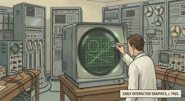
Sketchpad was an interactive drawing system that ran on a computer with a display. Instead of typing commands and waiting for results, you could draw directly on the screen and see changes immediately.
Imagine an early mix of a vector drawing app (where shapes stay editable) and a CAD program (where geometry matters). Sketchpad let you create lines, circles, and shapes, and then treat them as objects you could work with—not just pixels painted onto a screen.
The loop was straightforward:
That sounds normal now, but at the time it was a major shift: the computer became something you could interact with visually, not just instruct through text.
Sketchpad’s drawings were made of geometric elements the computer understood: endpoints, lengths, angles, arcs. Because the system knew what each element was, it could keep the drawing consistent when you edited it. If you changed a line’s endpoint, connected pieces could update along with it.
That “model behind the picture” is the key idea. It’s why Sketchpad is often described as an ancestor of modern CAD, vector editors, and many UI design tools: it treated a drawing as structured data you can manipulate, not a static picture you merely view.
Sketchpad’s most visible leap wasn’t a new kind of math—it was a new way to talk to the computer. Instead of typing commands and waiting for output, Sutherland let people point directly at the screen using a light pen.
A light pen was a pen-shaped pointing device you held against a CRT display. When the screen’s electron beam swept past the spot under the pen’s tip, the system could detect the timing and calculate the on-screen position. That made the pen an early “cursor you can hold in your hand,” long before the mouse became standard.
With the light pen, Sketchpad introduced an interaction style that now feels fundamental:
This combination of selection + direct manipulation changed the computer from a device you describe things to into a device you edit things on.
Modern input methods follow the same basic idea:
Sketchpad’s light pen was an early proof that pointing and acting on visible objects is often faster and more intuitive than issuing abstract commands.
When you can grab a line and adjust it in place, you iterate faster: try, see, tweak, repeat. That immediate feedback reduces errors, lowers the learning curve, and makes experimentation feel safe—core usability traits that still define successful design and drawing tools.
Sketchpad’s most surprising trick wasn’t that you could draw—it was that your drawing could mean something. Instead of treating everything as a pile of pixels, Sketchpad let you describe relationships between parts of a drawing and ask the computer to keep those relationships true.
A constraint is a rule you attach to geometry.
This is different from redrawing by hand every time you change something. You set the intent once, then edit freely.
Constraints turn editing into the kind of chain reaction you actually want. Move one point, and everything connected updates automatically to satisfy the rules. That means fewer manual fixes and far fewer accidental distortions.
It also makes drawings easier to evolve. A constrained shape can be stretched, aligned, or adjusted while keeping important properties intact—parallel lines remain parallel, equal lengths stay equal, and angles remain consistent.
Sketchpad hinted at a bigger idea: graphics can be built from objects with relationships (points, lines, shapes), not just marks on a screen. The computer maintains those relationships like a quiet assistant.
You can see the same mindset in modern tools: CAD systems use parametric constraints, and UI design tools use layout constraints (pinning, alignment, “keep spacing equal”). Different domains, same core concept: describe how things should behave, then let the system handle the math.
Sketchpad didn’t just let people draw lines faster—it introduced an idea that still powers modern design work: you shouldn’t have to redraw the same thing over and over.
In Sketchpad, you could create a symbol—think of it as a master definition of an object—and then place multiple instances of it in your drawing. Instead of copying raw geometry every time, you were reusing a single recipe.
That meant repetition became a feature, not a chore. Need ten identical brackets, windows, or circuit elements? You could place ten instances quickly, keeping the drawing consistent.
Traditional copying makes duplicates that drift apart over time: you edit one, forget the others, and the drawing becomes inconsistent. Sketchpad pushed toward a better approach: reuse the same component so changes stay coordinated.
A practical example:
Even if the exact mechanics differ from today’s tools, the core workflow is recognizable: a single source of truth, repeated safely.
If you’ve used modern design software, you’ve seen Sketchpad’s descendants:
This is why Sketchpad feels less like an old drawing program and more like an early model of “component-based design”—a way to scale visual work without sacrificing consistency.
Sketchpad’s most important shift wasn’t a new shape or a faster machine—it was a new way of using a computer. Instead of typing a command like “draw line from A to B,” you could point at the line itself, grab it, and change it right on the screen.
Direct manipulation is simple: you act on the object, not on a description of the object.
In Sketchpad, the drawing wasn’t a distant result that appeared later. The drawing was the interface. If you wanted a line to move, you selected that line and moved it. If you wanted a corner to change, you adjusted the corner.
Equally radical was the speed of response. Sketchpad showed changes as you made them—while you were still working, not after you finished a batch of instructions.
That immediate feedback creates a tight loop:
This turns software into something you can probe and shape, not just operate.
Many everyday UI behaviors are descendants of this interaction style:
Even when we use menus or keyboard shortcuts, we still expect the object to remain central: select it, act on it, and watch it update immediately.
Sketchpad helped set a baseline that users now assume: software should be interactive, visual, and responsive. When an app makes you fill out forms, hit “Apply,” and wait to see what happened, it feels outdated—not necessarily because features are missing, but because the feedback loop is broken.
Sketchpad wasn’t “CAD” in the modern sense—there were no bills of materials, no machining toolpaths, no giant parts libraries. But it demonstrated a crucial shift: technical drawing could be something you do with the computer, not something you submit to the computer and wait for.
Engineering design is iterative. You try a dimension, see how it affects clearances, change it, and check again. If every adjustment requires re-entering a long list of coordinates or waiting for an offline plot, the tool fights the workflow.
Sketchpad showed that precision work benefits from direct, visual interaction: you can point at a line, select it, and edit it while seeing the result immediately. That tight loop is what makes CAD usable for real design exploration.
Several Sketchpad concepts map neatly to what CAD users now take for granted:
It’s safest to say Sketchpad helped prove the concept of interactive, constraint-aware graphics. Some later systems were directly inspired by it; others arrived at similar solutions as hardware and research matured. Either way, Sketchpad made a compelling case that computers could support the day-to-day mechanics of drafting and design—not only calculate results after the fact.
Sketchpad didn’t look like a modern desktop, but it proved a crucial point: people could talk to computers by pointing at pictures, not just by typing commands. Once that idea clicked, the rest of the “everyday” interface started to make sense—windows you can grab, objects you can select, and actions you can see.
Early computing often meant learning exact command words and formats, then waiting to see if you got the result you wanted. Interactive graphics flipped that experience. Instead of remembering the right syntax, you could recognize what you needed on screen and act on it. That shift—from recall to recognition—is a core reason graphical user interfaces (GUIs) became approachable to more people.
Sketchpad’s light pen was an early pointing device: aim at something, select it, move it. Later systems replaced the pen with the mouse, trackball, and touchpad—but kept the same mental model.
Windowed interfaces benefit directly from this: when multiple things are visible at once, pointing and selecting becomes the natural way to choose which thing you mean. Even if your computer isn’t showing CAD-like drawings, it’s still filled with on-screen objects you manipulate.
Many common UI patterns echo the same interaction loop:
As interactive graphics spread, researchers and product teams needed ways to evaluate what “works” for real people. That effort became human–computer interaction (HCI)—the field focused on designing, testing, and improving how humans and computers communicate through interfaces.
If you’ve ever dragged a rectangle in Figma, resized a button in Sketch, or adjusted Auto Layout in a design tool, you’ve used ideas that feel very “Sketchpad-ish”: draw directly, keep relationships intact, and reuse parts without redrawing everything.
Modern UI tools treat shapes as objects you can select, move, and edit in place—exactly the mental model Sketchpad helped popularize. You don’t “describe” a circle; you grab it. Immediate visual feedback turns design into a conversation with the screen: tweak, see, tweak again.
Sketchpad’s constraint-based drawing maps neatly to responsive UI behavior:
In design systems, constraints are the difference between a mock and a component that survives real content—long translations, dynamic data, and different screen sizes.
Sketchpad’s “master + instance” idea shows up today as components, variants, and tokens. A single source of truth lets teams update typography, padding, or states once—and have those changes cascade across screens. That reduces drift, speeds reviews, and makes handoff more predictable.
One interesting parallel shows up in newer “vibe-coding” workflows. Platforms like Koder.ai let you create web, backend, or mobile apps through chat, but the best experience still depends on Sketchpad-like principles: fast feedback, a clear model behind what you see, and reusable building blocks.
For example, when Koder.ai generates a React UI (or a Flutter screen), the practical win isn’t just speed—it’s that you can iterate in a tight loop, keep components consistent across screens, and roll changes forward (or back) without losing structure. In a sense, it’s the same shift Sketchpad pioneered: stop treating software as a one-way “submit and wait” process, and start treating it as an interactive workspace.
These concepts still improve workflows because they reduce manual work and errors: encode intent (alignment, spacing, behavior) into the design itself, so the system stays coherent as it grows.
Sketchpad is remembered less for a single “feature” and more for a set of ideas that quietly became defaults.
First, interactive graphics: the computer isn’t just printing results—it’s a surface you can work on.
Second, constraints and relationships: instead of redrawing everything by hand, you describe how things should stay connected (parallel lines, equal lengths, aligned points). The system helps maintain intent as you edit.
Third, direct manipulation: you act on the object itself—select it, move it, reshape it—and you see the change immediately.
Fourth, reusable building blocks: defining a component once and reusing instances is a straight line to modern components, symbols, and design systems.
Make actions visible. If users can’t see what can be selected, moved, or edited, they won’t trust the tool.
Reduce mode switching. Every extra state (draw mode, select mode, edit mode) adds friction and mistakes. Prefer workflows where the same gesture works consistently, and where the UI clearly signals what will happen next.
Support reuse early. Teams often treat components as a late-stage cleanup. Sketchpad’s reminder is that reuse changes how people think: it turns editing into managing relationships, not pushing pixels.
Design for feedback speed. Immediate response isn’t just “nice”—it’s what makes exploration feel safe.
If you’re evaluating modern build tools, look for these same properties: a visible model, quick iteration, and easy rollback when an experiment fails. (For instance, Koder.ai’s planning mode and snapshots/rollback are practical ways to preserve that “safe to try” loop when you’re generating and refining an app.)
Look for museum or university demos of early interactive computing; seeing a light pen session makes the concepts click.
Watch documentaries and interviews about early human–computer interaction to hear how these ideas were discovered through hands-on experimentation.
If you want primary sources, search for Ivan Sutherland’s original Sketchpad thesis and accompanying technical reports—they’re unusually readable for foundational work.
For more history posts like this, browse /blog.
Sketchpad was an early 1960s interactive drawing system created by Ivan Sutherland. Instead of describing drawings in text, you could draw and edit directly on a screen—selecting lines/circles as objects and changing them with immediate visual feedback.
Because it proved computers could be interactive visual workspaces, not just batch calculators. Its core ideas—direct manipulation, real-time feedback, constraint-based geometry, and reusable symbols/instances—show up later in CAD, GUIs, and modern design tools.
Interactive graphics means you can see visual elements and change them immediately.
Practical signs you’re in an “interactive graphics” workflow:
A light pen was a pen-like pointing device used on CRT displays. By detecting timing as the screen refreshed, the system could determine where you were pointing.
In Sketchpad it enabled:
Constraints are rules attached to geometry—like “this line stays horizontal” or “these sides stay equal.” When you edit one part, the system adjusts related parts to keep the rules true.
That’s useful because it lets you edit intent, not just appearance—so shapes don’t accidentally drift out of alignment as you iterate.
Sketchpad stored drawings as structured geometry (points, lines, arcs, relationships), not as a flat image. Because the computer “knew” what each element was, it could support operations like moving endpoints, maintaining connections, and applying constraints without redrawing everything manually.
Sketchpad demonstrated that technical drawing works best with a tight loop: edit → see → refine. That’s essential for engineering iteration.
Several CAD-like ideas it helped validate:
Sketchpad helped prove people could interact with computers by pointing at on-screen objects and manipulating them directly.
That mental model later fits naturally with GUI patterns like:
Sketchpad supported a “master + instances” approach: define a symbol once, place many instances, and keep drawings consistent.
Today you see the same principle in:
A few practical takeaways:
If you want more related posts, browse /blog.