Aug 10, 2025·8 min
Joe Gebbia’s Early Airbnb Strategy: Design + Scrappy Growth
A practical look at Joe Gebbia’s early Airbnb strategy—using design thinking, fast experiments, and scrappy execution to build a new marketplace category.
A practical look at Joe Gebbia’s early Airbnb strategy—using design thinking, fast experiments, and scrappy execution to build a new marketplace category.
Airbnb’s “early phase” isn’t a vague origin story—it’s a specific stretch from the first Airbed-and-breakfast experiment in 2007–2008 through the YC-era rebuild and early scale-up around 2009–2010. In that window, the team wasn’t optimizing a mature product. They were trying to make a strange idea feel safe, simple, and worth trying.
When people say Airbnb “created a new category,” they mean consumers and hosts didn’t have an existing mental box for it.
Hotels were familiar: you pay, you show up, you get a room.
Staying in a stranger’s home (and letting strangers stay in yours) raised new questions: Is this even allowed? Will it be awkward? Is it safe? What happens if something goes wrong? Category creation means answering those questions before customers even know how to ask them.
Airbnb’s early moves are still instructive because they paired two forces that don’t always show up together:
This post uses those themes to explain why certain early choices worked, not to argue that every tactic is universally repeatable. Airbnb benefited from timing, a major city market, and a founding team with complementary skills.
Where possible, the discussion aligns with publicly available accounts—founder interviews and reporting such as Leigh Gallagher’s book The Airbnb Story—while focusing on practical takeaways rather than mythology.
Joe Gebbia is often described as Airbnb’s design-driven co-founder. With a background in design (including studying at RISD) and early work in creative roles, he brought an instinct for how people feel when they use a product—especially when the product asks them to do something unfamiliar, like staying in a stranger’s home.
That design lens wasn’t “make it pretty.” It was a way of reducing friction: clarifying what the service is, how it works, and why it’s safe enough to try.
Without over-reading private decisions, the public story of Airbnb’s early team has a clear shape:
What’s notable is the fit: a new category needs both a working system and a clear, reassuring first impression.
Early Airbnb had constraints that forced focus: limited cash, limited time, and a massive trust barrier. A design mindset helps in that situation because it pushes you to decide what the user must understand right now.
Instead of adding lots of features, design-led founders tend to ask: What’s the single moment where confidence is won—or lost? For Airbnb, that meant making homes feel real, hosts feel accountable, and the booking flow feel straightforward enough that a first-time guest would actually click “Reserve.”
Airbnb didn’t start by “disrupting hospitality.” It started with a painfully practical mismatch: plenty of people had extra space (a spare room, an air mattress, an unused apartment for a weekend), and plenty of travelers wanted a place to stay that didn’t require hotel prices.
For hosts, the early promise was simple: turn idle square footage into income with minimal setup. For guests, the promise was equally concrete: get a cheaper, more flexible stay—often in neighborhoods where hotels were scarce.
But that surface-level exchange hid the real challenge.
Booking a hotel room is familiar: standardized rooms, predictable rules, and a front desk if something goes wrong. Renting a stranger’s home is emotionally loaded. Early Airbnb had to overcome questions like:
In other words, the product wasn’t just a transaction—it was a leap of faith.
Many guests weren’t only buying accommodation. They were hiring Airbnb for a different experience: the feeling of staying “like a local,” getting more space, and—eventually—something closer to belonging than lodging. That emotional job helped explain why a spare room could compete with a hotel even when it wasn’t perfectly convenient.
Early messaging had to walk a tight line. If it sounded too much like “a cheaper hotel,” it raised comparisons Airbnb couldn’t yet win on consistency. If it sounded too unfamiliar, it felt risky. The early customer problem was as much about making the idea feel normal as it was about matching travelers with rooms.
Design thinking is a practical way to build products when you don’t yet know the “right” answer. In plain language, it means: understand real people (empathy), make a simple version quickly (prototype), learn from what happens, and repeat (iteration). It’s less about taste and more about turning uncertainty into a series of small, testable questions.
If you’re building today, tools that shorten the “idea → test” cycle can amplify this approach. For example, a vibe-coding platform like Koder.ai can help teams prototype a web app, backend, or mobile flow from a chat-driven spec—useful when you want to validate onboarding, trust screens, or marketplace flows before investing in a full engineering pipeline.
For a marketplace like Airbnb, empathy work isn’t a workshop—it’s fieldwork. You’re trying to see what makes someone hesitate, what makes them feel safe, and what makes them click “book.”
Empathy work for hosts could look like:
Empathy work for guests could look like:
A prototype is anything you build to answer a question fast. It can be a landing page, a revised listing layout, a new photo style, or a different checkout flow. The goal isn’t perfection—it’s to learn what changes behavior.
Instead of debating “Is this feature good?”, prototyping asks: “Does this reduce confusion?” “Does it increase bookings?” “Do people feel more comfortable?”
Startups fail when they bet big on assumptions they never tested—especially assumptions about trust, pricing, and willingness to try something new. Design thinking breaks big risks into smaller ones and validates them one by one. That’s how a new category gets built: not by guessing confidently, but by learning quickly and acting on what you see.
Airbnb didn’t start by building a perfect travel platform. It started by proving a simple question: would anyone pay to stay in a stranger’s home? That’s the core idea behind a minimum viable product (MVP)—the smallest version of a product that can test the most uncertain parts of the business.
An MVP isn’t “small” for the sake of being small. It’s small so you can validate what could kill the idea quickly. For Airbnb, the riskiest assumptions looked like this:
If any of these fail, better photos or a nicer logo won’t save you.
Early onboarding flows are where marketplace ideas often break. Airbnb had to reduce the moments where a user thinks, “This feels sketchy” or “This is too much work.” The biggest friction points weren’t advanced features—they were basics:
Design choices here weren’t decoration. They were risk control.
In an MVP phase, page views and press mentions can distract. What matters are metrics that show real learning:
Those signals tell you whether the experience works—not whether people merely noticed it.
Airbnb wasn’t just building a product—it was trying to start a market. Two-sided marketplaces have a simple trap: guests won’t show up if there are no good places to stay, and hosts won’t bother listing if there are no guests. That “who goes first?” loop is the chicken-and-egg problem.
Early on, the team didn’t rely on broad, generic marketing. They focused on situations where demand already existed—like big conferences with sold-out hotels—so the “guest” side had a reason to search for alternatives.
To build supply (hosts), they made listing feel doable and low-risk. They personally helped people create listings, refine descriptions, and set pricing. Instead of waiting for perfect self-serve onboarding, they did the manual work that got inventory live.
To spark demand (guests), they went where renters already were, tested small distribution hacks, and refined the booking flow so curious visitors could quickly understand what they were buying: a place to sleep, hosted by a real person, near the event.
Trying to “launch everywhere” would have diluted effort and produced thin, unconvincing inventory in many cities. Concentrating on one location at a time helped Airbnb create a dense set of options in a specific area—enough to feel real, not empty.
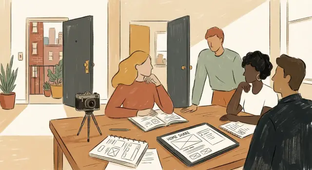
Marketplaces grow when they reduce uncertainty. Airbnb leaned into trust signals—clear profiles, verified details, reviews, and especially high-quality photos. Better photos didn’t just look nice; they improved confidence, which improved bookings, which created more reviews, which attracted more hosts.
Airbnb’s early growth wasn’t powered by clever dashboards. It was powered by founders doing unglamorous, manual work to make strangers feel safe clicking “Book.” That focus on trust showed up in one surprisingly tactical place: listing quality.
A home is an emotional purchase. Grainy, dim photos signal risk—“What are they hiding?”—and risk kills conversion. Clear, well-lit images do two jobs at once: they make the space look desirable and they make the host feel real.
Early on, Airbnb learned that upgrading photos could lift bookings dramatically. Instead of waiting for hosts to “figure it out,” the team treated photography as part of the product experience, not a nice-to-have.
This wasn’t accidental hustle; it was a deliberate strategy. The founders would:
These are not scalable tasks. But they were the fastest way to remove friction when the marketplace was fragile and every booking mattered.
Hands-on fixes produced a priceless byproduct: clarity about why users hesitated. By seeing apartments, talking to hosts, and watching how listings were created, the team could spot repeated problems—poor lighting, vague titles, missing policies, inconsistent pricing.
Those patterns later become requirements for scalable systems: photo guidelines, listing templates, onboarding checklists, and quality standards. In other words, the manual phase wasn’t a detour. It was field research that turned “trust” from a vague goal into specific, buildable improvements.
Airbnb wasn’t just selling beds—it was asking people to trust strangers with their homes. That’s a high-friction idea, so the story had to do a specific job: explain the concept quickly, reduce fear, and make the behavior feel familiar.
A strong narrative turns “a weird new website” into a simple mental model. Early on, Airbnb benefited from framing itself like something people already understood: a friendlier, more local alternative to a hotel. When users can place you in an existing category, they spend less energy decoding what you are—and more energy deciding whether they want it.
Features are what you built (profiles, photos, messaging). A promise is what the customer gets (save money, stay anywhere, feel safe).
A useful rule: if your headline lists product parts, you’re probably not making a promise. If it describes an outcome in plain language, you are.
For example:
To test positioning without rebuilding the product, run small experiments around three elements:
Measure clicks, sign-ups, and booking intent—not just “which copy people like.”
Design choices—typography, color, photography, tone—signal whether something feels sketchy or credible. Airbnb’s early brand needed clarity (no confusion), warmth (human, welcoming), and credibility (professional, reliable). When the visuals and words match the promise, the new behavior starts to feel normal.
When your team is small, “growth” can’t mean running dozens of campaigns. It has to mean improving the few steps that move someone from curiosity to a booking.
For early Airbnb, a practical funnel looked like:
That map is useful because it tells you where to look first: which step leaks the most, and what a single change could do.
Tiny teams win by writing down likely blockers and tackling them one by one:
Notice these aren’t only “marketing problems.” They’re clarity problems.
Instead of complex tooling, prioritize lightweight tests:
If your bottleneck is build speed, consider a workflow that lets you test quickly without over-engineering. For instance, Koder.ai’s planning mode plus snapshots/rollback can be handy for rapid iteration—ship a change, measure, and revert cleanly if it doesn’t move the metric.
Each experiment should have a one-sentence hypothesis and a measurable outcome:
“If we explain cancellation terms on the listing page, more users will submit a request because they feel safer.”
Track one primary metric per test (e.g., request rate from listing views) and write down what you learned. That habit turns scrappy execution into compounding progress—without needing a big team or a big budget.
Airbnb didn’t just need awareness—it needed understanding. When a product creates (or reshapes) a category, people aren’t simply deciding which brand to pick; they’re deciding whether the behavior itself is safe, normal, and worth the social risk. That’s less “marketing” and more education: showing what happens, what could go wrong, and what protections exist.
For a new category, the main objection is often “I don’t do that.” Ads can create curiosity, but education reduces uncertainty. In marketplaces, uncertainty isn’t abstract—it’s personal: Will the place look like the photos? Will I be safe? What if the host cancels?
This is why early category builders invest in plain-language explanations, clear expectations, and trust signals—not to “sell harder,” but to make the unfamiliar feel legible.
Early adopters are willing to tolerate ambiguity. They’ll try something new for price, novelty, or the story they can tell afterward. Mainstream users want predictability. They assume there’s a “standard way” things work, and they need proof that the experience won’t surprise them in the bad way.
A useful pattern in marketplace growth is that early adopters accept scrappy processes (manual support, imperfect inventory, uneven quality), while mainstream growth usually requires smoother flows, clearer rules, and more visible guarantees.
Crossing the trust gap often looks like a sequence rather than a leap:
None of these moves are magic on their own, but together they can turn a niche behavior into a category people recommend without caveats.
Airbnb’s early playbook is useful because it’s simple: understand the human problem, ship something small, then tighten the loop between what you learn and what you change.
Start with empathy, not features. The “job” wasn’t booking a room—it was feeling safe, confident, and welcome in a stranger’s home.
Ship fast, learn faster. The early team didn’t wait for perfect tooling or a polished brand system. They put real listings in front of real guests, then used the results to decide what to fix next.
Treat trust as a product surface. Copy, photos, messaging, and support aren’t “nice-to-haves” in marketplaces—they are conversion drivers.
Use this as a weekly review (and keep it brutally honest):
Don’t romanticize the scrappiness. Some early tactics worked because of timing, media attention, and a small initial market where manual effort was feasible.
Also, not every startup should create a new category. If you’re in an established space, it may be smarter to win on a narrow wedge (one customer type, one use case) rather than explain a brand-new concept.
If you want more practical breakdowns like this, explore /blog.
Airbnb’s early strategy is a reminder that design thinking only matters when it’s paired with scrappy execution. Joe Gebbia and the team didn’t treat design as decoration; they used it to clarify the real customer problem, reduce uncertainty, and make a strange new idea feel safe enough to try. That combination—clear intent + fast iteration—created momentum toward product-market fit and helped a two-sided marketplace start moving.
Rewrite your core promise in one sentence. Make it concrete and specific (who it’s for, what outcome they get, what changes for them). If you can’t say it simply, you can’t test it quickly.
Run one “trust audit” on your funnel. Pick the moment where a new user hesitates (signup, checkout, first message). Add one trust element—clear pricing, better photos, a short FAQ, a guarantee, or social proof—and measure conversion before/after.
Validate the riskiest assumption with a tiny MVP. Don’t build a full feature set. Create a manual workflow, a landing page, or a concierge-style test that proves demand (or disproves it) in days, not weeks.
If you want to compress the build-and-test cycle even further, consider using a rapid prototyping workflow (for example, Koder.ai) to spin up an experiment, deploy it, and iterate with snapshots and rollback—especially helpful when you’re still searching for the clearest trust and onboarding flow.
If you want more practical frameworks, explore /blog/mvp-validation, /blog/growth-experiments, and /blog/founder-storytelling for examples you can adapt to your own startup.
Note: Early startup stories often get retold with simplified timelines. If you’re relying on specific historical details about Airbnb’s early strategy or Joe Gebbia’s exact role in a moment, verify them using primary sources or firsthand interviews.
Airbnb’s “early phase” usually refers to the period from the first Airbed-and-breakfast experiment (2007–2008) through the YC-era rebuild and early scale-up (2009–2010). It’s useful to study because the team was solving category-level trust problems, not optimizing a mature product.
Because users didn’t have a mental model for it. Hotels are familiar; staying in a stranger’s home triggers new objections—legality, awkwardness, safety, and “what if something goes wrong?” Category creation means answering those questions clearly enough that trying it feels normal.
In this context, design thinking means reducing anxiety and friction by:
It’s less “make it pretty” and more “make it feel safe and obvious.”
For early Airbnb, the core mismatch was unused space vs. expensive stays. But the real blocker wasn’t price—it was trust:
A practical MVP for a marketplace validates the assumptions that can kill the idea:
Polish comes after those fundamentals are proven.
Early traction comes from creating a tight loop in one place:
Density beats “launch everywhere” when you’re small.
Because low-quality listings create high perceived risk. Clear, well-lit photos do two jobs:
In a trust-heavy marketplace, listing quality is part of the product.
It means doing manual, unscalable work to learn faster when the marketplace is fragile, such as:
The goal is to remove friction now and discover patterns you can automate later.
Positioning has to make the unfamiliar feel legible. A useful approach is:
Test it with real funnel metrics (clicks → requests → bookings), not preferences.
In an MVP phase, avoid “bragging metrics” like page views or press mentions. Track learning signals tied to the core action:
These tell you whether the experience works, not just whether it’s noticed.