

John Warnock, PostScript & PDF: How Documents Went Digital
A plain-English look at John Warnock’s PostScript and PDF, and how they shaped desktop publishing, printing, and modern document workflows.
Why document consistency used to be so hard
Before PostScript and PDF, “sending a document” often meant sending a suggestion. The same page could look different depending on the computer, printer, fonts installed, or even the paper-handling hardware at the other end.
A few things made documents especially fragile:
- Fonts weren’t guaranteed. If the recipient didn’t have your typeface, the system substituted another one—changing line breaks, page counts, and carefully aligned layouts.
- Printers spoke different languages. One printer might understand a certain set of commands, while another interpreted them differently—or not at all.
- Graphics were inconsistent. A chart that looked crisp on screen could print jagged, shifted, or partially missing, especially when moving between software.
- “What you see” wasn’t “what you get.” Early screens were low resolution compared to printers, so previews were often misleading.
This is the problem John Warnock focused on: reliable page output. Not “close enough,” but predictable—so a page designed on one system could be printed on another with the same shapes, spacing, and typography.
A quick preview: PostScript vs PDF
To keep it simple:
- PostScript is a page-description language—a way to tell a printer, step by step, how to draw a page.
- PDF is a file format—a container that packages the finished page description (plus fonts, images, and other details) so it travels well.
What you’ll get from this article
This guide is for non-technical readers who want the story behind modern documents: how publishing and printing became dependable, why “save as PDF” works so often, and what PostScript and PDF still teach us about making files that behave the same everywhere.
John Warnock: the person behind the page-description idea
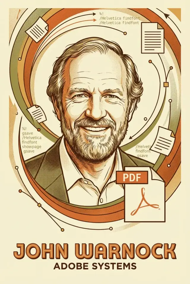
John Warnock was a computer scientist who spent much of his early career thinking about a surprisingly practical problem: how to describe a page so it prints the same way every time, on every kind of machine.
Before Adobe, he worked in research environments where ideas were explored long before products existed. At Xerox PARC in the 1970s, teams were experimenting with networked printers, graphical interfaces, and ways to represent complex pages. Printing wasn’t just “send text to a printer”—it meant mixing fonts, lines, shapes, and images, and doing it reliably.
The printing problem he focused on
The core issue was mismatch. A document created on one system might look correct on screen but break when printed on another device with different resolution, fonts, or capabilities. For businesses, publishers, and designers, that inconsistency translated directly into cost: reprints, delays, and manual fixes.
“Device-independent” in plain English
Device-independent output means you don’t describe how a specific printer should draw something; you describe what the page is. For example: “place this paragraph here in this font,” “draw a 0.5-point line,” “fill this shape with this color.” The printer (or another interpreter) then converts that description into the dots it can actually produce.
Warnock helped push this approach from research to everyday tools. Co-founding Adobe in 1982, he and colleagues packaged page-description ideas into software that could run across different systems and drive different printers. The significance wasn’t a single invention in isolation—it was turning a technical concept into a dependable bridge between computers and printed pages.
PostScript explained without jargon
PostScript is a page description language—a way to describe a finished page so any compatible printer can draw it the same way.
A simple analogy: if a word processor file is like a draft in your kitchen (editable, full of notes, styles, and settings), PostScript is the recipe you hand to a professional chef. It doesn’t say “make it look nice.” It says exactly what to put where, in what order, with what measurements.
What PostScript actually describes
PostScript can describe the building blocks of a printed page:
- Text: which font to use, what size, and where each line goes.
- Shapes and lines: boxes, curves, rules, and other graphics.
- Images: how to place a photo on the page and how to map its pixels.
- Positioning: precise coordinates, so margins, columns, and alignment stay consistent.
Think of it as instructions to a very literal drawing robot. If the instructions are the same, the result should be the same—whether the output device is a desktop printer or a high-end imagesetter.
Why vector descriptions mattered
A big reason PostScript was such a breakthrough is that much of it is vector-based: it describes graphics as math (lines, curves, fills) rather than as a fixed grid of pixels.
That means a logo, headline, or diagram can scale up for a poster or down for a business card while staying sharp—no blurry edges from “stretching” pixels.
What PostScript is not
PostScript is not a word processor format. It’s not meant for collaborative editing, tracked changes, or easy reflow of text. It’s closer to a final output description—optimized for reliable printing rather than everyday writing and revision.
How PostScript enabled desktop publishing and better printing
Before PostScript, “what you see is what you get” often meant “what you see is a hopeful preview.” The breakthrough was a shared way to describe a page so the computer and the printer could agree on the same instructions.
The desktop publishing chain, end to end
Desktop publishing quickly formed a predictable chain: authoring → layout → output.
An author wrote text in a word processor. A designer flowed that text into a page layout app, choosing columns, spacing, and images. Then the layout was sent to a PostScript printer (or to a service bureau) where the same page description was interpreted to draw the final page.
Because PostScript described the page in a device-independent way—shapes, text, positions, and curves—printers weren’t guessing how to “approximate” the screen. They were executing a precise set of drawing commands.
Why PostScript printers made WYSIWYG believable
A PostScript-enabled printer effectively became a miniature publishing engine. It could render vector graphics cleanly, place elements accurately, and output consistent pages from one job to the next.
That consistency made layout decisions trustworthy: if a headline fit on the screen, it was far more likely to fit on paper. This reliability is what made desktop publishing practical for brochures, newsletters, manuals, and ads.
Fonts: the quiet make-or-break detail
Typography is central to professional publishing, and PostScript supported scalable outline fonts that printed sharply at many sizes.
But errors still happened:
- Missing fonts could cause ugly substitutions and text reflow.
- Some printers had limited memory, choking on complex pages or high-resolution images.
- Different printer implementations could expose edge cases, especially with unusual fonts.
Even with those pitfalls, PostScript reduced the biggest source of chaos: the printer no longer “interpreted” your document its own way—it followed the page description.
Printing and prepress: why predictability mattered
Commercial printing isn’t just “send a file and hit print.” Prepress is the step where a document is checked, prepared, and converted into something a press can reproduce reliably. The big priority is predictability: the same job should look the same today, tomorrow, and on a different machine.
What prepress needed from digital documents
Print shops cared about a few practical outcomes:
- Separations: breaking a page into inks (typically CMYK) so each plate prints the right parts of the image.
- Proofs: fast, trustworthy previews that approximate the final result, catching errors before plates and press time are wasted.
- Consistent output: text stays crisp, images land in the right place, and colors don’t shift unexpectedly.
Those needs pushed everyone toward formats that described pages in a device-independent way. If the page description is complete—fonts, vectors, images, and color instructions—then the printer isn’t “guessing” how to render it.
The classic workflow: PostScript → RIP → plates
For years a common pattern was: a design app generated PostScript, and the print shop ran it through a RIP. A RIP (Raster Image Processor) is software or hardware that converts page descriptions into the pixel-based data a specific printer or imagesetter can output.
That middle step mattered because it centralized the “interpretation.” Instead of relying on whatever printer driver or office device happened to be used, the print provider could run jobs through a controlled RIP setup, tuned for their press, paper, screening method, and ink.
When predictability is the goal, repeatability becomes a business advantage: fewer reprints, fewer disputes, and faster turnaround—exactly what professional printing demands.
Why PDF was created and what it changed
PostScript was a breakthrough for printing, but it wasn’t designed to be a “send this to anyone” document format. A PostScript file is essentially a program that describes a page. That works great when a printer (or a typesetter) has the right interpreter, but it’s awkward for everyday sharing: viewing was inconsistent, output could vary by device, and the file didn’t naturally behave like a self-contained document you could reliably open on any computer.
The problem PDF set out to solve
PDF was created to make documents portable in the practical sense: easy to distribute, easy to open, and predictable in how they render. The target wasn’t just “it prints,” but “it looks the same everywhere”—on different screens, on different printers, and across different operating systems.
PDF as a package, not just a description
A key change was treating a document as a single package. Instead of depending on external pieces, a PDF can include (or reference in controlled ways) what’s needed to reproduce the pages:
- The page content and layout (text, vector graphics, images)
- Fonts (often embedded, so missing fonts don’t change line breaks)
- Color information and output intent
- Metadata (author, titles, accessibility tags, and more)
That packaging is why a PDF can preserve exact pagination, spacing, and typographic details even years later.
One format that works for screens and print
PDF bridges two worlds. For screen viewing, it supports fast display, searching, hyperlinks, and annotations. For print, it preserves precise geometry and can carry the information professional workflows need (fonts, spot colors, trim boxes, and other print-oriented settings). The result: a file that behaves like a final document, not a set of instructions that might be interpreted differently depending on where it runs.
PostScript vs PDF: the simplest useful comparison
PostScript and PDF are often mentioned in the same breath because they both describe pages. But they were built for different jobs.
PostScript: a program that draws a page
PostScript is a page-description language—a set of instructions like “use this font,” “draw this curve,” “place this image here,” and “print it at this exact size.” A PostScript-capable printer (or software called a “RIP”) executes those instructions to produce the final page output.
That’s why PostScript historically fit the printing world so well: it’s not just a container for content, it’s a precise recipe for how the page should be rendered.
PDF: a file made to be shared and read
PDF is a file format designed so a document can be viewed, exchanged, annotated, and archived with consistent appearance across devices. Instead of being “run” like a program, a PDF is typically interpreted for display by a viewer (Acrobat, a browser, a mobile app) and can also be printed.
In everyday terms: PostScript is closer to “instructions for the printer,” while PDF is closer to “the document you send.”
When each is used today (high level)
PostScript still appears behind the scenes in professional printing and prepress workflows, especially where dedicated RIPs and print servers handle incoming jobs.
PDF is the default for sharing final documents—contracts, manuals, forms, proofs—because it’s easy to open anywhere and preserves layout.
A simple comparison
| Topic | PostScript | |
|---|---|---|
| What it is | A language (a set of drawing/printing instructions) | A file format (a packaged document) |
| Primary purpose | Reliable page output on printers/RIPs | Reliable viewing, exchange, and archiving |
| Strengths | Precise control over rendering; printing-oriented | Portable; viewer-friendly; supports forms, links, accessibility |
| Typical users | Print shops, prepress, print servers | Everyone: businesses, designers, publishers, customers |
If you remember one thing: PostScript was built to produce the page; PDF was built to deliver the page.
How PDF shaped modern digital workflows
PDF quietly became the “final form” of a document: the version you send when you want the other person to see exactly what you see. In many workplaces, Word files and slide decks are still the drafting tools, but the PDF is the checkpoint—what gets approved, attached to an email, uploaded to a portal, or stored as the record.
The universal handoff file
A big reason is predictability. A PDF bundles layout, fonts, vector graphics, and images into a package that usually behaves the same across devices and apps. That made it ideal for handoffs between teams that didn’t share the same setup—or even the same operating system.
Cross‑platform collaboration without surprises
As organizations mixed Macs and Windows PCs (and later Linux systems on servers and in universities), PDF reduced “it looks different on my computer” problems. You could create the document in one tool, review it in another, and print it somewhere else with fewer unintended changes.
This also made workflows easier to standardize:
- Legal teams could circulate contracts for review without layout shifts.
- Designers could send proofs to clients who didn’t own design software.
- IT could deploy one viewer and support one format for many use cases.
Automating document workflows (where the old lessons still apply)
The same “portable, predictable output” idea now shows up in internal apps that generate documents on demand—quotes, invoices, audit reports, shipping labels, onboarding packets.
If your team builds these systems, it helps to treat PDF generation as a first-class workflow: consistent templates, embedded fonts, repeatable export settings, and a way to roll back changes when a template update breaks a layout. This is also where a platform like Koder.ai can fit naturally: teams can vibe-code an internal document portal or a PDF-generation microservice from a chat interface, then iterate safely using planning mode and snapshots/rollback—while still exporting the source code when you want full ownership.
Paperwork at scale: government, education, business
PDF helped institutions that process lots of forms and notices. Governments adopted PDFs for applications and public documents; schools used them for syllabi, packets, and submissions; businesses relied on PDFs for invoices, manuals, and compliance records. The shared expectation became: “If it’s important, there’s a PDF.”
The caveat: accessibility and forms need extra care
A PDF isn’t automatically accessible. Screen readers often need properly tagged structure, meaningful reading order, and alt text for graphics. Forms also require thoughtful setup—fillable fields, validation, and compatibility testing—otherwise they become hard to complete or impossible to submit. PDF can preserve a document perfectly, including its problems, unless you design it to be usable.
Fonts, color, and images: the hidden details that matter
Most “my file looks different on your machine” problems aren’t about the layout—they’re about the invisible ingredients: fonts, color definitions, and image data. PostScript and later PDF made these details more controllable, but only if you package them correctly.
Fonts: why embedding changed everything
Fonts used to be a nightmare because a document often referenced a font instead of carrying it along. If the printer (or another computer) didn’t have the exact same font version, text could reflow, line breaks would change, or a substitute font would appear.
PDF solved much of this by allowing font embedding: the typeface (or just the needed characters) can be included inside the file. The key idea is simple: if the font travels with the document, the document stays stable.
Color: RGB vs CMYK in plain terms
Screens mix light, so they use RGB (red, green, blue). Printing mixes inks, so it usually uses CMYK (cyan, magenta, yellow, black). A bright neon screen color may not exist in ink, so converting RGB to CMYK can dull or shift tones.
When a workflow is predictable, you decide when and how that conversion happens, rather than letting it occur automatically at the last second.
Images: resolution and compression trade-offs
For print, images need enough detail at the final size. Too low and you get soft, blocky results; too high and files become heavy and slow.
Compression is similar:
- JPEG keeps files small but can add artifacts.
- Lossless options preserve quality but increase size.
Practical pre-print checklist
Before sending a file to print, check: embedded fonts, intended color mode (RGB vs CMYK), image resolution at final size, and whether compression artifacts are visible in critical photos or gradients.
Standardization and long-term archiving
If PostScript proved that a page could be described precisely, PDF pushed the idea further: a document can also carry the rules needed to interpret it consistently. Standardization is the difference between “it opens on my computer” and “it can be trusted to look the same years from now.”
Why standards matter for reliability
A standard is basically a shared contract: how fonts must be referenced, how colors are defined, how images are embedded, and which features are allowed. When everyone follows the same contract, documents survive handoffs—between apps, operating systems, printers, and service providers—without turning into guesswork.
That predictability is especially important when the original author, software version, or font library is no longer available.
Archival and compliance use cases (in plain terms)
Organizations often need to keep records that remain readable and visually stable over time: signed forms, reports, technical manuals, invoices, product labels, or regulated communications. Standards don’t “guarantee compliance,” but they can reduce ambiguity by making files self-contained and easier to validate.
PDF/A, at a high level
PDF/A is an archive-focused version of PDF. Think of it as a rule set that favors long-term readability over flashy features. In general terms, it requires things like embedding fonts, using reliable color definitions, and avoiding elements that depend on external resources or behaviors (for example, certain kinds of encryption or dynamic content).
When to consider standardized PDFs
Consider a standardized PDF approach when you:
- Exchange files with outside printers, agencies, or partners and need fewer “what changed?” surprises.
- Store documents for years and want confidence they’ll still render the same.
- Need repeatable review/approval steps (preflight checks, consistent export settings).
A practical next step is defining an internal export checklist and testing it on a handful of real documents before making it policy-wide.
Common mistakes and how to avoid them
PDFs feel “final,” but most problems come from a few predictable places: images, page geometry, color settings, and fonts. Catching them early saves time, reprints, and awkward last‑minute edits.
File size bloat (and slow sharing)
A huge PDF is usually caused by uncompressed images or accidentally embedded duplicates.
- Export using a “Press Quality” preset only when you truly need it; otherwise use a balanced preset.
- Downsample photos to a sensible target (often 300 ppi at final size for print; much less for screen).
- Avoid placing the same high‑res image multiple times if your layout app can link it once.
Blurry or pixelated images
Blurriness is almost always low-resolution artwork scaled up.
- Don’t enlarge small images in the layout—replace them with higher‑resolution originals.
- Keep logos and icons as vector when possible (SVG/AI/EPS placed properly), not screenshots.
Incorrect page size (the “why is this cropped?” problem)
Page boxes can be confusing: a PDF may look right on screen but have the wrong trim/bleed settings.
- Confirm the PDF’s TrimBox matches the final size.
- Add bleed (commonly 3 mm / 0.125 in) only if your printer asks for it.
- Don’t rely on “fit to page” in print dialogs—export the correct size.
Print surprises: bleed, color, and missing fonts
- Crop/bleed confusion: Make sure background colors/images extend into the bleed area.
- Color shifts: Know whether the job expects CMYK or RGB; convert consistently and preview with a soft proof if available.
- Missing fonts: Embed fonts on export or outline only when necessary (outlining can hurt text clarity and searchability).
Quick diagnosis checklist
- Does the PDF open with the correct page size and orientation?
- Are images sharp at 100% zoom?
- Are fonts embedded (and not substituted)?
- Are there unexpected spot colors or transparency artifacts?
- Does TrimBox/BleedBox match what the printer requested?
For a step-by-step export checklist you can reuse, see /blog/pdf-export-checklist.
What PostScript and PDF still teach us today
PostScript and PDF were never just “file formats.” They were promises: if you describe a page clearly enough, it can be reproduced faithfully—on different printers, different computers, and decades later.
What still matters
Two ideas aged especially well: device independence (don’t tie documents to one machine) and fidelity (what you approve is what others see and print). Even when everything is “digital,” those guarantees reduce expensive back-and-forth, rework, and misunderstandings.
Where documents are heading
A lot of content is now web-first: responsive layouts, continuous updates, and collaboration. At the same time, expectations are rising for accessibility (real text, tagged structure, readable order) and structured content that can be reused across channels.
That doesn’t replace PDF—it changes when you use it.
Why PDF isn’t going away
PDF coexists with modern tools because it’s a reliable handoff format: approvals, contracts, regulated records, packaging a final design, or sending a file to a printer. Web pages are great for reading and sharing; PDFs are great for freezing intent.
Practical guidance: choose based on purpose
- Use web/HTML when you need responsiveness, frequent updates, and discoverability.
- Use editable source files (docs, design files) when collaboration and revision are the priority.
- Use PDF when you need a stable “final,” consistent printing, or long-term retention—especially if you can export a tagged, accessible PDF.
If you’re unsure, pick the format that best matches the “moment”: draft, collaborate, approve, publish, archive. That simple framing is the lasting lesson from Warnock’s page-description legacy.
FAQ
Why did the same document used to look different on different computers or printers?
It was hard because documents depended on the recipient’s setup.
- If the exact fonts weren’t installed, substitutions changed line breaks and pagination.
- Printers interpreted commands differently (or not at all).
- Graphics and positioning could shift between apps and devices.
- Screen previews were often misleading due to low display resolution versus print.
What does “device-independent” mean in plain English?
Device-independent output means you describe what the page is (fonts, shapes, coordinates, colors), not the quirks of one specific printer.
A compatible printer or interpreter can then convert that description into its own dots while keeping the intended layout and geometry consistent.
What is PostScript, and what was it designed to do?
PostScript is a page-description language—instructions that tell a printer or RIP exactly how to draw each page.
It excels at precise placement of text, vector shapes, and images for reliable print output, but it’s not meant to be a collaborative, editable document format.
Why did vector-based description matter so much for printing?
Vector graphics are described as math (lines, curves, fills) instead of a fixed grid of pixels.
That’s why logos, diagrams, and type can scale up or down and still print sharply, which was a major advantage for desktop publishing and professional printing.
What is a RIP, and why did print shops rely on it?
A RIP (Raster Image Processor) converts PostScript (or PDF) page descriptions into the pixel-based raster data an imagesetter or printer actually outputs.
Print shops used RIPs to control interpretation in a consistent environment, improving repeatability across jobs and reducing costly surprises.
Why was PDF created if PostScript already existed?
PDF was created to be an easy-to-share, predictable document package.
Unlike PostScript (which is essentially a program that draws pages), a PDF typically bundles what’s needed to reproduce the pages reliably—often including embedded fonts, images, and layout—so it’s easier to view and exchange across systems.
What’s the simplest practical difference between PostScript and PDF?
PostScript is mainly “instructions for the printer.” PDF is mainly “the document you send.”
Practically:
- PostScript: executed by printers/RIPs for output control.
- PDF: viewed, shared, annotated, and archived with consistent rendering, and also printable.
What does “font embedding” do, and why does it prevent layout changes?
Embedding fonts means the typeface data (or the required characters) travel inside the PDF.
That prevents substitutions that change spacing and line breaks, helping the document keep the same pagination and typography even on machines that don’t have your fonts installed.
What should I check before sending a PDF to a printer?
Start with the printer’s requirements, then verify the “invisible” details.
- Confirm page size and that the TrimBox matches the final trim.
- Add bleed only if requested (commonly 3 mm / 0.125 in).
- Check images at 100% zoom for sharpness at final size.
- Ensure fonts are embedded (not substituted).
- Make color handling deliberate (RGB vs CMYK), not accidental.
For a reusable process, see /blog/pdf-export-checklist.
When should I consider PDF/A instead of a regular PDF?
Use PDF/A when long-term consistency matters more than interactive features.
It’s designed for archiving and typically requires things like embedded fonts and reliable color definitions, while avoiding elements that depend on external resources or dynamic behavior.