Sep 26, 2025·8 min
Landing pages for influencer campaigns: Instagram to store
Landing pages for influencer campaigns that turn Instagram taps into sales: build campaign pages, track attribution cleanly, and reduce mobile checkout friction.
Landing pages for influencer campaigns that turn Instagram taps into sales: build campaign pages, track attribution cleanly, and reduce mobile checkout friction.
Instagram traffic is high-intent for a few seconds, then it disappears. People tap from a Story or bio, hit a slow load, see a page that doesn’t match what they just watched, and back out. Many drop-offs happen before someone even reads the first paragraph.
The most common break is message mismatch. The influencer shows a specific item, price, benefit, or bundle, but the page is generic. If the first screen doesn’t confirm they’re in the right place, people assume the offer is gone or confusing.
Sending people to the homepage makes this worse. Homepages are built for browsing: categories, promos, and choices. Instagram taps usually aren’t browsing. People are trying to finish one simple action they already decided on, and every extra decision steals intent.
Campaign-specific doesn’t have to mean a fully custom site. It means the page is built around one campaign promise: one creator, one product (or bundle), one clear next step. If a creator says “the travel set in sand color,” the page should open on that set, in that color, with the exact offer terms visible.
Mobile attention also changes page structure. On a phone, the first screen does most of the work. Prioritize what answers, “Is this what I wanted?” and “What do I do next?”
A quick way to spot friction is to open the page on your own phone and judge the first 10 seconds:
Get those right and influencer pages stop feeling like a detour. They feel like a natural step from the post to checkout.
Pick one goal for the click. If you want sales, the page should push “buy now” and get people to the product fast. If you want leads, keep it to one form and one clear reason to share an email. When you mix goals, people tend to do nothing.
Then match the page promise to what the influencer posted. People click with a fresh expectation in their head: the shade name they saw, the bundle they heard about, the price they were told, or the deadline that made it urgent. If they land on a generic page, that trust breaks fast.
A useful rule: the first screen should answer “Am I in the right place?” without scrolling.
Before you design anything, write the promise down:
Plan the minimum info a shopper needs to feel safe. On mobile, long paragraphs get skipped, so choose trust signals that scan fast: clear price, shipping and delivery expectations, returns, secure checkout badges, and real reviews. If the offer is time-based, show a clear end time and keep it consistent with what the influencer said.
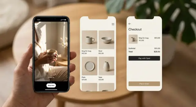
Example: if the influencer says, “Use code MAYA15 for 15% off the Starter Kit,” your Instagram swipe up landing page should open directly on that Starter Kit. Put the discount details on the first screen and make the code easy to apply or already applied.
A campaign page should feel like a continuation of the creator’s post, not a generic storefront. The simplest rule is one influencer, one product set, one page. If the creator is talking about a specific bundle or shade, the page should focus on that exact choice.
Use a short, human URL pattern you can reuse, like creator name plus drop name. Even if most people never type it, clear naming helps your team stay organized and makes reporting easier when several creators are live at once.
Match the top of the page to the post. Swap the hero image, headline, and first sentence so they mirror the creator’s wording. If the Reel says “the 2-step glow kit,” the page shouldn’t open with “Shop our bestsellers.” That gap is where taps turn into exits.
A solid campaign specific landing page usually needs only a few blocks:
Consider small variations by traffic source. Stories are fast and often work better with less scrolling and a bigger button. Reels and bio link traffic can handle a bit more context, like a short FAQ.
If you build landing pages for influencer campaigns in a tool like Koder.ai, a practical approach is to keep one base template and swap only what’s creator-specific (hero, copy, and product set) for each drop.
Most people arrive from Instagram on a phone with little patience for hunting. Your page should answer three questions quickly: what is it, how much is it, and what do I do next?
Start with a simple top block that loads fast and reads well on a small screen. Use one clear product photo (or a short loop), the product name, the price, and one primary button. If there’s a creator deal, show it right there so the promise matches the post.
Keep the rest tight. Instead of a full spec sheet, pick 3 to 5 details that remove doubt and help someone decide: size/fit, what’s included, expected results, compatibility, or care. Put deeper details into expandable sections so you don’t push the buy button off-screen.
A clean structure that works well:
Social proof has to fit mobile, too. A short quote, a compact rating summary, or a small “X sold this week” style note (only if it’s accurate) beats a heavy carousel that slows the page.
Put trust basics close to the main button so people don’t have to scroll to feel safe: shipping window, easy returns, accepted payment options, and how to reach support. Keep it direct.
Attribution answers a simple question: which creator and which post led to this order? For influencer attribution tracking, you usually want two signals working together: UTMs on the link and a creator-specific code.
UTMs are small tags added to the end of a URL. They tell your analytics tool where a visit came from. The main goal is consistency, so reporting stays clean.
A practical naming set looks like:
Discount codes help when UTMs get lost. That happens more than people expect: links get shared in group chats, in-app browsers strip parts of the URL, or someone clicks today and buys next week on another device. A unique code (like MAYA10) gives you a second way to attribute the sale. Decide upfront how you’ll count orders when UTMs and codes disagree, then document it.
Edge cases are normal. People share links, return later, or tap multiple creators before buying. Pick a reporting rule and stick to it:
Whatever rule you choose, make sure campaign data survives the full purchase flow. Pass UTMs from the landing page into checkout (via stored session data, hidden fields, or a cart attribute) and save them on the order record alongside the discount code.
When you measure performance per creator and per post, don’t stop at orders. Track the steps where people drop:
If you want pages to be easy to compare later, start with a naming system you’ll actually use. Keep it consistent across page slugs, UTMs, and discount codes, like creator_handle-post_date-creative_a.
Then build a simple template with reusable blocks so you’re not rebuilding from scratch each time. A good template usually includes a headline that matches the post, one key product image, a few benefit bullets, social proof, and a single clear call to action.
A practical build and launch flow:
When you create one page per creator, keep the promise tight. The first screen should answer, “What is this, why should I care, and what do I do next?” If the influencer is selling a bundle, show that bundle first, not your whole catalog.
Once the post is live, watch results during the campaign window, not a week later. If clicks are high but add-to-cart is low, tighten the hero section and move the CTA higher. If add-to-cart is high but purchases lag, focus on checkout speed and payment options instead of rewriting the whole page.
If you build in a tool like Koder.ai, saving your template as a snapshot makes it easier to test changes and roll back quickly if a variation performs worse.
When someone taps from Instagram, they’re usually on a phone, on shaky reception, and making a fast decision. Your landing page can do everything right, and you can still lose the sale if checkout feels slow or demanding.
One of the biggest wins is guest checkout. Account creation kills motivation on mobile. If you want emails, ask after the order or offer an optional checkbox, not a hard stop.
Forms should respect autofill. Use the right input types (email, tel), keep labels clear, and remove anything you don’t truly need to ship the product. Combine fields when you can, default the country, and avoid extra steps like “confirm email.”
Fast payments matter even more for influencer traffic. Many shoppers are ready to buy, but not ready to type card details with one thumb. Wallet options (like Apple Pay or Google Pay) often close the gap between “I’ll come back” and a purchase.
Keep checkout simple:
Example: a creator posts a limited drop with a code. A shopper taps, adds one item, and hits checkout. If they see a full-screen signup prompt and a long form, they bounce. If they see guest checkout, autofill-friendly fields, and a wallet button, they can finish in under a minute.
Most influencer traffic arrives curious, not convinced. The fastest way to lose it is to make people think or wait.
A common slip is sending everyone to a generic collection page. It feels safe because it has everything, but it forces a decision too early. People bounce when they see 40 products and no clear “this is the one you just saw on Instagram.” For landing pages for influencer campaigns, the page should match the exact item, bundle, or outcome the creator promised.
Speed is the next silent killer. Pages loaded with heavy video, oversized images, and extra widgets can feel fine on desktop, then crawl on mobile data. If the first screen takes too long, users never reach the offer.
Trust breaks when the offer changes after the post goes live. If a creator says “20% off today,” and visitors see a different price, bundle, or minimum spend, it looks like bait and switch. Even small changes (shipping threshold, bonus item, end date) can tank conversion.
Attribution problems often come from messy tracking. Missing UTMs, different UTM names per influencer, or mixing codes and UTMs without a plan makes results hard to compare.
Checkout failures can erase the whole campaign. A discount code that’s visible on the landing page but fails to apply at checkout is especially painful on mobile.
Quick fixes that prevent most of these issues:
Example: if Mia posts a story at noon and you swap the bundle at 2pm, late viewers will feel misled and refunds can rise even if clicks stay strong.
Before a post goes live, do a fast phone test that matches how people will actually land and buy. The biggest wins often come from fixing small details that cause drop-offs.
Open the page on a mid-range phone (not the newest one) and switch to 4G. If it feels even slightly slow, it’ll be worse for real visitors. Then check the first screen carefully. People decide in seconds whether they’re in the right place.
Pre-flight checklist:
Also check the confirmation page. It should clearly show the order number, what was purchased, and what to expect next. That one screen can prevent a lot of “Did my order go through?” support tickets during a spike.
A skincare brand runs a 7-day drop with one creator and one product: a “Glow Bundle” (cleanser + serum + moisturizer). The creator posts one Reel, then daily Stories, and pins the bundle in their bio for the week. The page promise is simple: “Get the Glow Bundle - limited 7-day price, ships in 24 hours.”
They use two links so they can see what works:
Both links land on the same campaign-specific landing page, but attribution stays clean because the UTMs differ. They also add a backup discount code (GLOW7) for people who copy the name and search later.
Each day, the team checks three numbers side by side for Stories vs bio:
By day 2, Stories drive more sessions, but bio visitors complete checkout more often. That points to fast interest vs higher intent. Mid-campaign, they make small, safe changes: swap the hero image to a clearer bundle photo, move the top FAQs higher (especially “Will this work for sensitive skin?”), and add a short shipping note near the price.
When reporting back to the creator, keep it simple: Story and bio sessions, total purchases, and the overall conversion rate for the campaign page. If you use codes, explain that codes capture late buyers while UTMs capture direct clicks, so neither tells the full story alone. If you’re building pages in a tool like Koder.ai, save a snapshot before changes so you can compare day 1 vs day 4 without guessing what changed.
The easiest way to improve over time is to treat landing pages for influencer campaigns like a system, not a one-off. Build a small campaign page kit you can reuse, then change only what’s unique to each creator and offer.
Start with one template and duplicate it for each creator. Keep the structure consistent so your data stays comparable.
Decide what you want to lock at the order level so reporting stays clean even if links break or people come back later:
During the campaign, change one thing at a time so you know what helped. For example: day 1 headline, day 2 CTA text, day 3 image order. Watch a small set of numbers: click-to-add-to-cart, add-to-cart-to-checkout, and checkout completion.
If you need to ship pages fast, tools like Koder.ai can help you build campaign pages via chat, then export source code, deploy, and use custom domains when needed. The key is consistency: the same template, the same tracking fields, and small controlled changes you can compare.
Start with message mismatch and load speed. Make sure the first screen repeats the creator’s exact promise (product, shade/bundle, price, code) and loads fast on mobile data. Then check if the main CTA is visible without scrolling and nothing blocks it (popups, chat widgets, cookie banners).
Send them to one focused campaign page that opens on the exact item the creator showed. Homepages and big collections add choices and slow decisions. If you must offer options, keep them below the first CTA and default to the creator’s featured product or bundle.
Keep one clear goal per click.
Mixing “buy + subscribe + browse” usually reduces all outcomes.
Mirror the post, word for word when possible. Match:
Your first screen should answer “Am I in the right place?” without scrolling.
A simple structure is enough:
Avoid adding extra sections that push the CTA below the fold.
Make the top block do most of the work:
Put deeper details into expandable sections so the buy button stays close to the top.
Use two signals: UTMs on the link and a creator-specific code.
Pick a simple rule for credit (last-click, first-click, or split) and keep it consistent across every creator.
Test the full path on real phones before the post goes live:
Do this on at least one iPhone and one Android, and on a slower connection.
Default to guest checkout and fast payments.
If add-to-cart is high but purchases are low, checkout friction is often the cause.
Use a reusable template and only swap what’s creator-specific (hero, copy, product set, code, UTMs). Save versions so you can compare changes and roll back quickly.
If you build in Koder.ai, you can keep a base page, duplicate it per creator, and use snapshots/rollback to test small changes without rebuilding everything.