Jun 30, 2025·8 min
Live Chat & Lead Capture: What to Add (and Skip)
A practical checklist for live chat and lead capture: what to add, what to skip, and how to keep chat helpful without hurting conversions or trust.
A practical checklist for live chat and lead capture: what to add, what to skip, and how to keep chat helpful without hurting conversions or trust.
Before you tweak greetings, add a form, or set up automation, decide what “good” looks like for your chat widget. A live chat that tries to do everything usually does nothing well—because the questions, tone, and handoff rules for support are different from those for sales.
Start by choosing one main goal:
If you pick “both,” make it explicit: “Support and sales” isn’t a strategy unless you define how visitors get to the right path in one click.
Your chat should guide people toward a small set of outcomes. Common high-intent actions include:
Avoid mixing too many asks (“Book a demo,” “Start a trial,” “Download a PDF,” “Subscribe”) in the same flow. It makes the widget feel like a pop-up ad.
Tie your goal to 2–3 metrics so you can tell whether changes help:
A simple rule: if you can’t measure it, don’t optimize for it.
The same chat prompt shouldn’t appear everywhere.
When chat aligns with what the visitor is already trying to do, lead capture feels helpful—not forced.
A chat widget should feel like help is available—not like a pop-up fighting for attention. The best triggers match intent and respect what the visitor is trying to do.
Different pages deserve different “open” rules:
On blog posts, help docs, and guides, auto-opening chat often hurts more than it helps. Prefer a subtle launcher, or trigger only after meaningful engagement (deep scroll, long time on page). If the content answers common questions, link to self-serve options inside the widget instead of forcing a conversation.
Mobile screens are tight, and exit intent is unreliable. On mobile, lean on click-to-chat, scroll depth, or a longer time delay—and avoid anything that covers the main text.
Let visitors dismiss the widget in one tap, then keep it closed for a while (for example, 24 hours or at least the current session). If someone closes chat twice, treat that as a clear “not now.”
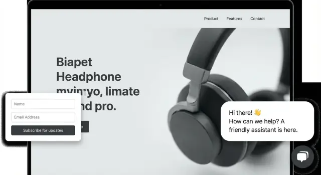
Your opening message sets expectations and prevents the chat from turning into a slow back-and-forth. Keep it human, short, and action-oriented—one or two sentences is plenty.
Aim for: who you are + what you can help with + what happens next.
Example:
“Hi—want help choosing a plan or do you need support with an account issue? Pick an option below and we’ll point you to the right place.”
This works because it doesn’t overpromise, and it invites the visitor to choose a path.
The first question should sort visitors by intent, not interrogate them.
Try:
“What are you trying to do today?”
Then offer 3–4 buttons that match your highest-volume conversations:
Buttons reduce typing, speed up resolution, and help you tag conversations for reporting.
Add a small line that tells people what to expect:
This single detail lowers frustration and increases the chance they’ll leave contact info when needed.
If your site is friendly, the chat should be too. Avoid overly salesy greetings like “How can I delight you today?” and skip long paragraphs. The best opener feels like a helpful receptionist: direct, calm, and quick to route.
A lead capture form inside live chat should feel like a helpful “save this conversation” step—not a mini application.
Ask only for what you’ll actually use. For many teams, name + email is enough to follow up and connect the chat to a person. Every extra field (phone, company size, budget) reduces completion—especially on mobile.
If you need more context, consider whether it belongs later in the conversation—or in your CRM after the fact.
People are more willing to share details when the reason is clear. A short, plain-language note works well:
This also prevents the form from feeling like a sales trap.
Instead of leading with a long form, start the chat with help: answer one question, share a relevant link, or suggest the right plan—then ask for details when it makes sense (“Want me to email this summary?”). Progressive questions keep the conversation moving and increase trust.
When possible, let visitors proceed without handing over contact details. A simple option like “Continue without email” reduces friction and still lets engaged users self-identify later.
You can add a gentle fallback: “If you’d like a copy of this, drop your email anytime.”
Asking for an email the moment someone opens chat is a quick way to lose them. A better pattern is: help first, then capture details once the visitor has a reason to continue.
Start by answering the question they already have. After one or two useful messages (for example, confirming availability, pricing range, or basic fit), you’ve earned the right to ask:
“Want me to send a summary or a quote? What’s the best email?”
This keeps the exchange feeling like service, not a gate.
Don’t show the form to everyone. Trigger it only when intent is clear—like when someone:
That’s when a short form feels natural, because it unlocks the next step.
If the form looks heavy on a phone, people abandon it. Stick to the minimum:
Name (optional), email or phone (pick one), and one context field like “What are you looking for?” If you need more, collect it later in the conversation.
After submit, don’t just say “Thanks.” Be specific:
“Got it—someone will reply within 1 business hour. If you prefer, you can also book a time here: /pricing.”
Clarity reduces anxiety and increases the chance they’ll stick around (or actually respond).
If someone has to type a full sentence just to get started, many won’t. The fastest way to increase chat engagement (and keep it useful) is to remove friction: fewer decisions, fewer keystrokes, and an obvious path to the right place.
Quick replies are the “tap to answer” buttons that appear inside the chat. They work because they move visitors past the blank-text-box moment.
Good quick replies are short, specific, and action-oriented—for example:
Once a visitor taps a quick reply, you can ask one focused follow-up question instead of forcing them to explain everything upfront.
A simple menu helps people self-sort without reading paragraphs.
Keep it tight—four choices is usually enough:
Behind the scenes, each option should trigger the right routing: different team, different opening questions, different expectations.
Not every chat needs a conversation. If someone asks “How do I cancel?” they want the answer, not a back-and-forth.
Include one or two helpful links in the widget—especially for high-volume topics:
Offer self-serve without sounding like deflection. Pair links with a clear next step: “If this doesn’t solve it, reply here and we’ll help.”
Even if you use automation, visitors should never feel trapped.
Add an obvious option like “Talk to a person” or “Get human help.” It prevents frustration, reduces repetitive messages, and builds trust—especially for billing issues, edge cases, and high-intent sales conversations.
Offline chat is still lead capture—if you treat it like a clear, lightweight contact path instead of a “fake live” experience. The goal is to remove doubt (“Will anyone respond?”) and make the next step obvious.
Show business hours in the widget and in the offline state. Don’t bury them in a tooltip. A simple line like “Mon–Fri, 9am–5pm ET” prevents frustrated messages and boosts the quality of inquiries.
When you’re offline, swap the chat prompt for an honest message that sets expectations:
Example copy:
“Thanks! We’re offline right now. Leave a message and we’ll reply within 1 business day. If it’s urgent, please use /contact.”
Offline mode works best when the form is short and purposeful: question + email (and optionally name). If you ask for a phone number, explain why (“Only if you want a call back”).
If your tool supports it, offer to send a chat transcript by email—but only with explicit consent. A simple checkbox (“Email me a copy of this conversation”) reduces “Did my message go through?” anxiety.
When offline, route the conversation to a shared inbox or ticketing email, and provide a clear fallback:
That way, the widget stays helpful—and never pretends a human is waiting.
Automation can help you respond instantly, qualify leads, and route requests—but only if it’s honest and easy to escape.
If the first reply is from a bot, say so. A simple line like “I’m an automated assistant—happy to connect you with a person anytime” prevents the “is anyone there?” frustration and builds trust.
Keep the bot’s job small: greet, identify intent, and offer the next step. If you need more than a few steps to get value, the flow is probably too long.
If you’re building a custom chat experience (or internal tools that power routing, lead enrichment, and handoff), a vibe-coding platform like Koder.ai can help you prototype and ship quickly—especially when you want a tailored flow instead of a generic widget.
Decide in advance when the bot must hand over to a human. Common triggers:
When a handoff happens, say it plainly: “I’m connecting you to a teammate now.” If nobody is available, switch to a clean offline capture (not fake “typing…”).
Log the handoff context and pass it to the agent: page URL, selected topic, answers already shown, and the last visitor message.
A good standard is: by the time a human joins, they can start with “I see you’re asking about X on /pricing—want to compare plans or talk timeline?” That single detail can be the difference between a lead captured and a chat abandoned.
People share contact details in chat faster when they feel safe. The goal isn’t to turn your widget into a legal document—it’s to be clear, honest, and minimal.
Use one plain-language line near the form or right after the first question. Example: “We’ll use your email to send your quote and follow up about this request.” Add a link to your privacy policy: /privacy.
If you record chat transcripts, say so (briefly). If you use the data for marketing, say so (specifically), and offer an obvious opt-out.
Avoid intrusive prompts for information that can create real harm if mishandled:
If payment or identity is required, route people to a secure flow instead of collecting it in the widget.
Add consent checkboxes only when your jurisdiction or policy requires them (for example, marketing opt-in). Keep labels short and human, not vague legal text. If there are two purposes (support vs. marketing), separate them.
Store only what you need to help the person and follow up. Fewer fields reduce friction and reduce risk if anything goes wrong. A good default is: name (optional), email or phone (one), and the question.
Live chat should feel helpful and respectful. A few “growth hacks” reliably do the opposite—hurting trust, increasing bounces, and lowering lead quality.
If a widget feels staged, people assume the offer is staged too.
A chat box is already a strong visual element. Over-triggering it turns “helpful” into “get me out of here.”
People open chat to get an answer. If the first thing they see is a form, they’ll leave (or type fake info).
Long, aggressive forms inside a tiny widget are a conversion killer.
The rule: reduce friction, increase clarity, and never make the chat feel like a trap.
Live chat feels “busy,” but busyness isn’t the same as results. To optimize lead capture, you need a small set of signals that tell you whether chat is helping people move forward—or creating friction.
Don’t ask “Where did you hear about us?” in the chat. Instead, capture attribution quietly:
This gives you clean reporting on which campaigns actually drive qualified chats.
At minimum, track these milestones (in analytics and/or your chat tool):
If you can, also track time-to-first-response and handoff rate (bot → human), but only after the basics are stable.
Transcripts are your best “why.” Review them to find:
Once a week, do a 20-minute sweep:
Testing your chat widget doesn’t need a full CRO program. A few small, controlled experiments can quickly reveal what increases qualified conversations and captured leads.
Run simple A/B tests on when chat opens:
Keep the success metric clear (e.g., “lead captured per 100 visitors,” not “chats started”).
The opening message is often the difference between “ignore” and “reply.” Test:
Don’t force one setup everywhere. Create page-based variants:
On mobile, space is the bottleneck. Test button size, widget position, and whether the chat launcher overlaps key CTAs. Also test shorter quick replies (1–3 words) to reduce typing.
Every winner should update your team’s canned responses, routing rules, and handover notes. Otherwise, you’ll keep re-learning the same lessons with different visitors.
Use this as a quick “ship it” list for live chat lead capture. It’s intentionally short so you can paste it into a task tracker and assign owners.
Goal:
Triggers (open conditions):
Greeting (first message):
Routing (where conversations go):
Lead capture form (minimal fields):
Offline mode (no pretending it’s live):
If the visitor is sales-intent, send them to /pricing. If they need a human conversation, send them to /contact.
Start by picking one primary job for the widget:
Trying to do everything with one generic opener usually creates confusion and low-quality chats.
Choose 1–2 outcomes and keep them consistent across prompts and buttons. Common high-intent actions include:
Avoid stacking multiple CTAs in one flow (demo + trial + PDF + newsletter). It makes chat feel like an ad and reduces follow-through.
Use a small set of metrics that you’ll actually review weekly:
If you can’t measure it reliably, don’t optimize the widget around it.
Match triggers to intent and page type:
Also add a frequency cap (once per session/day) so it doesn’t keep popping back up.
Treat closing as a clear boundary:
This reduces frustration and improves trust (and lead quality).
Use a short, human opener that does three things: sets context, offers help, and routes.
Example:
“Hi—do you need help choosing a plan or support with an account issue? Pick an option below.”
Keep it to 1–2 sentences, avoid hypey language, and add routing buttons so visitors don’t have to type to get started.
Ask only for what you’ll truly use, typically:
If you add fields like phone, company size, or budget, completion drops—especially on mobile. If you must ask for more, collect it later (after you’ve helped) or in your CRM after the chat.
Don’t ask for email immediately. A practical pattern is:
This keeps the interaction feeling like service rather than a gate.
Use offline mode as an honest, lightweight contact path:
Avoid pretending it’s live (no fake typing or “online” status).
Add simple trust signals without turning the widget into a legal wall:
If you need marketing consent, keep it separate and understandable.