

“Make My Website Like This”: Copy the Style, Not the Content
Learn how to recreate the look and feel of a website you like—without copying text, images, or layouts. A practical, ethical step-by-step guide.
What “Make My Website Like This” Actually Means
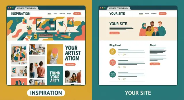
When a client says “make my website like this,” they rarely mean “copy every pixel.” They’re usually pointing to a feeling: clean and modern, bold and editorial, friendly and playful, premium and minimal.
Your job is to translate that reaction into decisions you can defend—then rebuild those decisions using the client’s brand, content, constraints, and goals.
What clients typically mean
Most clients are trying to communicate one (or more) of these:
- “I like how easy it is to use.”
- “I like the visual polish.”
- “I like how it tells the story.”
- “I want to look like I belong in that category.”
Using a reference site to set direction is normal. The key is to borrow principles, not assets.
Style vs. content vs. layout (quick definitions)
- Style: the visual system—typography, colors, spacing, imagery treatment, button shapes, motion, overall tone.
- Content: the words and media—copy, photos, illustrations, icons, testimonials, charts, brand names.
- Layout: how content is arranged—page structure, section order, grids, and component patterns.
Borrowing style cues is usually safe and expected. Copying content is a hard no. Copying layout can be acceptable in broad strokes (common patterns exist), but cloning a distinctive structure too closely can still create legal and reputational risk.
Why “close enough” can still be risky
Even if you redraw everything, a near-identical page can look like a knockoff—hurting trust and inviting complaints. The risk isn’t only legal; it’s also reputational. People notice when two sites feel like twins.
Set expectations early: similar vibe, different execution
A strong agreement sounds like this:
“We’ll match the vibe—clean type, generous spacing, confident headlines—but we’ll design original pages, write original copy, and use your own visuals so it clearly belongs to your brand.”
That one sentence prevents weeks of misaligned feedback later.
What You Can Copy (and What You Shouldn’t)
What you can borrow (safely)
Treat other sites as references for design direction:
- Color direction (not exact palettes): “mostly neutral with one bright accent,” “muted pastels,” “high contrast.”
- Typography direction: “bold, editorial headlines,” “rounded, friendly sans-serif,” “technical and precise.”
- Spacing and density: generous whitespace vs. compact, information-rich blocks.
- Interaction patterns: sticky navigation, subtle hover states, accordion FAQs, card-based grids.
- Component categories: pill vs. square buttons, border vs. shadow cards, outline vs. solid icons (as a category).
These are “design ingredients” that help you reach a similar vibe while still producing an original result.
What you must not copy
Where people accidentally cross the line:
- Text and messaging: headlines, product descriptions, FAQs, microcopy—don’t “find and replace.”
- Images and videos: photos, hero imagery, background textures, testimonial headshots.
- Icons and illustration sets: especially distinctive or custom styles.
- Distinctive visuals: proprietary diagrams, infographics, signature patterns, custom animations.
- Brand assets: logos, taglines, mascots, and recognizable motifs tied to the other company.
Layouts: when it becomes “too similar”
General structures (hero → benefits → testimonials → CTA) are common. It starts to feel like copying when you match the same section order, same grid, same spacing, and same visual hierarchy, and it’s instantly recognizable side-by-side.
A good rule: keep the idea (e.g., “three benefit cards”), change the expression (content, proportions, typography, imagery, and component styling) so it’s clearly yours.
Gather Better References: The 3–5 Example Rule
A single reference can trap you into copying specifics. Asking for 3–5 examples creates range, which makes it easier to extract repeatable signals.
Why 3–5 examples work
With multiple references, you can identify patterns like:
- “They all feel clean and spacious” (spacing + grid)
- “They all use bold headlines with lots of white space” (typography)
- “They all have calm motion, nothing flashy” (animation)
- “They all sound confident and friendly” (copy tone)
Once you see the pattern, you can recreate the style logic without recreating any single page.
Ask them to label what they like (and what they don’t)
Don’t accept “I like it” as usable feedback. Ask for quick annotations:
- Fonts: modern/classic/playful? bold or subtle headings?
- Colors: muted or bright? high contrast or soft? favorite accent color?
- Simplicity: minimal and calm, or content-rich?
- Animation: none, subtle fades, or dynamic interactions?
- Tone: serious, friendly, premium, quirky?
Equally important: collect the negatives.
Examples of useful “no” statements:
- “No huge hero videos.”
- “No tiny light-gray text.”
- “No busy backgrounds or cluttered footers.”
- “No playful doodles—keep it professional.”
Use a short intake form or checklist
A lightweight checklist reduces meetings and keeps feedback comparable:
- Link + screenshot
- 3 things you like (typography, color, spacing, layout, imagery, navigation, motion, tone)
- 3 things you dislike
- One sentence: “If our site felt like this, it would be…”
Translate “Vibe” Into Clear Design Requirements
1) Turn examples into adjectives (then define them)
From your 3–5 references, choose 5–8 adjectives: calm, premium, playful, editorial, bold, minimalist, cozy, technical, friendly.
Then define them as decisions:
- Calm = lots of whitespace, gentle contrast, fewer visual “shouts” per screen.
- Premium = restrained palette, high-quality type, strong hierarchy, fewer but stronger visuals.
- Editorial = larger headlines, thoughtful spacing, reading-first layouts.
This becomes your translation layer from “vibe” to buildable choices.
2) Define the audience and the single main goal
Write one sentence for who it’s for, and one sentence for the primary outcome.
Examples:
- Audience: “Operations managers at 50–200 person companies who need fewer vendor headaches.”
- Goal: “Book qualified intro calls for our service package.”
A “premium” vibe for luxury retail and a “premium” vibe for B2B consulting may look very different once the audience is clear.
3) Set success metrics you can measure
Choose 2–4 metrics tied to the goal:
- Conversion rate (forms, bookings, purchases)
- Time on key pages (services, pricing, case studies)
- Lead quality (fit, budget, readiness)
- Scroll depth or click-through to critical pages
Metrics keep taste debates from derailing the project.
4) Write a one-paragraph style brief
Combine the above into a short brief anyone can reference:
“We want a calm, premium, editorial feel for operations leaders. The site should build trust quickly and drive booked calls. Use simple layouts, strong typography, restrained color, and clear hierarchy. Success is more qualified bookings and higher engagement on services and case studies.”
Create a Mood Board and a Mini Style Guide
A reference site is still a full website. To capture the feel without copying the execution, break the feel into parts you can describe and reproduce.
Build a focused mood board (not a scrapbook)
Your mood board should answer: What should this website feel like when someone lands on it? Keep it tight.
Include 3–8 items total across these buckets:
- Typography: 1–2 heading styles and 1 body style (note weight, size, line spacing).
- Color: temperature (cool/warm), contrast level, how accents are used.
- Photography/illustration style: lighting, framing, saturation, “real people” vs. abstract.
- UI patterns: buttons, cards, nav style, hero approach, icon style, spacing density.
Add screenshots with short notes like: “Large, confident headlines,” “Soft shadows, rounded corners,” “One accent color used only for CTAs.”
Turn it into a mini style guide you can actually build
Convert the mood board into consistent rules:
- Type scale: H1/H2/H3, body, small text (sizes + line heights)
- Buttons: primary/secondary, radius, hover behavior
- Cards: padding, border vs. shadow, image treatment
- Form fields: border style, focus state, error state
If you maintain design tokens, this is where they start (font sizes, spacing steps, color roles).
Document do’s and don’ts (with receipts)
Create a simple “Do / Don’t” list with examples:
- Do: “Use one accent color for primary actions.”
- Don’t: “Copy this exact layout or icon set.”
That constraint list prevents accidental cloning and keeps new pages consistent later.
Rebuild the Style With Typography, Color, and Spacing
If you want a similar feel without the “knockoff” look, rebuild from first principles: type, color, and spacing.
Typography: same mood, different fingerprints
Identify what the reference typography is doing: editorial and calm? techy and precise? playful and rounded?
Choose typefaces that match the mood without matching the exact font. If the reference uses a high-contrast serif for headlines, pick a different high-contrast serif (or a sharp, elegant sans) rather than the same family.
Then define a type scale so pages stay consistent:
- H1, H2, H3 sizes (and when each is used)
- Body text size and line-height rules
- Caption and small text styles
A readable baseline for many sites: comfortable body line-height (often ~1.5–1.7), slightly tighter headings, and generous paragraph spacing.
Color: different hues or different proportions
Many “copied” designs give themselves away with the same hero background and accent. Build a palette that’s yours:
- Choose different hues (e.g., reference is navy + neon green; you choose deep teal + warm lime)
- Or keep a similar family but change proportions (e.g., reference is mostly dark; you go mostly light neutrals with small bold accents)
Also define states: link, hover, focus, and error/success colors.
Spacing: the invisible thing that makes it feel “premium”
Spacing is one of the fastest ways to create cohesion without copying layouts. Use a spacing system (e.g., 4/8/16/24 or 6/12/24/36) and stick to it for:
- Section padding
- Gaps between cards and columns
- Button padding and form spacing
When everything aligns to a consistent rhythm, the design feels intentional—even if the page structure differs from your references.
Design Components Instead of Copying Pages
Recreating an inspiration site page-by-page is a common trap: you either end up too similar, or you get stuck when your content doesn’t fit the same shapes. Instead, copy the system, not the page.
Start by spotting the recurring pieces
Most marketing sites are assembled from reusable “Lego bricks.” List what repeats across your references:
- Hero section (headline, subhead, primary CTA, secondary link)
- Feature blocks (icon + title + short copy)
- Testimonials (quote, name, role, company)
- Pricing cards (plan name, price, features, CTA)
- FAQ accordion
Naming components shifts the work from “copy their homepage” to “build our hero, our pricing, our FAQ.”
Build your own component set
Create a small component library you can reuse across pages:
- Buttons (primary/secondary/tertiary, hover + disabled states)
- Navigation (desktop + mobile)
- Cards (features, blog posts, resources)
- Forms (input, textarea, dropdown, error messages)
If you want to move quickly, a vibe-coding platform like Koder.ai can be useful here: you can describe the target vibe and component set in chat, generate a working React-based UI, and iterate without “locking in” a copied layout. Features like planning mode and snapshots/rollback also help you explore variations safely while keeping the implementation original.
Define variation rules (so it stays coherent)
Polished sites use controlled variation. Set rules such as:
- Corner radius: e.g., 8px for cards, 999px for pills, never random
- Shadow levels: none / soft / elevated (3 tiers max)
- Icon style: outline vs. solid, stroke width, corner style
Document it like a mini playbook
A one-page component guide is enough: what each component is for, where it’s used, and allowed variations.
Plan Structure and Wireframes Around Your Content
Copying the reference site’s page order is the fastest way to inherit assumptions that don’t fit your business.
Start with user needs (not the reference)
Before sketching, list what visitors need to know before they buy:
- “Is this for someone like me?”
- “What does it cost and what’s included?”
- “Can I trust you—proof, reviews, results?”
- “What happens next if I contact you?”
Those questions become the backbone of your structure.
Create a simple sitemap and page goals
Map the pages you actually need and give each a single job:
- Home: clarify what you do, who it’s for, and the next step
- Product/Service: explain the offer, benefits, and key details
- Pricing: reduce anxiety with clear tiers, inclusions, and FAQs
- Contact: make reaching you easy; set expectations for response time
Add supporting pages (About, Case Studies, FAQ) only when they serve a clear purpose.
Write a unique content outline for each page
Outline headings and sections based on your offer, not the reference block sequence. Decide what proof you’ll show, which objections to handle, and what you want visitors to do next.
Wireframe to fit your content
Wireframes are layout sketches, not decoration:
- If you have three strong case studies, give them room.
- If pricing is custom, design for consultation flow instead of a pricing table.
- If your product is visual, plan a gallery or demo section.
Once the structure works, apply the inspiration site’s style—without inheriting its blueprint.
Create Original Copy and Visuals (No “Find and Replace”)
To make the execution clearly different, your words and visuals must be your own.
Rewrite messaging from scratch (benefits, proof, CTAs)
Start from what’s true about your business. A simple framework:
- Benefits: what outcome does the customer get (faster, simpler, safer, more confident)?
- Proof: what makes it believable (numbers, testimonials, case studies, logos, certifications)?
- Calls to action: what’s the next step (book a call, start a trial, request a quote) in your tone.
You can match the reference’s rhythm (short punchy lines vs. longer explanations) while changing the underlying ideas and wording. Avoid signature phrases and distinctive metaphors.
Use original visuals (or properly licensed assets)
Don’t lift screenshots, icons, illustrations, or photos—even if they feel generic.
- Take your own screenshots of your product or process.
- Use your own photography when possible.
- If you need stock, use licensed assets and keep a record.
If you want a similar hero vibe, recreate the concept: same level of polish, different subject and composition.
Don’t mirror headings and section order
Even with brand-new text, copying the same section flow can read like imitation. Reorder the story to fit your strengths: lead with proof, combine thin sections, or add a section the reference doesn’t have.
Match the feel, keep the words yours
Tone is allowed; phrasing isn’t. Decide your voice (friendly, premium, direct, playful) and apply it consistently across headings, buttons, and microcopy.
Quality Checks: Similar Feel, Clearly Different Execution
You’re aiming for “same genre, different song.” Before you ship, confirm you captured the vibe without matching details.
The “similar vibe” test
Open the reference and your draft side-by-side for 60 seconds. Close the reference and ask: what do you remember?
- If you remember mood (clean, playful, premium), you’re on track.
- If you remember specific details (that exact hero layout, those exact icons), you’re too close.
Accessibility sanity check
A site can feel similar while being better for real users. Review:
- Contrast and readability (avoid tiny, thin, low-contrast body text)
- Clear hover/focus states for links and buttons
- Logical keyboard navigation through menus, forms, and modals
Responsive reality check
Mobile should be intentionally designed, not just “shrunk desktop.” Check for:
- A mobile-first header with a clear primary action
- Reflowed sections (stacking, shorter line lengths, larger tap targets)
- No critical interactions that rely on hover
Run a “too close?” checklist
Before launch:
- Are you using the same hero layout pattern and repeating the next 2–3 sections in the same way?
- Do your colors and typography create a distinct brand signature?
- Are illustrations, icons, photos, and microcopy original (or properly licensed)?
If two or more answers feel shaky, redesign one layer—spacing, typography, or component shapes—to break the “clone” feeling quickly.
Legal and Ethical Guardrails (Plain English)
You can learn from a site you admire—type hierarchy, spacing rhythm, component patterns. What you shouldn’t do is lift protected work or make your site so similar that users think it’s the same brand.
Copyright basics (what’s usually protected)
Copyright typically protects specific creative expression, not general ideas.
- Text: headlines, paragraphs, product descriptions, taglines, microcopy. Don’t “rewrite by swapping a few words.”
- Images & photography: protected by default. Don’t download, screenshot, or borrow.
- Icons & illustrations: often licensed; distinctive custom styles are typically protected. Avoid tracing or “clean room” redraws of unique art.
- UI patterns: common patterns are generally fair to reuse, but a highly distinctive combination can still create problems if copied too closely.
Trade dress & brand confusion (the “looks like them” problem)
Even without copying exact assets, you can run into trouble if the design causes confusion.
Watch for:
- A near-identical logo placement, color palette, and typography combo
- A unique hero layout, illustration style, or mascot that feels unmistakably “theirs”
- Similar product naming, tone, and messaging structure that implies affiliation
A simple test: if a quick glance makes someone say, “Is this the same company?” you’re too close.
When to consult a legal professional
Consider a quick review if you’re:
- Operating in the same market as the reference brand
- Recreating a very recognizable visual identity
- Unsure about licensing for fonts, photos, icons, or templates
- Receiving a complaint, takedown notice, or “cease and desist”
Document your process (it helps more than you think)
Keep a lightweight paper trail showing independent work:
- Your brief (goals, audience, constraints)
- The mood board (multiple references)
- Wireframes and drafts showing iteration
- Notes on licensed assets (receipts/links) and what you created in-house
This isn’t bureaucracy—it’s clarity, and it helps keep “inspired by” work clearly on the ethical side.
FAQ
When a client says “make my website like this,” what are they actually asking for?
It usually means they want the same vibe (clean, premium, playful, editorial), not a pixel-perfect duplicate.
Your job is to translate their reaction into concrete decisions—typography, spacing, color roles, components, tone—then execute those choices with their brand, content, and constraints.
What’s the difference between style, layout, and content—and why does it matter?
A simple, safe framing is:
- Style: fair to reference (type direction, spacing, component feel, motion restraint).
- Layout: okay in broad patterns (hero → benefits → proof → CTA), but avoid distinctive “signature” structures.
- Content: don’t copy (words, images, icons/illustrations, diagrams, screenshots).
If you’re ever unsure, treat it as content and make it original.
What can I safely borrow from a reference website?
Borrow principles, not assets:
- Typography direction (e.g., bold headlines + simple body)
- Spacing/density (roomy vs. compact)
- Interaction patterns (sticky nav, accordions, hover states)
- Component category (cards, pill buttons, outline icons as a style family)
Then rebuild with different fonts, a distinct palette, your own copy, and original visuals so it reads as unmistakably yours.
What should I never copy from another site?
Avoid copying anything that’s likely protected or uniquely identifiable:
- Headlines, paragraphs, microcopy, FAQs, taglines
- Photos, videos, background textures, screenshots
- Custom icons/illustrations/mascots (and don’t trace or “redraw” them)
- Distinctive diagrams, infographics, animations, patterns
- Brand elements (names, logos, recognizable motifs)
Even “lightly edited” versions can still be too close—start from your own message and assets.
Why is a ‘similar’ layout still risky even if I redesign everything?
“Close enough” can create two problems:
- Reputation: it looks like a knockoff, which hurts trust.
- Confusion risk: users may think you’re affiliated with the other brand.
If a side-by-side glance makes someone say “these are twins,” change a layer fast—typography, spacing rhythm, component shapes, imagery style, and page flow usually break the clone feeling.
Why should I collect 3–5 reference sites instead of one?
One reference pushes you toward copying specifics. With 3–5, you can extract the shared signals instead:
- common typography mood
- consistent spacing density
- recurring component patterns
- motion style (none vs subtle)
- tone (friendly, direct, premium)
Design from those patterns so you’re inspired by a direction, not duplicating a single page.
How do I get useful feedback from non-designers about reference sites?
Ask them to add quick notes per example:
- 3 things they like (fonts, color, spacing, layout, imagery, nav, motion, tone)
- 3 things they don’t want (“no hero video,” “no tiny gray text,” “no busy backgrounds”)
- One sentence: “If our site felt like this, it would be…"
This turns “I like it” into usable requirements and reduces revision loops.
How do I build a mood board and mini style guide without turning it into a scrapbook?
Use a mood board to capture the feel, then convert it into buildable rules.
Include a small set of examples for:
- typography (headline + body characteristics)
- color roles (neutrals, accent usage, contrast level)
- imagery style (real photos vs abstract, lighting, framing)
- UI patterns (buttons, cards, nav, spacing)
Then define a mini guide: type scale, button styles/states, card padding/shadows, form focus/error states, and a short “Do/Don’t” list to prevent accidental cloning.
What’s the best way to avoid copying page-by-page?
Build a component system instead of recreating pages:
- identify reusable blocks (hero, feature cards, testimonial module, pricing card, FAQ)
- design each component in your brand (type, colors, spacing, imagery)
- set variation rules (corner radius, shadow tiers, icon style)
This keeps the vibe consistent while ensuring the execution is clearly original—especially when your content doesn’t match the reference’s content.
What checks should I do before launching to make sure the site isn’t a ‘clone’?
Run a quick “too close?” pass:
- Side-by-side test: do you remember mood or exact details?
- Originality check: are copy, photos, icons, and illustrations truly yours or properly licensed?
- Structure check: does your section order/hierarchy differ where it should?
- Accessibility: contrast, readable type, visible focus states, keyboard navigation
- Responsive: mobile is intentionally designed (not just shrunk desktop)
If it feels too similar, change one foundational layer (type, spacing rhythm, component shapes) rather than doing tiny tweaks everywhere.