Sep 13, 2025·8 min
Create a Micro-SaaS Website With Minimal Pages and Clear Value
Learn how to build a micro-SaaS website with only the pages you need: clear messaging, simple structure, pricing, FAQs, and CTAs that convert.
Learn how to build a micro-SaaS website with only the pages you need: clear messaging, simple structure, pricing, FAQs, and CTAs that convert.
A minimal micro-SaaS site only works when visitors instantly understand what you do, who it’s for, and why it matters. Before you write pages or pick a template, lock in one clear value proposition you can repeat everywhere.
Avoid broad labels like “analytics,” “automation,” or “AI.” Pick a single painful problem you can describe in everyday words.
Good: “Stop chasing teammates for status updates.”
Too vague: “Improve team productivity.”
Your best prospects should be able to self-identify in one glance. Use a job role or a real situation.
Examples:
Use this formula:
“<Product> helps <target user> <achieve outcome> without <common headache>, in <time / effort saved>.”
Example: “AcmeNotes helps busy therapists write session notes in under 2 minutes, without copy-pasting templates.”
Features are proof, not the headline. Choose only what directly supports the promise. If a feature doesn’t make the outcome faster, easier, cheaper, or less risky—save it for later.
A simple check: if you can’t tie a feature to the core problem in one sentence, it doesn’t belong on the minimal site yet.
Every element should drive one primary next step (not five). Typical choices:
Once you pick it, keep it consistent across the site and in your header button. Secondary links are fine, but they should never compete with the main action.
A micro-SaaS site should answer the questions that block a decision. If a page doesn’t reduce uncertainty or help someone take the next step, it’s noise.
Home, Pricing, FAQ, and Contact cover nearly every early-stage need.
If you already have in-app support (chat widget, helpdesk link), “Contact” can be as small as an email address in the footer.
A one-page SaaS website is often enough when:
In that case, structure the page as: problem → promise → proof → pricing → FAQ → CTA.
Create separate pages when any section becomes “scroll fatigue”:
Add /privacy and /terms only if required by your payment provider, analytics/email tools, or customer expectations. Keep them plain-English and short; link them in the footer.
Avoid extra pages that don’t support decisions—especially a generic “About.” Create it only if you need it to: explain credibility (regulated niche), clarify who’s behind the product, or meet procurement requirements.
A minimal SaaS landing page works best when it guides a visitor through one clear story: what this micro-SaaS does, who it’s for, and what to do next—without making them hunt for meaning.
Your hero should do four jobs, immediately:
Keep the hero tight. If you need a paragraph to explain it, the structure is off.
After the hero, move in a straight line:
This flow supports your SaaS value proposition without forcing visitors to assemble it themselves.
Lead with 3–5 short benefits (the “so what”). Then add a small features section that supports those benefits—no full spec sheet. Think: “automatically sends reminders” (feature) backing up “stop chasing people for updates” (benefit).
Use clear headings and short blocks of text. After any major section (benefits, how it works, or proof), repeat the same CTA so the next step is always one scroll away.
If you want an even simpler option, you can model your homepage after a one-page SaaS website and link out only to /pricing and /faq.
If a visitor can’t explain what you do after a quick glance, they’ll default to “I’ll look later.” Your job is to make the offer instantly clear: who it’s for, what outcome they get, and why your approach is different.
Pick one primary audience and one measurable result. Then add the mechanism.
Examples:
Headline ideas you can adapt:
Your subheadline should answer: What is it? For whom? Avoid clever wording.
Example template:
A lightweight {product type} for {specific user} that {primary job}, so you can {benefit}.
Skip generic claims like “easy” or “powerful” unless you explain what makes it easy.
Keep it concrete and action-based.
Before you move on, read your hero section out loud. If it sounds like it could describe five other tools, it’s still too vague.
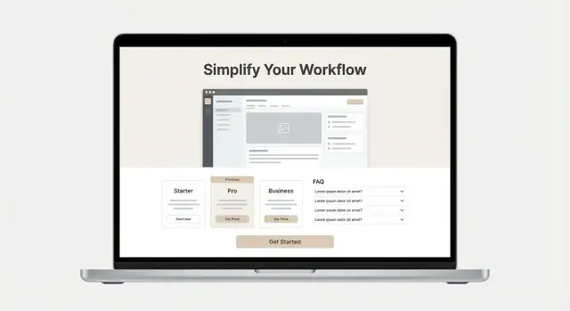
A micro-SaaS site doesn’t need a carousel of screenshots. One strong visual can do the job better: it reduces decision fatigue and forces you to show the “aha” moment that matches your promise.
Choose either:
Whatever you pick, make sure it directly supports your headline. If you claim “turn meeting notes into tasks,” your visual should show that exact transformation—not a settings screen.
Add two to three small callouts on top of the visual. Keep them benefit-led and specific:
Avoid labeling UI parts (“This is the sidebar”). The callouts should tell visitors what they gain.
A single image can still show motion and progress. Frame your visual around a mini workflow:
For example, show a document going in on the left and the finished result on the right. This helps non-technical buyers understand value instantly.
Heavy visuals slow down the page and hurt conversions.
Alt text should be descriptive and useful, not stuffed with keywords. Example:
“Dashboard showing weekly churn trend and an alert highlighting the top cancellation reason.”
That tells both what it is and why it matters.
A good pricing page doesn’t “sell harder”—it makes the decision easier. The goal is clarity: what it costs, what you get, and what happens next.
For a micro-SaaS, complexity usually hurts conversion. Pick one of these structures:
Whatever you choose, spell out exactly what changes between tiers. Avoid vague labels like “Pro features.” Instead, use concrete differences such as:
It’s fine to highlight one plan as “Recommended,” especially if it matches your ideal customer. Keep it honest:
Place short, skimmable answers near the pricing table so people don’t have to hunt:
Use a single primary action that matches the next step:
Keep the CTA wording consistent with your homepage and signup flow so users feel they’re on a straightforward path—not being redirected into something unexpected.
A good FAQ page isn’t a dumping ground for leftover details. It’s a decision-helper: it answers the objections people hesitate to ask on a sales call, and it prevents the wrong customers from buying.
Before writing anything, collect the top 10 questions prospects ask before they sign up. Pull them from:
If you can’t find 10, you probably haven’t talked to enough potential users yet.
Aim for 2–5 sentences per answer. Only link to longer docs when it truly helps someone evaluate (not when you want to avoid explaining).
Example: “Yes—supports Slack and Zapier. For the full list and setup steps, see /docs/integrations.”
Most micro-SaaS buyers have the same “can this work for me?” concerns. Make sure your FAQ addresses:
This is one of the highest-leverage FAQ entries. It builds trust and reduces churn.
After you’ve answered setup time and “who it’s for,” add a simple next step:
Ready to try it? Go to /pricing or /signup.
People don’t just buy features—they buy confidence that your micro-SaaS will work for them, and that you’ll be around if something goes wrong. The trick is to build trust with evidence you can stand behind, not hype.
Start with the easiest proof to validate:
If you’re early-stage, you can still communicate momentum—just be precise. “Built for freelance accountants” is safer than “Trusted by accountants everywhere.” “Used by 12 teams” is fine if it’s true.
A minimal SaaS landing page can feel anonymous. Fix that with a few lightweight details:
You don’t need a big “About” page; a short block in the footer often works.
Include the basics people look for: data ownership, backups, and how you handle personal data. If you have a /privacy and /terms page, link them in the footer.
Avoid overreaching statements like “bank-grade security” unless you can explain what that means. Simple, accurate phrasing builds more trust than grand claims.
A micro-SaaS site works best when every page answers one question: “What should I do next?” If your buttons compete (Start Trial vs. Book Demo vs. Contact vs. Subscribe), visitors pause—and many leave.
Choose one action you want most visitors to take:
Use the same label, color, and placement across pages: top navigation, hero section, and near the end of each page. Consistency builds confidence and reduces decision fatigue.
A secondary CTA is useful only if it serves a different audience with a different intent—typically “Contact sales” or “Email us”. Keep it visually quieter (outline button or text link) so it doesn’t steal attention from the primary CTA.
Good pairing examples:
Your contact page can be minimal and still reassuring:
That response-time line does more than a long “support” paragraph.
After any submission (trial, demo, or contact), show a confirmation message and send an email that answers:
Don’t just collect emails. Add one sentence near the waitlist CTA:
Clear CTAs plus clear follow-through make a small site feel dependable—and make conversion easier without adding more pages.
Your website is a sales tool, not a long-term engineering project. The goal is to ship something clear, fast, and easy to update—then improve it based on real usage.
Choose the simplest option that you (or your team) can maintain without friction:
A good rule: if you’re already shipping a product, don’t take on a whole new web stack “just because.” Use what you can confidently update in 10 minutes.
If you’re trying to go from idea → working app → marketing site quickly, a vibe-coding platform like Koder.ai can compress the build phase: you can describe the product in chat and generate a React web app with a Go + PostgreSQL backend, then export the source code, deploy, and iterate. The same “minimal pages, clear CTA” principles still apply—you’re just removing weeks of setup work.
Templates save time, but they also make many SaaS sites look identical. Keep the template structure, but tailor the two sections visitors judge you by immediately:
Everything else (feature grids, animations, fancy transitions) is optional and often slows you down.
Most visitors will see your site on a phone, and many will skim. Before you publish, check:
If you want a quick sanity check: open the site on your phone, hold it at arm’s length, and see if the main CTA is still obvious.
You don’t need a complex analytics setup to learn what’s working. Track a small set of events:
This keeps decisions grounded without turning your site into a tracking project.
Speed is part of clarity. A minimal site should feel instant:
Fast pages reduce bounce, especially on mobile connections—and they make your product feel more trustworthy before anyone even reads your copy.
A minimal site is only “done” when it reliably turns the right visitors into activated users. The goal isn’t more pages—it’s a cleaner path from first impression to meaningful product use.
Pick a few metrics that reflect your onboarding reality, not vanity traffic. A practical baseline is:
Visits → CTA clicks → signups → activated users
“Activated” should be a concrete moment (e.g., created first project, connected an integration, exported a report). If you don’t define activation, you’ll optimize for the wrong wins.
Set up events for key actions so you can pinpoint friction. At minimum, track:
This tells you whether the problem is clarity (few CTA clicks), confidence (many pricing views but few trials), or onboarding (signups without activation).
Keep tests lightweight: one change at a time, measured over a consistent time window. Good candidates:
If you need inspiration, keep a short swipe file of your own options and test the top two.
Add a one-question prompt on key pages (pricing, signup, or exit intent): “What stopped you from starting today?” Or send a short post-visit survey to new signups who didn’t activate.
Schedule one focused upgrade per week: rewrite one section, tighten one FAQ answer, or adjust one CTA. Small, consistent iterations compound—and your minimal site stays minimal while getting sharper.
A minimal micro-SaaS site should feel “done” quickly—then improve based on real usage. Before you hit publish, run this checklist to make sure the essentials are covered and nothing important is missing.
Pages
Make sure your header links point to the core decision pages:
If you collect any personal data (even email signups), add a small footer with legal links:
Copy
Read your homepage hero section out loud. A visitor should understand:
Also check that your buttons use the same wording everywhere (for example: “Start free trial” or “Get started”—pick one).
Visuals
Confirm you’re showing one strong product visual (or one short demo) that matches your main promise. If your screenshot doesn’t clearly show the outcome, swap it for something more obvious (a before/after, a generated report, a dashboard with a highlighted metric).
CTAs and contact options
Speed and tracking
If you want search traffic, start with a small set of posts tied to “ready to buy” questions. Examples:
Keep posts focused and link naturally to /pricing and /faq.
If users ask “how does this work?”, don’t rewrite the whole site—add one link to a short product tour or help doc. This can be a lightweight page (or even a single doc) you share from /faq or after signup.
Then review your analytics weekly: which page is losing people, which questions repeat, and which promise gets clicks. Small edits—headline clarity, one better screenshot, a clearer price explanation—usually beat big redesigns.
Start with one sentence that covers three things: the problem, the specific user, and the promised outcome.
Use: “{Product} helps {target user} {achieve outcome} without {common headache}, in {time/effort saved}.” Then reuse that exact wording on your homepage hero, pricing page, and signup flow.
For most early-stage micro-SaaS products, the minimal set is:
Add more pages only when they reduce uncertainty or support a clear traffic goal.
A one-page site is enough when you have:
A practical layout is: problem → promise → proof → pricing → FAQ → CTA.
Split into separate pages when the scroll becomes work—especially for decision-heavy sections.
Common triggers:
If a section is critical and long, give it its own page.
Pick one primary action and make everything support it.
Good defaults:
Keep the CTA label consistent across the header, hero, pricing, and footer so visitors never have to re-decide what to do next.
Your hero should answer in seconds:
If you need a full paragraph to explain it, tighten the promise or narrow the audience.
Lead with benefits (outcomes) and use features as proof.
A simple structure:
If you can’t connect a feature to the core promise in one sentence, leave it off the minimal site for now.
Use one strong visual that matches your headline and shows the “aha” outcome.
Options:
Add 2–3 callouts focused on outcomes (not UI labels), and keep the file lightweight so it doesn’t slow down the page.
Keep pricing simple and decision-friendly:
Highlight a “Recommended” plan only if it honestly fits most of your ideal customers.
Include only what you must, and keep it readable.
For many micro-SaaS sites, plain-English basics (data handling, backups, ownership) are enough to build trust without overpromising.