Apr 14, 2025·8 min
Build a Mobile App to Manage Subscriptions Across Services
Learn how to plan and build a mobile app that tracks subscriptions across services, handles reminders, integrates data sources, and protects user privacy.
What a Subscription Management App Should Solve
Most people don’t have “a subscriptions list.” They have fragments scattered everywhere: a streaming service billed to one card, a gym membership billed to another, an App Store subscription tied to a different account, and a handful of free trials buried in old emails. The result is predictable: duplicate subscriptions, forgotten renewals, and charges that feel like surprises.
What “across services” really means
A subscription management app earns its value when it can pull the picture together from multiple sources—not just a single bank feed.
“Across services” typically includes:
- Bank and card transactions (recurring payments and merchant patterns)
- Email and receipts (renewal notices, invoices, “your trial ends” messages)
- App store purchases (iOS/Android subscriptions)
- Manual entries (cash-based memberships, family plans, services billed annually)
Each source fills gaps the others miss. A bank feed shows what was paid, but not always the plan details. Emails reveal renewal dates and pricing changes, but only if the user used that inbox and the sender format is recognizable.
Outcomes users expect
Users aren’t looking for another spreadsheet. They want:
- Clarity: a single, trustworthy list of active subscriptions (and a history of past ones)
- Control: the ability to tag, group, and quickly answer “do I still need this?”
- Fewer surprises: upcoming renewals surfaced early enough to act
A good “first win” is letting someone answer, in under a minute: What am I paying for every month, and what renews next?
Set expectations about automation
Be transparent about what the app can and cannot automate.
- With bank data, you can detect many recurring charges, but you may not know the exact renewal terms.
- With email/receipt access, you can often extract renewal dates and plan names, but coverage depends on inbox history, sender templates, and the user’s chosen email.
- Cancellations usually can’t be automated across all merchants; the app can guide users with links and steps instead of promising “one-tap cancellation everywhere.”
That honesty builds trust and reduces support issues later.
Define Your Target Users and Use Cases
A subscription management app is only “simple” when it’s simple for a specific person. Before features, define who you’re building for and what they’ll open the app to do in the first 30 seconds.
Key user groups to design around
Students often juggle streaming, music, cloud storage, and app trials on tight budgets. They need quick answers: “What renews this week?” and “How do I stop a free trial before it charges?”
Families typically share multiple services and forget who pays for what. They want clarity: “Which subscriptions are duplicated across family members?” and “Can we consolidate plans?”
Freelancers accumulate tools over time (design apps, hosting, invoicing, AI tools). They care about categorizing spending and spotting price increases that quietly raise monthly costs.
Small teams face even more sprawl: multiple seats, add-ons, and annual renewals. Their main use case is accountability and control: “Who owns this subscription?” and “What happens if the card expires?”
Common pain points (the moments that create churn)
Your use cases should directly map to the annoyances people already feel:
- Forgotten trials turning into paid plans
- Price increases that go unnoticed until the next charge
- Duplicate services (two music plans, multiple cloud storage tools, overlapping productivity apps)
- “Mysterious” charges where the service name on the bank statement doesn’t match the app name
Accessibility and low-friction setup
Finance-adjacent apps must feel welcoming. Prioritize:
- Plain-language labels (“Next charge” instead of “renewal cadence”)
- Large-text support and clear contrast
- A setup path that works even if users don’t want to connect a bank account on day one (manual entry + optional scan/import later)
Pick a primary platform first
Choose iOS first if your early audience is more likely to use paid subscriptions, Apple Pay, and the Apple subscription ecosystem (App Store subscriptions), and if you want a tightly controlled set of devices for faster QA.
Choose Android first if you’re targeting wider device coverage, price-sensitive markets, or users who commonly pay through cards and carrier billing.
Either way, write down the “primary user” in one sentence (e.g., “a freelancer who wants to stop paying for tools they no longer use”). It will guide every product decision that follows.
MVP Scope and Feature Prioritization
An MVP for a subscription management app should answer one question quickly: “What am I paying for, and when does it renew?” If the first session feels busy or complicated, users won’t stick around—especially for a product that touches finances.
Your MVP: the smallest set that delivers daily value
Start with a feature set that’s easy to understand and fast to complete:
- Add subscriptions (manual entry first): service name, price, billing cycle, payment method (optional), and category
- Renewal dates: next charge date plus a simple timeline of upcoming renewals
- Reminders: a default reminder (e.g., 3 days before renewal) with a one-tap on/off
- Spend overview: monthly total, plus a quick breakdown by category (streaming, productivity, delivery, etc.)
This MVP works even without integrations. It also gives you clean baseline data for later automation.
Nice-to-haves (park them until the core feels effortless)
These features can be powerful, but they introduce complexity, edge cases, or third-party dependencies:
- Cancellation links and step-by-step cancellation guidance
- Shared subscriptions (split costs, household tracking)
- Price change alerts (requires reliable detection and user trust)
Prioritize with effort vs. impact
Use a simple 2×2: ship items that are high impact / low effort first (e.g., a fast add flow, better reminder defaults). Delay high effort / uncertain impact items (e.g., shared plans across multiple households) until you see clear demand.
Define success in plain language
Write metrics that reflect real user wins:
- “A user adds 5 subscriptions in 5 minutes.”
- “80% of users set at least one reminder in the first session.”
- “Users can find their next renewal date in under 10 seconds.”
If you can’t measure it easily, it’s not a priority yet.
Data Model: Subscriptions, Renewals, and Edge Cases
A subscription management app succeeds or fails on whether it can represent reality. Your model needs to be simple enough to work with, but flexible enough for messy billing patterns.
The core objects (keep them separate)
At minimum, model four distinct things:
- Merchant/Service: “Netflix,” “Adobe,” “Apple,” etc. Store brand name, category, and identifiers you’ll match against later.
- Subscription: the user’s relationship to that service (plan name, price, currency, status, start date)
- Renewal cycle: how billing repeats (monthly, annual, every 4 weeks, custom interval) plus the next renewal date
- Payment method: card, bank account, app store billing, PayPal—whatever the user uses
A subscription can change payment methods over time, so avoid baking the payment source into the subscription record permanently.
This separation also helps when one merchant has multiple subscriptions (e.g., two different Google services) or one subscription has multiple charges (taxes, add-ons).
Tricky cases you should support upfront
Some edge cases are common, not rare:
- Annual plans: they look “quiet” most of the year—store both the interval (1 year) and last/next charge dates so reminders work
- Free trials: track a trial end date, what the paid price will be, and whether it auto-converts
- Paused plans: a pause isn’t the same as canceled—add a “paused until” date (or a pause window)
- Bundles: one charge covers multiple services (e.g., Apple One)—model a bundle subscription with linked “included services,” without duplicating the payment
Status: what it means and who can set it
Define status carefully. A practical set is active, canceled, and unknown:
- Active: you have evidence of recent billing or the user confirms it
- Canceled: the user explicitly marks it canceled (or you detect a confirmed cancellation)
- Unknown: you detected something once, but can’t confirm it’s still ongoing
Let users override status, and keep a small audit trail (“user set to canceled on…”) to prevent confusion.
Multi-currency and time zones (plan for it day one)
Store monetary values as amount + currency code (e.g., 9.99 + USD). Store timestamps in UTC and display in the user’s local time zone—because “renews on the 1st” can shift when users travel or when daylight savings changes.
How You’ll Discover Subscriptions Across Services
Subscription discovery is the “input problem”: if you miss items, users won’t trust the totals; if setup is painful, they won’t finish onboarding. Most successful apps combine multiple methods so users can start quickly and improve accuracy over time.
Four common acquisition methods
Manual entry is the simplest and most transparent: users type the service, price, billing cycle, and renewal date. It’s accurate (because the user confirms it) and works for any provider—but setup takes time, and users may not remember all details.
Receipt scanning (camera OCR of invoices or app store receipts) is fast and feels magical, but accuracy depends on lighting, document layout, and language. It also requires ongoing tuning as receipt formats change.
Email parsing looks for signals like “receipt,” “renewal,” or “trial ending,” then extracts merchant/amount/date. It can be powerful, but it’s sensitive to provider template updates and raises privacy concerns. You’ll need clear permission prompts and an easy “disconnect” option.
Bank feeds (recurring payments inferred from card/bank transactions) are great for catching subscriptions the user forgot. Tradeoffs: messy merchant names, misclassification (memberships vs. one-off purchases), and added compliance/support load from bank connectivity.
Tradeoffs to plan for
- Accuracy vs. automation: more automation means more false positives/negatives to handle
- User trust: email/bank access can feel invasive—be explicit about what you read and why
- Ongoing maintenance: parsing rules and merchant mappings need regular updates
A safe fallback when automation fails
Use a “suggested match + confirm” flow:
- Show a detected charge/message as a suggestion (“Looks like Netflix — $15.49 monthly”).
- Ask for confirmation and missing fields (billing cycle, renewal date).
- Let users mark “Not a subscription” to train your rules and prevent repeats.
Sources to support (and not) at launch
Be specific in onboarding and privacy messaging:
- Support at launch: manual entry + bank-feed recurring detection (or manual + receipt scanning—pick one automation path)
- Defer initially: full email inbox parsing across providers, international bank connections, and niche billing systems (e.g., enterprise invoicing), unless they’re central to your audience
Clarity here reduces support tickets and prevents broken expectations.
Integration Strategy and Categorization Rules
Start free, scale when needed
Start on the free tier and move up when your build needs more credits.
Integrations are where a subscription management app becomes genuinely useful—or frustrating. Aim for an approach that works for most users without forcing them to connect everything on day one.
How integrations work (connect, import, categorize)
Start with a few clear “inputs” that feed the same internal pipeline:
- Connect accounts: link bank accounts and cards to import transactions automatically
- Import: allow CSV imports from banks, or email/receipt forwarding for providers that don’t show clean merchant data
- App store signals (optional): import Apple/Google subscription receipts or status to improve accuracy
No matter the source, normalize data into one format (date, merchant, amount, currency, description, account), then run categorization.
Rules-based categorization that feels smart
A practical starting point is a rules engine that can evolve into something more advanced later:
- Merchant name patterns: match “NETFLIX.COM” and “Netflix” to the same provider using aliases and regex-like patterns
- Amount + frequency: a $9.99 charge every ~30 days is a strong signal, even when merchant text is messy
- Plan detection: track common tiers by amount ranges (e.g., $9.99 vs $15.49) to label “Basic/Standard/Premium”
- Grace windows: accept real-world drift (28–33 days, weekends, holidays, annual renewals)
Make categorization explainable. When a charge is labeled as a subscription, show the “why” (matched merchant alias + recurring interval).
The “edit and correct” loop
Users will correct mistakes; turn that into better matches:
- Let users change provider, billing cycle, and category
- Offer “Apply to past/future transactions” so fixes stick
- Save user-specific aliases (e.g., “SPOTIFY*US” → Spotify) without breaking global rules
Avoid provider lock-in
Integration vendors can change pricing or coverage. Reduce risk by abstracting integrations behind your own interface (e.g., IntegrationProvider.fetchTransactions()), storing raw source payloads for reprocessing, and keeping categorization rules independent of any single data provider.
UX and Navigation: Make It Simple to Stay Organized
A subscription management app succeeds when users can answer one question in seconds: “What’s my next charge, and can I change it?” UX should optimize for fast scanning, few taps, and zero guessing.
Primary screens to anchor the experience
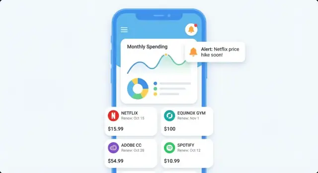
Start with four core screens that feel familiar and cover most journeys:
- Dashboard: a “Next 7/30 days” preview showing upcoming charges, total expected spend, and any alerts (price increases, trials ending)
- Subscriptions list: a clean, searchable directory with filters (active, trials, canceled, yearly) and simple sorting (next renewal, highest cost)
- Subscription detail: one place to see plan, renewal schedule, payment source, history, and notes
- Calendar: a visual view that answers “what hits my card this week?” without digging
Clarity beats cleverness
In lists and cards, show the essentials at a glance:
- Next charge date (not just “renews monthly”)
- Amount (with billing cycle)
- Payment source (card/account label)
Keep these three elements consistent across every screen so users learn the pattern once.
Quick actions that reduce friction
People open this app to act, not browse. Put quick actions on the subscription detail (and optionally as swipe actions in the list):
- Mark as canceled (with an optional “canceled on” date)
- Change renewal date (useful when the detected date is off or the user switched plans)
- Add a note (e.g., “shared with family,” “cancel after season finale”)
Minimal onboarding, then optional power
Keep onboarding light: start with manual entry in under a minute (name, amount, renewal date). After users see value, offer optional connections/imports as a “level up,” not a requirement.
Reminders and Notifications Users Won’t Disable
Build the admin dashboard
Make tools for categorization rules and merchant aliases without hand wiring everything.
Notifications are the difference between an app people open occasionally and one they genuinely rely on. Reminders only work when they feel timely, relevant, and under the user’s control.
The core notification types to support
Start with a small set that maps to real “save me money/time” moments:
- Upcoming renewal: “Netflix renews tomorrow — $15.99.” This is your baseline value.
- Trial ending: higher-priority because it often converts into a paid plan
- Price change: alert when you detect an increase (or decrease)
- Inactivity check: a gentle prompt like “You haven’t used Spotify in 30 days—still worth it?” (powered by user input or lightweight heuristics in MVP)
Keep notification content consistent: service name, date, amount, and a clear action (open details, mark as canceled, snooze).
Give users real control (without burying settings)
People disable notifications when they feel spammed or surprised. Build controls that are simple and visible:
- Timing: e.g., 1 day before, 3 days before, 7 days before
- Quiet hours: “Don’t notify me at night”
- Frequency/batching: daily digest vs. individual alerts
- Per-subscription toggles: turn off reminders for “fixed” subscriptions they never plan to cancel
A useful pattern: default to helpful settings, then offer a clear “Customize” entry point from the reminders UI.
Channels: push, in-app, email (what to pick for MVP)
For an MVP, push + in-app is usually enough: push drives timely action, while in-app gives users a history they can review.
Add email only if you have a clear reason (e.g., users who don’t allow push, or a monthly summary). If you include email, keep it opt-in and separate from critical alerts.
Prevent alert fatigue with smart defaults
Use sensible batching so you’re not creating noise:
- If multiple subscriptions renew soon, send one summary (“3 renewals this week”) with a tap-through list
- Escalate only for high-impact events: trial ending tomorrow, unusually large renewal, price increase
- Avoid redundant messages: if a user marks a subscription as canceled, stop future renewal reminders immediately
The goal is simple: reminders should feel like a personal assistant—not a marketing channel.
Privacy, Security, and User Trust
A subscription management app quickly becomes “finance-adjacent,” even if you never move money. Users will only connect accounts if they understand what you collect, how it’s protected, and how they can opt out.
Know what sensitive data you may touch
Depending on how you discover subscriptions (email scanning, bank connections, receipts, manual entry), you may handle:
- Email content and metadata (sender, subject lines, timestamps)
- Transaction details (merchant name, amount, currency, date)
- Account identifiers (bank connection tokens, masked account numbers)
- Subscription identifiers (service user IDs, invoice numbers)
- Device identifiers and push notification tokens
- Personal profile data (name, region, preferences)
Treat all of the above as sensitive. Even “just merchant names” can reveal health, dating, or political affiliations.
Principles that keep trust intact
Data minimization: collect only what you need to deliver the core value (e.g., renewal date and amount), not full messages or full transaction feeds if summaries suffice.
User consent: make every connector explicit. If you offer email-based discovery, it should be opt-in with a clear explanation of what you read and what you store.
Clear permissions: avoid vague prompts like “access your email.” Explain scope: “We look for receipts from known subscription merchants to find recurring charges.”
Secure storage and access controls
Focus on the basics done well:
- Encryption at rest for databases and backups
- Secure key management (use a platform KMS; don’t hardcode secrets in the app)
- Least-privilege access so internal services and staff can only access what they must
- Token handling: store third-party access tokens securely, rotate when possible, and isolate them from analytics systems
- Logging hygiene: ensure logs never include raw emails, full transactions, or tokens
If you’re using third-party data providers, document what they store vs. what you store—users often assume you control the whole chain.
Privacy UX that users can actually understand
Make privacy a product feature, not a legal footnote:
- A simple “What we collect / Why / How long” page in onboarding and settings
- Granular toggles (e.g., “Email receipt scanning,” “Bank connection,” “Marketing analytics”)
- Clear data export and delete my data flows with expected timelines
A helpful pattern: show a preview of what the app will save (merchant, price, renewal date) before connecting a data source.
For related decisions, align your notification strategy with trust as well (see /blog/reminders-and-notifications-users-wont-disable).
App Architecture and Tech Choices (Plain-English Overview)
Architecture is simply “where data lives and how it moves.” For a subscription management app, the biggest early decision is local-first vs. cloud sync.
Local-first vs. cloud sync
Local-first means the app stores subscriptions on the phone by default. It loads fast, works offline, and feels private. The trade-off is that switching phones or using multiple devices requires extra setup (export, backup, or optional account sync).
Cloud sync means data is stored on your servers and mirrored to the phone. Multi-device support is easier, and shared rules/categorization are simpler to update. The trade-off is higher complexity (accounts, security, outages) and more user trust hurdles.
A practical middle ground is local-first with optional sign-in for sync/backup. Users can try the app immediately, then opt in later.
Core components (what you’ll likely need)
- Mobile app (iOS/Android): UI, local database, notification scheduling, and “last known state”
- Backend API (optional at MVP): login, sync, integrations that can’t run on-device, and shared categorization rules
- Database: stores users (if any), subscriptions, merchants, rules, and audit history (helpful for debugging)
- Background jobs: fetch integration updates, refresh exchange rates, send emails/push notifications, and run cleanup/retry tasks
Building faster with Koder.ai (prototype to production)
If your main constraint is speed, a platform like Koder.ai can help you go from product spec to a working subscription tracker quickly—without locking you into a no-code ceiling. Because Koder.ai is a vibe-coding platform built around a chat interface and an agent-based LLM workflow, teams can iterate on the core loop (add subscription → renewal calendar → reminders) in days, then refine it with real user feedback.
Koder.ai is especially relevant for this kind of app because it aligns well with common stacks:
- Web: React for admin dashboards (rules engine, merchant alias management, support tooling)
- Backend: Go + PostgreSQL for subscriptions, renewals, audit trails, and background jobs
- Mobile: Flutter for cross-platform iOS/Android delivery
When you need more control, Koder.ai supports source code export, plus deployment/hosting, custom domains, snapshots, and rollback—useful when you’re tuning notification logic or categorization rules and want safe releases. Pricing spans free, pro, business, and enterprise, and if you share what you learn, there’s also an earn credits program (and referrals) that can offset early development costs.
Syncing behavior: offline, conflicts, retries
If you support sync, define “what wins” when edits happen on two devices. Common options:
- Last edit wins (simple, acceptable for many fields)
- Merge by field (safer for notes/tags)
Design the app to be usable offline: queue changes locally, sync later, and retry safely with idempotent requests (so a flaky network doesn’t create duplicates).
Performance: fast, quiet, battery-friendly
Aim for instant open by reading from the local database first, then refreshing in the background. Minimize battery use by batching network calls, avoiding constant polling, and using OS background scheduling. Cache common screens (upcoming renewals, monthly total) so users don’t wait for calculations every time.
Testing Plan: Accuracy, Reliability, and Edge Cases
Plan the app in minutes
Use Planning Mode to map screens, data model, and reminders in one place.
A subscription management app only earns trust when it’s consistently right. Your testing plan should focus on accuracy (dates, totals, categories), reliability (imports and syncing), and edge cases that show up in real billing systems.
Define what “correct” means
Write down pass/fail rules before you test. Examples:
- Renewal date accuracy: next renewal is correct across time zones and when a plan changes
- Totals: monthly and annual spend match the underlying schedule (including taxes/fees if you support them)
- Categorization: the same merchant maps to the same category every time, and user overrides don’t flip back later
Edge-case scenarios worth automating
Recurring payments are full of tricky calendar math. Build automated tests for:
- Daylight savings changes (notification time and renewal date don’t shift unexpectedly)
- Leap years (Feb 29 behavior)
- Monthly billing on the 29th/30th/31st (what happens in shorter months)
- Multi-currency subscriptions (conversion, rounding, and display rules)
- Trials converting to paid, paused plans, refunds, and plan upgrades mid-cycle
QA flows: what to click through every release
Keep a repeatable checklist for:
- Onboarding (manual entry vs. connecting sources)
- Connecting sources (permissions, failures, retries)
- Importing and deduping subscriptions
- Editing subscriptions (price, cycle, category, merchant name)
- Notification setup, delivery, and “snooze” behavior
Monitoring after release
Testing doesn’t stop at launch. Add monitoring for:
- Crash reporting and slow screens
- Import failures (by provider, error type, and frequency)
- Notification delivery issues (scheduled vs. delivered, permission changes)
Treat every support ticket as a new test case so accuracy steadily improves.
Launch, Iteration, and Measuring Success
Launching a subscription management app isn’t a single event—it’s a controlled rollout where you learn what people actually do (and where they get stuck), then tighten the experience week by week.
A practical launch sequence
Start with a small alpha group (10–50 people) who will tolerate rough edges and give detailed feedback. Look for users with many subscriptions and different billing habits (monthly, annual, trials, family plans).
Next, run a closed beta (a few hundred to a few thousand). This is where you validate reliability at scale: notification delivery, subscription detection accuracy, and performance on older devices. Keep a simple in-app feedback button and respond quickly—speed builds trust.
Only then move to a public release, when you’re confident the core loop works: add subscriptions → get reminders → avoid unwanted renewals.
Store assets that explain value fast
Your screenshots should communicate the promise in seconds:
- “Find and track subscriptions in one place”
- “Know what renews next week”
- “Get reminders before you’re charged”
Use real UI, not marketing-heavy graphics. If you have a paywall, make sure it’s consistent with what the store listing implies.
Onboarding support that prevents churn
Add lightweight help where it matters: a short tutorial tip the first time someone adds a subscription, an FAQ that answers “Why didn’t it detect X?”, and a clear support path (email or form). Link it from Settings and onboarding.
Metrics that tell you what to fix next
Track a few post-launch metrics that map to real value:
- Activation: % who add at least 1 subscription within 24 hours
- Retention: week-1 and month-1 return rate
- Subscriptions added per active user
- Alerts acted on: open rate and “marked as handled” rate
Use these to prioritize iterations: remove friction, improve detection, and tune reminders so they feel helpful—not noisy.
FAQ
What does “manage subscriptions across services” actually mean?
It means building a single, trustworthy view of subscriptions by combining multiple inputs:
- Bank/card transactions (recurring charges)
- Emails/receipts (renewal notices, invoices, trial endings)
- App store subscriptions (iOS/Android)
- Manual entries (cash memberships, annual plans, shared services)
Relying on only one source usually leaves gaps or creates false assumptions.
Why isn’t a bank feed enough to track subscriptions accurately?
A bank feed shows what was charged, but often misses the context users need to act:
- Plan/tier name and what’s included
- Trial end date and whether it auto-converts
- Renewal terms when billing dates drift
- Bundles where one charge covers multiple services
Use bank data for discovery, then confirm details with receipts or user input.
What’s the best MVP feature set for a subscription management app?
Your MVP should answer one question fast: “What am I paying for, and when does it renew?”
A practical minimum set:
- Manual add (service, price, billing cycle, next charge date)
- Upcoming renewals timeline (next 7/30 days)
- Reminders with a simple default (e.g., 3 days before)
- Spend overview (monthly total + category breakdown)
You can add automation later without breaking the core loop.
How should I structure the data model for subscriptions and renewals?
Model four separate objects so you can handle real-world billing:
- Merchant/Service (brand, aliases, category)
- Subscription (plan name, price, currency, status)
- Renewal cycle (interval + next renewal date)
- Payment method (card/bank/app store/PayPal), tracked over time
This separation helps with bundles, add-ons, multiple plans per merchant, and payment changes.
Which edge cases should a subscription app handle from day one?
Support common “not actually rare” scenarios early:
- Annual plans (store last + next charge dates)
- Free trials (trial end, paid price, auto-convert flag)
- Paused subscriptions (paused-until window)
- Bundles (one payment, multiple included services)
- Merchant naming mismatches (“mysterious” statement descriptors)
If the model can’t represent these, users won’t trust totals or reminders.
Can my app offer one-tap cancellation for subscriptions?
Set expectations clearly: most cancellations can’t be automated reliably across merchants.
Instead, provide:
- A “Mark as canceled” action (with optional canceled-on date)
- Links to the right cancellation page (web/app store)
- Short, step-by-step guidance
- Immediate stopping of future reminders once canceled
This approach is honest and reduces support issues.
How do I avoid false positives when detecting subscriptions automatically?
A safe pattern is “suggested match + confirm”:
- Show a detected item (e.g., “Looks like Netflix — $15.49 monthly”).
- Ask the user to confirm and fill missing fields (cycle, renewal date, category).
- Offer “Not a subscription” and remember it to prevent repeat prompts.
This balances automation with accuracy and builds user trust over time.
What’s a practical way to categorize subscriptions that still feels “smart”?
Start simple with explainable rules, then refine:
- Merchant alias matching (e.g., “NETFLIX.COM” → Netflix)
- Amount + frequency signals (recurs every ~30 days)
- Grace windows (28–33 days, weekends/holidays)
- Tier inference by price ranges (optional)
When you label something, show why it matched so users can verify quickly.
How do I design reminders people won’t disable?
Use notification types that map to real “save me money” moments:
- Upcoming renewal (baseline)
- Trial ending (higher priority)
- Price change (when reliably detected)
- Optional batching (weekly digest) to reduce noise
Give visible controls: timing (1/3/7 days), quiet hours, per-subscription toggles, and snooze. If it feels spammy, users will disable everything.
How should I handle time zones and multi-currency subscriptions?
Plan for this upfront:
- Store money as amount + currency code (e.g., 9.99 + USD)
- Store timestamps in UTC, display in the user’s local time zone
- Define clear rounding/conversion rules if you show totals across currencies
Without this, renewals can shift when users travel, and totals can become misleading.