Jul 08, 2025·8 min
Mobile-Friendly Websites: Common Mistakes and How to Fix
Learn the most common mobile-friendly website mistakes—slow pages, tiny tap targets, broken layouts, and hard navigation—and how to fix them fast.
Learn the most common mobile-friendly website mistakes—slow pages, tiny tap targets, broken layouts, and hard navigation—and how to fix them fast.
Most people first meet your business on a phone—often while distracted, on a slower connection, and using one thumb. If your mobile-friendly website feels cramped, slow, or confusing, visitors don’t “try harder.” They bounce, abandon forms, or call support instead.
Small mobile usability mistakes create outsized business effects:
Search engines and ad platforms pay close attention to mobile experience. If pages are slow or unstable, you may see weaker performance even if your content is great. Metrics tied to Core Web Vitals mobile (like loading speed and layout stability) influence how competitive you are—especially for high-intent searches.
On the paid side, a slow mobile page speed or frustrating landing page can reduce conversion rates and increase cost per acquisition.
A truly mobile-friendly website is more than “it fits on my phone.” It typically means:
Next, you’ll get a quick audit checklist, then 11 common mobile usability mistakes—with practical fixes you can apply immediately to your design, content, and site performance.
Before you fix anything, get a clear baseline. A good mobile audit is a mix of real-device testing and a few fast tools that reveal what users actually experience.
Use at least one iPhone and one Android device if possible, and try both a smaller and a larger screen.
Check:
In Chrome or Safari dev tools, switch to responsive mode and sweep through common widths. Then simulate a slower connection and mid-range device.
Look for obvious red flags: horizontal scrolling, elements overlapping, delayed interactions, and sudden layout jumps when images load.
Run Lighthouse locally and PageSpeed Insights for a second opinion. Note:
Create a short checklist (and screenshot evidence) before changes. Record the pages tested, key issues found, and current metrics so you can confirm improvements instead of guessing.
If your site looks “okay” on desktop but feels cramped on a phone, the root problem is often the viewport and layout rules. When these aren’t set up for mobile, browsers try to squeeze a desktop page into a small screen—leading to tiny text, forced zooming, and horizontal (side) scrolling.
A few telltale signs:
Missing or incorrect viewport meta tag is the classic culprit. Without it, mobile browsers assume a wider “virtual” viewport.
Another frequent issue is a fixed-width layout (for example, containers set to width: 1200px), which forces the page to overflow on phones.
Finally, many sites rely on pixels everywhere. Pixels can work in moderation, but using px for most sizing makes it harder for layouts to adapt and for users who change text size.
Start with the correct viewport tag:
<meta name="viewport" content="width=device-width, initial-scale=1" />
Then switch from fixed widths to fluid grids (percentages, flexible columns) and use responsive-friendly units like %, rem, and vw where they make sense. Add breakpoints only when the design actually needs them—too many can create conflicting rules.
A quick validation step: shrink your browser window and confirm content reflows naturally without horizontal scrolling. Then test on a real phone to ensure nothing relies on hover or desktop-only spacing.
When text spills off the screen or UI elements overlap, mobile users lose trust fast. This usually shows up on smaller phones, in landscape mode, or when users increase their system font size.
A few repeat offenders cause most overflow bugs:
Design components to flex with content instead of forcing content to fit:
flex-wrap: wrap;min-width: 0; on the child that should shrinkoverflow-wrap: anywhere; (or word-break: break-word; as a fallback)Cards should grow vertically with text; forms should handle longer labels and helper text without pushing buttons off-screen. Be especially careful with fixed-height input rows, two-column layouts, and inline error messages.
Run a quick “stress test” on mobile:
Catching these cases early keeps your mobile-friendly website readable, tappable, and calm under pressure.
Small buttons don’t just feel annoying—they cause mis-taps. On mobile, a single wrong tap can send someone to the wrong page, add the wrong item, or dismiss a screen they needed. After two or three slip-ups, many people simply leave.
As a rule of thumb, aim for tap targets around 44×44 px (common iOS guidance) or 48×48 px (common Android guidance). Also leave breathing room—about 8 px of spacing between nearby tappable items helps reduce accidental taps.
You’ll often see this mistake in:
Make the tap area bigger even if the visual element stays the same:
Mobile users can’t “hover” to discover what’s clickable. Make interactive elements look interactive, and provide clear pressed feedback. Also ensure visible focus states for keyboard users and accessibility tools, so taps and selections are always unambiguous.
Mobile navigation often fails not because it’s “missing,” but because it’s awkward. If key actions sit at the very top, menus are buried, or labels are vague, users hesitate—especially when they’re using one thumb while walking, commuting, or multitasking.
A few common patterns:
Start by deciding the 3–5 actions most mobile visitors need (pricing, booking, contact, shop, login, etc.). Put those in a simple, clearly labeled primary nav.
If you use a sticky header, keep it slim and stable—avoid resizing or shifting elements on scroll. When the browser’s address bar collapses/expands, a jumpy header can cause mis-taps because buttons move under the user’s thumb.
If your site has lots of pages (blog, docs, inventory), add a visible search icon or field in the header. Don’t hide it behind multiple taps.
A good rule: one-handed navigation should feel predictable, not like a scavenger hunt.
Mobile page speed is often dominated by images and video. A “hero” photo that looks fine on desktop can become a multi‑megabyte download on a phone, especially on cellular networks. The result: slow first load, higher bounce rates, and weaker Core Web Vitals mobile scores.
Use responsive images so each device downloads only what it needs. Pair srcset/sizes with WebP or AVIF to cut file size without a visible quality hit.
<img
  src="/images/product-800.jpg"
  srcset="/images/product-400.avif 400w, /images/product-800.avif 800w, /images/product-1200.avif 1200w"
  sizes="(max-width: 600px) 92vw, 600px"
  alt="Product photo"
  loading="lazy"
>
This is one of the quickest responsive design fixes that pays off immediately for a mobile-friendly website.
Lazy-loading is great for galleries and long pages, but don’t lazy-load the first image users see. For embedded video, use a lightweight thumbnail with a play button, then load the player on tap.
Icon packs are a hidden weight source. Replace decorative PNG icons with SVG where possible, and trim unused icons from libraries. Smaller assets mean faster rendering and fewer mobile usability mistakes tied to slow, janky scrolling.
A mobile-friendly website can still feel “broken” if it loads slowly. On phones, every extra script, font file, and third-party tag competes for bandwidth and CPU—so even a good responsive design can become frustrating.
The usual causes are render-blocking CSS/JS, oversized JavaScript bundles, and third-party tags (analytics, A/B testing, chat widgets, popups). Web fonts can also delay text rendering or trigger extra network requests—especially if you load multiple families, weights, and icon fonts.
Start by prioritizing what’s needed for the first screen:
defer (or async where safe) to scripts so they don’t block rendering.font-display: swap.Use real mobile data (not only desktop tests) to monitor Core Web Vitals mobile:
Make performance a monthly check, not a one-time project. If you need a quick starting point, add this to your audit checklist: /blog/mobile-audit-checklist.
Nothing feels “broken” faster on mobile than a page that moves while you’re reading—especially when a button jumps right as you tap it. This problem is measured by Cumulative Layout Shift (CLS), one of the Core Web Vitals.
Most shifts come from content loading after the initial layout is already on screen:
Start by making the browser “predict” the final layout:
width/height attributes or CSS aspect-ratio.On a real phone (or device emulation), reload key pages and watch:
If taps keep missing because content moves, treat it as a conversion bug—not just a “nice-to-fix” performance detail. For deeper metrics, see /blog/core-web-vitals.
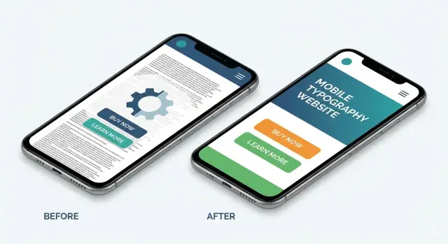
Mobile screens are small, used at arm’s length, and often viewed in less-than-ideal lighting. If your copy feels “fine” on desktop but strains the eyes on a phone, you’ll see higher bounce rates and fewer conversions—even when your responsive design looks correct.
Common mobile usability mistakes include tiny base font sizes, low-contrast text (light gray on white), and lines that stretch too long on larger phones. Add inconsistent heading styles, and readers can’t quickly scan or trust the hierarchy of information.
Start with a simple, repeatable type scale:
Web fonts can hurt mobile page speed and readability if they load late or swap visibly. Prefer system fonts when possible, or optimize web fonts for mobile: subset character sets, serve WOFF2, limit weights, and set font-display: swap to reduce blank text.
Check contrast in bright sunlight and in dark mode. Make interactive text (links, buttons) clearly distinguishable, and avoid relying on color alone—especially important for mobile-friendly website accessibility.
Forms are often where mobile users give up—especially on contact forms, logins, and checkout. The most common issues are too many fields, tiny inputs, unclear labels, and keyboards that don’t match what the field expects.
If a form makes users pinch-zoom, hunt for the “Next” key, or retype the same info twice, it’s leaking conversions. Watch for:
Use the right field settings so the phone helps the user instead of fighting them:
type and inputmode (email, tel, number) so the correct keyboard appearsautocomplete (name, email, address, cc-number) to enable fast autofillFor authentication and payment steps:
Finally, test with the sticky keyboard open: key buttons (Submit, Next) should remain reachable, and autofill shouldn’t hide important fields.
Popups can work on desktop, but on mobile they often block the exact thing people came for: the content. Intrusive interstitials, stacked promo banners, and hard-to-close modals can turn a quick visit into an instant bounce—especially when the overlay steals scroll, hides navigation, or covers the “Back” path.
A newsletter popup appears the moment the page loads, followed by a cookie banner, followed by a “Download our app” bar. Now only a small strip of the page is visible, and the close “X” is tiny or too close to other tappable elements.
Use respectful timing. Trigger prompts after someone has engaged—e.g., after they’ve scrolled, finished an article, or visited a second page—rather than on first paint.
Make closing obvious and easy. The close button should be large enough to tap, have clear contrast, and be placed consistently (typically top-right). Also allow dismissal by tapping outside the modal when it makes sense, and ensure the close control is reachable one-handed.
Avoid blocking content. If the message isn’t critical, don’t use a full-screen takeover. Consider:
Consent is important, but it doesn’t need to dominate the screen. Use a small, well-structured banner with clear buttons (“Accept”, “Reject”, “Manage”), proper focus handling for keyboard users, and no scrolling traps. If you need a detailed settings panel, open it on demand rather than forcing it immediately.
When in doubt, ask: does this overlay help the user right now? If not, make it smaller, later, or inline.
A site can be perfectly responsive and still feel “broken” on mobile if it’s not accessible. Mobile users rely more on touch, voice control, larger text settings, and screen readers—and small oversights (like missing labels or weak contrast) can block key actions like checkout or booking.
Start with the controls people tap the most: navigation, search, product filters, add-to-cart, and forms.
Many users increase text size or reduce animations to prevent discomfort.
You don’t need a full certification to catch major issues. Test key flows with:
Treat accessibility as a usability feature: the improvements usually make the site clearer and easier for everyone.
Fixing mobile issues works best when you treat it like a release process, not a one-time cleanup. Start small: pick 3–5 “money pages” (homepage, top landing page, pricing, checkout/signup, contact) and make them your baseline.
Create a “mobile release checklist” for every page/template so problems don’t return with the next update. Keep it short and repeatable:
Budgets prevent “just one more script” from quietly slowing mobile down.
Track improvements with analytics, funnels, and Core Web Vitals. Watch mobile-only metrics like conversion rate, bounce/engagement, and rage clicks (if you use session replay). If a fix improves speed but hurts signups, you need to adjust.
If you’re rebuilding templates or launching new landing pages, it helps to prototype and validate the mobile experience early—before you’ve invested weeks into a desktop-first layout. Teams sometimes use a vibe-coding workflow like Koder.ai to draft responsive React pages from a simple chat prompt, then export the source code and refine performance details (images, fonts, scripts) with the same checklist you used in the audit.
Next steps: review your key pages and iterate monthly. Re-audit after major campaigns, CMS changes, or new tracking tools—those are common regression points.
A mobile-friendly website is one that’s easy to read, tap, and navigate on real phones—on slower connections and with one-thumb use. In practice it includes:
Mobile visitors rarely “try harder” when something is slow or awkward—they leave. Small mobile usability issues often cause:
Even minor improvements to tap targets, forms, and speed can show up directly in conversions and fewer complaints.
Search engines and ad platforms evaluate mobile experience signals such as speed, responsiveness, and visual stability. Poor mobile performance can lead to:
Use mobile-focused reports in Lighthouse/PageSpeed Insights and watch Core Web Vitals (LCP, INP, CLS).
Start with a fast baseline that mirrors real users:
Prioritize your “money pages” first (homepage, top landing pages, signup/checkout, contact).
Add (or fix) the viewport meta tag so the browser uses the device width:
<meta name="viewport" content="width=device-width, initial-scale=1" />
Then remove fixed-width containers (e.g., ) and move toward fluid layouts using , , and flexible grids. Confirm there’s no horizontal scrolling across common widths and on a real phone.
Overflow/overlap usually comes from components that can’t adapt to content. Practical fixes:
flex-wrap: wrap)min-width: 0)Aim for comfortable tap targets and spacing:
Also separate destructive actions (like Delete) from primary actions and provide clear pressed/focus feedback since mobile users can’t hover.
One-handed navigation should feel predictable and task-focused:
Test with your thumb: the primary path should never feel like a scavenger hunt.
Images and video often dominate mobile page weight. Strong quick wins:
srcset/sizes to serve appropriately sized responsive imagesThis usually improves mobile page speed and Core Web Vitals faster than most code refactors.
CLS happens when content shifts after the page appears, breaking reading and causing mis-taps. Reduce it by reserving space and avoiding late injections:
width/height) or use CSS aspect-ratiowidth: 1200px%removerflow-wrap: anywhere (or word-break: break-word)Stress-test with long headlines, validation errors, and larger accessibility text sizes to catch edge cases early.
font-display: swap with similar fallbacks)Reload key pages on a real phone and watch the first screen and primary buttons during load.