Dec 21, 2025·8 min
Modern App Creation 101: A No‑Code Guide for Beginners
Learn how modern apps are created—without coding. Understand the parts of an app, pick the right tools, design screens, connect data, test, and publish.
Learn how modern apps are created—without coding. Understand the parts of an app, pick the right tools, design screens, connect data, test, and publish.
“Building an app” simply means creating a useful tool that people can open, tap, and rely on to get something done—like booking appointments, tracking inventory, managing clients, or sharing updates with a team.
You don’t need to write code to ship a real app anymore. No‑code and low‑code tools let you assemble an app from building blocks: screens (what users see), data (what the app remembers), and rules (what happens when someone clicks a button). The trade‑off is that you still make many important decisions: what problem you’re solving, which features matter first, how your data should be organized, and how the app should behave in edge cases.
This guide walks through the typical path from idea to launch:
App: A set of screens and actions that helps users do a task.
Database: The organized place your app stores information (users, orders, messages).
API: A “connector” that lets your app send/receive data from another service (payments, email, calendars).
Login: The way users prove who they are so the app can show the right data.
Hosting: Where your app runs online so others can access it.
App store: Apple/Google marketplaces for distributing mobile apps (not required for every app).
If you can describe your app clearly and make thoughtful choices, you’re already doing app creation—even before the first screen is built.
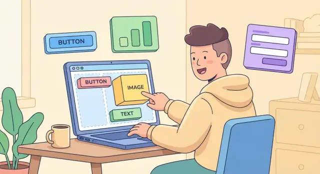
Most apps—whether you build them with no‑code tools or traditional code—are made from the same four building blocks. If you can name them, you can usually debug them.
Screens are what people see and tap: forms, buttons, menus, lists, and pages. Think of screens like the “rooms” in a building—users move from one to another to get something done.
Data is what the app stores: user profiles, tasks, bookings, messages, prices, and so on. If screens are rooms, data is the filing cabinet (or spreadsheet) behind the scenes. Even simple apps usually need a database so information doesn’t disappear when you close the app.
The frontend is the part you interact with (the screens). The backend is the part that stores and processes information (the database + logic).
A helpful analogy: the frontend is the counter at a café; the backend is the kitchen and the order system.
Logic is the “if this, then that” behavior: show an error if a field is empty, calculate totals, send reminders, or restrict actions based on roles.
Integrations connect your app to tools like email, calendars, payment providers, maps, or CRMs—so you don’t have to rebuild everything yourself.
“State” is what your app remembers right now—like the selected date, items in a cart, or whether a user is logged in. Some state is temporary (only for this session), and some is saved as data (so it’s still there tomorrow).
Choosing how to build your app is mostly about trade‑offs: speed vs flexibility, simplicity vs control, and short‑term cost vs long‑term options. You don’t need to pick “the best” approach—just the best fit for what you’re building right now.
No‑code means you build by clicking and configuring (drag‑and‑drop screens, forms, workflows). It’s ideal when you want to move fast.
Low‑code mixes visual building with small bits of code (or advanced expressions). It’s a middle path when you want more control without going full engineering.
Traditional coding means building with programming languages and frameworks.
In practice, there’s also a newer workflow that sits between no‑code and traditional coding: describing what you want in plain English and letting an AI system generate the app structure, screens, and backend scaffolding—while still producing real source code you can own.
For example, Koder.ai is a vibe‑coding platform where you build web, server, and mobile apps through a chat interface. It can be a good fit when you want no‑code speed but don’t want to be locked into a purely visual builder—especially if you care about exporting source code, having a real backend, and keeping a clear path to customization.
Most beginner setups combine a few pieces:
If you need a prototype to validate an idea, go no‑code.
For an MVP or internal tool (dashboards, approvals, trackers), no‑code or low‑code is often enough.
For a customer‑facing app with payments, heavy traffic, strict branding, or unique features, consider low‑code now with a path to custom code later—or a platform that generates a full application stack you can evolve.
Budget and time matter, but also:
A good rule: start simple with the least complicated tool that can still ship what you need.
Before you choose a tool or design a screen, get clear on why the app should exist. Beginners often start with features (“it should have chat, profiles, payments…”), but the fastest progress comes from starting with a goal.
Most first apps succeed because they do one of these things well:
A clear problem statement keeps you from building “nice to have” features.
Try filling in this sentence:
“[Target user] struggles with [problem] because [current workaround], and that causes [impact].”
Example: “Freelance photographers struggle with tracking deposits because they juggle DMs and bank transfers, causing missed payments and awkward follow-ups.”
An MVP (minimum viable product) is not a “cheap version.” It’s the smallest app that lets a real user complete the main job end-to-end. If your app can’t deliver the core outcome, extra features won’t rescue it.
To keep your MVP small, pick one primary user and one primary action (for example: “request a quote,” “book an appointment,” or “submit a task”).
Use this quick template to write your first draft:
User: (who exactly?)
Goal: (what do they want to accomplish?)
Steps: 1) … 2) … 3) …
Success metric: (how will you know it works?)
If you can’t describe the steps in 3–5 lines, your MVP is probably too big. Tighten it now—it will make every later decision (screens, data, automations) much easier.
Before you touch a no‑code tool, map what people are trying to do. Most apps feel “simple” because their main paths are clear—and everything else supports those paths.
A user flow is the sequence of steps someone takes to complete a goal. Common flows include:
Pick 1–2 flows that matter most, and write them as simple “Step 1, Step 2, Step 3.” That becomes your build plan.
You don’t need design skills to plan screens.
Option A: Paper sketch
Option B: Simple wireframe tool
Use a basic wireframe app (or slides) to create boxes for sections. Keep it grey-and-boxy on purpose—this is about structure, not colors.
Build the happy path first: the most common, successful route (e.g., sign up → browse → buy). Delay edge cases like “password reset” or “what if the card fails” until the core experience works end‑to‑end.
Most beginner apps can start with:
If you can sketch these and connect them with arrows, you’re ready to build with far fewer surprises.
Every app that feels “smart” is usually doing one simple thing well: remembering information in an organized way. That organized memory is your database. It stores things like users, orders, messages, tasks, and settings so your app can show the right screen to the right person at the right time.
If screens are what people see, data is what your app knows.
Most beginner-friendly tools describe data in one of two similar ways:
Either way, the idea is the same:
Example: a simple “to-do app” might have:
Apps usually need to connect records together.
In the example above, each task belongs to a user. That connection is a relationship. Some common patterns:
Good relationships help you avoid duplication. Instead of storing the user’s full name on every task, you store a link to the user record.
If your app has logins, you’ll typically deal with:
A simple rule to follow: decide early which data is private, which is shared, and who “owns” each record (for example, “a task is owned by its creator” or “owned by a team”).
A few data issues can quietly create big headaches later:
If you get your data structure right, the rest of app creation—screens, logic, and automation—becomes much easier.
App “logic” is simply a set of rules: if this happens, then do that. No‑code tools let you build these rules by choosing triggers (what happened) and actions (what the app should do), often with a few conditions in between.
A useful way to design logic is to write rules as plain sentences first:
Once your rule reads clearly in English, translating it into a visual builder is usually straightforward.
Form validation: require fields, check formats (email/phone), prevent impossible values (quantity can’t be negative).
Status changes: move items through stages (New → In Review → Approved) and lock or reveal fields based on status.
Notifications: email, SMS, or in‑app alerts when something important happens (a task is assigned, a deadline is near).
Pricing rules: apply discounts, taxes, shipping tiers, or promo codes based on cart total, location, or membership level.
Use an automation or workflow when a rule should run every time, without someone remembering to do it—like sending reminders, creating follow‑up tasks, or updating multiple records at once.
Keep critical workflows simple at first. If a workflow has many branches, write them down as a short checklist so you can test each path.
Even if you connect services later, decide early what you’ll need:
Payments (Stripe/PayPal), email (Gmail/Mailchimp), maps (Google Maps), calendars (Google/Outlook).
Knowing this upfront helps you design the right data fields (like “Payment Status” or “Event Timezone”) and avoids rebuilding screens later.
Good design isn’t about making your app “pretty.” It’s about helping people finish a task without thinking too hard. If users hesitate, squint, or tap the wrong thing, design is usually the reason.
Clarity: Each screen should answer “What is this?” and “What can I do here?” Use plain labels (e.g., “Save changes,” not “Submit”). Keep one primary action per screen.
Consistency: Use the same patterns everywhere. If “Add” is a plus button in one place, don’t switch to a text link elsewhere. Consistency reduces learning time.
Spacing and readable text: White space is not wasted space—it separates groups and prevents mis-taps. Use a comfortable base font size (often 14–16px for body text) and avoid long, dense paragraphs.
Buttons should look clickable and differ from secondary actions (e.g., outline vs solid).
Inputs (text fields, dropdowns, toggles) need clear labels and helpful examples (placeholder text is not a label).
Lists and cards work well for browsing items. Use cards when each item has multiple details; use simple lists when it’s mostly one line.
Navigation bars should keep the most important destinations stable. Don’t hide core features behind multiple menus.
Aim for strong contrast between text and background, especially for small text.
Make tap targets big enough (at least around 44×44px) and leave space between them.
Always include labels, and write error messages that explain how to fix the issue (“Password must be 8+ characters”).
If you define this once, every new screen becomes faster to build—and easier to test later in /blog/app-testing-checklist.
Most apps don’t live alone. They send receipts, take payments, store files, or sync customer lists. That’s where integrations and APIs help.
An API is a set of rules that lets one app “talk” to another. Think of it like ordering at a counter: your app asks for something (for example, “create a new customer”), the other service responds (for example, “customer created, here’s the ID”).
No‑code tools often hide the technical details, but the idea stays the same: your app sends data out and receives data back.
A few services show up again and again:
When you connect multiple tools, decide which one is the main place your data lives (your “source of truth”). If you store the same customer in three places, duplicates and mismatched updates are almost guaranteed.
A simple rule: store core records (users, orders, appointments) in one system, and sync outward only what other tools need.
Keep it safe and boring:
Testing isn’t about finding every bug—it’s about catching the issues that make people quit. The best approach for a first-time builder is simple: test the most common paths, on more than one device, with fresh eyes.
Run these checks end-to-end, pretending you’re a brand-new user:
If you can, ask someone else to do the same checklist without guidance. Watching where they hesitate is gold.
Start small: 5–10 people who match your audience is enough to reveal patterns.
Even a spreadsheet works. Each bug report should include:
Resist the urge to “fix everything” in one giant update. Release small changes, measure what improves, and repeat. You’ll learn faster—and you’ll keep the app stable while it grows.
Choosing how to launch is mostly about where people will use your app—and how much “distribution work” you want to take on.
Your app needs a home on the internet (or inside your company network). That home is called hosting—a server that stores your app and delivers it to users.
Deployment is the act of publishing a new version to that home. In no‑code tools, deployment often looks like clicking “Publish,” but behind the scenes it’s still placing your latest screens, logic, and database connections onto a live environment.
If you’re using a full-stack build platform like Koder.ai, deployment can also include practical “ops” features that matter after launch—such as hosting, custom domains, snapshots, and rollback—so you can ship updates without worrying that one bad change will break your live app.
This is usually the fastest path. You publish, get a URL, and users open it in a browser on desktop or mobile. It’s great for MVPs, admin dashboards, booking forms, and customer portals. Updates are easy: deploy changes and everyone sees the latest version next time they refresh.
Mobile stores can help with discovery and feel “official,” but they add steps:
Expect review times to vary—from hours to days—and be ready for revisions if the reviewer asks for clearer privacy details, login instructions, or content changes.
If the app is only for staff, you can launch privately: restrict access by email/domain, put it behind a login, or distribute it through internal tools (MDM, private links, or an intranet). This avoids public store reviews and keeps changes in your control, while still requiring thoughtful permissions and data access rules.
Launching your app is a milestone, not the finish line. The work after release is what keeps it reliable, safe, and affordable as real people start using it.
Maintenance is the ongoing care of your app:
A simple habit: keep a small change log and review it weekly so you don’t lose track of what’s live.
Even a small internal app can hold sensitive information. Start with practical basics:
If you collect personal data, write down what you store, why you store it, and who can access it.
No-code tools often charge in a few common ways: subscriptions, per-user fees, and usage-based costs (database size, automations, API calls, storage). As usage grows, costs can jump—review your pricing page monthly and track what drives usage.
If you’re comparing platforms, also check whether you can export your source code and how hosting/deployment is priced, because those factors affect your long-term flexibility.
Keep learning with your tool’s docs and community forums, and save useful guides in one place. Consider hiring help when you need a polished interface (designer), custom code/integrations (developer), or a clean build plan and security review (consultant).
For more planning tips, revisit /blog/start-with-a-simple-mvp.
You’re still doing app creation if you can:
No-code removes programming, not product decision-making.
Start with one primary user and one primary action that delivers value end-to-end (e.g., “book an appointment” or “submit a request”). Keep it small enough to describe in 3–5 steps and attach a success metric (time saved, bookings completed, fewer errors). If you can’t summarize it simply, the MVP is probably too big.
Most apps are made of:
When something breaks, asking “Is it a screen, data, logic, or integration issue?” speeds up debugging.
A user flow is the step-by-step path someone takes to finish a goal. To create one quickly:
Build the happy path first; add edge cases after the core flow works.
Use a database when you need information to persist and be searchable/filterable (users, bookings, tasks, orders). A spreadsheet can be okay for quick exports or admin workflows, but apps usually need:
Good data structure makes screens and automations much easier.
State is what the app remembers right now (selected date, logged-in status, items in a cart). Some state is temporary (session-only) and some should be saved as data (so it’s there tomorrow).
A practical rule: if you want it to survive refresh/logout/device change, store it in the database; otherwise keep it as temporary state.
Start by deciding:
Then enforce it with permissions so users only see/edit what they should. This prevents accidental data exposure—especially in multi-user apps.
Pick a single source of truth for core records (users, orders, appointments), then sync outward only what other tools need. This avoids duplicates and mismatched updates.
Prefer official connectors, grant minimum access (read-only when possible), and keep API keys in secure settings—never in public pages or client-side configs.
Test the most common paths end-to-end:
If you want a structured checklist, use /blog/app-testing-checklist and have 1–2 people try it without guidance.
A web app is fastest: publish, share a link, and update instantly. A mobile app can feel more “official,” but adds store assets, privacy details, and review time. An internal app avoids public distribution but still needs strong permissions.
Plan ongoing costs too: subscriptions, per-user fees, and usage-based charges (automation runs, storage, API calls).