Aug 22, 2025·7 min
Multi-maker catalog: showcase crafts without marketplace complexity
Learn how a multi-maker catalog can showcase many artisans with maker profiles, simple navigation, and delayed payouts, without building a full marketplace.
Why a marketplace feels like too much for small craft sellers
When you have many makers and one shared audience, a full marketplace can feel like using a cash register to sell lemonade. Shoppers want to browse, fall in love with a few items, and learn who made them. Instead, you end up running systems designed for high volume and high-risk selling.
Marketplace complexity shows up fast, even with 10 makers. Onboarding turns into a project. Disputes and refunds get messy because different makers handle things differently. Taxes and invoices vary by location. Payout schedules and fees require constant reconciliation. And when something goes wrong (late shipping, a damaged item), support becomes your job.
That’s a lot of operational weight before you even know whether the catalog will get steady traffic.
A simpler goal is a multi-maker catalog: one place where shoppers can discover products, filter by style, and click into handmade maker profiles without feeling lost. It keeps the experience organized, but it doesn’t force you to solve every marketplace problem on day one.
Picture a local craft collective running a seasonal online showcase. Customers want to browse ceramics, knitwear, and gifts under $50, then see the maker behind each piece. The collective wants to promote one destination, not juggle 15 separate mini-sites. A shared catalog gets you there.
Set expectations clearly: this model is browsing and discovery first, operations second. Add heavier marketplace features later if you truly need them.
What a multi-maker catalog is (and what it is not)
A multi-maker catalog is one online storefront featuring products from several makers in one place. It looks and feels like a curated shop, but each maker keeps their identity. Think of it as a gallery with mini-boutiques inside, not an open marketplace.
The point is simplicity. You publish the catalog, run a single checkout flow, and keep admin work to a small number of repeatable steps. For many groups, it’s the most practical marketplace alternative for artisans who want to sell together without building a complex system.
Discovery stays familiar. Customers browse by broad category (candles, ceramics, prints), by maker pages (a profile showing only that maker’s items), and by collections (like “Under $40 gifts” or “Plant lovers”).
“Payouts later” is what keeps this model light. Instead of instant automated splits on every order, you treat payouts as a manual or batch task. For example, you export a weekly order report, total each maker’s sales, subtract an agreed fee, then pay out weekly or monthly. It’s predictable and avoids fragile automation early on.
What this is not: an open marketplace where anyone can sign up, list freely, and expect the platform to handle tax forms, disputes, compliance, refunds across many policies, and automated payment routing. A multi-maker catalog is usually curated, with a defined group and clear rules.
If you build this with Koder.ai (koder.ai), the simplest version is the same idea: one storefront, maker profile pages, and an admin view that helps you track orders and run payouts on your schedule.
When this approach works best
A multi-maker catalog works best when you want the variety of a marketplace but still want one simple front door for customers. It’s a strong fit when trust and curation matter more than automation.
It tends to work well for pop-up events, craft guilds, co-ops, local boutiques extending online, and seasonal collections. Customers get one place to browse, while each maker stays visible through profiles and product groupings.
You’ll like this approach if order volume is low to medium and your team can handle some manual work for now. A local shop running a “Made in Town” page might take orders during the week and settle with makers every Friday.
Good signs it’s a match:
- Low to medium order volume
- Products that don’t create complicated returns (prints, candles, ceramics, small gifts)
- A small team that can do weekly check-ins, simple reporting, and periodic payouts
- One cohesive brand feel with many makers
It’s a weaker fit for high-volume selling where customers expect marketplace-level guarantees, instant shipping integrations, and automated payouts. The manual parts can get painful quickly.
You’re ready to add automation when orders arrive daily, customer messages pile up, makers ask for real-time dashboards, or payout reconciliation starts taking longer than curation.
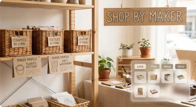
Designing handmade maker profiles that customers actually use
Maker profiles should answer two quick questions: Who made this, and what should I expect if I order? If the profile feels like an application form, makers will rush it and customers will ignore it.
Keep profiles short, visual, and consistent across every maker. A good rule is that the essentials fit on one screen before a shopper scrolls.
The essentials (what to include)
Keep the required fields small but confidence-building:
- A clear maker photo or studio shot (not a logo)
- A 2-3 sentence story (what they make and why)
- Location (city and country is enough)
- Materials and care notes in plain language
- Typical lead time for made-to-order items
Then add one optional discovery field, like “signature style” (earthy glazes, bold geometric patterns).
Trust signals without policy chaos
Shoppers get nervous when every maker page feels like a different set of rules. Decide what stays consistent across the whole catalog, then allow a few maker-specific notes.
Keep consistent across the catalog: the returns and exchanges window, shipping method and packaging standards, and the support process. Let makers customize only what truly varies, like processing time, custom order rules, or allergy warnings.
Make profiles useful for browsing, too. Each maker should have a visible way to filter to their items (for example, “Ceramics by Lina”), so customers can shop across makers but still feel the “store within a store” effect.
Catalog structure: products, categories, tags, and inventory
A good catalog feels calm. The fastest way to get there is to decide what every product page must include, what only some products need, and what never belongs on the page.
Start with a small set of required fields and standardize how makers fill them out. At minimum, every product should show a clear title, price (and what’s included), variants (size, color, scent), a short shipping note, and maker attribution.
Photos are the next big structure choice. Set two or three rules and stick to them: a consistent background style, a consistent crop (square often works well), and a minimum quality bar (good light, sharp focus, no clutter). When images match, customers trust the catalog more.
For browsing, keep categories broad and tags specific. Categories answer “what is it?” (Ceramics, Prints, Candles). Tags answer “what kind?” or “for who?” (minimal, floral, under $25, kid-friendly, custom). If you can’t explain a tag in one sentence, it’s probably clutter.
Inventory also needs clear labels so customers know what happens after they buy. Pick one per product (in-stock, made-to-order, limited drop, one-of-one) and apply it consistently.
“Store within a store” navigation that stays easy
Iterate without risk
Use snapshots and rollback to test navigation changes without fear of breaking the storefront.
A good multi-maker catalog lets people shop in two modes without thinking: browse the whole collection, or step into one maker’s mini-store. The trick is to make the jump obvious and reversible on every page.
Start with three entry points. A maker directory helps shoppers who already know a name. A maker filter on category and search pages helps people narrow down while staying in the main catalog. Then give each maker a clean landing page that feels like a small storefront: short bio, bestsellers, and the same categories customers see elsewhere.
Navigation patterns that reduce clicks
Keep the structure consistent so customers don’t get lost:
- Breadcrumbs that show where you are (Home > Candles > Maker: Pine & Wax)
- A clear “All makers” view and a clear “This maker only” view
- Product cards that always show the maker name next to the item title
- Checkout that repeats the maker name per line item
Search should support the same two modes. Let shoppers search across all makers by default, then offer a simple toggle like “Search within this maker.” Someone looking for a “blue mug” can start wide, then narrow to a potter once they find a style they like.
Avoid the biggest confusion point: don’t hide maker identity behind the product. If shoppers can’t tell who made an item until late in the process, the “store within a store navigation” feeling breaks.
Step-by-step: set up a multi-maker catalog in a week
A week is enough if you keep the first version small and make a few decisions early. The goal is a multi-maker catalog that feels curated, not complicated.
A simple 7-day plan
Start by choosing how money and orders will work. If you’re not ready for full checkout, begin with inquiries or preorders and add checkout later. Mixed models can work too, like checkout for ready-to-ship items and inquiries for custom work.
- Day 1 (sales flow): Decide what happens when someone clicks Buy. Write the steps from product page to confirmation.
- Day 2 (shared rules): Agree on shipping windows, packaging basics, and who handles what (refunds, damaged items, customer questions).
- Day 3 (profiles + minimum products): Create maker profiles and publish a small set of products. A useful minimum is 6-10 items per maker so the mini-store feels real.
- Day 4 (navigation): Set up a maker directory and a few filters people actually use (price range, category, ready-to-ship vs made-to-order).
- Days 5-7 (pilot): Launch quietly with 3-5 makers. Watch where people get stuck, fix naming, and tighten templates before inviting more.
A small pilot often reveals gaps fast, like inconsistent size notes or unclear shipping timelines. Fix those in the template so each new maker starts with the same expectations.
If you’re using a chat-based builder like Koder.ai, this plan maps cleanly to pages and workflows: maker profiles, product pages, a directory with filters, and a basic admin view for orders.
How “payouts later” can work without drama
Launch a curated pilot
Ship a curated pilot for 5 to 15 makers, then iterate based on real customer behavior.
“Payouts later” works when everyone knows the rules before the first sale. You’re doing straightforward bookkeeping on behalf of makers, then paying them on a predictable schedule.
Pick one payout rhythm and stick to it. Monthly payouts are easiest when returns, late shipments, or custom items are common. Weekly or biweekly feels better for makers but creates more admin work. For time-boxed drops (like a weekend pop-up), paying out after each drop is often the cleanest option.
Decide how fees work in plain language. A flat commission is easy to explain. A small listing fee can work if you do a lot of marketing and want makers to share costs. If you use a shared marketing fee, set a clear cap so makers aren’t surprised.
To avoid confusion, track the same few data points for every order, even if it’s a spreadsheet at first. Keep payout statements readable in one minute: order ID and date, maker name, items, item totals, any fees, and any refunds or adjustments with a short note.
The goal is boring consistency. Clear timing, clear fees, and clear statements remove most drama.
Common mistakes that make catalogs feel messy
A multi-maker catalog should feel curated, not chaotic. Most mess comes from a few avoidable choices that confuse shoppers or add work for you.
Hiding the maker until the last step is a common one. If customers see a product photo and price but can’t quickly tell who made it, trust drops. Put the maker name near the product title and make it easy to reach the maker profile.
Another issue is policy soup. When each maker has different rules for returns, custom orders, and shipping timelines, shoppers don’t know what they’re agreeing to. You don’t need a perfect policy, but you do need clear, limited options displayed in the same place on every product page.
Onboarding can also get too heavy. If you ask for long bios, lots of photos, tax documents, and detailed shipping matrices on day one, makers stall or submit low-quality info just to get through. Start with the minimum needed to publish, then add “nice to have” fields later.
Categories can quietly explode, too. Near-duplicates like “Earrings,” “Ear rings,” and “Handmade earrings” make navigation feel broken.
A few simple fixes keep things tidy:
- Show maker name everywhere a product appears (cards, search, checkout summary)
- Standardize policy labels (returns yes/no, custom orders yes/no, ship time range)
- Make onboarding two-step: “publish basics” first, “improve profile” later
- Cap categories and use tags for details (material, color, occasion)
Quick checklist before you invite more makers
Before you add more people, make sure the basics are easy for customers and manageable for you.
Start with browsing. If someone lands on a product, they should be able to jump to the maker, then back to a category page quickly. If that takes too many taps, shoppers won’t see the range.
Then check product clarity. Every item should clearly show who made it, whether it’s made-to-order or ready-to-ship, a timing estimate, and what happens if materials run out.
A quick pre-launch check:
- Test navigation from homepage to a maker page, then to a category page (and back) in under two clicks
- Confirm every product card shows the maker name and a clear timing note (for example, “ships in 3-5 days”)
- Put payouts in writing: when makers get paid, what fees exist, and how refunds affect payouts
- Define exceptions: a path for custom requests and a rule for out-of-stock items
- Confirm you can reconcile orders to makers and totals quickly using one export or one admin view
Do a dry run with 3 makers and 10 products each. Pretend a customer orders from two makers, then one item goes out of stock. If you can answer “who needs to do what next” without a meeting, you’re ready.
If you’re building the back office yourself, add a simple “orders to payouts” view early, even if it’s just a table. This is also the kind of internal workflow you can prototype quickly in Koder.ai before you commit to more automation.
A realistic example: a curated holiday crafts catalog
Plan the first version
Use Planning Mode to map pages, roles, and the orders-to-payouts flow upfront.
A local studio runs a holiday pop-up every December, but this year they want online sales without running a full marketplace. They publish a multi-maker catalog with 12 makers and about 150 items: ornaments, candles, knitted goods, ceramics, and small gift bundles.
Shoppers land on a single holiday homepage, then browse in two ways. A maker directory shows every maker with a photo, a short “what I make” line, and a few featured items. Filters keep it simple: category (Decor, Wearables, Stocking Stuffers), price range, ready to ship, and personalized.
If someone clicks a maker, they stay inside the same site using “store within a store” navigation. It feels like one cohesive holiday shop, not 12 separate websites.
Checkout is unified. The buyer gets one confirmation with a summary that splits items by maker. Each maker receives only their line items, shipping address, and personalization notes. Fulfillment stays straightforward: makers ship directly, add a tracking number, and the buyer sees updates in one place.
Payouts happen at the end of the month. The studio exports the order list, groups sales by maker, subtracts the agreed fee (for example, 10 percent for marketing and packaging inserts), then shares a plain statement: total sales, fees, refunds, and payout amount. Makers know what to expect because timing and fee rules are written down.
After the first month, they tighten a few things based on real questions: they merge overlapping categories, add a handful of “gift for” tags, replace inconsistent photos with a short checklist, clarify processing times and returns in one policy block, add an order cut-off banner for holiday delivery, and update a few bios to include materials and sizing details.
Next steps: launch the simple version, then improve it
Treat the first version as a pilot. Pick a small group of makers you trust, agree on simple rules, and ship a version that works end to end. The target is “customers can browse and buy” before you add more features.
A practical first launch usually looks like this: 5 to 15 makers, 30 to 100 products total, consistent photos and naming, a tight set of categories and tags, and a clear note explaining how ordering works. Assign one person to handle fixes during the first week.
Before you invite more makers, write down the minimum data you’ll track for payouts and support. Even if you do payouts later, you still need a paper trail when someone asks, “Did my order go through?” Keep it consistent: order date, buyer name, maker name, item, price, fees, delivery status, payout status.
Then add automation only where it removes real pain. If you keep copying data, answering the same question, or chasing missing details, that’s a good target. If it’s just a nice-to-have, skip it.
If you want to build the first version quickly, Koder.ai can help you prototype the storefront, maker pages, and a basic admin flow through a chat-driven build, with the option to export the source code later when you’re ready to own and extend it.