Jul 19, 2025·8 min
Musician/Band Websites: Tour Dates, EPKs, and Merch Setup
Learn how to build a musician/band website that sells tickets and merch: tour dates, EPK essentials, press assets, and a simple merch setup.
Learn how to build a musician/band website that sells tickets and merch: tour dates, EPK essentials, press assets, and a simple merch setup.
A good musician website isn’t just a prettier version of your socials. It’s the one place you control—where information stays accurate, links don’t break because an algorithm changed, and fans, press, and promoters can all get what they need in seconds.
Inform: People land on your site with a specific question: “Where are you playing?”, “How do I listen?”, “What do you sound like?”, “How do I contact you?”, “Where’s the merch?” Your pages should answer those questions without digging.
Convert: A visitor should have a clear next step—buy a ticket, follow/stream, join your email list, or grab merch. If your website doesn’t guide actions, it’s just a brochure.
Help booking: Promoters and venues don’t want a scavenger hunt through Instagram highlights. They want a clean EPK, a quick way to verify draw and music style, and a contact path that doesn’t require a DM.
Social is great for discovery, but it’s not built for reliability. Posts disappear in feeds, links get buried, and you can’t present a complete, organized press package. For tour announcements and booking, clarity beats virality.
By the end of this guide, you’ll have a practical structure for those three pillars—plus the supporting pages and setup details that make your band website work like a tool, not a placeholder.
A band website works best when it answers two questions quickly: “What should I do next?” (for fans) and “Can I book you?” (for promoters). That clarity starts with a simple structure—before you choose a theme, upload photos, or write a bio.
If you’re building fast (or iterating between releases), a structured approach matters more than the tool you use. Whether you’re hand-coding, using a CMS, or using a vibe-coding platform like Koder.ai to generate a React-based site from a chat brief, you’ll get better results when the pages and calls to action are decided upfront.
More pages usually means more confusion. A clean top menu also performs better on mobile.
A solid default structure:
If you’re not actively touring, you can swap Tour Dates for Shows or hide it until you have listings.
You can’t build two separate sites, but you can prioritize what each group needs.
Fan-first order (good for most bands):
Home → Tour Dates → Music → Merch → Videos → Contact
Promoter-first order (if you’re booking hard):
Home → EPK → Tour Dates → Music → Contact → Merch
Tip: even with a fan-first menu, place a visible Booking link in your header or footer that jumps straight to the right contact details.
Most visitors will arrive from Instagram, TikTok, or a text message—on their phone.
Every page should make the next step obvious. Choose 3–4 primary CTAs and use them consistently:
When your structure is set, building becomes mostly “filling in” content—without endless redesigns later.
Your homepage has one job: tell a new visitor who you are and give them a clear next step—without making them hunt.
Within the first screen (especially on mobile), make these obvious:
If you’re in an active release cycle, “Listen” usually wins. If you’re touring heavily, “Get Tickets” can be the better default.
Don’t force people to scroll for basics. Add a slim row of quick links right under the hero section:
This doesn’t replace your navigation—it’s a shortcut for people who already know what they want.
Media sells the story, but heavy embeds can tank load time (and conversions). Keep it fast by:
A simple “Featured” block with one track and one video link often outperforms a crowded media wall.
Email is still your most reliable channel. Put a signup:
Offer a small incentive that fits your audience: a free download, unreleased demo, early ticket access, or 10% off merch. Keep the form minimal (email only), and say what they’ll get and how often you’ll send it.
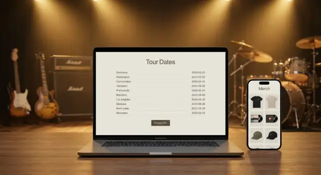
Your tour dates page has one job: help someone decide to attend (or book) a show in seconds. If it’s hard to scan, missing ticket links, or unclear about timing, you’ll lose momentum.
Put upcoming shows first, in chronological order. Past dates are optional—helpful for social proof, but keep them collapsed behind a “Past shows” toggle so they don’t bury the important stuff.
A simple structure works best:
Aim for a consistent, repeatable layout so fans don’t have to “re-learn” your page each time.
At minimum, each listing should include:
If the show has support acts or special notes (18+, early show/late show), add a short secondary line—don’t cram it into the venue field.
Don’t delete dates when plans change. Update them with an obvious status so fans don’t travel on bad info:
Add “Add to Calendar” links (Google, Apple/ICS) so fans can save the date instantly.
For livestreams or virtual events, always show the time zone (e.g., “8:00 PM ET / 5:00 PM PT”) and avoid vague language like “tonight.”
Most fans will view this on a phone. Use a single-column layout, generous spacing, and a ticket button that’s easy to tap. If someone has to zoom to find the venue or the link, you’ve already made it too hard.
Ticket links are where excitement turns into action—so make them obvious, consistent, and easy to measure.
For most bands, the cleanest setup is one primary ticket button per show plus a single global Tickets button in your site header.
Keep the button label consistent (“Tickets” beats “Buy Now” in a mixed context) and add a smaller “Info” link for venue details, ages, doors time, and support.
UTMs let you see which links actually drive sales in analytics dashboards.
Use the same structure everywhere:
utm_source= where the click happened (website, newsletter)utm_medium= the channel (referral, email)utm_campaign= the tour or run (spring_2026)Example:
https://tickets.example.com/event123?utm_source=band_website&utm_medium=referral&utm_campaign=spring_2026
If a ticket partner strips UTMs, route clicks through your own short URL first (e.g., /tix/chicago) and redirect to the vendor.
If VIP is a separate purchase, don’t make fans choose too early.
For each date, add a compact promo block: a poster thumbnail (optional), Share buttons (copy link, Facebook event link if relevant), and a short, readable URL like /tix/toronto. Short links also look better on flyers and stage announcements.
An EPK (Electronic Press Kit) is a quick “this is who we are” package that helps other people say yes faster. Promoters use it to decide if your band fits a bill, press uses it to write accurate coverage, and playlist curators/bloggers use it to verify your story and grab the right links.
The goal: answer the core questions in under two minutes—who you are, what you sound like, what you look like, and how to book or cover you.
Keep it focused on decision-making:
Your EPK should load fast and work on mobile. Avoid forcing logins (Google Drive permissions, gated downloads). Host assets with direct links, and use sensible file sizes.
If you’re rebuilding your site often between tour legs, tools that support quick iteration and rollback can help you keep the EPK current without breaking links. For example, Koder.ai supports snapshots and rollback, which is useful when you need to update assets quickly before a run of shows.
Skip anything that slows decisions: long autobiographies, outdated shows, every review you’ve ever had, giant uncompressed images, and broken/private links. If it doesn’t help someone book you or cover you, it doesn’t belong here.
Journalists, bloggers, and venue marketers often work on tight deadlines. A clean “Press Assets” area lets them grab what they need in one visit—without emailing back and forth or pulling low-res images from Instagram.
Offer two options:
Keep it simple: a short intro line, then clear buttons like “Download Press Photos (ZIP)” and “Download Logo Pack.” If you already have an EPK page, link to this section from it (and vice versa).
Make filenames descriptive and consistent so they don’t get renamed to “IMG_2049.jpg” in someone’s folder.
Examples:
BandName_PressPhoto_2025_Credit-Name_01.jpgBandName_Logo_Black_RGB.pngBandName_Logo_White_Transparent.pngInclude a tiny text file in the ZIP (or a short note on the page) with photo credits and your preferred band name formatting.
Spell out what you’re providing:
One sentence is enough: “Press photos may be used for coverage and show promotion with credit to [Photographer Name].”
Update the pack each album or tour cycle: swap in the current lineup photo, refresh logos/branding, and remove outdated posters so press doesn’t accidentally promote the wrong era.
Your merch page should feel like the easiest table in the venue to buy from—clear options, great visuals, and a checkout that doesn’t make people think.
Most band sites do best with a dedicated /merch shop page plus a few featured items on the homepage (for new drops or bestsellers). If you have a small catalog, consider bundles (tee + sticker pack, vinyl + poster) to raise average order value without adding more browsing work.
Fans buy faster when the details answer common questions:
If you offer tour-only items online, say so plainly: “Limited stock from the current run.”
Aim for a consistent set per product:
Keep backgrounds simple and lighting even so the design is the focus.
For drops, add a short timeline: when it ships, whether restocks are planned, and what “limited” means (limited run vs. limited time). For pre-orders, include cutoff date, estimated ship window, and a note that ship dates can shift slightly.
Minimize friction: show price + shipping early, allow guest checkout, and keep the cart visible. Fewer pop-ups, fewer redirects, and one clear “Checkout” button beat fancy extras every time.
A good band merch store isn’t only shirts and vinyl. Digital items and small add-ons can raise your average order value without adding much inventory stress—especially when you’re on the road.
Digital merch works best when it’s specific, useful, and instantly delivered. Popular options include:
Keep file sizes reasonable, name files clearly, and include a simple license note (e.g., personal use vs. commercial).
A free download can be your best email collector, but only if it’s transparent. Use a short form that says what subscribers will receive (tour updates, new releases, merch drops) and include an unchecked checkbox for marketing consent.
Offer one focused freebie—like a single live track or a rehearsal-room demo—then deliver it automatically via your email platform.
Add-ons are easiest when they’re lightweight and easy to pack:
In your cart, present add-ons as optional upgrades (“Add a signed insert for $5”) rather than forcing bundles.
Don’t write legal essays. Instead, collect only what you need at checkout: shipping address for physical goods, and billing info for payment processing.
For digital-only orders, hide shipping fields entirely. For taxes, use your platform’s built-in tax settings and add a plain note like “Tax calculated at checkout where applicable.” If you ship internationally, show estimated shipping costs early to avoid abandoned carts.
Promoters, venues, and journalists shouldn’t have to hunt for a way to reach you. If they can’t find the right contact in seconds, they may move on to the next act.
Make Contact a top-level link in your header nav (not buried in a footer menu). Then repeat the most important contact option in your EPK footer (for people who land on your EPK first and scroll).
A simple pattern works well:
Different inquiries need different answers (and different response times). Create dedicated emails or forms for:
If you’re a solo operation, the inbox can still forward to the same place—what matters is that the sender feels confident they’ve used the right channel.
Keep it brief, but actionable:
Skip captchas if you can. Instead, use:
If you want to go one step further, add a line like: “For bookings, include date, venue, capacity, and budget range.” It sets expectations and cuts follow-up emails.
A band website isn’t “done” when it launches. The best musician website stays findable, fast, and easy for every fan, promoter, and journalist to use—especially on a phone, five minutes before doors.
Search engines mostly reward clarity. A few small choices can make a band website show up for the exact queries you want.
Accessibility improvements usually help everyone—especially mobile users and people scanning quickly.
A fast music website design keeps people from bouncing before they click tickets.
Put a recurring reminder on your calendar:
You don’t need complex dashboards. Track a few actions that map to real outcomes:
If those numbers improve, your site is doing its job—even if your design stays simple.
A musician website should do three things:
If it doesn’t quickly answer questions and guide the next step, it’s acting like a brochure instead of a tool.
Social platforms are great for discovery, but they’re not reliable for organized info. Feeds bury posts, links get lost, and you can’t present a clean press package.
A website is the one place you control, where the most important details (tickets, contact, EPK assets) stay accurate and easy to find.
A practical foundation is:
Keep the main navigation to 5–7 items so it stays clear on mobile and visitors don’t have to hunt.
Choose based on your current priority:
Even with a fan-first menu, add a visible “Booking” link in the header or footer that jumps straight to booking details.
Above the fold (especially on mobile), make these obvious:
Then add quick links right under the hero (e.g., , , ) so repeat visitors can move fast.
Keep it fast and focused:
This keeps load time down (especially on phones) and makes it clearer what you want visitors to do next.
Use a consistent layout for every date. Include:
Put upcoming shows first and archive past shows behind a toggle so the page stays scannable.
Don’t delete the date—label it clearly so fans don’t act on bad info:
Clear statuses reduce confusion (and angry emails).
An effective EPK helps someone decide “yes” quickly. Include:
Skip long autobiographies, outdated info, and anything with broken or private links.
Use UTMs so analytics can tell you what drives clicks:
utm_source= (where the click happened, e.g., band_website)utm_medium= (referral, email)utm_campaign= (spring_2026)Example:
https://tickets.example.com/event123?utm_source=band_website&utm_medium=referral&utm_campaign=spring_2026
If a ticketing partner strips UTMs, route through your own short link first (e.g., /tix/chicago) and redirect to the vendor.