Jul 15, 2025·8 min
Newsletter Landing Pages: High-Converting Signup Patterns
Learn proven newsletter landing page patterns that increase signups: headline formulas, form layout, incentives, trust signals, and tests to improve conversion rates.
What Makes a Newsletter Landing Page Convert
A newsletter landing page is a page built for one job: get a visitor to join your email list. That focus matters. Unlike a homepage or product page, a lead capture page removes side quests—extra navigation, unrelated offers, and competing calls to action—so the decision is simple: “Do I want this newsletter?”
Why dedicated pages usually convert better
Multipurpose pages try to serve everyone, which often means they persuade no one. A dedicated newsletter landing page matches a specific intent (learn more, get tips, stay updated) and channels it into a single email signup form.
With fewer distractions, your conversion rate optimization work becomes clearer: when signups change, you can more confidently attribute the change to what you tested.
Dedicated pages also let you tailor the message to the traffic source. A visitor coming from a podcast or a LinkedIn post can land on copy that directly continues that story, instead of hunting around a general site.
The patterns you can copy (and then tailor)
High-converting signup patterns are repeatable, but not one-size-fits-all. Treat each pattern below as a starting template:
- A clear promise (what you’ll send and why it’s useful)
- A low-friction form design (few fields, obvious privacy cues)
- A single, specific CTA copy (what happens after the click)
- Credible proof (why you’re worth trusting)
A quick note on results
Conversion rates vary by audience, offer, and traffic quality. Treat every improvement as a learning loop: make one change, measure signups, and keep what works. The goal isn’t a “perfect” newsletter landing page—it’s a page you can iterate on with confidence through testing.
Start With One Goal and One Primary Metric
A newsletter landing page converts best when it asks for one clear action: submit an email address. Add an optional name field only if it genuinely improves the reader’s experience (for example, personalization in the first email).
If the page is meant to grow your list, everything should support that single moment: the submit.
Choose the one action
Write the goal in a sentence you can test:
- “A visitor enters their email and clicks Subscribe.”
- (Optional) “A visitor enters email + first name and clicks Subscribe.”
If you can’t describe the goal without adding “and then they also…”, the page is trying to do too much.
Remove distractions that compete with signup
Common conversion killers are simple: they give people a reason to leave.
Remove or reduce:
- Full navigation menus (keep a small logo if you must)
- Extra CTAs (“Book a demo,” “Follow on social,” “Read more posts”) above the fold
- Long footers packed with unrelated links
- Sidebars, popups, or anything that shifts attention away from the form
You can still include necessary links (privacy policy, terms), but keep them visually quiet.
Define your primary metric (and a few secondary checks)
Your primary metric should be: signup rate.
A practical definition:
Signup rate = form submits / landing page unique visitors
Then watch secondary metrics to protect list quality:
- Confirmation rate (if double opt-in)
- Early engagement (opens/clicks in the first 1–3 emails)
- Unsubscribe/spam complaint rate (churn)
Tracking basics (so you know what’s working)
At minimum, track page views, form submits, and traffic source.
Use UTMs consistently (e.g., utm_source, utm_medium, utm_campaign) and pass that data into your email tool or analytics so you can compare signup rate by channel—not just total growth.
Headline and Subheadline Patterns That Set Clear Value
Your headline’s job is to answer “Why should I care?” in one breath. Your subheadline proves it’s real by adding specifics: who it’s for, what it covers, and how often it arrives.
5 headline templates that work
-
Benefit-led: “Get smarter about [topic] in 5 minutes a week.”
-
Outcome-led: “Ship [result] faster with a weekly [topic] playbook.”
-
Curiosity-led (with boundaries): “The [topic] mistakes most [audience] don’t notice—until it’s expensive.”
-
Resource-led: “A weekly roundup of the best [topic] ideas, tools, and examples.”
-
Identity-led: “For [audience] who want [goal] without [pain].”
The best templates include a clear topic and a believable time/effort promise. If you can’t add a number (minutes, examples, steps), add a concrete deliverable (checklists, scripts, teardown notes, prompts).
Pairing headline + subheadline (with examples)
A strong pairing follows this pattern:
Headline = primary promise.
Subheadline = who it’s for + what’s inside + cadence + proof of specificity.
Example A
Headline: “Write emails people actually read.”
Subheadline: “A Monday newsletter for solo founders: 1 subject line swipe, 1 story angle, and 1 CTA example—every week.”
Example B
Headline: “Weekly product marketing that drives signups.”
Subheadline: “For early-stage SaaS teams. Get one positioning teardown and one launch idea each Thursday (5–7 minute read).”
Example C
Headline: “Stop guessing what to post on LinkedIn.”
Subheadline: “Twice a week: 3 post prompts, 2 real examples, and 1 ‘why it worked’ breakdown for B2B consultants.”
Specific beats vague—every time
Replace fuzzy claims (“actionable insights,” “growth hacks,” “valuable tips”) with what they’ll receive: frameworks, templates, teardowns, curated links, or case studies. If you can’t describe the next issue in one sentence, your headline will feel generic—and your signup rate will reflect it.
Signup Form Layouts That Reduce Friction
Your form is the decision point: the easier it feels, the more people finish it. Aim for the minimum input that still lets you deliver the newsletter.
Keep fields to the minimum
For most newsletter landing pages, one field (email) is enough. Every extra field creates a new reason to hesitate: “Do I trust this?”, “Will this spam me?”, “Is this worth the effort?”
Ask for a name only when it clearly improves the experience:
- Ask for name if you’ll use it immediately (personalized welcome email, tailored recommendations, segmented content).
- Skip the name if it’s “nice to have.” You can request it later in the first email or in a preference center.
Choose a layout that fits the page
Three common signup patterns work well; which one converts best depends on how much context is on the page.
- Single field + button (classic row): Fastest to understand, great for short pages and top-of-page hero sections.
- Inline form (field and button on one line): Clean and compact, but can feel cramped on mobile if not responsive.
- Stacked (field above button): Often best on mobile and for larger buttons; also helps when your CTA copy is longer.
Microcopy that removes doubt
Small text can do big work—especially right under the field or button.
Use clear placeholders (e.g., “[email protected]”), and add a simple privacy note like: “No spam. Unsubscribe anytime.” If you’re collecting more than email, explain why (“First name helps us personalize your intro series”). Keep it short, specific, and close to the form so reassurance arrives right when people need it.
CTA Button Copy and Design Patterns
Your button should tell people what they’ll get and make the next step feel safe and effortless.
CTA copy formulas that sell the outcome
Avoid generic labels like “Submit” or “Sign up.” Instead, describe the benefit in plain language.
- Get the outcome: “Get weekly growth tips” / “Send me the playbook”
- Start the habit: “Start reading in 5 minutes” / “Join the Monday brief”
- Make it personal: “Yes—send me the updates”
- Clarify the commitment: “Subscribe (free)” / “Get 1 email/week”
- Pair with a micro-promise nearby: under the button add: “No spam. Unsubscribe anytime.”
If your newsletter has a clear format, name it: “Get the 3-link Friday roundup” beats “Subscribe.”
Button design basics that reduce hesitation
A good-looking button isn’t enough; it must be unmistakably clickable.
- Contrast: Make the button color clearly stand out from the page background and surrounding elements. If everything is bright, nothing is.
- Size & tap targets: On mobile, aim for at least 44×44 px tappable area. Use generous padding so the label doesn’t feel cramped.
- One primary CTA: Keep one dominant button. Secondary actions (like “Read an issue”) should be visually quieter.
- Readable label: Use sentence case and short phrases (2–5 words). Ensure text contrast is accessible.
Errors, loading, and success states (where conversions are won)
Treat form feedback like part of the copy.
- Inline errors: Show errors right next to the field (“Please enter a valid email”) and keep the user’s typed email intact.
- Required fields: If a name is optional, mark it optional—don’t punish people with surprise validation.
- Loading state: After tap/click, disable the button and show “Subscribing…” so users don’t double-submit.
- Success state: Confirm inline with a clear message (“You’re in—check your inbox for a confirmation email”). If double opt-in is required, say so explicitly.
Incentives: Lead Magnets That Fit the Newsletter
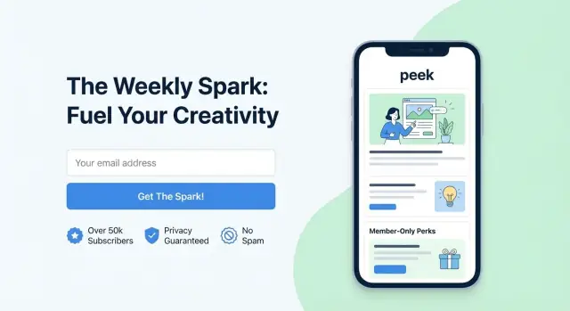
Show a real newsletter preview
Add a simple issue preview section so visitors can picture what they will receive.
An incentive (lead magnet) can lift signup rates, but only if it reinforces the newsletter’s promise. The best magnets feel like a “sample” of what subscribers will keep getting—same topic, same tone, same level of usefulness.
Incentive types that work well
Common options that pair nicely with most newsletters include:
- Content upgrade: a deeper version of a specific topic (e.g., extended notes, extra examples, swipe file)
- Checklist: a quick, printable set of steps to complete a task
- Templates: copy-and-paste frameworks, scripts, Notion/Google Docs layouts
- Discount: best when the newsletter supports a product, course, or service (and the discount isn’t the only reason to join)
When incentives help (and when they hurt)
Incentives help most when visitors already have mild interest but need a small nudge to act now—especially with cold traffic or first-time visitors.
They can backfire when the magnet is too “big” or too generic. A broad freebie (“Free eBook!”) may inflate signups while lowering reader quality: more one-and-done downloads, fewer opens, and more unsubscribes. If your newsletter is the core product, consider keeping incentives lightweight so you attract people who want ongoing value.
Placement: where to show the incentive
- Above the form: best for high-impact magnets; makes the offer clear before asking for an email
- Below the form: good when the newsletter itself is compelling and the magnet is just a bonus
- Side panel: useful on desktop layouts where the form and incentive can be seen together without scrolling
Delivery details that reduce support issues
Be explicit about how it arrives: instantly, after email confirmation, or via the welcome email. If there’s a confirmation step, say so near the button (“Confirm your email to get the template”). Clarity here reduces drop-off and “Where’s my download?” replies.
Trust Signals and Social Proof That Feel Real
People don’t hesitate because they hate newsletters—they hesitate because they’re not sure what they’re signing up for, who’s behind it, or whether it’s worth the inbox space. The best trust signals answer those questions quickly, without turning your landing page into a wall of badges.
Proof that’s specific (and true)
If you share a subscriber count, keep it accurate and time-bound (“12,400 readers as of Nov 2025”). Inflated numbers are easy to spot and can hurt conversions more than having no number at all.
Testimonials work best when they’re concrete. A short quote that names the outcome beats vague praise:
- “The Friday recap saves me 30 minutes of research.”
- “I used the template from Issue #18 to pitch my next project.”
If you have recognizable logos (companies your readers work at, podcasts you’ve been on, publications you’ve written for), a small row of logos can help—just avoid implying endorsements.
Reduce the “who is this?” question
A compact author block near the form builds confidence:
- Name + one-line role (“Product marketer, 10 years in B2B SaaS”)
- A credibility anchor (“Formerly at…”, “Wrote for…”, “Speaker at…”)
- Optional: a small headshot for warmth
Show what they’ll actually receive
Add a “what you’ll get” preview close to the signup box: 2–3 recent issue snippets, or three bullet headlines from your latest email. This removes guesswork and sets expectations.
Keep proof near the form—without clutter
Place one strong proof element (count or testimonial or logos) within a scroll of the email signup form, and a second one just below it. If everything shouts “trust me,” nothing does.
Content Preview Patterns That Reduce Guesswork
Keep full code ownership
Generate the page in React and export source code to fit your existing stack.
People hesitate to subscribe when they can’t picture what they’ll get. A clear preview lowers uncertainty by turning your promise (“weekly insights”) into something concrete (“three takeaways and one recommendation”). It also filters in the right subscribers—those who actually want your style and topics—so your list grows with fewer future unsubscribes.
Preview formats that work (and when to use them)
1) The 3-bullet sample (fastest to scan)
A short “This week you’ll get:” block is ideal above the fold or right next to the email signup form. Keep bullets specific and outcome-focused.
Example:
- How to write a subject line that boosts opens without sounding salesy
- A teardown of a high-converting newsletter landing page (with what to copy)
- One tool and one template to speed up your next send
2) An embedded email screenshot (most tangible)
A cropped screenshot of a real issue makes the format instantly understandable: length, tone, visuals, and structure. Use it when your newsletter has a distinctive style (charts, diagrams, curated links) or when your audience is skeptical. Keep it readable on mobile; a tight crop of the header and first section usually beats a full-page image.
3) An archive link (best for serious evaluators)
Add a simple “Read past issues” link to an archive page so visitors can verify quality without friction. This works well for professional newsletters where readers want to assess credibility. Keep it relative (e.g., /archive) and place it near the CTA so it feels like help, not a detour.
Set clear expectations: frequency, length, and time-to-read
A preview is stronger when it includes practical details:
- Frequency: weekly, twice a month, or “only when there’s something worth sharing”
- Time to read: “5 minutes” or “under 3 minutes”
- Typical length: “3 ideas + 1 resource” or “one deep dive”
These cues reduce “Will this flood my inbox?” anxiety and help people decide quickly.
Topics covered (and not covered)
Add a short boundary statement so the right people opt in:
- “Covers: email growth experiments, CTA copy, landing page teardown notes.”
- “Doesn’t cover: crypto picks, generic motivation, or daily news summaries.”
Being explicit improves conversion quality—your signup patterns feel honest, and your conversion rate optimization work isn’t undone by mismatched expectations later.
Mobile, Speed, and Accessibility Conversion Boosters
A big share of signups happens on phones—often from social links where people are already impatient. Small usability issues (a cramped form, a slow load, a confusing error) can quietly cut your conversion rate.
Mobile-first layout checks
Make the page feel effortless on a small screen:
- Spacing: Give the headline, form field, and CTA generous padding so nothing feels “tappable by accident.”
- Keyboard behavior: Use the right input type for email so the @ key is easy to reach, and make sure the keyboard doesn’t cover the CTA.
- Sticky CTA (when appropriate): For longer pages, a subtle sticky signup button or bar can help—just don’t block content or create accidental taps.
Speed tips that actually move the needle
Speed is a conversion feature. Keep the page light:
- Compress and resize any visuals; avoid large background images.
- Remove unnecessary scripts (extra analytics, chat widgets, heavy animations).
- Prefer a simple layout over complex sections that require lots of assets.
If you’re unsure what’s slowing things down, temporarily remove add-ons one by one and measure the impact.
Accessibility basics (which also help everyone)
Accessibility reduces friction for all visitors, not only those using assistive tech:
- Use clear field labels (not placeholders only).
- Ensure strong color contrast and obvious focus states for keyboard navigation.
- Provide specific error messages (“Please enter a valid email address”) and keep the input visible after an error.
Privacy and compliance
Link to your policy near the form (e.g., /privacy). Add a consent checkbox only if your email platform/legal requirements demand it—extra steps can lower signups. Keep the promise clear: what people will receive and how often.
Personalization and Traffic Match for Higher Intent
A newsletter landing page converts best when it feels like the natural “next step” from wherever someone clicked. If the promise changes between the source and the page, visitors hesitate—even if your newsletter is great.
Match the message to the source
Map your top entry points and align the first screen (headline, subheadline, and CTA) to each one:
- Paid ads: Mirror the ad’s exact benefit claim and wording. If the ad says “weekly prompts to write faster,” don’t open with “marketing insights for creators.”
- Blog posts: Match the topic they were reading. Someone coming from a pricing guide likely wants practical comparisons; someone from a founder story may care about behind-the-scenes lessons.
- Social bio links: Keep it broad, but specific about the outcome. Bio traffic is often cold, so clarity beats cleverness.
Use simple personalization (without creepiness)
You don’t need heavy tooling to create a tailored experience. Two practical options:
- Variants per audience segment: Create two or three page versions for your main audiences (e.g., founders, marketers, freelancers) and send each traffic source to the best fit.
- Dynamic copy blocks: Swap one or two lines based on the URL parameter (like
?source=twitter). Keep changes obvious and helpful—headline, a single proof line, or the content preview.
Add a quick “who it’s for” filter
A short section like “This newsletter is for you if…” helps visitors self-qualify. It reduces low-intent signups and increases confidence for the right readers. Keep it tight: 3–5 bullets with concrete roles or situations, and one clear outcome.
Keep links minimal
Every extra link is an exit. If you must include navigation, limit it to one or two essentials, such as /blog for more samples and /pricing if the newsletter is tied to a paid product.
A/B Testing Plan: What to Change and What to Measure
Make testing reversible
Take a snapshot before each test so you can compare and roll back if needed.
A/B testing works best when it’s simple. Your goal is to learn why people aren’t signing up (or why the wrong people are signing up), not to endlessly tweak colors.
What to test first (highest impact)
Start with the elements that usually drive the biggest swing in signups:
- Headline + subheadline: Does the page clearly promise a specific outcome (and for whom)?
- CTA button copy: “Get weekly prompts” often beats “Submit.” Test benefit-first language.
- Incentive (lead magnet): Try “5-email starter series” vs “PDF checklist” vs no incentive.
- Proof placement: Testimonials near the form vs lower on the page; logos near the CTA vs in the footer.
A simple, repeatable test plan
- Write one hypothesis: “If we make the headline more specific, more visitors will understand the value and subscribe.”
- Change one thing: Only the headline (not the form, CTA, and proof all at once).
- Define success metrics:
- Primary: signup conversion rate (signups / unique visitors)
- Secondary: form start rate, CTA click rate, bounce rate
- Run long enough: Keep the test running at least one full business cycle (often 7–14 days) so you don’t overreact to a weekend spike.
- Use a minimum sample size: Don’t call winners after 30 visitors. Wait until each variant has a meaningful number of visits (many teams use hundreds+ per variant as a practical starting point).
Don’t stop at signups: track subscriber quality
A “winning” variant can grow your list while lowering value. Review 7–30 day downstream metrics by variant:
- Open rate and click rate
- Reply rate (if you ask for replies)
- Unsubscribes and spam complaints
Pick winners that improve both conversion and fit—that’s how you get sustainable email list growth.
Build-and-iterate faster (without adding engineering drag)
Testing is only as fast as your ability to ship variants. If you’re working with limited dev time, a vibe-coding platform like Koder.ai can help you spin up landing-page variants and wire up form flows from a chat interface—then export the source code if you want to bring it into your existing stack. That makes it easier to run “change one thing” experiments (headline, CTA copy, proof placement) without turning every iteration into a full sprint.
Quick Checklist and Common Mistakes to Avoid
When conversions stall, it’s rarely because you need a new “growth hack.” It’s usually because one of the basics is leaking attention or trust. Use this fast check before you redesign anything.
Quick conversion checklist
- Clarity: Can a first-time visitor explain the newsletter in one sentence after reading the headline and subheadline?
- Low friction: Is there a single, obvious action (the signup) with minimal choices?
- Trust: Do you show who’s behind it, why you’re qualified, and a real signal that others read it?
- Preview: Can people see what they’ll receive (sample issues, bullets of recurring sections, or a short excerpt)?
- Mobile: Does the form feel effortless on a phone (large inputs, no tiny checkboxes, no side-by-side fields)?
- Speed: Does the page load quickly and avoid heavy embeds that delay the form from appearing?
Common mistakes that quietly hurt signups
Asking for too much, too soon. Every extra field reduces completion. If you truly need more info, collect it later (after signup) or make it optional.
Unclear value. “Weekly insights” is vague. “A 5-minute weekly brief with 3 tactics you can use Monday” is specific.
Hidden frequency or surprise content. If you don’t state how often you email, visitors assume “too much” and bounce. Also clarify what’s included (tips, links, promotions, job posts, etc.).
Multiple competing CTAs. If your landing page has “Subscribe,” “Book a call,” and “Download,” the visitor chooses “leave.”
Copy-and-paste page structure (section order)
- Headline (clear promise) + subheadline (who it’s for + what’s inside)
- Signup form (email only) + CTA button
- One-line frequency + privacy note
- Content preview (short excerpt or 2–3 example topics)
- Social proof (subscriber count or 1–2 credible quotes)
- About the author (1–2 lines) + optional “read a sample issue” link
Next steps: create 2–3 variants and test
Build small variations rather than full redesigns. For example, test (1) headline promise, (2) CTA button copy, and (3) preview format (excerpt vs. bullets). Run them as separate variants and track signup rate and completion rate so you know what actually improved performance.
FAQ
What is a newsletter landing page, and why does it convert better than a homepage?
A newsletter landing page has one job: get an email signup.
Strip away anything that competes with that action (full navigation, multiple CTAs, unrelated links), and make the promise + form the visual center of the page.
What metric should I track first to know if my landing page is working?
Use signup rate as the primary metric:
Signup rate = form submits / unique landing page visitors
Then sanity-check list quality with secondary metrics like confirmation rate (if double opt-in), early opens/clicks in the first 1–3 emails, and unsubscribe/spam complaint rate.
Should I ask for a name or only an email address?
Start with email-only.
Add first name only if you will use it immediately (e.g., personalization in the welcome email, segmentation, tailored recommendations). If it’s merely “nice to have,” collect it later via a preference link or inside the first email.
How do I write a headline and subheadline that make the value obvious?
Keep it specific and concrete:
- Headline: the core benefit or outcome in one breath
- Subheadline: who it’s for + what’s inside + cadence (and ideally time-to-read)
Swap vague phrases like “actionable insights” for deliverables like templates, teardowns, scripts, or curated links.
What CTA button copy tends to increase newsletter signups?
Use benefit-first button labels instead of generic text:
- “Get weekly growth tips”
- “Send me the playbook”
- “Subscribe (free)”
Add microcopy near the button to reduce anxiety (e.g., “No spam. Unsubscribe anytime.”) and ensure the button is high-contrast and easy to tap on mobile.
Which trust signals actually help conversions (without clutter)?
Use the smallest proof that answers “Is this worth my inbox?” near the form:
- One strong testimonial with a specific outcome
- A time-bound subscriber count (accurate)
- A small logo row (without implying endorsement)
Pair it with a compact author line (role + credibility anchor) to reduce “who is this?” hesitation.
How can I preview my newsletter so visitors know what they’ll receive?
Show a preview that makes the newsletter tangible:
- 3 specific bullets: “This week you’ll get…”
- A link to past issues (e.g., /archive)
- A short excerpt snippet near the form
Include expectations: frequency, typical length, and time-to-read to reduce “will this flood my inbox?” worry.
Do I need a lead magnet, and how do I avoid attracting low-quality signups?
Use incentives when they reinforce the newsletter’s promise (not distract from it):
- Checklist, template, swipe file, content upgrade
Be explicit about delivery: instantly vs after confirmation vs in the welcome email. If double opt-in is required, say that next to the CTA to prevent drop-off and support emails.
How do I match the landing page to different traffic sources for higher intent?
Aim for “message match” from click to page:
- Mirror the wording/benefit from the source (ad, podcast mention, LinkedIn post)
- Create 2–3 variants for major audiences (founders vs marketers vs freelancers)
- Use light personalization via URL parameters (e.g.,
?source=twitter) to swap a line of copy
Keep links minimal so people don’t wander away before subscribing.
What’s a practical A/B testing plan for a newsletter landing page?
Run simple tests that change one thing at a time:
- Headline + subheadline specificity
- CTA button copy
- Incentive vs no incentive
- Proof placement near the form
Let tests run a full cycle (often 7–14 days) and wait for meaningful volume (commonly hundreds of visits per variant). After picking a winner, verify downstream quality (opens/clicks, unsubscribes, spam complaints) before scaling.