

One Photo a Day App: Build a Simple Daily Memory Journal
Plan a one photo a day app that saves one daily photo plus a short note, then lets users browse by month for simple, fast memory recaps.
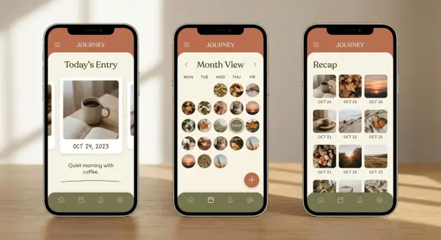
What a one-photo-a-day memory app solves
Most people take plenty of photos, but almost none of them turn into memories you can easily revisit. They end up buried in an endless camera roll, mixed with screenshots, duplicates, and random pictures you took “just in case.” A week later, it’s hard to remember why you took a photo at all.
A one photo a day app fixes this by making the decision small and clear: pick one photo that represents your day, add a short note, and you’re done. No albums to manage, no long entries to write, and no pressure to capture everything. The point is a tiny daily habit that still adds up to something meaningful.
The monthly recap is where it clicks. When you browse by month, you don’t see thousands of images. You see around 30 highlights. That makes patterns obvious: the week you kept cooking at home, the days your kid had soccer practice, the month you traveled, or the stretch when you were stressed and everything looked like late-night desk photos.
It also sets a healthier expectation than many journaling apps. This is about consistency, not perfect photography. A blurry sunset, a photo of your coffee, or a quick shot of your laptop at 11:48 PM can be the right “one photo” if it honestly reflects the day.
If you’ve ever said “I should remember this,” but later couldn’t find the photo or forgot the story behind it, the promise is simple: one moment per day, saved with one sentence, easy to replay month by month.
The core experience in plain terms
A one photo a day app should feel like brushing your teeth: quick, repeatable, and done before you can overthink it. You’re not trying to create perfect memories. You’re capturing proof that the day happened.
The daily loop
The loop is simple: open the app, take (or pick) one photo, add a short note, save, done. If it takes longer than a minute, many people will skip days.
A good flow looks like this:
- Open straight to the camera or a clear “Add today’s photo” button.
- Add a note that fits on one line (allow more, but don’t require it).
- Save with today’s date automatically.
- Show a quick confirmation and return to the home view.
This habit works for busy people who want memory without effort: parents saving one kid moment a day, travelers keeping a lightweight log, founders and employees who lose track of weeks, and anyone who wants a calmer alternative to posting.
The monthly recap
Browsing should feel just as calm as logging. A month grid with 28 to 31 thumbnails is enough. Tap a day to see the photo and note, then swipe to the next day if you want. That’s a recap without endless scrolling.
It helps to show gaps gently. A blank tile for a missed day is fine. It reminds people they can come back tomorrow instead of feeling like they failed.
This app is not a full photo editor, a social feed, or a place to binge content. If you add filters, reactions, comments, or infinite scroll too early, the habit often breaks because the app stops feeling quick.
Features that matter (and what to skip)
A one photo a day app lives or dies on effort. If someone misses two days and feels behind, they quit. The best features remove friction. They don’t add choices.
Start with the daily entry: one photo, date set automatically, and a short note with a clear limit (for example, 200 characters). Keep anything extra optional. Location can be a toggle, not a requirement. The goal is “tap, snap, type one line, done.”
For the monthly recap, most apps need two ways to browse over time:
- A calendar-style view for “that was on the 12th.”
- A thumbnail-first view for “that weekend trip.”
If you only ship one view at first, thumbnails usually feel more rewarding and still work when days are missing.
Search and filters can stay minimal early on. Month browsing is the main path. If you add one extra way to find things, favorites (a simple star) often beats complex tags. If you do add moods or tags, keep them limited and quick to tap. Avoid anything that turns a daily habit into data entry.
Reminders should be gentle and flexible. Let people set a time, allow a snooze, and avoid guilt. “One photo?” works better than “You missed yesterday.”
Export builds trust. People expect they can take their memories with them: photos plus notes in a basic format they can save.
What to skip early:
- Social feeds, likes, comments
- Heavy editing tools and filters
- Too many mood options or long prompts
- Streaks that punish missed days
- Complex accounts before the app proves useful
Privacy, storage, and trust basics
A one photo a day app feels personal, so trust isn’t optional. People need to believe their photos and notes won’t surprise them later.
Start by explaining storage in plain options:
- On-device only: Photos stay on the phone. It’s private and simple, but switching phones can mean losing everything without a backup.
- Cloud only: Easy sync across devices, but users will ask where data lives and who can see it.
- Both: Save locally for speed and sync as a backup when the user signs in.
Privacy expectations are straightforward. Make entries private by default. Add an app lock (passcode or biometrics), especially if the app shows the last photo on launch. Also be clear about what you don’t do: no public feed, no auto-sharing, no pulling extra photos without asking.
Permissions are another trust moment. Ask only when needed, and explain why right before the system prompt. Typical requests are camera access (to take the daily photo), photo library access (to pick an existing photo), and notifications (for a gentle reminder). If someone says no, they should still be able to use the app, just with fewer options.
Deletion should be simple and clearly described. If a user deletes an entry, it should disappear from the app and be removed from synced copies within a reasonable window. Say what happens to the photo file and the note, not just “data.”
How to plan the app in 7 clear steps
Planning a one photo a day app is mostly about making a few firm choices early, so you don’t keep changing the rules later.
-
Pick your first platform. If you want the lowest friction for testing, start with a simple web app people can use right away. If your audience expects camera-first use, start with iOS or Android.
-
Lock the MVP scope. The first version only needs: take or upload today’s photo, add a short note, browse by month, and a basic backup option.
-
Sketch the key screens. Aim for five: capture, add note, month view, day detail, and settings. If you can’t draw a screen in 30 seconds, it’s probably too complex.
-
Write your rules for “one per day.” Can users add yesterday’s photo? Can they replace today’s photo? What happens if they miss a day?
-
Define a simple data model. Each entry usually needs: date, photo, note, created time, updated time, and (optionally) a favorite flag.
-
Plan backup and restore early. Decide what “backup” means (device only, cloud, or export) and what happens when someone switches phones.
-
Choose success metrics you’ll actually use. Track a few numbers: week-1 retention (do they come back?), streak rate (do they keep the habit?), and reminder opt-in (did reminders feel helpful?).
A simple screen-by-screen layout
A one photo a day app works best when the layout feels obvious after five seconds. Keep a small set of screens that repeat the same pattern: add today, review later, and adjust settings without hunting.
Onboarding (2-3 quick screens)
Keep onboarding short. Explain the one-photo rule, what “today” means (local time), and privacy basics. End with one action: pick a reminder time or skip.
The main screens
A clean structure that covers most needs:
- Home (Today): one clear “Add today’s photo” action. If today is already saved, show a thumbnail and note preview with a simple “Done” state.
- Month view: a grid or list that scrolls fast. Dates should be readable, and missing days should look clearly empty.
- Day detail: the full photo and note, with edit, delete, and favorite.
- Settings: reminder time, backup/restore, export, and optional app lock.
One small rule that helps: in month view, tapping an empty day should only open “Add for that day” if you allow backfilling. If you want a stricter journal, show a gentle message instead.
Tiny interactions that keep it pleasant
Small choices make the habit feel lighter:
- After selecting a photo, show a subtle “Add a note (optional)” hint.
- After saving, return to Home with a calm confirmation.
- In Day detail, confirm delete with a clear warning, with cancel one tap away.
Common mistakes that make people quit
The biggest risk is turning a tiny daily habit into a chore. People download this kind of app because they want an easy memory cue, not another task.
One common trap is making the note box feel like a full diary page. When the empty space is huge, users feel like they should write something meaningful, and they skip the day instead. Notes work best when they feel light: “Tried the new ramen place” or “First snow.”
Streaks can also backfire. Gentle reminders can help, but heavy streak pressure creates guilt the moment someone misses a day. If you show streaks at all, treat them as a quiet bonus, not the main score.
Month browsing is the payoff, so don’t hide it. If the month grid takes extra taps or loads slowly, users never get that quick recap feeling. Fast month switching and smooth thumbnails matter more than fancy filters.
Tagging and search are often built too early. They sound useful, but they add decisions. Get the core loop solid first: open, pick a photo, add a short note, save, see the month.
Time zones and backdating are silent deal-breakers. Someone takes a photo at 11:50 PM while traveling, crosses a time zone, and the entry lands on the wrong day. Or they forget and want to add yesterday’s photo, but the app won’t allow it. Both feel unfair.
Simple fixes that keep people going:
- Keep notes short by default and allow longer only if they choose.
- Make missed days normal: allow gaps and offer “Add for yesterday” without shame.
- Put month view one tap away and cache recent months for speed.
- Delay tags until users have a real reason to search.
- Store entries with a clear local date and offer manual date edits.
Quick checklist before you build
If the app feels slow or unclear, people stop using it. Before you add features, test the basics with a simple prototype and a timer.
The 5 checks that decide if it sticks
Run these checks on a real phone with real photos:
- Can you capture or pick a photo, add a short note, and save in about 20 seconds without hunting for buttons?
- When you open the app, can you tell in one glance if today is already saved (and what you saved)?
- When you browse a month, does it load quickly and clearly show gaps so the recap feels honest?
- Can you swap today’s photo or edit the note without creating duplicates?
- Is there a one-sentence explanation of how your data is backed up or exported, written in plain words?
A quick reality test: imagine you’re on the bus, you take a photo of your coffee, type “First day at the new job,” and hit save. If any step makes you pause, that’s friction you’ll feel every day.
Tiny details that prevent confusion
A few small choices prevent support headaches later:
- Keep one clear primary action on the home screen: “Add today’s photo.”
- Use simple status text like “Today: saved” or “Today: not yet.” Avoid icons-only status.
- In month view, show missing days with empty squares or subtle placeholders.
- When replacing a photo, ask one clear question: “Replace today’s photo?” and show a preview before confirming.
A realistic month-in-use example
Maya just had her first baby. Most days feel like a blur, and her camera roll is a mess: ten near-identical photos, plus screenshots and random memes. She wants something simpler, so she uses a one photo a day app that asks for one picture and one short note.
On day 1 she snaps a quiet moment: the baby sleeping on her chest. Her note is one line: “First nap that lasted more than 20 minutes.” The next day it’s a tiny win: “We figured out the swaddle.” Some days the photo isn’t perfect, but the point is to keep moving, not to create a highlight feed.
By week two, the habit becomes automatic. After dinner, she opens the app, picks the best photo from that day, and adds a sentence. The app saves privately by default, so nothing appears on social media and there’s no pressure to share. When her partner asks to see the month, she can show it on her phone without sending the images anywhere.
On day 17, she misses a day. No alarms, no guilt. The next morning the calendar shows an empty spot for yesterday. She taps it and adds a simple catch-up entry: a photo from the previous day’s walk and “First time outside without crying (me or baby).” If she can’t find a photo, she can leave the day blank and move on.
At the end of the month, she opens the monthly view and it feels like a small highlight reel. Each day is one tile, and tapping through them takes seconds. In about two minutes she can relive the month: the first smile, the first bath that didn’t end in tears, and the quiet ordinary days she would’ve forgotten.
Next steps to ship a small, useful first version
Write the rule of the habit in one sentence and don’t bend it: one photo, one short note, once per day. People stick with products that make “done” obvious.
Then lock the MVP. For a one photo a day app, the first version only needs:
- Capture or pick one photo and add an optional short note
- A monthly view that shows every day, including missed days
- A simple reminder setting
- One safety net (account-based sync or a basic export), so people feel safe
Write a tiny spec before you build: the screens (Add Entry, Month, Settings), the fields (photo, date, note), and edge cases (time zones, late-night entries, replacing today’s photo). It keeps you from endless “just one more tweak” decisions.
Run a small beta on purpose. Aim for 20 to 50 people who will try it daily for a month. Measure how many days they log, and what makes them skip. After week one, ask one question: “What stopped you yesterday?” The answers almost always point to friction, shame, or reminders that are too easy to ignore.
If you want to prototype quickly without a traditional build pipeline, a chat-driven platform like Koder.ai (koder.ai) can help you turn the screens and rules above into a working web, mobile, or full-stack app, then iterate using planning mode and snapshots before you export the source code.
Keep a “later” list and protect it. Only add tags, themes, shared albums, or fancy filters if beta users request them repeatedly and they don’t slow down the daily entry.
FAQ
What counts as a “good” one-photo-a-day entry?
Pick one image that best represents the day, even if it’s ordinary or imperfect, then add one short line about what was happening. Keeping the choice small is what makes the habit sustainable.
Should the app allow missed days or force a perfect daily streak?
Default to allowing gaps and treating them as normal. If you want higher retention, let users optionally add “yesterday” without making it feel like they’re failing or falling behind.
How do I keep the daily entry fast enough that people actually use it?
Keep the daily flow under a minute: open the app, pick or take a photo, type a short note, save. If there are extra steps like editing, tagging, or multiple screens, make them optional and easy to skip.
What features are must-haves for the first version?
A solid MVP is daily entry (one photo + short note), automatic date handling, a month grid to browse, day detail view, and a simple reminder setting. Add one safety net early, like sync or export, so people trust their memories won’t disappear.
What features should I avoid early because they break the habit?
Skip anything that turns it into a feed or a chore: social features, heavy filters, complex tagging, long writing prompts, and punitive streak mechanics. These usually increase decision fatigue and make people quit after they miss a day or two.
What privacy basics do users expect from this kind of app?
Keep entries private by default and explain storage clearly in plain words. Ask for permissions only when needed, support an app lock if the last photo shows on launch, and make deletion straightforward so users feel in control.
How do I handle time zones and late-night photos correctly?
Define “today” using the user’s local date, and store that date explicitly rather than relying only on timestamps. For edge cases, offer a manual date edit or a clear rule for late-night entries so travel doesn’t misfile memories.
Should users be able to edit or replace a photo after saving?
Let users replace today’s photo without creating duplicates, and keep the action obvious in the day detail screen. A simple confirmation like “Replace today’s photo?” prevents accidental changes while keeping it quick.
What’s the simplest way to support backup and export?
Export photos and notes together in a simple, readable format so users can keep a personal backup. Even if you offer cloud sync, export reduces anxiety and support requests because users know they’re not locked in.
How can Koder.ai help me ship a one-photo-a-day app faster?
Use it to prototype the core screens and rules quickly, then iterate with small changes based on real daily use. The key is to build the tight loop and month recap first, test with a small group for a month, and only then add extras if they don’t slow the habit.