Dec 31, 2025·6 min
Persona and task flow thinking: Alan Cooper’s simple method
Learn persona and task flow thinking to turn fuzzy app ideas into clear screens, actions, and priorities, inspired by Alan Cooper.
Learn persona and task flow thinking to turn fuzzy app ideas into clear screens, actions, and priorities, inspired by Alan Cooper.
A long feature list can feel like progress. You can point to it and say, “We know what we’re building.” Then you try to sketch the first screen and realize the list doesn’t tell you what the user is doing right now, what they’re trying to finish, or what the app should show first.
Feature lists hide priorities. “Notifications,” “search,” “profiles,” and “settings” all sound important, so everything ends up on the same level. They also hide intent. People don’t wake up wanting “filters” or “admin roles.” They want to book an appointment, get paid, track a delivery, or share photos with family.
That’s why feature list vs user goals isn’t just a planning argument. It changes the screens. If the goal is “book a haircut for Friday,” the first screen needs time slots and a clear next step, not a menu of ten features.
Feature lists also pull teams into UI debates too early. People argue about button placement, tab names, dark mode, and how many settings pages there should be. Those choices feel concrete, but they’re guesses made before you agree on the job the app must help someone complete.
A better starting point is simple: pick a real user, pick one job they want to finish in one sitting, and map the smallest set of steps that gets them to done. Once you do that, screens start to appear naturally. Each screen earns its place by supporting a step in the flow.
Alan Cooper popularized a shift that still holds up: stop treating software like a pile of features, and start treating it like an interaction. The point isn’t what your app can do. The point is what a person is trying to get done, and whether the app helps them do it with minimal friction.
That mindset is what many people now mean by Alan Cooper interaction design. Focus on intent and sequence. If you can describe the journey clearly, the screens almost design themselves. If you can’t, a longer feature list won’t save you. It usually creates clutter because every feature adds decisions, buttons, and edge cases.
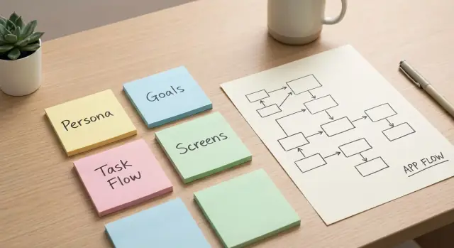
Cooper’s practical toolkit is two parts:
A flow forces you to answer questions a feature list avoids: what triggers the task, what “success” looks like, what the user must decide right now, and what information you really need at each step.
Even if you plan to build with a chat-based vibe-coding platform like Koder.ai, you still need that clarity. Otherwise you’ll generate lots of screens that look plausible but don’t connect into a satisfying start-to-finish experience.
A persona is a short, believable description of the person you’re designing for first. It’s not a full biography. It’s just enough detail to make decisions without constantly saying, “It depends.”
Start with goals and context, not demographics. The same “busy parent” behaves differently depending on where they are, what device they’re on, and what pressure they’re under. Good personas for product design make those constraints concrete so your screens have a clear purpose.
If your persona is too vague, you’ll feel it. It starts sounding like “everyone,” it becomes mostly demographics, it lists preferences without a clear goal, and it can’t explain why this person would use the app today.
Keep the persona lightweight. A few lines is enough:
Example: “Mina, a dental receptionist, uses her phone between patients. Her goal is to confirm tomorrow’s appointments fast. Her pain point is chasing people who don’t reply. Success is sending a reminder and seeing a clear ‘confirmed’ status in under a minute.”
One more rule: a persona is a design tool, not an ideal customer profile. You can have many audiences later, but you need one primary persona now. When people argue about a screen, bring it back to Mina: does this help her reach her goal in her real context, or is it just another feature?
A task flow is the smallest set of steps a person takes to reach one clear goal. It’s not a sitemap, not a feature list, and not a full journey map. It’s one path from “I want to do X” to “X is done.”
A good flow starts with a trigger and ends with a success state. The trigger is what makes the user begin: a need, a message, a button, or a problem. The success state is what “done” looks like in plain language: “appointment booked and confirmed,” “invoice sent,” or “password changed and I’m signed in.” If you can’t describe both in one sentence each, the flow is still fuzzy.
Most flows are simple until a decision shows up. Decisions are the forks that change what happens next, like “Do you already have an account?” or “Is this item in stock?” Calling out those forks early prevents you from designing a perfect happy path that breaks the moment reality appears.
To shape a flow without overthinking it, answer five questions:
People abandon tasks when they feel uncertain. Your flow should mark the moments where reassurance matters: progress, status, confirmation, and clear errors.
A simple example is “reset my password.” Trigger: “I can’t log in.” Success: “I’m back in my account.” Decision: “Do you have access to email?” Reassurance points: “email sent,” “link expired,” “password changed,” “you are signed in.” Once those are written down, the screens are obvious because each step needs a place to happen and a message that removes doubt.
Most app ideas start as a pile of nouns: dashboard, chat, calendar, payments. The faster route to clarity is to force the idea into a promise, a person, and a sequence of steps.
Start with one sentence that could go on a front page. Make it specific enough that someone can nod or say, “No, that’s not me.” Example: “Help freelance designers get paid faster by sending a clean invoice and taking card payments in under 2 minutes.”
Then pick one primary persona for version one. Not “everyone,” not “small businesses.” Choose a person you can picture on a normal Tuesday. If you design for three different people at once, you’ll add extra screens that don’t help anyone.
Next, pick one goal to design first, ideally the one that creates the main value. “Feel organized” is fuzzy. “Send an invoice and confirm it was viewed” is clear.
A repeatable process looks like this:
Only after the flow fits on one page should you write a feature list. Keep it short and prioritized: the few features that make the steps possible, plus the minimum needed to recover from those failures.
If you’re using a build tool like Koder.ai, this is also where planning mode helps. Paste the promise, persona, and flow into one place and keep the team aligned before screens and code multiply.
A task flow is a sequence of intentions. Now turn each step into either a screen the user lands on, or a single action they take on an existing screen.
Keep it blunt: one step equals one clear outcome. If a step has two outcomes, it’s usually two steps.
Name screens by purpose, not by layout parts. “Pick time” beats “Calendar screen.” “Confirm details” beats “Form page.” Purpose names keep you focused on what must happen, not what it looks like.
When translating a flow into screens, decide three things for each step: what the user must see, what they must choose, and what they must enter. Then choose the next obvious action (usually one primary button). Remove anything that doesn’t help them complete that step.
Navigation should be boring. Each screen should answer: “What do I do next?” If someone needs a menu to figure out the next move, the screen is trying to do too much.
Also capture basic states as notes, not full designs: loading, empty, success, error, and when the main action should be disabled. You want the team to remember these states while building, not spend days debating colors.
Tools like Koder.ai can help you draft screens from your flow text, but the clarity still comes from you: purpose, required info, and the next action.
Imagine you want a simple app that lets people book a local class (yoga, tutoring, a haircut). A feature list might say “search, calendar, payments, reminders.” That still doesn’t tell you what the first screen is, or what happens after someone taps “Book.”
Start with one persona: Sam, a busy parent on a phone in a parking lot who wants to book a spot in under 60 seconds. Sam doesn’t want to create an account, compare 20 options, or read a long description.
Now write the happy path as a short story: Sam opens the app, finds the right class quickly, picks a time, enters a name, pays, and gets a clear confirmation.
Add two edge cases to keep the flow honest: the class sells out as Sam taps a time, and the payment fails.
The screens that fall out of that flow are straightforward:
When “sold out” happens, handle it inside the time picker: explain it plainly, suggest the next closest slot, and keep Sam on the same screen. When payment fails, keep the entered details, say what happened in normal language, and offer “try again” and “use another method.”
If you build this in Koder.ai, you can ask it to generate these screens from the flow text, then tighten the wording and fields until the 60-second goal feels real.
Flows usually break for one reason: you’re designing for a crowd, not a person. When the persona is “everyone,” every decision becomes a compromise. One user wants speed, another wants guidance, another wants total control. The result is a flow that tries to satisfy all of them and satisfies none.
The fix is to narrow the persona until choices become obvious. Not “busy professionals,” but “a receptionist who books appointments between phone calls,” or “a parent booking a haircut for a child on a cracked phone screen.” Once you can picture their day, you can decide what to cut.
Another failure mode is starting from what you can store instead of what someone is trying to do. If your first draft is based on database fields and internal admin steps, the product turns into long forms and the main task gets buried. People don’t wake up wanting to “fill fields.” They want to confirm a booking, pay, get a reminder.
A third trap is “extras first” thinking. Settings, preferences, roles, tags, and customization are easy to list, so they creep in early. But if the core task is shaky, extras just add more paths and more confusion.
If you’re generating screens quickly with a tool like Koder.ai, the same risk applies: speed is useful only if you keep the flow honest - one persona, one goal, one clear next step on every screen.
Before you open a design tool or start coding, do one pass to make sure your idea can actually turn into screens people can finish.
You should be able to say the primary persona’s goal in one sentence with a clear finish line: “Book a haircut for Saturday at 11am and get a confirmation.” The happy path should fit on one page. If it sprawls, you probably mixed two tasks or you’re solving for multiple personas at once.
Check that every screen is named by purpose and tied to a flow step (purpose beats widgets). Make decisions and confirmations explicit, not implied. If the user must choose something, show the choice. If something important happened, show a confirmation or a clear error.
Then cut anything that doesn’t move the task forward. If a screen doesn’t help the user decide, enter information, pay, or confirm, it’s usually noise for the first version.
Read the flow out loud like a story: “I want X, I do A, then B, then I confirm, then I’m done.” Wherever you stumble, that’s the design problem.
If you use Koder.ai, this is also a strong prompt starter: paste the one-sentence goal and the happy-path steps, then ask for the minimum set of screens and actions.
Pick the single flow that best proves your persona can reach their goal. Treat it as your spine. Everything else is optional until this works end to end.
Turn that flow into a tiny build plan: the handful of screens the persona visits, the actions they take on each one, the minimum data the system must know, a short list of failure cases you must handle, and the success state that confirms “done.”
Now decide what to cut. Cutting isn’t about being minimal for its own sake. It’s about making one main goal feel effortless. If a feature doesn’t help the persona finish the flow today, it goes to “later.”
Validate the plan by acting it out. Read the persona description, then walk through the steps as if you are them. Missing information shows up fast: Where did the date come from? How do I change my choice? What happens if I made a mistake?
If you want to move faster, use Koder.ai planning mode to iterate on the persona and flow in chat before you generate screens. Once you start building, features like snapshots and rollback can help you test changes boldly and revert quickly if a “small tweak” breaks the path.
A feature list tells you what exists, not what happens first. It flattens priorities (everything sounds important) and hides user intent.
Start with one user goal like “book a class for Friday” and the first screen becomes obvious: show the next available times and a clear next step, not a menu of features.
A persona is a short, believable description of the primary user you’re designing for first. It’s not a demographic profile.
Include:
Keep it lightweight and goal-driven. Write 3–5 lines you can use to settle design arguments.
Example structure:
A task flow is the smallest set of steps that takes a persona from intent to a clear success outcome. It’s one path, not your whole product.
If you can’t state the trigger (“why they start”) and the success state (“what done means”) in one sentence each, the flow is still fuzzy.
Write the happy path as short verbs (choose, enter, review, confirm), then add a few real-world breakpoints.
A practical minimum:
This keeps your screens honest instead of perfect-on-paper.
Turn each step into either:
For every step, decide:
Then give them one obvious next action (usually one primary button).
Name screens by purpose, not layout.
Better:
Worse:
Purpose names keep you focused on the job the screen must help the user finish.
People quit when they’re unsure what happened or what to do next. Add reassurance where doubt appears.
Common reassurance moments:
When you design for “everyone,” you start adding extra steps for conflicting needs: speed vs. guidance vs. control. The flow bloats and no one feels served.
Pick one primary persona for version one. You can support other users later, but you need a single decision-maker now to keep screens coherent.
Use Koder.ai after you’ve written the promise, persona, and flow. Paste them in and ask for the minimum set of screens and actions.
A good workflow:
Koder.ai can speed up output, but the flow is what keeps the experience connected end to end.