Jul 18, 2025·8 min
Photographer Websites: Fast Galleries That Win Booking Inquiries
Build a photographer website with galleries that load fast, look great on mobile, and turn visitors into booking inquiries with clear CTAs and simple forms.
Build a photographer website with galleries that load fast, look great on mobile, and turn visitors into booking inquiries with clear CTAs and simple forms.
A beautiful portfolio is table stakes. Your website’s real job is to turn the right visitors into real conversations—then make it easy for them to inquire.
Treat “more inquiries” as the north star. Every page should answer two quiet questions a potential client has:
If a page can’t support those answers, simplify it or remove it.
A general “I shoot everything” message often attracts mismatched leads and more back-and-forth. Instead, name your focus and ideal client:
You don’t need to exclude other work forever—but your homepage should lead with the category you want booked next.
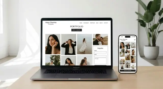
Most photographer sites only need a small set of pages, done well:
If you offer multiple services, consider separate portfolio and pricing sections per service so visitors don’t have to “translate” your site.
Good design is measurable. Track a few signals that relate directly to booking intent:
When you know your goal, your niche, your core pages, and your metrics, “fast galleries” stop being a nice feature—they become part of a booking workflow that works.
A photography site isn’t judged like a brochure. People arrive with a goal—see your work, decide if it fits, and move on to pricing or an inquiry. If the gallery hesitates, visitors don’t just get impatient; they start to doubt the experience they’ll have as a client.
Fast galleries feel professional. Thumbnails that appear quickly let people start browsing immediately, which increases the chance they’ll reach your best sets and then click into your contact flow. Slow galleries do the opposite: they interrupt the “just one more photo” rhythm that makes someone emotionally buy into your style.
Speed also affects trust in subtle ways. A stuttering page can feel broken, unsafe, or outdated—especially on mobile networks—so people abandon before they ever consider sending an inquiry.
Most slowdowns come from a few predictable choices:
Often it’s not one “big problem,” but several small ones stacking up.
You don’t need perfect scores to see better results. Aim for:
Clients don’t need full-resolution files in the gallery—they need beautiful previews. The sweet spot is images that look crisp on modern screens while staying small enough to load fast. That usually means exporting at sensible dimensions, using modern formats when possible, and letting larger versions load only when someone opens a photo.
When speed improves, browsing feels effortless—and effortless browsing turns into more clicks toward your inquiry form.
Fast galleries start long before you upload anything. The goal is simple: deliver beautiful photos at the smallest file size that still looks great on real screens.
If your website builder or gallery tool can automatically serve AVIF/WebP with JPEG fallback, turn it on.
Uploading full-resolution originals (e.g., 6000px wide) wastes bandwidth. Instead, export for the largest size you actually display.
A practical rule:
You can keep separate exports for thumbnails and large views, or let your CMS generate them.
Compression isn’t “ruining quality”—it’s removing data viewers won’t notice. Use consistent exports so your gallery feels uniform.
Typical starting points:
After export, spot-check areas like skin tones, gradients, and fine textures.
Responsive images let phones download smaller files while desktops get sharper versions. Look for settings like srcset, “responsive images,” or “auto-generate sizes.” This is one of the biggest real-world speed wins.
Lazy-loading helps, but keep the experience smooth:
A fast gallery isn’t only about raw load time—it’s about how quickly people can start looking and how little friction they feel while moving through your work. The goal: show something sharp immediately, then stay out of the way.
Different sessions call for different browsing modes. A grid works well for “show me everything” discovery. Masonry can feel more editorial (great for mixed orientations), but keep spacing consistent so it doesn’t feel jumpy. A slideshow is best when you want visitors to slow down and follow a story. Albums (by wedding, family, brand, location, season) help people self-sort quickly—often faster than endless scrolling.
Visitors decide in seconds whether your work fits. Prioritize sharp, fast thumbnails that appear immediately, then load the larger image only when they open it.
A few UX details that help the gallery feel instant:
Even if your site can technically handle 150 images, people won’t enjoy browsing them in one long page. Cap each gallery to a focused selection and use pagination or album categories so visitors can quickly jump to what they care about.
If you’re unsure what to cut, ask: “Does this image add variety or proof?” If not, it’s a candidate to remove.
Browsing should feel natural everywhere:
Finally, avoid autoplay video and heavy transition effects. They often make galleries feel sluggish and distract from the one thing people came to do: judge your photography quickly and confidently.
Most photography traffic is mobile. If the site feels slow or fiddly on a phone, people won’t “wait and see” your best work—they’ll leave.
Mobile UX is mostly spacing. Your galleries and menus should be easy to use one-handed.
On mobile, users scroll fast. Don’t make them hunt for the next step.
A simple approach is a sticky “Inquire” button or repeating a clear call-to-action after key sections (end of a gallery, after testimonials, below packages). The goal: whenever someone thinks “I like this,” the path to contacting you is immediately available.
Nothing feels slower than a page that shifts under your finger. Layout shifts also cause accidental taps.
Reserve space for thumbnails and hero images so the grid doesn’t reflow as files arrive. If you use a masonry layout, ensure placeholders match the expected aspect ratios. This makes browsing feel steady even on weaker connections.
Desktop Wi‑Fi can hide mobile problems. Do quick checks that match real life.
If something feels laggy, fix that first—mobile visitors decide in seconds whether your portfolio is worth exploring.
A fast gallery gets people to stay. Now make it obvious what to do next.
Most visitors aren’t ready to “Contact” you—they’re trying to figure out whether you’re available and within budget. Use a clear primary call-to-action that matches that moment:
Those phrases reduce hesitation because they feel low-commitment and practical. Keep the CTA label consistent across the site so visitors don’t have to re-learn your navigation.
Don’t hide your booking path on a single Contact page. Place CTAs:
A simple pattern that works: gallery → a short “What you get” paragraph → one strong CTA button.
Make the form easier to fill out and more useful for you by adding a short pre-qualification section:
This filters out mismatches without sounding harsh, and it saves time on follow-up emails.
A small reassurance line can increase completed inquiries:
“I reply within 24 hours (Mon–Fri). If you don’t hear back, check spam or send a quick note via /contact.”
Also mention the next step (a quick call, a proposal, or package recommendations). When visitors know the workflow, hitting “Send” feels safe—and your portfolio views turn into real booking momentum.
Your inquiry form is the handoff between “I like this work” and “I’m ready to talk.” If it feels long, confusing, or unreliable, people bounce—especially on mobile. A high-converting form keeps the effort low, sets expectations, and reassures visitors they’re contacting a real professional.
Ask for only what you truly need to respond well. A great baseline is:
That’s enough to start a real conversation without turning the form into an application. If you need more detail, you can collect it after the first reply.
Smart dropdowns reduce typing and help you route leads faster. Two that usually help:
Keep dropdowns optional where possible, and avoid stacking too many. Too many choices can feel like homework, and people may abandon the form rather than guess.
Spam is real, but friction is expensive. Prefer protection that’s mostly invisible (or one click at most). If you use a checkbox challenge, keep it lightweight and mobile-friendly. Avoid anything that forces users through multiple steps or repeated puzzles.
After someone hits “Send,” remove doubt:
This reassurance alone can reduce duplicate submissions and anxious follow-ups.
Right before submitting, people often want one more check: “Are they legit, and can I afford this?” Include small, nearby links to /pricing and /about so visitors can reassure themselves without hunting. The goal is to keep them moving toward sending the inquiry, not reopening twenty tabs.
A fast gallery gets people excited. Clear pricing helps them decide whether to reach out—and what to ask for. The goal isn’t to publish every detail, but to remove the “I have no idea what this costs” friction that stalls inquiries.
You have three solid options:
If you prefer custom quotes, show a starting price plus a short note about what changes pricing (hours, locations, album add-ons). This filters out mismatched leads without scaring off serious clients.
Package pages often fail because they list vague promises instead of specifics. Use everyday terms and answer the questions clients already have:
Avoid jargon like “deliverables” as a headline—clients respond better to “What you get.”
Add short, direct answers for:
Place a compact FAQ block right below pricing and again near your contact section. Keep it scannable—5–8 questions max—so visitors can decide quickly and move straight to /contact with fewer follow-up emails.
SEO for a photographer website doesn’t have to mean chasing hacks. It’s mostly about being clear: what you shoot, where you shoot it, and how someone books you.
If you serve multiple places, create one page per service area (city/region) only when it reflects how you actually work. A “Wedding Photographer in Austin” page is useful if you genuinely book Austin weddings and can show relevant work.
Keep each location page specific: a short intro, a tight gallery, and a clear next step to /contact. Avoid spinning out dozens of near-identical pages.
Make portfolio categories that match what clients ask for (weddings, family, brand, newborn). Then write simple titles and 1–2 sentence descriptions for each category—enough context to explain what they’ll see and who it’s for.
Add descriptive alt text and captions where it helps. Think “Bride and groom walking down aisle at outdoor venue” rather than keyword stuffing. Alt text is for clarity and accessibility first.
Claim and align your local info (name, location, contact details) everywhere you control it. Your site’s footer, Contact page, and business profiles should match. Consistent details make it easier for search engines—and clients—to trust you.
Build internal links between the pages people actually need:
This helps SEO, but it also improves your online booking workflow by reducing dead ends and guiding visitors toward an inquiry.
A fast gallery gets people to the work. Trust is what gets them to contact you. When someone fills out an inquiry form, they’re not just choosing a style—they’re choosing reliability, communication, and a smooth experience.
Add recognizable proof close to your galleries and near your contact call-to-action. One strong, specific testimonial beats a wall of generic praise.
If you can, include a first name + initial and a small detail that signals authenticity (“We got our full gallery in 10 days”).
Your About page doesn’t need a life story. It needs reassurance. Write a short bio that explains your approach and what clients can expect: how you guide people, how you handle timelines, and how you deliver images.
A simple structure works well:
People hesitate when they can’t tell if you’re available where they are. Add clear contact options and include location/service area details (city, region, and whether you travel). If you have a studio address, list it; if not, specify how meetings work.
Link your contact page prominently (e.g., /contact) and make sure it matches the rest of your site’s visual style and typography so it feels professional and consistent.
Policies reduce uncertainty, but only share what you can verify and stand behind. If you mention deposits, rescheduling, or cancellation terms, keep the wording plain and avoid legal-sounding overreach. A short FAQ section is often the cleanest place for this, with a link to details when needed.
A fast photography site isn’t a one-time project. It’s something you protect—especially after uploading new galleries, installing a plugin, or changing your theme. The goal is simple: know what’s working, notice when something slows down, and make small improvements without turning your website into a second job.
Set up analytics so you can see whether visitors actually move through your site.
If you’re not sure where to start, begin with two numbers: gallery views and completed inquiry forms. Everything else is secondary.
Performance often drops for predictable reasons: large image uploads, extra scripts, and “helpful” add-ons.
Create a simple rule: after you publish a new gallery or install/update a plugin, run a quick speed check and test your main pages (home, portfolio, one gallery, contact). Keep a short log in a note so you can spot patterns.
You don’t need a full redesign to improve bookings. Pick one change at a time and run it for a couple of weeks.
Examples:
Maintenance is mostly three things: updates, backups, and a repeatable image workflow.
Launch checklist (one-time): analytics installed, conversion events tested, mobile gallery tested, form delivers to your inbox, backup enabled.
Quarterly checklist (repeat): update plugins/theme, test gallery load on mobile, submit a test inquiry, remove unused plugins, review top pages and conversion rate.
If you’re building or rebuilding your site and want to ship these basics faster, a vibe-coding platform like Koder.ai can help you generate a clean React front-end and a simple backend flow from a chat-based plan—then iterate without a full dev sprint. It’s especially useful when your “must-haves” are straightforward (fast galleries, mobile UX, pricing + contact flow) and you want the option to export source code, roll back via snapshots, and deploy with custom domains.
When your process is simple, your site stays fast—and your inquiries stay steady.
Your main goal should be more qualified inquiries. Build every page to answer:
If a page doesn’t support those, simplify it or remove it.
Lead with the category you want booked next (not “I shoot everything”). On your homepage, name:
This helps the right people self-select and reduces mismatched inquiries.
Most photographers can convert well with:
Aim for a page that feels usable within a couple of seconds on average mobile, then optimize the browsing flow:
You don’t need perfect scores—just a noticeably frictionless experience.
The most common causes are:
Usually it’s several small issues stacking up rather than one “broken” thing.
Use modern formats when you can, but prioritize reliability:
If your builder supports “serve WebP/AVIF with JPEG fallback,” enable it.
Don’t upload full-resolution originals. Export near the largest size you actually display:
Then compress consistently (e.g., JPEG quality ~70–82) and spot-check skin tones, gradients, and fine textures.
Yes—responsive images and sensible lazy-loading are two of the biggest speed wins.
srcset / “auto sizes”) so phones download smaller filesMake the next step obvious and low-friction:
Also tell people what happens after they submit (response time + next step).
Track a few signals tied to booking intent:
After every change (new gallery, plugin, theme update), re-test your main pages on mobile and submit a test inquiry to confirm everything still works.
If you offer multiple services, split portfolio/pricing by service so visitors don’t have to “translate” your site.