Feb 03, 2026·8 min
Plan an App With Screenshots: From Ideas to Requirements
Plan an app with screenshots by sorting what to copy, what to avoid, and what to add, so rough inspiration becomes clear requirements.
Why screenshots help when your idea is still rough
A new app idea can feel obvious in your head and oddly vague the moment you try to explain it. Words like "clean," "simple," or "like that app but easier" don't give anyone much to work with. Screenshots help because they make your taste visible.
Once you start planning with screenshots, the conversation stops living in abstract words. You can point to a login flow, a dashboard layout, or a checkout screen and say what feels right and what doesn't. People respond to examples faster than to broad descriptions, so early product planning gets easier.
Screenshots also reveal patterns you might miss in a written brainstorm. You may notice that several apps solve the same task with tabs instead of a menu. Or you may see that a page looks polished but pushes the main action too far down the screen. Small observations like that turn into useful decisions instead of loose opinions.
This matters most when the idea is still changing. A founder, designer, or product manager can collect a few screens and add quick notes about what to copy, what to avoid, and what feels missing. That gives everyone a shared starting point before anyone writes a long requirements document.
Still, screenshots are references, not a full spec. They show direction, not all the rules behind the product. A screenshot can suggest how a screen should feel, but it won't explain edge cases, user roles, error states, or how data moves through the app.
Think of screenshots as raw planning material. They help you compare options, spot strong patterns, and talk clearly about what you want to build. Whether you later turn that plan into prompts in Koder.ai or hand it to a development team, the conversation starts from something concrete instead of guesswork.
Collect the right screenshots first
Start small. You don't need a huge mood board. You need a focused set of examples from three to seven tools that solve the same kind of problem your app will solve.
If you collect too many screenshots, the patterns get blurry. If you collect too few, you risk copying one product's choices without noticing better options.
Choose tools that match the job, not just the style. If you want to build a booking app, compare booking flows. If you're sketching a small CRM, look at CRM dashboards, contact records, pipelines, and task views instead of random apps with nice colors.
Capture the exact screens you want people to react to. Full app tours rarely help. Each screenshot should answer a clear question: How does signup feel? What appears on the home screen? How is search handled? Where do settings live?
A simple way to sort them is by stage:
- signup and onboarding
- home or dashboard
- search, filters, or navigation
- item details or main work screen
- settings and account controls
This makes comparison easier because you're judging similar screens side by side. A login screen should be compared with other login screens, not with a reporting page.
Be strict about scope. Your first version does not need every screen you see in mature products. If a screen supports advanced billing, team permissions, or deep analytics, save it for later unless it is central to your core use case.
That filter matters because extra screenshots create extra debate. People start discussing edge cases before the basic flow is clear.
A good test is simple: would this screen help someone decide what version one must do? If not, leave it out.
By the end, you should have a lean set of screenshots that covers the core journey and nothing more. That gives you a clean base for app requirements from inspiration instead of a folder full of attractive distractions.
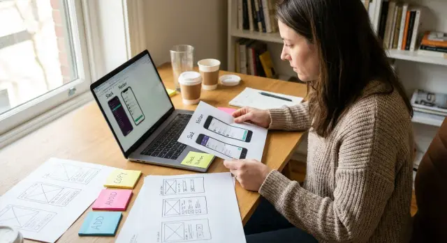
Label each screen: copy, avoid, or add
A screenshot becomes useful when you label it. Without notes, it turns into vague inspiration, and vague inspiration usually leads to vague product decisions.
A practical system uses three labels:
- Copy for patterns that already solve a problem well
- Avoid for anything confusing, slow, or distracting
- Add for gaps you notice while comparing several tools
The key is to label the pattern, not the whole app. One product may have a great onboarding flow but a messy dashboard. Another may handle search well but hide important actions. Treat each screen as a collection of choices, not a full template.
Imagine you're reviewing three project management apps. On one screenshot, the task list uses clear status badges and a visible due date. That's a Copy note. On another, the main action button is buried in menus. That's an Avoid note. Then you notice that none of the apps gives new users a quick summary of what to do first. That becomes an Add note for your version.
Keep every note attached to the screenshot itself. Don't throw observations into a separate document and hope you'll match them later. When notes sit beside the image, the reason stays clear. You can point to one button, one form, or one layout block and say exactly what worked or failed.
Short notes are enough:
- Copy: sticky save button at the bottom of the form
- Avoid: too many filters shown at once
- Add: simple empty state with a next step for first-time users
If you're building through chat in Koder.ai, these labels also make prompting easier. Instead of saying "make it modern," you can say "copy this card layout, avoid this crowded menu, and add a first-run checklist." That gives the builder something concrete to work from.
Turn screenshots into simple requirements
A screenshot only becomes useful when you turn it into a clear instruction. The easiest way to do that is to describe the screen from the user's point of view, not the designer's. Start with one question: what is the user trying to get done here?
If the screen is a signup page, the goal might be to create an account in under a minute. If it's a dashboard, the goal might be to check progress quickly and choose the next step. That keeps your notes focused and stops you from writing vague comments like "make it clean" or "similar to this app."
Then write down what the user notices first when the screen opens. Usually that's the page title, a short message, a key number, or the most visible button. That first impression matters because it shapes what the user does next.
After that, name the main action on the screen. Keep it short and direct:
- User sees a list of saved projects and a clear "New Project" button
- User can tap a project card to open details
- User can search by project name from the top bar
Now add what happens after the tap or click. This is where a screenshot turns into a usable requirement instead of a visual reference. For example: "When the user taps New Project, open a short form with name, type, and save button. After saving, show the new project in the list."
Only include edge cases that matter right now. If something could block the user, note it. If it's a rare detail, save it for later. A simple example:
"If the form is submitted with no project name, show a short error under the field and keep the user on the same screen."
That is how you plan an app with screenshots without getting stuck in design language. You're turning inspiration into behavior, one screen at a time.
Write feature notes your team can actually use
Use Screenshots To Build
Turn copy, avoid, and add notes into a clear first version in Koder.ai.
A screenshot helps, but nobody can build from a picture alone. The next step is to turn each idea into a short note that explains what the feature does in plain language.
The easiest method is one card or one note per feature. That keeps decisions small and easy to review. If you try to describe five ideas in one note, details get mixed together and people make different assumptions.
Give each note a name that anyone can understand at a glance. Skip labels like "engagement flow" or "user interaction module." Simple names such as "Save draft," "Share report," or "Reset password" are much clearer.
A simple structure that works
For each feature note, write four parts:
- Feature name
- Trigger: what starts it
- Action: what the app does
- Result: what the user sees or gets
For example, if you notice a useful checkout pattern, the note could say: "Guest checkout." Trigger: user taps Buy Now without an account. Action: app asks for shipping and payment details. Result: the order is placed and the user sees a confirmation screen.
After that, add only the rules people need to understand the feature. Keep it light. The goal is not to write a legal document. The goal is to remove confusion.
Useful rules often cover who can use the feature, which fields are required, what happens if something fails, and any clear limits such as file size or number of items. If a rule doesn't change how the feature works, leave it out for now.
A good feature note should let a designer, founder, or developer answer the same basic question: what happens, when does it happen, and what should the user expect? If everyone reads the note and gives the same answer, it's clear enough to move forward.
Spot the missing features worth adding
When you compare screenshots from a few similar apps, pay attention to what appears in all of them. If every tool has search, filters, saved items, or a clear way to go back, that's a clue. Users expect those basics even if they never ask for them directly.
The more useful signal often comes from what is missing. Look for places where a screen seems pretty but hard to use. Maybe there's no empty state, no error message, no way to edit something later, or no clear next step after a task is done. Those gaps create friction fast.
A simple review method is to ask two questions for each screen: what helps the user move forward, and what might make them stop? That turns visual inspiration into product planning.
Imagine three booking apps. All of them show available times, but only one lets the user reschedule without contacting support. That feature may not look exciting in a screenshot, but it solves a real problem. It's often smarter to add that kind of missing basic than a flashy extra like custom themes or animated transitions.
Use a short priority split so your notes stay clear:
- Must-have: needed for the app to work without frustration
- Should-have: very useful, but not essential on day one
- Nice-to-have: helpful later if time and budget allow
- Not now: interesting ideas that can wait
This helps you separate real needs from features that only look good on a mood board. The goal is not to copy every feature you see. The goal is to spot the gaps that matter most for your users.
A simple rule helps here: add missing basics before adding extras. If users can't recover a password, save progress, confirm an action, or understand what happened after they tap a button, the app will feel unfinished no matter how polished it looks.
A simple example from three existing apps
Plan Before You Build
Use planning mode to turn screenshot notes into a clearer app outline.
Imagine you want to build a small appointment booking app for a solo salon owner. The app only needs to do a few things well: show open time slots, let customers book, and send a reminder they can confirm with one tap.
This is a good kind of project to plan with screenshots because the goal is narrow. You're not copying whole apps. You're pulling out patterns that solve real problems.
You collect three screenshots from existing tools.
- The first app has a strong calendar screen. You mark Copy next to large time slots, clear day labels, and a simple color change between available and booked times. You mark Avoid next to tiny text and extra filters that make the page feel busy.
- The second app handles reminders well. You mark Copy next to a short confirmation message, a clear appointment time, and an easy confirm button. You mark Avoid next to a long message that hides the main action.
- The third app shows booking details after a customer has scheduled. You mark Add next to a small notes field for things like "first visit" or "needs extra time," because that is missing from the other two.
From screenshots to a first feature list
Now the notes become requirements. Instead of saying "make it like these apps," you can write down what the product actually needs.
- Calendar view with open and booked slots
- Simple booking form with service, date, and time
- Reminder message sent before the appointment
- One-tap confirm or reschedule action
- Optional customer note for special requests
That is already enough for a first version. A realistic flow might be: Sara books a haircut for Friday at 3:00, gets a reminder on Thursday, taps confirm, and leaves a note saying she wants extra time for styling.
This is why screenshots are useful. They turn vague inspiration into feature planning that a designer, developer, or a build platform can actually work from.
Common mistakes that waste time
The biggest trap is copying what looks good without asking why it exists. A clean screen may solve a very specific problem for that product, audience, or business model. If you copy it blindly, you can end up with a feature that looks polished but doesn't help your users.
A common example is taking a home screen from a social app and dropping that same pattern into a booking tool or CRM. The layout may feel familiar, but the user is trying to do a different job. Good planning starts with purpose, not style.
Another time-waster is mixing ideas from too many products into one flow. One app has a nice dashboard, another has smart filters, and a third has a slick checkout. Put all three together without a clear path and the result usually feels crowded.
This happens when teams save screenshots only for visual inspiration. They collect buttons, cards, and menus, but they don't write down the user action behind each screen. If you can't say what the person is trying to do on that screen, the screenshot is not useful yet.
Teams also lose time by planning edge cases too early. It's fine to note empty states, errors, or admin controls, but not before the basic flow works. First make sure a new user can complete the main task from start to finish.
One more mistake is treating a design preference like a user need. Saying "I want tab bars like this" is not the same as saying "users need to switch between these three areas quickly." The second version gives you something real to test.
A quick filter helps before you keep any screenshot:
- What job is the user doing here?
- Why does this pattern help that job?
- Would this still make sense in my app's flow?
If the answer is unclear, pause before adding it to the plan. A saved screenshot should lead to a better decision, not just a prettier mockup.
Quick checklist before you start building
Skip Vague Requirements
Use concrete prompts from your screenshots instead of broad design terms.
Before you move from screenshots to a real build plan, do one last pass. The goal is simple: make sure your notes are clear enough that someone else could understand the product without hearing the full story from you.
Start with the purpose of each screen. If a stranger looks at a screen and can't tell what they're supposed to do there, the screen isn't ready. A dashboard should help someone check status, a form should help them submit something, and a settings page should help them change a choice. If the goal is fuzzy, fix that before anything gets built.
Use this final check:
- Can someone describe the job of each screen in one sentence?
- Does every feature support a real user task, not just a cool idea?
- Did you clearly mark what to copy, what to avoid, and what to add?
- Did you remove features that are only nice to have in version one?
- Could your notes turn into a first build plan without a long meeting?
This is also the moment to cut scope. Early plans get messy when every screenshot turns into a feature request. If something doesn't help a user finish a core task, move it to a later version. That keeps the first release smaller, cheaper, and easier to test.
A quick example makes this clear. Imagine you saved three screenshots from booking apps. One has a calendar you want to copy, one has a checkout flow you want to avoid, and one is missing a simple confirmation screen you want to add. If those labels are clear, your product team can act on them quickly.
Next steps: move from inspiration to a build plan
Once your notes are clear enough to support decisions, stop collecting inspiration and start writing a short product brief.
Keep it simple. Say who the app is for, the problem it solves, and the main result the user should get. Then list the few screens that matter most for version one.
Next, sketch the first user flow from start to finish. Pick one path that represents the core value of the app, such as sign up, create something, review it, and share it. This helps you place each copied pattern in context and spot what's still missing, like an empty state, a loading step, or a confirmation screen.
A useful brief should answer four questions:
- Who is the main user?
- What is the one job they need done?
- Which screens are required for the first version?
- What will wait until later?
That last question is where many projects go off track. Choose the smallest version you can test with real users. If people can complete the main task without help, you have a solid starting point. Extra features can come later.
Keep your feature notes plain and specific. Instead of writing "smart dashboard" or "advanced workspace," write what the user can actually do: create a task, upload a file, approve a request, or send a message. Clear notes save time because they are easier to design, build, and review.
If you're using Koder.ai, labeled screenshots and simple flow notes can translate well into prompts for a first version. Since the platform supports web and mobile app creation through chat, it works best when your instructions are concrete and scoped.
Once you have a short brief, one complete user flow, and a small version to test, inspiration becomes a real build plan.