Aug 09, 2025·8 min
Product Catalog Websites: Templates, Pages, and Checklist
Build a product catalog website faster with the right template, essential pages, and a step-by-step setup checklist for content, SEO, and launch.
Build a product catalog website faster with the right template, essential pages, and a step-by-step setup checklist for content, SEO, and launch.
A product catalog website is built to help people browse and decide. Some catalogs are browse-first (the main “conversion” is an inquiry or quote request). Others are checkout-first (an online store where purchasing is the primary action). Knowing which one you’re building changes everything—from page layout to what data you must collect.
Browse-first catalogs focus on clarity and confidence: clean categories, strong product detail pages, easy comparison, and obvious next steps like “Request a quote” or “Talk to sales.” Pricing can be hidden, tiered, or shown as “starting from.”
Checkout-first catalogs still need browsing features, but they also require cart, taxes/shipping rules, payments, inventory, and customer accounts. If you’re not ready for that operational load, start browse-first and add ordering later.
Catalog-style sites work especially well for:
A catalog site should guide visitors toward a clear outcome. Common goals include:
When these goals are defined, choosing from catalog website templates becomes simpler: you’ll know whether you need heavy filtering, quote forms, dealer locators, or a full checkout.
Most catalog delays are content delays. Before building, list what you already have and what’s missing:
With these inputs, you can create consistent product listing pages and product detail pages that are easy to maintain as the catalog grows.
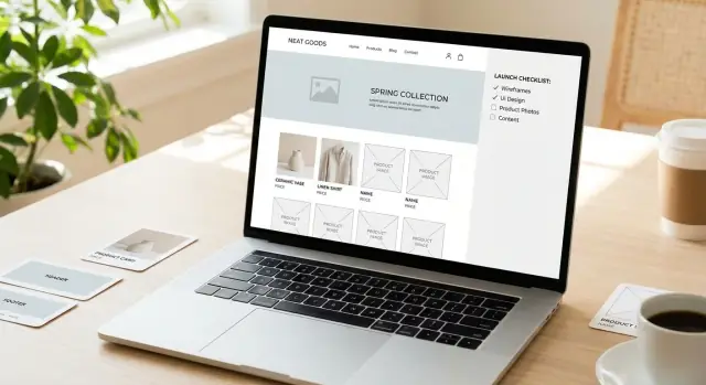
Your template choice sets the ceiling for how easy (or painful) it will be to maintain your product catalog website. Before you fall in love with visuals, decide what you’re actually buying: a starting point that supports catalog needs today and won’t trap you six months from now.
Most teams end up in one of these paths:
If you’re not sure, start with a template and validate your catalog structure and content first—you can always upgrade later.
If you want the speed of a template but expect to evolve into a more custom experience, a vibe-coding platform like Koder.ai can help you prototype (and iterate on) a catalog flow through a chat interface—then export source code when you’re ready to take it further.
Look for these essentials before you buy or commit:
If the template demo doesn’t show a realistic catalog—long lists, multiple categories, and a mix of product types—assume you’ll be the first to discover its limits.
Be cautious if you see any of these signs:
Ask upfront: will your catalog expand into more categories, variants (size/color/model), or thousands of items? Choose a template that supports pagination, consistent cards, and reusable sections.
Finally, decide what must be editable by non-technical staff: product descriptions, prices (if shown), spec tables, PDFs, FAQs, and banners. If editing requires code or a developer ticket each time, the template is costing you more than it saves.
A catalog website is easiest to build (and easiest to use) when the structure is settled before anyone picks colors, templates, or page layouts. Navigation problems usually start as “small” decisions—like inconsistent category names or unclear URLs—that snowball as the catalog grows.
Start with a simple tree and make sure it matches how customers shop:
Keep it practical. If a category will only ever have 3–5 items, it may not need its own level. If it will have 200 items, it probably needs subcategories and filters.
Decide a single URL pattern that mirrors your hierarchy and stick to it. This improves trust and makes the site feel predictable.
Home > Lighting > Pendant Lights > Luna Pendant
/lighting/pendant-lights/luna-pendant
If you later rename a category, plan how you’ll redirect old URLs so you don’t break bookmarks and search results.
Think in three navigation layers:
Cross-links matter because customers rarely browse in a perfect straight line. If someone lands on one product, give them clear paths to the most relevant alternatives.
A good rule is: a visitor should reach most products in 3–4 clicks from the homepage. If it’s taking 6–7 clicks, your hierarchy is likely too deep or your menu isn’t doing enough work.
Set simple rules early:
These rules keep menus clean, prevent duplicates (“Pendant Light” vs “Pendant Lights”), and make on-site search and filters behave more predictably.
A catalog site works best when visitors can answer three questions quickly: “Do you sell what I need?”, “Can I compare options?”, and “How do I get a quote or buy?” The pages below cover those needs without bloating your menu.
Your homepage should make your value proposition obvious in the first screen, then help people jump into the catalog.
Include:
Listing pages should help visitors narrow down options without friction.
Focus on:
A strong product detail page reduces back-and-forth emails and speeds up inquiries.
Include:
Visitors often check these before reaching out. Add credibility and remove uncertainty:
Even catalog sites need “what happens next” clarity.
Depending on your model, publish FAQs, shipping/returns, warranty details, and documentation—then link to them from product pages so customers don’t have to hunt.
A good product page is consistent. When every item follows the same pattern, people can scan faster, compare options, and confidently take the next step.
Start with a repeatable structure that works for simple and complex products.
1) Product title
Use the real product name plus the differentiator people search for (type, series, or model). Example: “ACME 2000 Pressure Regulator (Stainless Steel)”.
2) One-paragraph summary
In 2–4 sentences, explain what it is, who it’s for, and the main benefit. This is the text most visitors read before deciding whether to scroll.
3) Key specs (quick-scan block)
Show 5–10 essential specs near the top (not buried in a PDF): dimensions, materials, capacity, voltage, pressure range, standards, warranty—whatever drives selection.
4) Long description
Use short paragraphs and plain language. Answer: what it does, where it’s used, what makes it different, and any constraints (environment, installation, compliance).
Variants are where catalog sites often get messy. Pick one approach and apply it consistently:
Whichever you choose, make it obvious:
Every product detail page should have a primary next step. Common CTAs for a product catalog website:
Keep the CTA visible near the top and repeat it after the long description. If you use forms, ask only for what you need to follow up.
Put technical files on the product page—not only on a “Resources” page. Typical downloads include datasheets, manuals, compliance certificates, and CAD files.
Label files clearly (version/date), and note what variant they apply to.
Add a small “Related” section to improve browsing and help people build a complete solution:
This improves discovery and reduces support questions—especially when someone lands directly on a product page from search.
Good media does more than “look nice”—it helps people confirm they’ve found the right product quickly, and it reduces back-and-forth questions. The goal is consistency and clarity, so every product feels like it belongs in the same catalog.
Set standards early and apply them everywhere:
A gallery should tell a quick story:
Keep galleries tight. If you have 12 similar shots, visitors won’t know what matters.
Alt text is for accessibility (and it can support SEO), but it should be written for humans.
Use video when it answers questions a photo can’t:
Keep videos short (often 15–60 seconds is enough), add captions, and make sure the thumbnail works as a standalone image.
Media gets hard to manage when your catalog grows. Decide on a simple system:
sku1234_black_front.jpg, sku1234_black_detail-cap.jpg.v1, v2 only when necessary; otherwise replace files to avoid duplicates.These guidelines make updates faster, improve product listing consistency, and keep your catalog maintainable over time.
A catalog succeeds when people can narrow down options quickly and feel confident they didn’t miss the “right” item. Search, filters, and sorting work best when they’re based on real product data—not wishful UI.
Start with the filters buyers expect for your category, then add only what you can support consistently:
If you sell B2B or technical products, “material” might be “voltage,” “compatibility,” or “certification”—the principle is the same: filters should reflect real decision criteria.
Every filter you add creates a promise: “this will help you find something.” If the data behind it is incomplete or inconsistent, it breaks trust.
Keep filters tied to clean attributes you maintain for every product. Hide or disable filters that would return almost nothing, and don’t show options that have zero matching items.
Catalog search should do more than match keywords.
Define a default sort that matches the majority goal:
Make the current sort obvious, and keep it sticky as users paginate.
Pagination is easier to navigate and share. Infinite scroll can work, but make sure results still create indexable, linkable pages.
If you use filters and sorting, ensure URLs update (so a filtered view can be bookmarked) and avoid creating thousands of low-value combinations. When in doubt, keep filtered pages crawlable only when they’re genuinely useful, and link users back to the main category pages (see /blog/catalog-structure-and-navigation).
SEO for a product catalog website is less about “tricks” and more about making each page clearly about one thing—and easy for people (and search engines) to understand.
Start with consistent patterns:
Category pages often fail when they’re just grids of products. Add a short, unique intro (2–5 sentences) that explains what the category includes, who it’s for, and how to choose.
Be careful with duplicate category variations (for example, “Blue Widgets,” “Widgets in Blue,” and “Widgets > Color: Blue”). If filter combinations create lots of near-identical URLs, decide which ones should be indexable and which ones should not.
Each product detail page should have:
If you can, implement:
If a category has too few products or no real purpose, either merge it into a stronger category or add helpful content (buyer guidance, sizing info, common use cases) so the page earns its place.
A catalog can look great and still fail if it’s slow, hard to use on a phone, or feels unsafe. These essentials keep shoppers comfortable enough to browse, compare, and contact you.
Catalog pages often load dozens of images and scripts—small delays add up.
A practical rule: category pages should remain usable before every image finishes loading.
Many users will scan your catalog on a phone, even if they buy later on desktop. Make the “compare and decide” tasks easy:
Accessibility improvements often improve usability for everyone:
Trust is built with small signals:
Test like a customer who’s in a hurry: check for broken links, confirm useful 404 handling (with search and top categories), and set up redirects for renamed categories or discontinued products so bookmarks and search results don’t dead-end.
If your catalog site doesn’t track actions and capture leads, it’s mostly a brochure. The goal is to make it easy for interested visitors to raise their hand—and to measure which pages and products actually do the work.
Start by writing down the actions that signal real intent. Common catalog conversions include:
Choose 1–2 “primary” conversions (e.g., quote request, call) and a few “micro” conversions (e.g., download, email click). This keeps reporting clear.
Install analytics early so you can test events while the site is still in staging. At minimum, track:
Create goals for primary conversions so you can compare performance by channel (organic search, paid, referrals) and by page type (category vs. product detail).
Don’t rely on a single “Contact” page. Add lightweight capture points where decisions happen:
Make forms short. If you need more details, use a second step or follow up.
Use testimonials, certifications, and short case studies to reduce doubt near CTAs. Keep proof specific (industry, outcome, compliance standard) and avoid overwhelming product pages with long stories.
Once you have enough traffic, test one change at a time:
A catalog site often “looks done” before it’s actually ready. Use this checklist to catch the unglamorous issues that hurt findability, trust, and day‑one performance.
If you’re iterating quickly, prioritize a workflow that supports snapshots and rollback. (For example, Koder.ai includes snapshot/rollback and source code export, which can reduce the risk of shipping catalog changes frequently.)
Define: who can add/edit products, how often updates happen (weekly/monthly), and what requires approval (pricing, discontinued items, new categories). Keep a simple change log so future issues are traceable.
A product catalog website helps people browse, compare, and decide—even if they can’t buy instantly.
Pick the model first, because it changes the pages, data you need, and what “conversion” means.
Start browse-first if you’re not ready to support the operational complexity of ecommerce.
Browse-first is a better fit when:
You can still prepare for ecommerce later by keeping clean SKUs, attributes, and consistent product pages.
Prioritize structure and maintainability over aesthetics. Look for:
If a theme demo doesn’t show a realistic, large catalog, assume you’ll hit limits quickly.
Common issues that make catalogs painful to maintain:
If entering product content feels “improvised,” your catalog data will become inconsistent fast.
Use a hierarchy you can apply everywhere (menu, URLs, breadcrumbs, filters), such as:
Keep it practical:
Also set naming rules early (plural category names, consistent product title format) to prevent duplicates and messy search behavior.
At minimum, most catalog sites need:
Use a repeatable product layout so visitors can scan and compare quickly:
Choose one approach and apply it consistently:
Make the selection unambiguous:
Start with attributes buyers actually use, and only add what you can maintain consistently.
Useful patterns include:
Also ensure filtered views update the URL so they can be bookmarked, and avoid creating thousands of thin, near-duplicate pages.
Track real intent and make lead capture happen where decisions are made.
Set up:
Then place CTAs on product and category pages (not only on a Contact page) and keep forms short—ask only for what you need to follow up.
These pages answer the core visitor questions: “Do you sell it?”, “How do I choose?”, “What do I do next?”
Consistency beats creativity on product pages.