Aug 10, 2025·8 min
Build a Professional Nail Salon Website With Booking & Gallery
Learn how to create a professional nail salon website with online booking and a photo gallery. Get a clear checklist for pages, content, SEO, and launch.
Learn how to create a professional nail salon website with online booking and a photo gallery. Get a clear checklist for pages, content, SEO, and launch.
Before you pick a template or upload photos, decide what your nail salon website is for. A clear goal keeps the design simple and helps you choose content that actually leads to appointments.
Write down 2–3 outcomes you want the site to deliver in the next 60–90 days. For example:
These goals will guide what you highlight on the home page, how you arrange your services menu, and which calls-to-action you repeat.
Different clients scan your site differently. List your primary audience segments and what matters to them:
Once you know your targets, you can plan content that answers their questions quickly (price range, time, durability, design options).
Pick 1–2 main actions and make them easy to spot across the site:
If everything is equally important, nothing stands out.
Be realistic about time and quality. Many salons do best with a hybrid approach:
A simple plan—goals, audience, key actions, and ownership—will make every next step faster and cheaper.
Your domain and platform decisions affect everything that follows—from how easy your site is to update to how confident clients feel when they’re booking.
Choose a domain name that matches your salon name as closely as possible and is easy to spell after hearing it once. Short is better, and avoid hyphens, extra words, or clever spellings that clients might mistype.
If your exact name isn’t available, try small, clear additions like your city (e.g., YourSalonAustin.com) instead of changing the brand name.
A professional email (like hello@yourdomain) builds trust instantly—especially when clients are sharing contact details or asking about policies. You can still forward it to Gmail if you prefer, but having your own domain-based email looks established and keeps your messages organized.
Decide between a website builder and a custom build based on how quickly you need to launch and how hands-on you want to be:
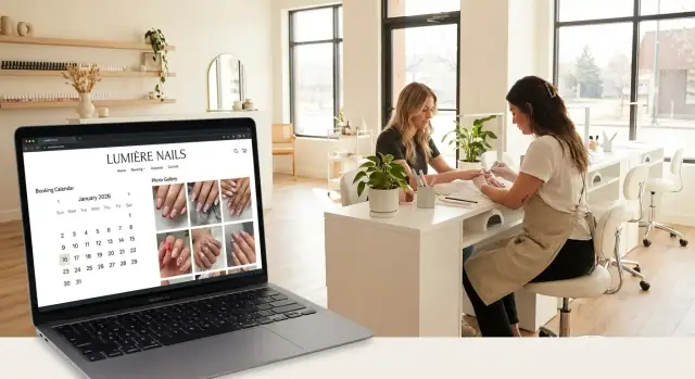
If online booking for salons is essential (it usually is), make sure your platform supports your booking calendar and lets clients book easily on mobile.
If you want speed without being boxed into a rigid template, a vibe-coding approach can be a strong middle ground. For example, Koder.ai lets you describe your nail salon website in chat (pages, booking flow, gallery layout, policies, SEO structure) and generate a full web app you can host, connect to a custom domain, and later export the source code if needed. Features like snapshots and rollback are also useful when you want to update pricing or policies without risking a broken booking page.
Before you choose colors or fonts, outline a basic site structure. A clear sitemap prevents “where do I put this?” confusion later and keeps pages easy to find.
Start with:
This structure sets you up for a mobile-friendly salon site that feels clean, premium, and effortless to navigate.
A great nail salon website doesn’t need dozens of pages—it needs the right ones, arranged so clients can get answers and book in seconds. Think “browse → trust → book.”
Home should quickly show what you do and who you serve. Include a clear “Book Now” button, a few signature services (e.g., gel manicure, nail art, pedicure), and a small preview of your best work.
Services is where clients decide whether you’re the right fit. Create a clean nail salon pricing menu that’s easy to scan. If you have a dedicated manicure service page, keep descriptions short, list add-ons, and show starting prices.
Booking should be dedicated to scheduling—no clutter. If you use a booking calendar, make it the main focus and minimize distractions so clients finish the appointment.
Gallery is your proof. A well-organized nail gallery website (short categories like “Natural,” “Gel,” “Acrylic,” “Art”) helps clients choose a style and feel confident booking.
About + Contact builds trust and removes friction. Add your location, hours, parking details, and accessibility notes (e.g., step-free entry, elevator, wheelchair-friendly stations if applicable). Your salon contact page should include tap-to-call, tap-to-map, and a simple contact form.
If they match your business, add:
Clients look for safety and professionalism. Mention hygiene practices, licensed technicians, and the products you use if you’re confident you can stand behind those claims.
Tip: Keep these pages visible in your main navigation on a mobile-friendly salon site so users don’t hunt for them.
Most clients will discover your nail salon website on a phone—and many will book within minutes if everything feels polished and easy. A premium look isn’t about flashy effects; it’s about clarity, consistency, and confidence.
Design the mobile version first: big tap targets, generous spacing, and simple sections that scroll naturally. Keep your home page focused on what a new visitor needs to decide fast: your style, your services, and how to book.
Aim for:
Use clear, consistent buttons—especially on high-traffic pages like Home, Services, Gallery, and Contact.
These should be visible on every key page, not buried in a menu. If your platform allows it, add a sticky header or quick actions bar so booking and directions are always one tap away.
Luxury feels calm and effortless. Choose one or two readable fonts and stick with them. Avoid thin, tiny text—especially for pricing and policies.
Use consistent button styles, icons, and photo shapes. A simple rule: if something looks “off” on mobile, remove it or simplify it. Smooth, predictable navigation always feels more expensive than extra effects.
Online booking should feel like texting your salon: quick, clear, and done in under a minute. If clients have to create an account, answer ten questions, or hunt for the “Book” button, they’ll bounce—and book somewhere else.
Aim for a straight path that matches how people decide:
“Optional” is the key word. Some clients care about a specific tech; others just want the next available appointment. Let them skip steps without guilt.
Every extra field increases drop-off. Collect only what you truly need to confirm the appointment:
If you want marketing consent, keep it as a single checkbox—don’t block the booking.
A booking calendar only helps if it reflects real availability. Configure:
If you offer add-ons (chrome, nail art, repairs), make sure they extend timing appropriately or show a “request” note that you can confirm.
Use your booking system’s automated messages if available: instant confirmation, a reminder the day before, and another a few hours prior. Include the essentials: service, time, address, and your change/cancellation rules.
Add booking in two high-visibility places: your homepage hero button and the main navigation. Keep the label direct (“Book Online”), and link to a dedicated /booking page (or the embedded calendar) so it’s always one click away.
Your services page is where most visitors decide whether to book—or keep scrolling. The goal is to make options easy to understand at a glance, with pricing and timing that prevents “what do I choose?” hesitation.
Skip internal jargon and write services the way clients ask for them. Clear names reduce back-and-forth messages and wrong bookings.
Examples that work well:
If you offer variations (e.g., “builder gel,” “hard gel,” “structured manicure”), include a short one-line description under the main label so clients know what’s best for them.
Display a starting price or price range, then list what the client gets. This makes pricing feel fair and reduces surprises at checkout.
For example:
If you charge extra for removal, repairs, or length upgrades, call it out right here.
Time is just as important as price. Add a realistic duration next to each service (e.g., 45 min, 75 min, 2 hrs). This helps clients choose correctly and keeps your calendar running on time.
Add-ons make it easy for clients to customize while increasing average ticket. Keep them scannable and specific:
Each service should have a clear “Book now” button that jumps directly into your booking flow with the correct service selected. If you have a dedicated booking page, link it consistently (e.g., /booking) and avoid making clients hunt for the next step.
A great gallery doesn’t just “show your work”—it helps a client choose a style quickly and feel confident clicking Book. Treat it like your visual menu.
Skip mixed lighting and cluttered backgrounds. Aim for a simple, repeatable setup: same corner of the salon, similar distance from the nails, clean props, and focused close-ups. Consistency makes your work look more premium and helps visitors compare styles without distraction.
Make browsing effortless by grouping sets into clear categories such as Gel, Acrylic, Short nails, Nail art, and Pedicure results. If someone comes in wanting “short natural gel,” they should find inspiration in seconds—not scroll through everything.
A photo is stronger with a short caption that adds context:
This sets expectations and reduces back-and-forth messages.
Large image files can slow your site and cause people to leave before they ever see your best work. Export images at a web-friendly size, use modern formats when possible, and compress them so pages load quickly without looking blurry.
Turn inspiration into action. For each gallery item, include a clear “Book this look” button that links to /booking. If your booking form allows it, pre-select the matching service (or add a note like “Request this photo”). The goal is simple: less thinking, more confirmed appointments.
People don’t book nail appointments purely on photos—they book because they feel safe, understood, and confident you’ll deliver. Your About, Team, and Reviews content should answer one question: “What will my experience be like?”
Keep it personal, but practical. Share your salon name, a short origin story, and what clients can expect when they walk in—your vibe, your cleanliness standards, and how you handle consultations.
A simple structure works best:
If you have multiple technicians and you can keep staff info current, a Team section can boost conversions. Add one friendly photo per tech and a few lines: specialties (e.g., Russian manicure, builder gel, intricate art), preferred styles, and booking tips.
If your team changes often, skip detailed bios and use a simpler “Meet the Studio” block on the About page.
Add a few short, recent reviews with permission. Include the client’s first name/initial and the service type when possible (“Gel overlay + art”). If you’d rather not manage testimonials, link out to your main review platforms and keep them visible on your salon contact page.
Mention relevant certifications, product brands you use, and hygiene routines (sealed tools, sanitation steps, patch tests when appropriate). Keep it factual and easy to scan.
Trust builders won’t replace great work—but they’ll help the right clients choose you faster.
People don’t hunt for details—they scan. If your address, hours, or phone number are buried, you’ll lose bookings to the salon that makes it effortless. Treat contact info like a “sticky note” clients can reach from any page.
Your Contact page should be complete, but the real win is repeating key details in your footer site-wide.
Include:
If you have multiple locations, list them clearly with separate hours and map links so clients don’t arrive at the wrong place.
Most clients will find you on their phone—often while walking around or sitting in a car. Add tap-friendly actions that work instantly:
Also, keep the contact layout simple: large text, big buttons, and no tiny links that are hard to tap.
Online booking should handle appointments. Your contact form should be for everything else.
Keep it short: name, email/phone, message. Add a note like: “For appointments, please use /booking so you can choose your service and time.” This reduces double-handling and missed requests.
Policies build trust when they’re written like a friendly checklist—not a contract.
When clients know what to expect, they book with confidence—and show up prepared.
Local SEO is what helps your nail salon website show up when someone searches “nails near me” or “gel manicure in [area].” The goal is simple: make it obvious to Google (and clients) where you are, what you offer, and why you’re a great choice.
Add local keywords where they fit—without stuffing them everywhere. For example, your homepage can mention “nail salon in Downtown Austin,” while your services page can include phrases like “gel manicure in South Congress.” Keep it conversational and specific.
Give key pages unique titles and meta descriptions so search results look relevant and clickable.
Your nail gallery website is full of search opportunities. Add image alt text that describes what’s in the photo, like “almond-shaped nude gel manicure with gold foil” or “short acrylic French tips with chrome finish.” This helps accessibility and can support search visibility.
Create (or claim) your Google Business Profile and ensure your NAP—name, address, and phone—matches exactly on your site, especially on your /contact page and footer. Even small differences (like “St.” vs “Street”) can cause confusion.
Write a couple of short articles that answer real questions (and link to your services and booking).
Examples:
Internal links help visitors find what they need—and help search engines understand your site structure.
Before you share your new nail salon website, do a “client walk-through.” Pretend you’re booking an appointment from your phone with one hand and zero patience. If anything feels confusing, it will cost you bookings.
Test on multiple phones and browsers (iPhone + Android, Safari + Chrome). Focus on the actions that matter:
Slow pages lose clients fast. Keep your gallery and homepage lean:
Add basic analytics so you can see what’s working:
Even simple data helps you improve your manicure service page, promotions, and navigation.
Enable SSL, platform updates, spam protection for forms, and automatic backups (most hosts/site builders provide these).
Create a monthly routine: update your nail salon pricing menu, hours/holiday closures, policies, and featured photos. A fresh gallery and accurate info builds trust—and saves you from awkward “your website says…” conversations.
If you’re building on a platform like Koder.ai, features such as one-click deployment plus snapshots/rollback can make ongoing maintenance less stressful—especially when you’re changing prices, reorganizing services, or testing a new booking flow.
A new site won’t help much if clients don’t see it—or if they see it once and never return. The goal is simple: make your nail salon website the fastest path from “I want my nails done” to a confirmed appointment.
Update your Instagram and TikTok bio link to your booking page (not the homepage). If you have online booking for salons, use the most direct URL you can, like /booking.
Pin a post or video that clearly says “Book now” and shows what happens after they tap (choose a service → pick a time → confirmation). The fewer steps people imagine, the more likely they are to book.
After each appointment, send a quick follow-up text with a link to your gallery, such as /gallery. Invite clients to save their look for inspiration next time.
This is where a nail gallery website becomes more than pretty photos—it becomes your repeat-visit engine. If your gallery includes names like “Chrome French” or “Holiday Red Gel,” clients can easily reference what they want again.
Place simple QR codes at the front desk, mirrors, and after-care cards:
This helps even walk-in clients convert into scheduled regulars—especially if your booking calendar shows real-time availability.
If you can truly honor it, run a small launch offer with a firm end date (e.g., “$10 off Gel Manicure—ends Sunday”). Keep the rules simple and display it on the site and socials. A complicated promo creates hesitation.
Some visitors won’t be ready to book immediately—they’re comparing options. Give them a clear next click:
Done well, your mobile-friendly salon site becomes the hub: socials bring attention, the gallery builds desire, pricing answers questions, and booking converts.
Start with 2–3 measurable outcomes for the next 60–90 days, like:
Then design the home page, services layout, and CTAs around those goals.
Focus on quick answers for the clients you want most.
If a visitor can’t find price range, timing, and how to book fast, they’ll leave.
Choose 1–2 primary actions and repeat them everywhere:
Make the primary CTA visible on Home, Services, Gallery, and Contact, and consider a sticky header or quick-actions bar for mobile.
Pick something short, brand-matching, and easy to spell after hearing it once.
Also set up a domain-based email (like hello@yourdomain) to look more established and keep messages organized.
Choose based on how fast you need to launch and how much you want to manage yourself.
Whatever you choose, confirm it supports mobile-friendly online booking and lets you update services, pricing, and photos without friction.
A simple structure covers almost everything most salons need:
This keeps navigation clean on mobile and reduces “where do I find this?” confusion for new clients.
Make it a straight path that mirrors how clients decide:
Collect only what you need (name, phone/email, service). Keep notes optional. Too many steps or required fields increases drop-off and lost bookings.
Use your booking system’s automation to reduce no-shows:
Include essentials in each message: service, time, address, and change/cancellation rules. Make sure your calendar rules match reality (hours, breaks, buffer time, add-on durations).
Make it scannable and transparent:
Where possible, add “Book now” buttons that pre-select the service in your booking flow.
Speed and organization matter as much as photo quality.
Add a clear “Book this look” link/button for each item that routes to /booking (or lets clients reference the photo in notes).