

Push notifications people don't disable: timing and design
Push notifications people don't disable start with the right ask at the right time, plus a clear preference center and messages that feel helpful, not noisy.
Why people disable push notifications
Annoying notifications feel like someone tapping your shoulder all day, then acting surprised when you leave the room. They interrupt, demand attention, and often give nothing back. After a few days of that, people do the simplest thing: silence you.
Most opt-outs happen for straightforward reasons. Messages arrive too often, they aren't relevant, or they show up at the wrong time (late at night, during work, or right after the user already did the thing). Sometimes the content is vague or clickbaity, so users stop trusting it. And if the first notification arrives before the user understands the value of the app, it reads like: "You barely know me, but you want access to my lock screen."
Disabling push is also a way to reduce mental noise. Many people already feel notification fatigue from email, social apps, and group chats. If your app adds even small, random pings, it gets lumped in with the rest and cut off. On mobile, that decision is harsh: once turned off, many users never turn it back on.
The real goal isn't winning permission once. It's keeping permission for months because every message earns its place.
A good notification is easy to define: it's expected, useful, and timely. Expected means the user can guess why they got it. Useful means it helps them do something they already care about. Timely means it arrives when it can help, not just when your system is ready.
The patterns that usually trigger an opt-out are predictable: asking for permission on first launch without a clear reason, sending "We miss you" messages with no personal value, repeating the same reminder after the user ignored it twice, using urgency words for routine updates, and mixing marketing blasts into the same channel as important alerts.
If you treat push like a privilege, users treat it like a benefit. If you treat it like free ad space, users treat it like spam.
What makes someone willing to opt in
People tap "Allow" when they believe notifications will help them, not the app. The easiest way to get push notifications people don't disable is to treat permission as a value exchange: you promise something specific, then you deliver it consistently.
Before you ask for permission, say the promise in plain language. Avoid vague lines like "Stay up to date." Instead, explain what will arrive, why it matters, and what the user can control. A good pre-permission screen answers three things: what you'll send (order status, reminders, price drops, security alerts), how often it will happen (and what "rare" actually means), and how they can change it later (preferences, mute, quiet hours).
Opt-ins go up when notifications match a real goal the user already has. Think in terms of what they're trying to accomplish, not what you want to promote.
People are far more likely to accept notifications for concrete value: savings ("Price dropped"), reminders ("Your appointment is in 2 hours"), updates ("Your delivery is 10 minutes away"), safety ("New sign-in"), or progress ("You hit your weekly goal").
Set expectations early, even if it feels less "salesy." If you send five messages a week, say so. If it's trigger-only (like shipping updates), say that too. Surprises create distrust, and distrust turns into opt-outs.
Show a tiny sample of the value before the system prompt appears. One realistic example can do more than a paragraph of copy:
"Sample notification: Your package is out for delivery - arriving between 3:10 and 3:40 PM."
That one line helps people picture the moment it saves them time, and it signals you're not planning to spam them.
Permission timing that feels natural
Most people don't hate notifications. They hate being asked too early, before they understand what they'll get. Permission timing is often the difference between push notifications people don't disable and push notifications they shut off forever.
A simple rule works: ask right after a user does something that proves interest. When someone saves an item, follows a topic, books an appointment, or finishes a workout, they've shown you what matters to them. That's the moment to offer updates tied to that action.
A reliable pattern is a soft-ask screen before the system permission prompt. Keep it short and specific: what they'll receive, how often, and why it helps. Then add two clear buttons: "Allow notifications" and "Not now." Only show the system prompt if they choose "Allow." That removes the surprise and sets expectations.
Good moments to ask tend to be right after a win (order placed, goal completed), right after they follow or subscribe, right after they save or bookmark, right after they set a reminder or start tracking something, or right after they turn on a feature that needs updates.
Bad moments are when users are busy, anxious, or skeptical. Asking on first launch is a common mistake because there's no trust yet. Asking during signup is also risky because people are trying to get through forms, passwords, and verification.
If they say no, don't punish them and don't keep popping prompts. Recover gracefully. Confirm they can still use the app normally, and surface a quiet option later in settings near the feature it affects. For example: "Get notified when your saved item changes" with a toggle, so the choice feels tied to a real benefit.
Concrete example: a resale app lets users save a search for "size 8 boots." Right after they tap "Save search," a screen says, "Want alerts when new matches appear? We'll send at most 1 per day." That request feels earned because it's attached to something the user just asked for.
Designing a notification preference center
A good preference center is your safety valve. It keeps people from turning notifications off at the system level because they can dial things up or down without feeling trapped.
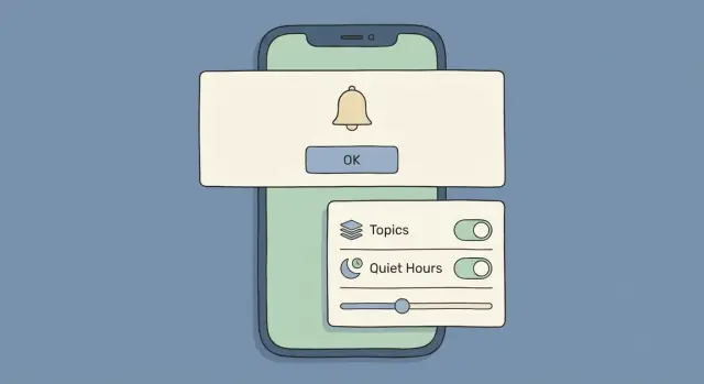
Start with three controls most people understand quickly: topics, frequency, and quiet hours. Topics let them choose what they actually care about. Frequency answers the real question behind many opt-outs: "Why are you messaging me so much?" Quiet hours prevent the fastest path to being disabled: a buzz at the wrong time.
The controls to include (and how to label them)
Keep the choices small and plain. If you offer 20 toggles, people won't manage them, they'll just shut you off.
Aim for a short set like: topic categories (orders, reminders, security, product updates using words users use), frequency options (instant, daily digest, weekly digest), quiet hours (a time window that follows device time), channel choices (push vs email vs in-app alerts), and a pause option (snooze for 24 hours or 7 days).
Defaults matter. Make them helpful but not aggressive. A safe default in many products is: essential alerts on (security or transaction status), marketing-style updates off, and frequency set to digest when it makes sense. If everything is on by default, you're creating notification fatigue on day one.
Where to surface it
Don't hide preferences only in a deep settings menu. Put them where people naturally look when they care.
After key actions, offer a small prompt like: "Want updates about this?" and send them straight to topic and frequency choices. After someone places an order, for instance, let them enable "Order status" push while leaving "Promos" off.
Also make it easy to find later inside Account/Settings, and anywhere a notification is shown (for example, "Manage notifications" near an in-app inbox). If someone feels annoyed, they should find a "pause" or "less often" option in under 10 seconds, instead of reaching for the system toggle.
If you build products with Koder.ai, treat the preference center as a first-class feature, not a footnote. It's cheaper to keep an opt-in than to win it back.
Message design that users trust
People keep notifications on when messages feel like a helpful tap on the shoulder, not a grab for attention. The best push notifications people don't disable are clear about why they arrived and what the person can do next.
Write like a human. Use short, plain words, and put the important detail first. "Your report is ready" beats "New update available." Specific beats clever.
Keep one message to one purpose. If a notification tries to do two things (news plus promo plus reminder), it reads like an ad and trains people to ignore you. If you have more to say, send fewer notifications and let the app handle the rest.
Personalization has to be earned. Base it on something the person clearly did, not what you guessed.
For example, if someone exported source code yesterday, "Export finished. Your ZIP is ready" makes sense. If you send "Build a mobile app today?" to someone who never asked for mobile, it feels random and creepy.
Urgency is fine. Pressure isn't. Real urgency explains the consequence without drama:
- Good: "Payment failed. Update your card to avoid losing access tomorrow."
- Bad: "Last chance! Act now!"
Timing matters more than people think. A useful message at the wrong hour becomes an annoyance. Respect local time, and avoid common sleep hours. For work-related products, try staying inside typical work hours unless it's truly urgent.
A simple template that works
A consistent structure helps users learn to trust your style:
- What happened (1 short sentence)
- Why it matters (optional, 1 short phrase)
- What to do (one clear action)
Example for a product like Koder.ai: "Deployment failed. Check logs to retry." It's direct, it matches an action the user took, and it doesn't pretend everything is urgent.
When messages are specific, expected, and well-timed, users experience notifications as part of the product, not noise.
Step-by-step: plan your notification system
If you want push notifications people don't disable, planning matters as much as copy. A small plan keeps you from sending "whatever feels useful" and accidentally creating fatigue.
1) Make a notification inventory
List every push message you might send, including the obvious ones (order updates, reminders) and the "maybe later" ones (digests, promos). Give each a working name so you can talk about it clearly.
For each notification, write: what it's for, who it helps, and what the user should do after seeing it. If you can't answer those in one sentence, it's a sign it may not be worth sending.
2) Group messages by purpose
Group your inventory into a few human buckets. For many apps, these cover most needs: reminders (something the user asked for or started), updates (status changes they're waiting on), promos (sales, upsells, marketing), safety/account (security alerts, policy changes), and tips/education (only if users clearly want it).
These groups become the backbone of your preference center UX. Users don't want 25 toggles. They want 3 to 6 choices that feel obvious.
3) Decide triggers and limits
For each message, define what triggers it and what limits it. Triggers answer "when is this relevant?" Limits answer "how do we avoid spam?"
A practical set is: a max per day, a max per week, and a quiet window (for example, no pushes at night in the user's local time). Also decide what happens when multiple notifications compete: which one wins, and which ones get dropped.
4) Draft templates and name them like a product
Create a short template for each notification: title, body, and the tap action. Name it like a user would describe it, not like an internal code. "Delivery update" beats "SHIP_STATUS_CHANGED_V2."
That naming discipline pays off when you build opt-in messaging and settings, and when support needs to explain what a user received.
5) QA with real scenarios
Test your plan with real journeys, not single messages in isolation. Walk through a new user (low trust), a returning user (wants fewer surprises), and a power user (high volume, needs control). Include a case where someone opts out of promos but keeps safety alerts, and a case where someone goes inactive for 30 days.
If any scenario produces a burst of pushes, confusing timing, or messages that assume too much, fix the trigger or tighten the limits before you ever ask for permission.
Common mistakes that cause opt-outs
Most people don't hate notifications. They hate surprises, clutter, and messages that feel like they were sent for the company, not for them. The fastest way to lose trust is to treat the opt-in as a one-time win instead of an ongoing relationship.
A common mistake is asking for permission the moment the app opens, before a person has done anything. Without context, the request feels random, so users either deny it or accept and regret it later. A better rule is: earn the first "yes" with a clear benefit right when it matters.
Another trust killer is volume. Many teams send a burst of messages right after someone opts in, trying to "activate" them. That usually creates notification fatigue, and the user's next move is to disable everything. If you must send early messages, keep them few, specific, and tied to actions the user already took.
Vague copy also drives opt-outs. Messages like "Check this out" or "Don't miss this" force people to open the app to learn what they're being interrupted for. If the value is real, say it plainly.
Timing mistakes are just as damaging. If you ignore time zones, you end up buzzing people during meetings, dinner, or sleep. Even one 3 a.m. ping can be enough to turn off all alerts.
Finally, make preferences easy. If the only options are "all" or "nothing," "nothing" wins. People also need a way to pause without hunting through settings.
The patterns behind most opt-outs are consistent: the permission prompt appears too early, there are too many notifications in the first 24 to 72 hours, messages hide the point, sends land at awkward local times, and there's no simple control (pause, quiet hours, topic choices).
Example: a shopping app sends "Big news!" at 7 a.m. local time for three days in a row, with no way to mute promos while keeping order updates. The user disables notifications completely, including the helpful ones.
Quick checks before you send
Before you hit send, pause for 30 seconds. Most opt-outs happen after a message that felt unexpected, unclear, or too frequent.
The 5-second relevance test
Ask one question: would the user be expecting this right now?
A delivery update when an order ships makes sense. A promo the morning after someone already bought the item doesn't. Use a quick checklist:
- Does this match something the user just did (or clearly cares about)?
- Can they understand it from the first line without opening?
- Will it land at a sensible local time and avoid quiet hours?
- Is there a cap on how often this type of message can appear?
- If they dislike it, can they turn off this category in settings?
Then read the message like a stranger would. If the value isn't obvious instantly, rewrite the first line. If it needs a lot of context, it's probably not a push notification.
Timing and control checks that prevent fatigue
Two things quietly drive fatigue: bad timing and no escape hatch. Local time matters more than you think. A 9 a.m. send for you might be 2 a.m. for them, and one rude wake-up can cost you the channel.
Frequency caps are the other guardrail. Decide a ceiling per category (for example, no more than 2 promos per week), then stick to it even when marketing is excited. The moment you break your own rule, users assume it will keep happening.
Finally, confirm the preference center includes this exact category. A quick sanity test: if a user complains, can support tell them exactly where to change it in under 10 seconds? If not, you're sending a message you're not ready to stand behind.
Example: if someone browsed flights, a single price-drop alert is helpful. Three alerts in one day, with no way to mute "price drops," feels like spam even if the deals are real.
A realistic example: earning opt-in without nagging
Imagine a meal planning app. It wants push opt-ins, but it also knows a bad first impression leads to quick disables.
On the first session, the app helps the user first. It lets them search recipes, save favorites, and build a simple weekly plan. No permission pop-up. Instead, it shows a small note like, "You can get reminders later if you want." The user stays focused on the task, not on a system dialog.
The moment the app earns the right to ask is tied to a clear action. After the user saves 3 recipes, it shows a gentle screen (not the OS prompt yet): "Want a reminder when it's time to cook? Choose what you want." If the user taps "Yes," then the app triggers the permission request. If they tap "Not now," the app backs off and keeps working normally.
The next screen is a simple preference center with plain language and sensible defaults. It offers a few choices: meal reminders (for planned dinners), new recipes (weekly digest), and deals (only if the user wants them). Each option explains frequency. For example, "Meal reminders: up to 1 per day on days you planned a meal." "New recipes: once a week." Deals are off by default.
A week later, the results look different from the usual "ask on launch" approach. Fewer people opt in overall, but the ones who do are happier. Sends are lower because the app only pings people who asked for that type of message, at the cadence they chose. That leads to fewer disables and fewer "turn everything off" moments.
This is how you get push notifications people don't disable: connect the permission ask to a win the user already had, and make sure every message feels like something they personally requested.
Measure, improve, and decide next steps
Treat notifications like a product feature: measure what happens, change one thing, and learn fast.
Start by tracking outcomes that tell you whether you're earning trust or burning it. Don't stop at opens. You also need the cost side:
- Opt-in rate (by screen, moment, and user segment)
- Disable rate (after specific notifications and over time)
- Open rate (and downstream actions, not just taps)
- Churn signals (uninstalls, fewer sessions, email unsubscribes)
- Preference edits (who turns categories off vs turning everything off)
Next, review the top offenders. Look for patterns: a certain category, a time window, or a repeated template that precedes disables. Tag every notification with a simple reason label (order update, reminder, promo) so you can answer: "Which messages caused the most opt-outs per 1,000 sends?" Fix those first.
Run small tests instead of big relaunches. Change one variable at a time: ask later (after a clear success moment), rewrite copy to make the benefit specific, cap frequency per category, separate must-know from nice-to-know, and start with fewer categories enabled.
Keep preferences visible and easy to edit. If users can quickly mute one type of message, they're less likely to disable everything. A useful rule: any notification should be editable from the preference center in 2 taps or less.
If you want to move quickly, building and iterating on the permission flow and preference center in Koder.ai (koder.ai) can help you ship changes fast, then export the source code when you're ready to take it further.
FAQ
When is the best time to ask for push notification permission?
Ask after they’ve shown intent.
Good moments are right after a user saves something, follows a topic, places an order, books an appointment, or turns on a feature that needs updates. The ask feels earned because it’s tied to a clear benefit.
What should I say on a pre-permission screen?
A simple pre-permission screen should answer three things:
- What you’ll send (examples: order status, reminders, security alerts)
- How often (be specific, not “rare”)
- How to change it later (preferences, quiet hours, pause)
Then only show the system prompt after they tap “Allow notifications.”
Why do users disable push notifications so quickly?
Don’t treat push like free ad space.
Most people disable notifications because they’re too frequent, too vague, or arrive at bad times. One late-night or irrelevant message can be enough to trigger a full opt-out at the system level.
What controls should a notification preference center include?
Start with the minimum that won’t annoy people:
- Topics (a few clear categories)
- Frequency (instant vs daily/weekly digest)
- Quiet hours (local time)
- Pause/snooze (24 hours / 7 days)
Keep it small. If users see 20 toggles, many will give up and turn everything off.
What are good default notification settings for new users?
A safe default is:
- Essential alerts on (security, transaction/status changes)
- Marketing-style pushes off
- Digest frequency on where it makes sense
If everything is on by default, you’re creating notification fatigue on day one.
How do I write push notifications that users trust?
Use a simple structure:
- What happened (clear and specific)
- Why it matters (optional, short)
- What to do next (one action)
Example: “Deployment failed. Check logs to retry.” Clarity beats cleverness.
Should marketing messages be sent via push notifications?
Separate them.
Keep must-know alerts (security, order status, failures) in a distinct category from promos/marketing. Mixing them trains users to treat every notification as an ad, which raises opt-outs.
How do I prevent notification fatigue from too many sends?
Set limits per category and respect local time.
Practical guardrails include:
- A max per day/week per category
- Quiet hours (no night sends in the user’s time zone)
- A rule for conflicts (which message wins when several trigger)
If you break your own caps, users assume it will keep happening.
What should I do if a user taps “Not now” or denies permission?
Recover gracefully:
- Don’t keep popping prompts.
- Confirm the app still works normally.
- Offer opt-in later near the feature it affects (a clear toggle like “Notify me when my saved item changes”).
Make the next ask feel tied to value, not to your growth goals.
How can I measure whether my notification system is working?
Track more than opens.
Focus on:
- Opt-in rate by screen/moment
- Disable rate after specific messages
- Preference edits (category-off vs all-off)
- Downstream actions after taps
- Churn signals (fewer sessions, uninstalls)
Tag each notification by purpose (reminder, update, promo, safety) so you can find which category causes the most opt-outs and fix that first.