

Product–Market Fit: Early Signs and Why Metrics Mislead
Learn what product–market fit really means, how to spot early signs through customer behavior, and why popular metrics can mislead founders.
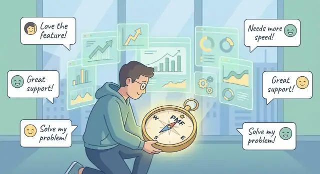
What Product–Market Fit Actually Means
Product–market fit (PMF) isn’t “we launched and users signed up.” It’s not even “revenue is growing.” Founders often confuse growth with fit because growth is visible and easy to chart—while fit is messier, slower to confirm, and can be masked by hype, discounts, or a one-time channel that temporarily works.
PMF is customer pull, not founder push
A simple way to think about PMF: the market pulls the product out of your hands.
That pull shows up when customers:
- Keep using the product without being chased
- Recommend it unprompted
- Feel real pain when it’s unavailable
- Buy again, expand usage, or upgrade without heroic persuasion
If your progress depends on constant pushing—manual onboarding for everyone, heavy incentives, endless “check-in” emails—your product might be useful, but it may not be fitting yet.
A continuum, not a badge
PMF isn’t a trophy you win once. It’s a continuum.
You can have “some fit” in a narrow niche, “better fit” for one use case, or “fragile fit” that breaks when you change pricing or acquisition channels. Early on, the goal isn’t to declare PMF—it’s to steadily increase the percentage of people who get value, come back, and would be genuinely disappointed if you disappeared.
Who this guide is for
This guide is for early-stage teams, indie founders, and small startups trying to answer: “Do we have real traction, or just noisy metrics?” We’ll focus on signals that beat dashboard glow—especially retention, activation, and customer evidence you can’t fake.
Product, Market, and Fit: A Simple Framework
People talk about product–market fit like it’s a single milestone, but it’s easier to understand when you split it into three parts: product, market, and fit.
Product: the promise you actually deliver
Your product isn’t just the app or the features. It’s the value promise a customer experiences: what problem you solve, how reliably you solve it, and what “done” looks like for them.
A calendar tool, for example, might really be “stop missing meetings,” or “make scheduling painless across time zones.” If you can’t say the promise in one sentence, customers probably can’t either.
Market: a specific group with a shared context
“Market” doesn’t mean “everyone with the problem.” It means a specific segment with similar needs, constraints, budgets, and buying triggers.
A product can look like it’s working because a few different groups are trying it—but that’s not one market. A freelancer, a sales team, and a hospital admin may all schedule things, but they buy for different reasons and stick around for different outcomes.
Fit: repeatable value delivery to that segment
Fit is when you can consistently deliver that promise to a defined segment—and do it again and again without heroics.
A helpful way to feel the difference is pull vs push:
- Pull: customers seek you out, referrals happen unprompted, and people are annoyed if they can’t use your product.
- Push: you have to keep forcing attention with ads, discounts, or constant outreach just to maintain usage.
Pull doesn’t mean “no marketing.” It means marketing amplifies demand that already exists instead of manufacturing it.
One niche can have fit while another doesn’t
PMF is not universal. You might have strong fit with “remote design agencies coordinating client reviews” but weak fit with “solo creators tracking tasks.” Same product, different market, different definition of “done.”
That’s why the best PMF question is: “Fit for whom, specifically?”
PMF vs Problem–Solution Fit: Don’t Skip the Middle
Problem–solution fit is when a specific group of people agrees the problem is real and your approach could solve it. Product–market fit (PMF) is stricter: your product reliably delivers that value in a way that makes customers stick around, pay (or meaningfully convert), and tell others—without you constantly “heroing” every deal.
Why prototypes can feel loved (and still not be PMF)
Early prototypes often get intense praise because you’re talking to motivated early adopters, giving white‑glove support, and tailoring the product in real time. That can create a strong “this is amazing!” signal, even if:
- the value disappears once onboarding isn’t led by the founder
- only a tiny slice of users can succeed without heavy guidance
- customers like the idea, but don’t change behavior long-term
- the product solves the problem, but not often enough (low frequency) to create habit or renewals
That “love” is valuable—it proves the problem matters. It just doesn’t prove you’ve built a repeatable system.
One practical way to keep yourself honest in this phase is to shorten iteration loops. For example, if you’re building an MVP with a platform like Koder.ai (a vibe-coding workflow where you create web, backend, and mobile apps through chat), you can ship small changes quickly, use snapshots/rollback to avoid breaking active users, and test whether activation and retention improve—rather than mistaking “we can build it” for “the market wants it.”
What should be true before you chase scale
Before turning on growth, you want the middle step: a repeatable path from first touch to lasting value.
- Clear ICP: you can describe who it’s for (and who it’s not) in plain language
- Repeatable onboarding: most new users reach value without custom help
- A defined “aha” moment: you know the action or outcome that predicts retention
- Stable positioning: you’re not rewriting the pitch every week
- Supportable delivery: fulfillment doesn’t break when volume doubles
A quick “growth mode” checklist
If you can answer “yes” to most of these, scaling is safer:
- We can acquire the same type of customer again this week.
- New users reach the first win in a predictable timeframe.
- Retention is strong for the ICP segment we’re targeting.
- Pricing isn’t purely experimental; customers accept it without lengthy negotiation.
- Our top reasons for churn are understood and actionable.
Early Signals You’re Getting Closer to PMF
You rarely “arrive” at product–market fit in a single moment. More often, you notice small shifts that make everything feel less forced: customers behave differently, and growth starts to have a pull instead of requiring constant pushing.
Behavior beats opinions
The earliest trustworthy signals show up in what customers do, not what they say in interviews.
Unsolicited referrals are a big one. If users are introducing you to teammates or friends without being asked—or they forward your product to a group chat with a simple “you need this”—that’s a strong hint your product is solving a real problem in a way people want to share.
Repeat use and renewals are another. When customers come back on their own rhythm (weekly, daily, or whenever the job appears), you’re building a habit around a real use case. Renewals (or customers upgrading without a discount) are even stronger, because they involve a deliberate decision, not curiosity.
The “upset if you disappeared” test
A practical gut-check: if your product vanished tomorrow, would a meaningful chunk of customers be genuinely upset—enough to email you, complain, or scramble for an alternative?
You’re looking for more than “that would be inconvenient.” The strongest version sounds like: “This breaks my workflow,” “we built a process around you,” or “we can’t hit our deadline without it.”
Leading indicators that sales is getting easier
Before revenue graphs look impressive, you may notice:
- Faster sales cycles (less time explaining the problem)
- Fewer fundamental objections (questions shift from “why” to “how”)
- Organic inbound (people show up already primed by a peer or a community)
The same story repeats
One underrated sign: a consistent use case emerges. Different customers describe you in surprisingly similar terms—same problem, same moment of need, same “this is what finally worked.” When that narrative starts repeating without you coaching it, you’re getting closer to fit.
Why Metrics Alone Often Lie to Founders
Numbers feel objective, which is exactly why they can be misleading early on. A dashboard can show “growth” while the underlying product still isn’t delivering repeatable value.
Vanity metrics can rise while the product stays weak
Many metrics go up simply because you pushed harder on distribution, not because users are getting lasting value. More ad spend, a louder launch, or a bigger partner can inflate signups and traffic—even if new users bounce after the first session.
The trap is psychological: rising charts reduce urgency to fix the core experience. Founders end up optimizing the top of the funnel instead of the product’s “must-have” moment.
Averages hide churn (the leaky bucket problem)
Averages smooth out pain. If you look only at “monthly active users” or an overall conversion rate, you can miss that most people try the product once and disappear.
This is the leaky bucket: you keep pouring in new users, and the total level looks stable (or even rising), but retention is broken. The business can look healthy right up until acquisition gets more expensive or a channel dries up.
Incentives can distort the numbers
Discounts, free credits, and affiliate payouts can create spikes that mimic traction. Users may sign up to claim value, not because they truly want the product. The same distortion happens when a sales team pulls deals forward with heavy concessions—revenue appears, but willingness to pay hasn’t been proven.
“Truth-seeking” metrics vs “comfort” metrics
Comfort metrics make you feel safe: total signups, pageviews, gross revenue, follower counts.
Truth-seeking metrics force clarity: retention by cohort, time-to-first-value, repeat usage, % of users reaching the key action, expansion without discounts, and the share of new customers coming from referrals.
If a metric can rise while customers are quietly leaving, it’s not proof of product–market fit.
Common Metric Traps: Vanity, Volume, and Misread Engagement
Metrics are supposed to reduce uncertainty. But before product–market fit, they often increase confidence for the wrong reasons. The biggest traps share a theme: they measure attention, not value.
Vanity: When “up and to the right” means nothing
Vanity metrics look impressive but don’t predict whether customers would be disappointed if you disappeared.
A classic example: high sign-ups, low activation. Imagine 10,000 people create accounts because your launch hits Product Hunt, but only 6% complete the key first action (import data, invite a teammate, create a first project). That spike isn’t traction—it’s a distribution event. If activation stays low after the spike, your product didn’t convert curiosity into real use.
Quick sanity check: plot activation rate (not absolute sign-ups) across weeks. If it’s flat while sign-ups swing wildly, your growth is marketing-driven, not value-driven.
Volume: When one channel masks poor product value
A single viral channel can make almost any startup look healthy—for a moment. A TikTok mention, a big newsletter feature, or a partner link can flood you with traffic and even short-term engagement.
The problem is that volume hides the denominator. If you’re bringing in a huge number of low-intent users, your top-line activity (DAU, pageviews, “events”) can rise even while your true fit is weak.
Quick sanity checks:
- Segment key metrics by acquisition source. If one channel drives most usage but users churn faster, you’ve got a funnel illusion.
- Compare Week 1 retention for “viral” cohorts vs “boring” cohorts (search, referrals from existing users). PMF often shows up in the boring cohorts first.
Misread engagement: “They used the feature” isn’t the same as “They got value”
Founders frequently optimize for feature engagement: clicks, time in app, number of actions. But many features are “busywork”—they create activity without creating outcomes.
Example: you celebrate that users open your analytics dashboard daily (high DAU), but retention is low because they don’t actually make better decisions or see improved results. They’re checking, not progressing.
Quick sanity checks:
- Identify 1–2 outcome proxies (e.g., “published a campaign,” “shipped a report,” “closed a deal”) and track whether feature usage correlates with those.
- Ask a simple qualitative question after key actions: “What did this help you accomplish today?” If answers are vague, engagement is likely misleading.
The goal isn’t more metrics—it’s fewer, tighter metrics tied to customer outcomes and repeatable retention.
Retention and Cohorts: The Clearest Window Into Fit
If you want one metric that’s hardest to fake, it’s retention—measured through cohorts. A cohort is simply a group of users who started at the same time (often “signed up in the same week”) so you can see what happens after the initial spike of curiosity.
Topline charts (total users, total revenue) mix old and new behavior together. Cohorts separate “Are we acquiring people?” from “Do they stick around once they’ve tried it?” That second question is where product–market fit shows up.
How to read a retention chart (without overthinking it)
A basic retention chart plots the percentage of a cohort still active over time (Day 1, Week 1, Week 4, etc.). Two patterns matter most:
- Declining lines that keep sliding toward zero: people try it, then leave. That’s usually weak fit, unclear value, or the wrong audience.
- A curve that drops early, then flattens: normal “tourist churn,” followed by a stable core that keeps returning. The flatter and higher the plateau, the stronger your fit.
You’re not hunting for perfect retention—just evidence of a consistent group that repeatedly gets value.
Split cohorts to find where fit actually exists
Average retention can hide a winning pocket. Split cohorts by:
- Acquisition channel (organic search vs referrals vs paid)
- Customer segment (freelancers vs teams, SMB vs mid-market)
- Use case (what job they hired you for)
Often one slice has a clear plateau while the blended view looks mediocre.
Practical retention milestones by stage
- Very early (pre-scale): can you retain a small but consistent core week-to-week?
- Early growth: does each new cohort retain at least as well as the previous one?
- Preparing to scale: are you seeing a stable retention plateau in your best segment/channel, not just in one “lucky” cohort?
Activation: Finding the “Aha” That Predicts Retention
Activation is the moment a new user first experiences real value—the “aha” that makes them think, “I should come back.” It’s not “created an account” or “clicked around.” It’s the first proof that your product solves the job they hired it for.
What the “aha” moment looks like
The best activation events have two traits:
- They’re tied to an outcome the customer actually wants (save time, get an answer, ship a file, close a task).
- They happen early enough that users can reach them without weeks of learning.
For a scheduling tool, activation might be “booked a meeting without back-and-forth.” For an analytics product, it might be “saw one metric they trust and acted on it.”
How to find it (without guessing)
Start with user journeys and interviews, then connect them.
- Watch new users end-to-end (session recordings, support calls, onboarding walkthroughs). Note the point where confusion drops and momentum appears.
- Interview recent signups who stuck around and ask: “When did you first feel this was worth it?” Then ask what they did right before that.
- Compare to churned users: what step did they never reach, or what promise felt unmet?
Often you’ll discover that the “aha” is a sequence, not a single click.
Measuring activation in a way that predicts retention
Once you have a candidate “aha,” measure:
- Time-to-value (TTV): how long it takes a new user to reach the moment.
- Key-step completion rate: what percentage of users complete the steps that lead to value (not every onboarding screen).
Don’t optimize onboarding that doesn’t drive outcomes
It’s easy to improve vanity onboarding metrics—more profile photos, more invites sent—without improving retention. If a step doesn’t increase the chance a user reaches the “aha,” treat it as friction, not progress.
Customer Evidence That Beats Dashboards
Dashboards are great at counting what happened. They’re terrible at explaining why it happened—or whether it will happen again. When you’re still searching for product–market fit, customer evidence often gives you a clearer signal than another chart.
The qualitative signals that matter
Look for repeated praise for the same specific benefit. Not “Nice app,” but “It saved me 30 minutes every morning” or “I finally stopped chasing invoices.” When multiple customers describe the same outcome, using similar phrases, you’re seeing the beginnings of a sharp value proposition.
Pay attention to the language customers use. The words they choose (“follow-ups,” “handoffs,” “approval delays”) are the words you should use in your homepage, onboarding, and sales emails—because it’s how the problem exists in their head.
Run structured interviews (15–20 minutes)
Use a consistent script so patterns show up fast:
- Trigger: “What happened that made you start looking for a solution?”
- Alternatives: “What did you try before us? What almost worked?”
- Decision: “Why did you choose us over the other options?”
- Outcome: “What changed after you started using it?”
Then ask for proof: “Can you walk me through the last time you used it?” Specific stories beat general opinions.
Polite feedback vs real evidence
Polite feedback sounds like compliments with no commitment: “Looks useful,” “We’ll try it.” Evidence has behavior + stakes:
- They keep using it without reminders.
- They introduce teammates.
- They ask about pricing, security, or billing.
- They’re willing to pay (or would be genuinely upset if you shut it down).
A lightweight survey that doesn’t mislead you
Send a one-question survey after a few successful uses:
“If you could no longer use [product], how disappointed would you be?” (Very / Somewhat / Not)
Follow with: “What’s the main benefit you get?” Avoid leading questions like “How much do you love…?” or multi-part prompts that let people agree politely. Keep it short, neutral, and tied to real use.
Pricing and Willingness to Pay as PMF Proof
Pricing is one of the most honest PMF signals because it forces a customer to trade something real (money, budget, internal credibility) for your outcome. You don’t need perfect pricing to prove fit—but you do need evidence that customers choose you at a level that makes your business viable.
Willingness-to-pay signals that matter
Look for behaviors that show increasing confidence and decreasing friction:
- Renewals that happen without drama: fewer “prove ROI again” conversations, fewer last-minute concessions.
- Upgrades and expansion: customers add seats, increase usage tiers, or buy add-ons because the product is now part of their workflow.
- Reduced discount sensitivity: you still offer discounts sometimes, but customers stop treating them as a requirement.
- Faster approvals: fewer stakeholders needed, shorter procurement cycles, less “send a revised quote.”
Why revenue growth can exist without PMF
Founders often point to growing revenue as proof of fit, but revenue can be “loud” for the wrong reasons:
- One-off deals driven by relationships, urgency, or a special feature you won’t repeat.
- Service-heavy implementations where consulting labor is doing the real work, not the product.
- Over-customization that wins deals but creates a new product each time.
If each sale requires a different pitch, different pricing logic, and a different delivery model, you may have sales ability—not product–market fit.
Heuristics for early pricing confidence
You’re getting closer when you notice fewer internal pricing debates and more consistent buyer behavior: similar objections, similar closes, and fewer “we’ll decide later” stalls. A simple test: can a new salesperson explain your pricing in two minutes without caveats?
Tie pricing tests to segments and outcomes
Run pricing experiments by clear segment (e.g., agencies vs in-house teams) and a specific outcome (time saved, revenue gained, risk reduced). Otherwise, you’ll “learn” contradictory things from mixed buyer types.
If you need a structure, document assumptions and tests in a simple page like /pricing, then update it only when evidence changes.
The Repeatability Test: Can You Do It Again Next Week?
A useful definition of product–market fit is repeatable traction at the unit level—not a one-off spike from a launch, press mention, or a single hero salesperson.
The loop you’re trying to repeat
Look for a simple, repeating cycle:
acquire → activate → retain → refer
If you can run that loop again next week with similar inputs (time, budget, team effort) and get similar outputs (new users/customers, value realized, renewals, referrals), you’re getting closer to fit.
What “repeatable sales motion” looks like (B2B vs B2C)
B2B repeatability usually means you can name the ICP clearly, predict the steps, and forecast conversion: a stable outreach channel, consistent demo-to-close behavior, onboarding that doesn’t require founders in every call, and renewals that don’t depend on discounts.
B2C repeatability is more about channels and product loops: one or two acquisition sources that don’t collapse as you spend a bit more, an activation moment that happens quickly, and natural sharing or re-engagement that brings people back without constant promos.
Healthy unit-level patterns to watch
Repeatability shows up in “boring” patterns:
- Support load per customer stays flat or falls as volume grows.
- Churn reasons converge (clear, fixable issues) instead of staying random.
- Referrals happen unprompted, not only after incentives.
A simple weekly scorecard
Review these every week:
- Acquisition: Do we have 1–2 channels with stable cost/effort per signup or lead?
- Activation: What % reaches the “aha” moment within 24–72 hours?
- Retention: Are cohorts improving month over month (not just totals)?
- Sales (if B2B): Are cycle length and win rate stable by segment?
- Support: Tickets per active customer trending down?
- Referrals: % of new users/customers from word-of-mouth increasing?
When to Scale, When to Refocus, and a Practical Next-Step Plan
The hardest part about product–market fit isn’t spotting a “big number.” It’s knowing whether growth will make things better—or simply make your current problems louder.
Signs it’s time to scale
Scaling makes sense when the business feels repeatable, not heroic. Look for these signs together (not in isolation):
- Retention stabilizes: your core cohort curve stops getting worse month after month, and repeat usage/purchase becomes predictable.
- Inbound increases: more people start finding you through referrals, word of mouth, or organic channels—without proportional increases in ad spend.
- Your ICP narrows: you can clearly describe who gets the most value (industry, role, use case) and you’re saying “no” to bad-fit customers.
- Onboarding is reliable: new customers reach the first meaningful outcome with minimal hand-holding, and support tickets trend down as volume rises.
If you need a different onboarding script for every customer, you’re still learning—not scaling.
Why scaling too early gets expensive fast
When you pour money into acquisition before the experience is stable, you amplify churn and confusion. You’ll spend more to acquire customers who leave quickly, your team will thrash between feature requests, and marketing messages will drift because you’re trying to speak to everyone.
A useful rule: if your best customers love you but your average customers struggle, the answer usually isn’t “more leads”—it’s clearer targeting and a simpler path to value.
A practical next-step plan (next 2–4 weeks)
- Double down on the winning segment: pick the top use case/industry where retention and satisfaction are strongest.
- Simplify messaging: rewrite your homepage and sales deck for that segment’s job-to-be-done; remove secondary promises.
- Tighten metrics: track one activation event, one retention view (cohorts), and one revenue signal (paid conversion or expansion). Ignore everything else for now.
If you want more frameworks like this, browse /blog.
If you’re ready to test faster without rebuilding your stack every iteration, Koder.ai can help you ship and refine web, backend, and mobile prototypes via chat—then export source code, deploy, and use snapshots/rollback as you chase a repeatable activation and retention curve. See /pricing for tiers and details.
FAQ
What is product–market fit in plain English?
Product–market fit (PMF) is when a specific market segment consistently gets repeatable value from your product without constant “founder push.” Practically, it looks like customer pull: users keep using it, renew or upgrade, refer others, and feel real pain if it disappears.
How is PMF different from “we’re growing”?
Growth can be manufactured (ads, hype, discounts, one-off partnerships). PMF is harder to fake because it shows up in repeat behavior:
- Retention by cohort stabilizes (a drop, then a plateau)
- Time-to-first-value is predictable
- Referrals and inbound happen without heavy incentives
How is PMF different from problem–solution fit?
Problem–solution fit means people agree the problem is real and your approach could work.
PMF is stricter: the product reliably delivers the promised outcome in a repeatable way—so customers stick around, pay (or meaningfully convert), and you don’t need heroic onboarding or custom work for every account.
What does “customer pull vs founder push” look like day-to-day?
Push signals you’re compensating for weak fit:
- Usage depends on constant reminders or check-ins
- Heavy discounts or incentives are required to close/retain
- Manual onboarding is needed for most customers
- Sales cycles are long because you must “teach the problem”
Pull signals customers are already primed and the product delivers quickly.
Why are retention cohorts the best early PMF metric?
Averages (like total MAU) hide churn. Use cohorts (e.g., users who signed up in the same week) to see if people keep coming back after the initial spike.
Look for a curve that drops early (tourists) and then flattens (a retained core). That plateau—especially in a defined segment/channel—is one of the clearest PMF signals.
What is activation, and how do we find our “aha moment”?
Activation is the first moment a user gets real value (the “aha”), not just account creation or clicking around.
To find it:
- Watch new users end-to-end and note where confusion turns into momentum
- Interview retained users: “When did it first feel worth it?”
- Compare churned users: what step/outcome did they never reach?
Then measure time-to-value and the % who reach that moment.
Which metrics most often mislead founders before PMF?
Common traps include:
- Vanity metrics: signups, pageviews, followers (impressive, not predictive)
- Volume illusions: one viral channel floods low-intent users and masks churn
- Misread engagement: feature clicks/time in app without outcome improvement
Prefer truth-seeking metrics: activation rate, cohort retention, repeat usage, expansion without discounts, and referral share.
How do we tell which segment actually has PMF?
Segment, don’t blend. Split retention and activation by:
- Acquisition channel (referrals vs paid vs search)
- Customer type (freelancers vs teams; SMB vs mid-market)
- Use case/job-to-be-done
You may have strong fit in one niche and weak fit elsewhere. The actionable question is: “Fit for whom, specifically?”
How does pricing and willingness to pay prove (or disprove) PMF?
Pricing forces a real tradeoff, so it’s a strong PMF proof. Watch for:
- Renewals without “drama” or constant ROI re-arguing
- Upgrades/expansion (seats, usage tiers, add-ons)
- Reduced discount sensitivity
- Faster internal approvals/procurement
Revenue can still be misleading if it’s driven by one-off deals or service-heavy delivery rather than repeatable product value.
When should we scale vs refocus, and what should we do next?
Scale when things feel repeatable, not heroic:
- Cohort retention plateaus in your best segment/channel
- Onboarding reliably gets most new users to value without custom help
- Your ICP and story are stable (you’re not rewriting the pitch weekly)
- Inbound/referrals increase without proportional ad spend
A practical next step is to focus on one winning segment, simplify messaging to that job-to-be-done, and track just three things for a few weeks: one activation event, cohort retention, and one revenue signal. See also: /pricing and /blog.