Feb 21, 2026·8 min
Reduce app support tickets in your public-facing app
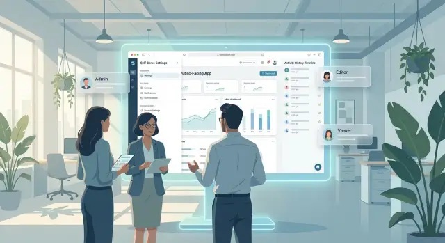
Reduce app support tickets by adding self-serve settings, simple permissions, and clear activity history that answers common questions fast.
Reduce app support tickets by adding self-serve settings, simple permissions, and clear activity history that answers common questions fast.
Support volume rarely rises because users are careless. It rises because the app makes people guess. When someone cannot tell what they can change on their own, the safest move is to contact support.
That gets worse in a public-facing app. Internal tools can lean on training, shared context, or a quick message to a teammate. Public users have none of that. Even a small moment of doubt can turn into a ticket.
One common problem is hidden control. A user sees a profile, project, or billing screen, but it is not obvious which parts are editable and which are locked. If the app does not explain that clearly, people assume something is broken instead of realizing they need a different role, plan, or approval.
Permissions create even more confusion. When a button is missing or an action fails without a plain reason, users often read it as a bug. From their side, that makes sense. They tried to do something normal, and the app gave them no useful context.
Missing history adds another layer of support work. If a setting changed, an invite was removed, or data was updated, users want to know what happened. Without visible activity history, they ask support the same questions again and again: Who changed this? When did it change? Was it me, my teammate, or the system?
Small questions pile up fast. One person asks where to update a domain. Another asks why they cannot edit a team setting. Another wants to know why yesterday's version looks different today. Each ticket is minor, but together they can eat up hours every week.
Teams that want to cut support load need to look beyond bugs. A big share of support work comes from uncertainty, not failure. When the product leaves basic questions unanswered, support becomes the place users go just to understand how the app works.
You can see this in client portals, account dashboards, and apps built quickly to get to launch. Even when the product basically works, unclear settings, vague permission limits, and no readable history make the experience feel shaky. Users do not report only broken features. They report confusion.
Start with your support inbox, not your roadmap. The best self-serve features usually come from the same questions your team answers every week: password resets, role changes, billing contacts, missing access, and "what changed?" moments.
Read through a few weeks of tickets and look for repeats. If a user could solve the issue alone with the right button, setting, or page, it belongs on your self-serve list. That is one of the fastest ways to reduce avoidable support without adding staff.
A simple way to sort the work is to group issues into three types. Settings questions cover profile updates, notification choices, and account preferences. Access questions are about who can view, edit, approve, or invite. History questions usually start with "Who changed this?" or "Why did this disappear?"
Do not begin with edge cases. Start with the problems that block daily work. If a customer cannot log in, cannot find a document, or cannot tell whether a teammate changed a record, that issue should move up the list.
Good first candidates have a few things in common: they happen often, they block common tasks, they are safe for users to fix on their own, and the result is easy to understand. If support handles the problem the same way every time, that is another strong signal.
Picture a small client portal. If clients keep asking for access to one project, that points to a permissions problem. If they keep asking whether a file was replaced, that points to an activity history problem. If they ask to change email alerts, that belongs in self-serve settings.
When you pick the right tasks, self-serve stops feeling like a nice extra. It becomes a practical way to keep support focused on real exceptions instead of routine fixes.
Self-serve settings work best when they remove the small requests that fill your inbox every week. If a user can safely change something on their own, they should not need to email support and wait for a reply.
Start with the settings people ask about most often. Common examples include profile details, password changes, notification preferences, team member access, and basic account information. These are routine tasks, and users expect to handle them without staff help.
A simple rule helps here: put account controls where people already expect to find them. Most users check the avatar menu, the account page, the billing area, or a clearly labeled settings section. If important controls are hidden behind vague labels, people assume the app does not support the change and open a ticket.
Before someone saves an update, show exactly what will change. A short preview or confirmation line prevents a lot of confusion. If a user changes an email address, plan setting, or permission level, they should see the result before they confirm it.
After the update, use plain success messages. Skip technical wording like "request processed" when "Your notification settings were updated" is clearer. A good message tells people what changed, when it changed, and whether they need to do anything next.
Keep advanced options out of the main path. Most users need only a few basic controls, so lead with those and place deeper options behind an "Advanced" area or a second step. That keeps the page easy to scan and lowers the chance of someone changing the wrong thing.
This is especially important in products built for speed. On a platform like Koder.ai, where teams can create web, server, and mobile apps from chat, everyday controls such as profile updates, password changes, and basic project preferences should be easy to find from the start. The faster you ship, the more important it is to keep routine controls obvious.
When self-serve settings are easy to find, easy to understand, and hard to misuse, users feel in control. Your team gets fewer avoidable tickets, and the app feels more trustworthy.
A lot of support tickets start with one simple question: "Why can't I do this?" If the answer is hidden, people assume the app is broken. Clear permissions lower support load because users can see what is happening, what they can do next, and who needs to help.
Start with role names that make sense outside your team. "Admin" and "Viewer" are usually clear. Names like "Tier 2 operator" or "Standard plus" are not. A customer should understand their role without reading a help article or asking support.
It also helps to show a short preview of each role before someone is invited or changed. If a manager is assigning access, they should be able to see the difference in plain language: can view reports, can edit billing, can invite teammates, cannot delete projects. That small preview prevents a lot of mistakes.
Never leave people with a greyed-out button and no reason. If an action is blocked, say why. A short message like "Only workspace admins can export data" is much better than silence.
The best message covers four things in one line or two. It tells the user what was blocked, why it was blocked, who can approve or change access, and what they can still do right now.
That last part matters. If someone cannot publish changes, maybe they can still save a draft or request approval. Give them a next step instead of a dead end.
A simple example: a client portal user tries to download invoices for the whole company. Instead of showing a vague error after they click, the app can say, "You can view only your own invoices. Ask your account owner or billing admin for company-wide access." Now the user knows the rule, the reason, and the right person to contact.
Good permission design is proactive. Put role details near invite forms, account settings, and sensitive actions. If a user is about to hand out access, they should not have to guess what that choice means.
Silent failures are the worst option. If a page loads empty because the user lacks access, say so clearly. An empty table with no note looks like missing data. A short message like "You do not have permission to view team activity" avoids confusion and saves your support team from tickets that never needed to happen.
A readable activity history is one of the simplest ways to reduce support tickets. When people can check what happened on their own, they ask fewer questions like "Who changed this?" or "Why did access disappear?"
The key is clarity. Users should be able to see who made a change, what changed, and when it happened without decoding technical terms.
Write event names the way a normal person would say them. "Role changed from Editor to Viewer" is better than "permission_update.success." "Project deleted" is better than "resource_destroyed."
Each entry should be short but specific. In most products, a useful history view shows the person who made the change, the item that was affected, the action that happened, and a clear timestamp shown in the same format everywhere.
Consistency matters more than extra detail. If one screen shows "3:15 PM" and another shows "2026-03-08 15:15 UTC," people start to doubt the record.
Filters also save time. Let users narrow the list by date, person, or item so they can answer their own question in seconds instead of scrolling through a long feed.
Major changes should stand out. Deletions, billing updates, role changes, and revoked access deserve stronger visual treatment because those are the events most likely to trigger support messages.
A small example makes the value obvious. If a client opens a portal and can no longer view a document, the history should clearly show that Alex changed their role from Admin to Viewer at 9:42 AM. That solves the mystery right away.
If you are building a portal or internal tool in Koder.ai, history is worth planning early rather than treating it as a later add-on. It helps users trust the system, and it gives your team fewer "what just happened" tickets to sort through.
Start with one support ticket that shows up again and again. Do not try to fix every pain point at once. If people keep asking, "Why can't I access this page?" or "Where did my change go?" that is the flow to map first.
Write down the exact path a user takes before they contact support. Include what they click, what they expect to happen, and where the confusion starts. That makes it easier to spot the missing piece: a setting they cannot find, a permission rule they do not understand, or an action that happened with no visible record.
Most fixes fall into a few simple categories. Users either need more control, a clearer explanation, a record of what changed, or an obvious next step. In practice, that usually means adding a self-serve setting, writing a plain blocked-access message, showing an activity log, or pointing them to the right approver.
Keep the fix narrow. If a user cannot edit a project because they have view access only, the screen should say that clearly and show who can change the permission. That usually works better than a long help article or a generic error.
After that, test the flow with someone outside your team. Pick a person who did not help build the product. Give them one task and watch where they pause, guess, or ask a question. Those moments matter more than what they say afterward, because real users often stop before they complain.
Take notes on the places where they still get stuck. Look for patterns such as unclear button labels, missing confirmation messages, or logs that make sense to your team but not to customers. Small wording changes often remove more tickets than big redesigns.
Then move to the next high-volume issue and repeat the process. One flow at a time feels slower at first, but it leads to cleaner product decisions. That matters even more for small teams building quickly, including teams using Koder.ai to ship customer-facing tools, where clear settings and visible history can prevent confusion before it turns into a support queue.
Imagine a small accounting firm with 200 clients and one person answering support email. Most tickets are not bugs. They are questions like "Why did I stop getting alerts?" or "Can you give my operations manager access to monthly reports?"
In a better client portal, the client can open Settings and change notification preferences on their own. They can turn email alerts on or off, choose weekly or monthly updates, and save the change right away. No one needs to email support just to flip a simple option.
Access works the same way. The account owner can see who already has access and what each person can do. If a manager needs permission to view reports but not edit billing details, the owner can request or approve that change inside the portal. That is much better than a vague email chain.
The activity history is what keeps confusion low. If a report looks different this week, the user can open a clear log and see that a filter was updated on Tuesday, a teammate changed the date range, and notifications were paused last Friday. That kind of record answers the question before it becomes a ticket.
The result is a cleaner support queue. One support person still matters, but their time goes to exceptions: a broken import, a billing edge case, or a permission conflict that needs review. Routine questions never reach the inbox.
If you are building a portal like this with Koder.ai, these features are worth planning early. They are not flashy, but they remove the daily friction users notice most.
Many support tickets start before anything is truly broken. The app makes a normal task feel confusing, risky, or hidden, so users ask a person instead of finishing it themselves. If you want fewer tickets, look for the small design choices that quietly push people toward support.
A common mistake is hiding important settings under vague menu names like "General," "Preferences," or "Advanced." Users do not know where billing alerts, notification rules, or access controls live, so they click around, give up, and open a ticket. If a setting affects daily work, name the menu after the result people want, such as "Team access" or "Email notifications."
Permissions often fail for the same reason. Internal role labels may make sense to your team, but names like "Operator 2" or "Standard+" mean nothing to customers. People need plain language that tells them what each role can see, edit, approve, or delete before they hit a blocked screen.
Another costly mistake is keeping activity history visible only to staff. When users cannot see who changed a setting, removed a file, or invited a teammate, they assume the system made a mistake. A simple, readable history view often answers the question before the ticket is written.
Error messages create more friction when they stop at "Something went wrong" or "Permission denied." Good messages explain what happened and what to do next. For example: "You can view this project, but only admins can publish changes. Ask a workspace admin or request access."
Defaults can also create quiet support problems. If you change notification rules, sharing settings, or approval steps without warning existing users, they notice only when their normal process breaks. That feels like a bug, even when the change was intentional.
A safer approach is straightforward: name menus by user goals, not internal categories; describe roles with clear actions people can take; show visible history for important account and content changes; write errors that include the next step; and warn users before defaults change.
Think about a small client portal again. If a customer cannot upload a document, they should be able to see the file limit, their role, and the latest account change in one place. That single screen can prevent several back-and-forth emails.
Before launch, test the basics with fresh eyes. Many support requests start because a setting is buried, a permission rule is vague, or a failed action gives no useful next step. A short review before release can catch the problems that later fill your inbox.
Start with account settings. Ask someone who has never seen the app to change their password, update a profile field, and find notification controls. If they pause, guess, or open the wrong menu first, the path is not clear enough.
Then check permissions. Users should know what their role can do before they hit a wall. Labels like Viewer, Editor, and Admin help only if the app explains them in plain words. Show limits near the feature itself, not only on a hidden admin page.
Activity history matters just as much. When people can see who changed a status, updated a file, or invited a new user, they ask support fewer questions. The history view does not need deep technical detail. It just needs a date, an action, and a clear name.
Before you ship, make sure a new user can find settings on the first try, role limits are explained near key actions, recent changes are visible without contacting support, and blocked actions explain why the user cannot continue and what to do next.
One more test matters more than most teams expect: ask one person outside your team to complete the main tasks without help. Internal teams already know how the product works, so they miss confusing spots. A friend, contractor, or early customer will notice them quickly.
In a small client portal, that tester should be able to log in, update a profile, upload a file, and understand why they cannot edit billing if their role does not allow it. If they need to ask even one basic question, fix that screen before release.
If your team is small, do not try to fix every support problem at once. Start with the one workflow that creates the same ticket over and over. That is usually where you will get the fastest drop in support load.
A useful rule is to count repeat questions, not just loud complaints. If users keep asking how to change billing details, reset access, find past actions, or understand who can edit what, those are the places to improve first. Small changes in those flows often do more than a full redesign.
A practical order is simple: pick one high-volume issue, write down where users get confused, ship one small fix, and then watch support messages for two weeks to see what disappears.
Keep your notes simple. A short running list is enough: the screen, the user question, and the likely cause of the confusion. After a few weeks, patterns become obvious. You may find that three tiny UI fixes remove more tickets than one big feature release.
It also helps to review real user wording. People rarely say, "the permission model is unclear." They say, "Why can my teammate see this but I cannot?" Use that language inside the product. Clear microcopy saves time for both users and support.
If you need to test or prototype these changes quickly, Koder.ai can help. It lets teams build web, server, and mobile apps from chat, which makes it easier to try a new settings screen, permission state, or history view without a long development cycle. For small teams, that kind of speed makes it easier to fix confusion while the problem is still fresh.
The goal is not perfection. It is steady removal of confusion, one repeat ticket at a time.
Start with repeat tickets, not feature ideas. If users keep asking about passwords, access, notifications, billing contacts, or what changed, those are the best first self-serve fixes because they remove routine support work fast.
Put them where users already look: the avatar menu, account page, billing area, or a clearly named settings section. If a control affects daily work, label it by the result people want, like "Team access" or "Email notifications."
Say exactly what is blocked and why in plain language. A good message should also point to the right next step, such as asking a workspace admin or requesting approval.
Use role names that make sense right away, such as Admin, Editor, and Viewer. Then add a short plain-language preview of what each role can view, edit, approve, or delete before someone assigns it.
Show who made the change, what changed, and when it happened in a consistent time format. Keep the wording human, so users see "Role changed from Editor to Viewer" instead of technical event names.
Treat it as a permission message, not an empty state. A short note like "You do not have permission to view team activity" prevents people from assuming data is missing or broken.
Use a short confirmation or preview before save, then show a clear success message after the update. Users should know what changed, when it changed, and whether they need to do anything next.
Test one common support flow from start to finish with someone outside your team. Watch where they pause, guess, or ask for help, because those moments usually reveal the wording or screen that needs work.
Start with one repeat issue, ship one small fix, and watch support messages for two weeks. Small wording and visibility changes often cut more tickets than a full redesign.
Koder.ai is useful when you need to try changes fast, such as a clearer settings screen, a better permission message, or a readable history view. That speed helps small teams fix confusion before it turns into a steady stream of support tickets.