

Restaurant Websites That Convert: Menu, Ordering & SEO Basics
Learn the essentials for restaurant websites that drive orders and bookings: menu structure, fast mobile pages, clear CTAs, and local SEO basics.
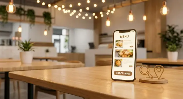
What “Conversion” Means for a Restaurant Website
A “conversion” isn’t always a credit-card checkout. For restaurants, it’s any action that moves someone from “thinking about dinner” to “I’m doing it.” The first step is choosing your primary goal—because your homepage, buttons, and even your SEO snippets should all point to that one outcome.
Pick the primary goal (and a clear secondary)
Most restaurants fit into one of these primary goals:
- Online orders (pickup/delivery)
- Reservations (book a table)
- Calls (often for takeout, catering, or large parties)
- Directions (especially for quick-service or tourists)
You can still support the others, but avoid treating every action as equal. If online ordering is your main revenue driver, it should visually win.
Map the two big customer journeys
Think in terms of intent:
- New visitor: “Is this place for me?” They need proof fast—menu, pricing range, location, hours, and trust.
- Returning customer: “I know what I want.” They want a shortcut—Order Now, Reorder, or Book again with minimal scrolling.
Designing for both usually increases conversions without adding complexity.
Above-the-fold essentials (no scavenger hunt)
Before someone scrolls, they should be able to find:
- Menu
- Order / Book (your primary CTA)
- Hours (including today)
- Address + tap-to-map
Set measurable KPIs you can actually improve
Choose 2–4 simple metrics to track monthly:
- Order button clicks (and completed orders if you can)
- Reservation button clicks
- Tap-to-call clicks (mobile)
- Tap-for-directions clicks
Once these are defined, every website change becomes easier to evaluate: did it increase the actions that matter?
Homepage Layout: Put Menu and Ordering First
Your homepage has one job: help hungry people take the next step in seconds. That usually means ordering, reserving, or calling—before they scroll, before they think, and definitely before they bounce.
Make the primary actions impossible to miss
Treat your top actions as persistent buttons (especially on mobile): Order Online, Reserve, and Call. A sticky header or bottom bar works well because the actions stay available while people skim photos or check details.
Use clear, literal labels. “Learn more” forces extra thinking; “Order Online” tells people exactly what happens next. If you offer delivery and pickup, consider a simple split button or a short chooser (Pickup / Delivery) instead of sending visitors into a maze.
Put essentials above the fold
Near the top of the page, include:
- Hours today (not just “Hours”)
- Address
- A one-tap Get directions link
This reduces friction for guests deciding whether to come now or later, and it helps locals confirm you’re the right spot without digging through the site.
Add trust cues right where decisions happen
People decide quickly if you fit their needs. Add a compact “at a glance” line near the hero area or under the main buttons:
- Cuisine type (e.g., Thai, Pizza, Modern Mexican)
- Price range (e.g., $, $$)
- Dietary options (e.g., vegetarian-friendly, gluten-free options)
These details prevent mismatched clicks and increase the quality of visits—fewer “maybe” visitors, more people ready to order or book.
Keep the homepage focused
Your homepage doesn’t need everything. A simple structure often converts best:
- Primary buttons (Order / Reserve / Call)
- Quick menu preview with a clear link to /menu
- A small promo area (lunch special, happy hour, catering) linking to one page
- Footer with full contact details
If someone can’t find your menu or ordering in the first few seconds, they’ll find another restaurant instead.
Menu Pages That People (and Google) Can Read
Your menu page is usually the most-visited page on a restaurant site—and often the moment a visitor decides to order, book, or bounce. A “pretty” menu isn’t enough; it has to be fast to scan, easy to understand, and readable by search engines.
Make the menu easy to scan
People don’t read menus online like a brochure. They hunt.
Use clear sections (Starters, Mains, Desserts, Drinks) and add quick jump links at the top. On mobile, a sticky category bar (that stays visible as someone scrolls) helps guests move instantly to what they want—especially for larger menus.
Small UX details matter here: keep item names left-aligned, prices easy to spot, and spacing consistent. If you run weekly specials, place them near the top of the relevant category instead of hiding them in a separate PDF.
Use real text—not just images or PDFs
Search engines can’t reliably “understand” a menu that’s only an image or a PDF, and neither can many assistive technologies.
Publish your menu as real HTML text. You can still design it beautifully, but the content should be selectable, searchable, and accessible. This improves menu SEO, helps your items show up for searches like “gluten-free pizza near me,” and makes it easier for guests to share items with friends.
Add prices, descriptions, and dietary tags
Missing prices are a conversion killer. Add clear pricing, short descriptions that explain what makes the dish appealing, and simple dietary tags such as:
- V (Vegetarian), VG (Vegan), GF (Gluten-Free), spicy
Keep tags consistent and don’t overdo icons—clarity beats decoration.
Subtle highlighting for signature and high-margin items
If you have signature dishes or high-margin items, give them a gentle nudge: “House Favorite,” “Chef’s Special,” or a small visual accent. Avoid shouting with giant badges everywhere; one or two highlights per section is usually enough.
Offer a printable view—without hiding the real menu
Some guests still want a printable menu. Provide a “Print menu” option, but don’t replace your main menu with a download. The primary menu should stay in-page as text so both people and Google can read it.
Online Ordering Flow: Fewer Clicks, Fewer Drop-Offs
Online ordering is where “I’m hungry” turns into revenue—so the flow has to feel immediate and predictable. The goal is simple: get people from your homepage (or menu) to a ready-to-order screen with as little decision fatigue as possible.
Choose the right ordering setup
You typically have three options:
- Native ordering page on your site (best for control and consistency)
- Embedded third-party ordering (keeps people on your domain, but can be slower)
- Outbound link to a third-party portal (fast to implement, but highest drop-off risk)
Whatever you choose, make the entry point unmistakable: a primary Order Online button that goes directly to the ordering destination—not to a general menu page.
Reduce steps (and preselect the right location)
If you have multiple locations, don’t make guests repeat themselves. From the first click, try to:
- Preselect the nearest or previously chosen location (using a clear location switcher)
- Land them on an ordering-ready page, not a “choose your city” detour
A practical rule: if someone has to click more than once after “Order Online” before they can add an item, you’re leaking orders.
Make pickup vs. delivery obvious
Many drop-offs happen at the “how do I get it?” moment. Place Pickup and Delivery choices near the top, styled like big buttons, and keep the language consistent across your site and the ordering experience.
If delivery is through a partner, label it clearly (e.g., “Delivery via DoorDash”). Surprises feel like friction.
Be transparent about fees and totals
If your ordering experience includes third-party service fees, small-order fees, or delivery surcharges, show that early—before checkout. A short note like “Delivery fees set by delivery partner” near the delivery toggle reduces abandoned carts and angry calls.
Add a fallback when ordering isn’t available
Ordering pages break, stores close early, and POS integrations go down. Build in a simple fallback:
- A visible Call to Order button (tap-to-call on mobile)
- A short message that updates based on hours (e.g., “Online ordering reopens at 4:00 PM”)
This keeps the guest moving forward—even when the ideal path isn’t available.
Calls to Action That Actually Get Clicked
A call to action (CTA) is the “next step” you’re asking a hungry visitor to take. On restaurant sites, the best CTAs are simple: Order online, Reserve a table, or Call. If you make that decision for people (instead of offering five competing options), more of them will follow through.
Pick one primary CTA per page
Each core page should have a single main goal:
- Homepage: “Order Online” (or “Reserve” if you’re reservation-led)
- Menu page: “Start Order” (not “Learn more”)
- Contact/Location page: “Call” or “Get Directions”
Secondary links (gift cards, catering, events) can exist—just don’t let them visually compete with the primary button.
Repeat CTAs where decisions happen
People decide after they’ve seen something reassuring. Place the CTA again right after key sections like:
- A short “popular items” block
- Delivery/pickup options and fees
- Location, hours, and parking notes
This reduces scrolling back up and keeps momentum.
Make buttons effortless on mobile
Most restaurant traffic is on phones, so your CTAs should be:
- Large enough to tap with a thumb
- High-contrast and clearly labeled (“Order Pickup” beats “Start”)
- Positioned consistently (top nav + in-page repeats)
Add microcopy that removes hesitation
A tiny line under the button can answer the question that stops the click:
- “Pickup in 20–30 min”
- “No account needed”
- “Reserve in under 60 seconds”
Don’t block the action
Avoid pop-ups that cover the menu or CTA—especially on mobile. If you must announce something (holiday hours), use a slim banner that can be dismissed and doesn’t interrupt ordering.
Location, Hours, and Contact: Remove Friction
If a guest is ready to order, book, or walk in, your website shouldn’t make them work to answer basic questions. The “where are you, are you open, and how do I reach you?” details are often the last step before a conversion—and also the easiest place to lose someone.
Build a clear home for each location
If you have more than one spot, don’t cram everything into a single footer line. Create a dedicated page (or at least a clearly separated section) for each location with its own:
- Name and brief descriptor (e.g., “Downtown — bar seating + late-night menu”)
- Address and phone number
- Location-specific hours
- Direct actions (Order Online, Reserve, Call)
These pages also help with local SEO for restaurants because they make it obvious to both people and Google which location matches their intent.
Keep NAP consistent (and boring—in a good way)
NAP means Name, Address, Phone. Use the exact same formatting across your site (header/footer, location pages, contact page) and match what you use in your Google Business Profile and other listings. Small differences like “St.” vs “Street” can create confusion for directories and search engines.
Make directions effortless
Add an embedded map on each location page, but don’t stop there. Include a prominent “Get Directions” link that opens the user’s map app—especially important on a mobile-friendly restaurant site.
If you want to go one step further, add a short “Finding us” paragraph:
- Parking options (garage name, street parking rules, validation)
- Nearby transit stops
- Entrance notes (rear patio entrance, lobby check-in, elevator access)
- Accessibility details (step-free entrance, accessible restroom)
Hours that prevent wrong expectations
List hours per location in a scannable format and keep them current. Add holiday updates (or a note like “Holiday hours may vary—check here for updates”) and include service-specific hours if they differ (brunch vs dinner, delivery vs dine-in).
Give multiple contact options—with the right defaults
Provide one-tap phone links and a simple contact method for non-urgent needs (email or a short form). If you take reservations, make the reservation button as visible as the ordering button—and keep both consistent across the site so guests don’t have to re-learn where to click.
Local SEO Basics for Restaurants
Local SEO is what helps nearby guests find you when they search “tacos near me” or “best brunch in your neighborhood.” The goal is simple: make it easy for Google (and people) to understand where you are, what you serve, and how to order or book.
Get your Google Business Profile right
Your Google Business Profile is often the first “website” guests see. Make sure the basics are accurate and complete:
- Primary and secondary categories that match what you actually are (e.g., Restaurant, Pizza Restaurant, Bar, Catering)
- Hours (including holiday hours) so you don’t lose visits from “are they open?” searches
- Fresh photos of your best-selling items, interior, and exterior signage
- A clear Menu link and Order/Reserve link that goes to the right page on your site (not a confusing directory)
Use local keywords naturally
On your homepage, location page, and key menu/ordering pages, include the city and neighborhood in a way that reads naturally:
“Wood-fired pizza in Ballard, Seattle” works better than repeating “Seattle pizza restaurant” ten times. Add details that build relevance: nearby landmarks, delivery radius, or “near [street/area].”
Add structured data (schema)
Adding Restaurant schema helps search engines understand your hours, location, and menu. If you have dedicated pages, you can also mark up:
- Menu page (Menu schema)
- Location and hours (LocalBusiness/Restaurant)
Build trust with reviews (the right way)
Actively ask happy guests to leave reviews after a visit or pickup, but don’t offer incentives. On your site, link to a simple /reviews page (or your contact page) that points people to the platforms you care about.
Create pages for high-intent services
If you offer catering or private dining, give them their own pages (e.g., /catering and /private-dining). These searches are often high-value—and a dedicated page can rank far better than a single paragraph buried on the homepage.
Mobile UX and Speed: The Quiet Conversion Boosters
Most restaurant customers hit your site from a phone—often while walking, driving (as a passenger), or deciding “right now.” If the page feels cramped, slow, or confusing, they won’t browse. They’ll bounce and pick the next option.
Build mobile-first, not desktop-shrunk
A mobile-friendly restaurant site is less about fancy design and more about comfort and clarity:
- Use readable font sizes and high contrast (menu items shouldn’t feel like a microscope job).
- Add generous spacing between links and buttons so taps don’t misfire.
- Keep navigation thumb-friendly: primary actions (Order, Reserve, Call, Directions) should be easy to reach and consistently placed.
Speed is conversion rate (especially for menus)
Slow pages quietly kill orders. A few practical moves usually make the biggest difference:
- Compress images before uploading, and use modern formats when possible.
- Avoid heavy sliders, autoplay video, and oversized hero banners that delay the first meaningful content.
- Keep page structure simple: one clear goal per page, minimal popups, and fewer competing blocks.
If you must feature big photography, load it thoughtfully so the menu and buttons appear first.
Test like a real customer
Don’t only test on office Wi‑Fi and a new phone. Check the site on:
- Multiple devices (iPhone/Android, small and large screens)
- Slower connections (cellular, “low data mode,” or a throttled network)
Open the homepage and ask: “Can I order within 5 seconds?” If not, simplify.
Short forms = more reservations and fewer drop-offs
Every extra field is a reason to quit. For reservation or catering inquiries, keep forms lean—typically:
Name, phone/email, date/time, party size.
Anything else can be handled after the initial confirmation. The goal is to capture intent while it’s hot.
On-Page SEO Checklist for Core Pages
On-page SEO is the part you control: what your pages are called, how they’re organized, and whether Google can understand them. For restaurant sites, a few small fixes on the Home, Menu, and Locations pages can noticeably improve visibility—without adding “blog work.”
1) Write titles and meta descriptions that match intent
Treat your title tag like your page’s headline in Google. Keep it specific and location-aware where it helps.
- Home title: [Restaurant Name] – [Cuisine] in [Neighborhood/City]
- Menu title: Menu | [Restaurant Name] [City]
- Locations title: Locations & Hours | [Restaurant Name]
For meta descriptions, don’t keyword-stuff—sell the click with what people want: ordering, reservations, popular items, and hours.
2) Use clean URLs and clear internal links
Clean URLs build trust for users and reduce confusion for search engines.
Use simple, predictable paths like:
- /menu
- /order
- /locations
- /catering (if relevant)
Then link to them consistently in your header and within page copy (for example, a short “Order online” line near the top of /menu that points to /order). This helps both navigation and SEO.
3) Add useful alt text to key photos
Alt text is primarily for accessibility, but it also gives context to search engines.
Keep it short and descriptive:
- “Margherita pizza with fresh basil”
- “Dining room at [Restaurant Name] in [City]”
Avoid stuffing keywords or repeating the same alt text across multiple images.
4) Prevent duplicate content from multiple menu versions
A common SEO problem: the same menu appears on multiple URLs (PDF, “menu” page, third-party embeds, seasonal pages). Pick one primary menu page (usually /menu).
If you must have a PDF, link to it from /menu, but don’t let it compete as a separate “main menu” page. Also avoid creating near-identical pages like /menu-lunch and /lunch-menu unless the content is genuinely different.
5) Submit an XML sitemap and make sure indexing is allowed
Make it easy for Google to find your pages:
- Generate an XML sitemap (often at /sitemap.xml)
- Submit it in Google Search Console
- Ensure your site isn’t accidentally blocking indexing (for example, no “noindex” tags on core pages and no disallow rules blocking /menu or /locations)
If you do only one thing here: make sure /menu, /order, and /locations are indexable, fast, and clearly linked from your homepage.
Photos, Social Proof, and Trust Elements
Great photos and believable proof do more than look nice—they answer the questions that stop people from ordering or booking.
Photos that set expectations (and reduce hesitation)
Use a small set of high-quality, real photos that show what guests will actually get. A strong hero dish on the homepage helps first-time visitors decide quickly, but don’t stop there.
Aim to include:
- A signature dish (or best-seller) with clear plating and portion size
- The dining room and seating style (cozy tables vs. communal vs. counter service)
- Ambiance cues: lighting, music vibe, patio, bar area
- Optional: a friendly staff photo (especially for neighborhood spots)
Keep key info near photos—people shouldn’t have to scroll for basics. If you have a homepage gallery, pair it with your cuisine type, address, and today’s hours, plus direct buttons like /order or /reservations.
Social proof that feels trustworthy
Reviews work best when they’re specific. Pick a few short testimonials that mention something real (a dish, fast pickup, service, atmosphere). Avoid editing quotes into marketing copy—use them accurately, with the source (Google, Yelp, or a guest name if you have permission).
If you have press mentions or awards, display them modestly (logos or a single line) so they support the decision without distracting from ordering.
Trust elements that prevent surprises
Be clear about policies in plain language, especially where people decide to book or buy:
- Reservation rules (late arrivals, table time limits, deposits if any)
- Cancellations and no-shows
- Large party process (minimum spend, pre-fixe menus, contact method)
Clarity builds confidence—and confident visitors click.
Content That Drives Repeat Orders (Without Extra Work)
Good restaurant content isn’t about becoming a publisher. It’s about giving past guests a reason to come back—and making it easy for new guests to decide faster.
Create one “Offers” page you can update anytime
Build a simple /offers page that you can edit without touching your design. Keep it flexible: a few cards with a title, short description, and an end date.
Examples that work:
- Weekday lunch combo
- Family meal bundles
- Limited-time seasonal specials
Add a clear button on each offer: Order Now (link to your ordering page) or Reserve (link to your reservations page). This page also becomes a handy link for social posts and email campaigns.
Add event pages that answer every question
If you host live music, tastings, holiday prix-fixe menus, or pop-ups, create an event page per event (or per recurring series). Include: date, start/end time, location, cover/ticket info, and what guests can expect.
Most importantly, place the conversion action near the top:
- Reserve a Table
- Buy Tickets
- Order the Special Menu
When the event ends, either remove it or mark it as “Past” and link to upcoming dates.
Build an email signup with a real benefit
Add a short signup form in your footer and on /offers. Promise something specific: “Get weekly specials,” “Be first to know about tastings,” or “Early access to holiday reservations.”
Keep it minimal (email only), and link to a simple /privacy page.
Publish tiny updates that feel personal
You don’t need long blogs. Post short updates like seasonal menu changes, a chef note, or a community event you’re supporting. One photo and 100–200 words is enough.
Link every piece of content back to ordering or reservations
At the end of each post or event page, add a relevant CTA: “Order the new ramen special” or “Reserve for Friday jazz night.” Content should always point back to the action you want guests to take.
Measurement and Continuous Improvement
A restaurant website isn’t “done” when it’s published. The best converting sites get small, regular tweaks based on what guests actually do—especially on mobile.
Track the clicks that matter
Set up analytics events for the actions that map to revenue and foot traffic:
- Order online button clicks
- Reserve button clicks
- Tap to call clicks
- Get directions / map clicks
In GA4, these can be simple click events. If your ordering tool lives on another domain, you still want to measure the exit clicks so you can compare performance across pages and campaigns.
Use UTM tags for third‑party links
If you send people to a third‑party platform (ordering, reservations, gift cards), add UTM tags to your website links so you can see which page drove the visit.
Example (format only):
/order?utm_source=website&utm_medium=button&utm_campaign=order_online
Keep a small doc with your standard UTMs so they stay consistent.
Watch what brings local traffic
In Google Search Console, review:
- Search queries (e.g., “tacos near me,” “best brunch in [neighborhood]”)
- Top pages getting impressions/clicks
If your menu page gets impressions but few clicks, improve the title/meta description. If it gets clicks but few orders, your calls to action may need work.
Run tiny A/B tests
Test one change at a time for 2–4 weeks: CTA text (“Order pickup” vs “Order now”), button color, or hero layout. Make a note of what you changed and the date.
If you’re iterating quickly, tools and workflows matter. Platforms like Koder.ai can help teams prototype and ship restaurant website changes faster (for example, adjusting CTA placement, rebuilding /menu as real text, or adding location pages) via a chat-driven build flow—then roll back safely using snapshots if a test underperforms.
Add a recurring checklist
Put a monthly reminder on the calendar to verify menu accuracy, hours, and phone number—and schedule a separate check for holiday hours and special closures. Consistency prevents avoidable drop-offs.
FAQ
What counts as a “conversion” on a restaurant website?
For restaurant sites, a conversion is any action that moves a visitor closer to buying or visiting—like tapping Order Online, booking a table, calling, or getting directions.
Pick one primary conversion (the one most tied to revenue) and design the homepage and navigation to make that action the easiest next step.
How do I choose the primary goal for my restaurant website?
Choose the action that most directly drives revenue for your business model:
- Fast-casual / takeout-heavy: Online orders
- Full-service dining: Reservations
- Catering-focused: Calls or a catering inquiry
- Tourist/high-foot-traffic areas: Directions
Then set a clear secondary goal, but don’t let it visually compete with the primary button.
What should be visible above the fold on mobile?
Above the fold (before scrolling), visitors should immediately see:
- A clear primary CTA (e.g., Order Online or Reserve)
- Menu access
- Hours today
- Address plus a tap-to-map Get Directions link
If someone can’t confirm “Are you open?” and “Can I order/book right now?” quickly, they’ll leave.
How should I design for new visitors vs. returning customers?
New visitors need reassurance fast:
- Cuisine type, price range, dietary options
- Menu and photos that match expectations
- Location and hours
Returning visitors want shortcuts:
- A persistent Order / Reorder / Reserve again path
- Minimal scrolling and fewer taps to start an order
Design for both by keeping primary actions persistent and details easy to scan.
Should my menu be a PDF, an image, or HTML text?
PDF/image-only menus hurt both usability and SEO. Real HTML text menus are:
- Searchable and scannable on phones
- More accessible (screen readers, zoom, copy/paste)
- Easier for Google to understand for queries like “gluten-free pizza near me”
If you want, offer a printable option—but keep the main menu as text on /menu.
How can I reduce drop-off in my online ordering flow?
Aim for one click from Order Online to an ordering-ready screen.
Practical improvements:
- Link the main CTA directly to /order (or the exact ordering destination)
- Preselect the nearest/previous location if you have multiple locations
- Make Pickup vs Delivery a clear top-level choice
- Show fees and delivery partner info early to prevent checkout surprises
What’s the best way to handle multiple restaurant locations on my site?
Create a dedicated page (or clearly separated section) for each location with:
- Location-specific address, phone, and hours
- Direct actions: Order, Reserve, Call, Directions
Also keep your NAP (Name, Address, Phone) formatting consistent across the site and your Google Business Profile to reduce confusion and improve local SEO.
What are the most important local SEO fixes for restaurants?
Start with the basics:
- Fully complete your Google Business Profile (categories, hours, photos)
- Use city/neighborhood terms naturally on key pages
- Add structured data (Restaurant/LocalBusiness schema, and Menu schema if relevant)
These steps help Google understand what you serve, where you are, and which page to show for high-intent searches.
What mobile UX changes most improve restaurant website conversions?
Focus on speed and thumb-friendly actions:
- Compress images; avoid heavy sliders/autoplay video
- Use large tap targets and high-contrast buttons
- Keep primary actions (Order/Reserve/Call/Directions) consistently placed, often via a sticky header or bottom bar
Test on real cellular conditions—not just office Wi‑Fi—to catch slow menu and ordering pages.
What should I track to measure whether the site is improving?
Track actions that map to revenue and visits:
- Order button clicks
- Reservation button clicks
- Tap-to-call clicks
- Get-directions clicks
If you send users off-site (ordering/reservations), add UTM tags to your buttons so you can compare which pages and campaigns drive the most intent. Then make one change at a time and review monthly.